The network for creativity
Join 1.25M professional creatives like you
Connect with clients, get discovered, and run your business 100% commission-free
Creatives on Contra have earned over $150M and we are just getting started
Back to feedPost
Sharing this amazing project I had the pleasure to work on ⚡️
LUMA is a matcha brand built around the ritual of taking a moment for yourself.
The identity combines a fresh, playful color palette with a clean and contemporary visual language, creating a brand that feels vibrant without losing its sense of calm.
The result is a modern matcha identity that brings together natural qualities with a bright, lifestyle-driven aesthetic.
Check the full project on https://www.behance.net/gallery/255763939/LUMA-Matcha-Branding
Tell me your thoughts! 🔥🍵



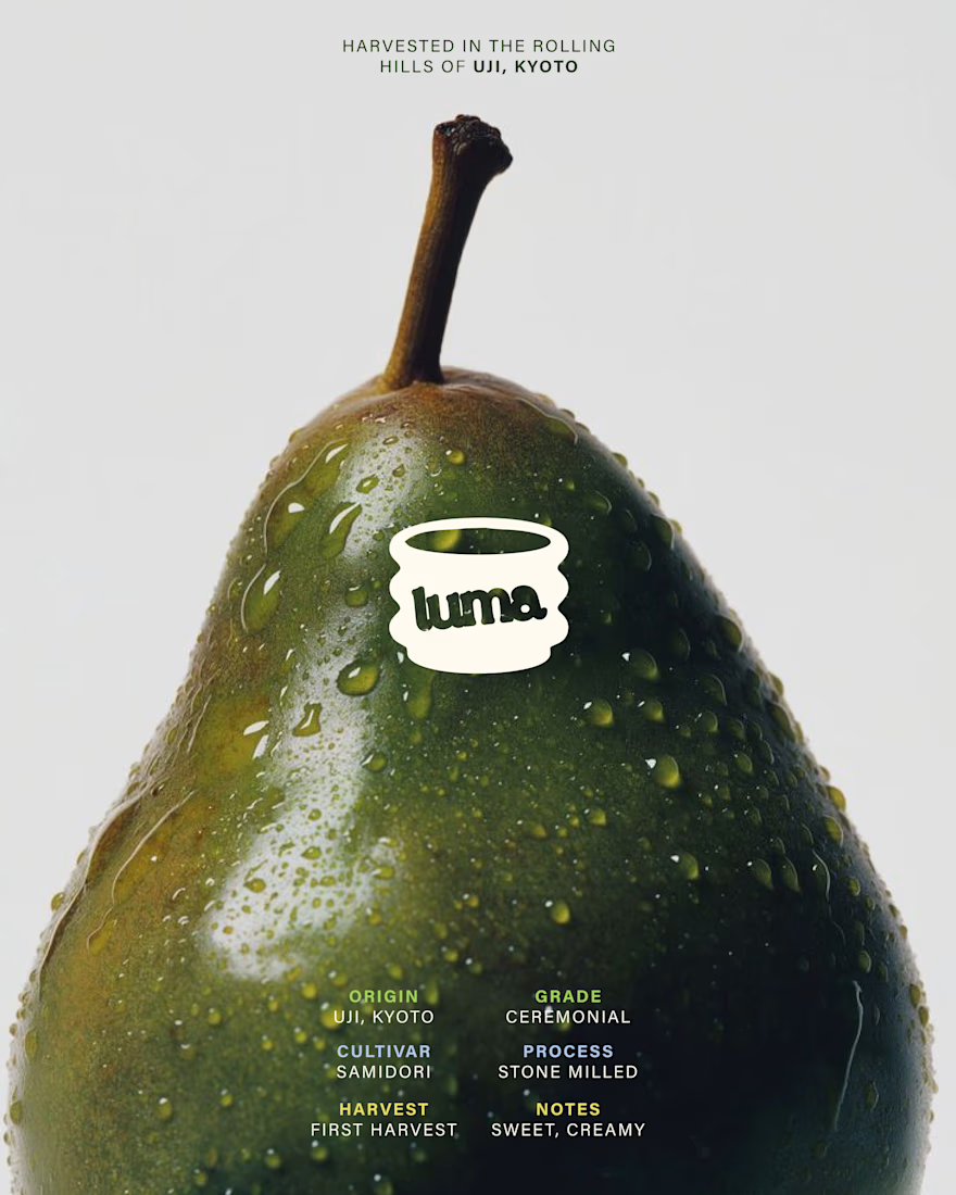
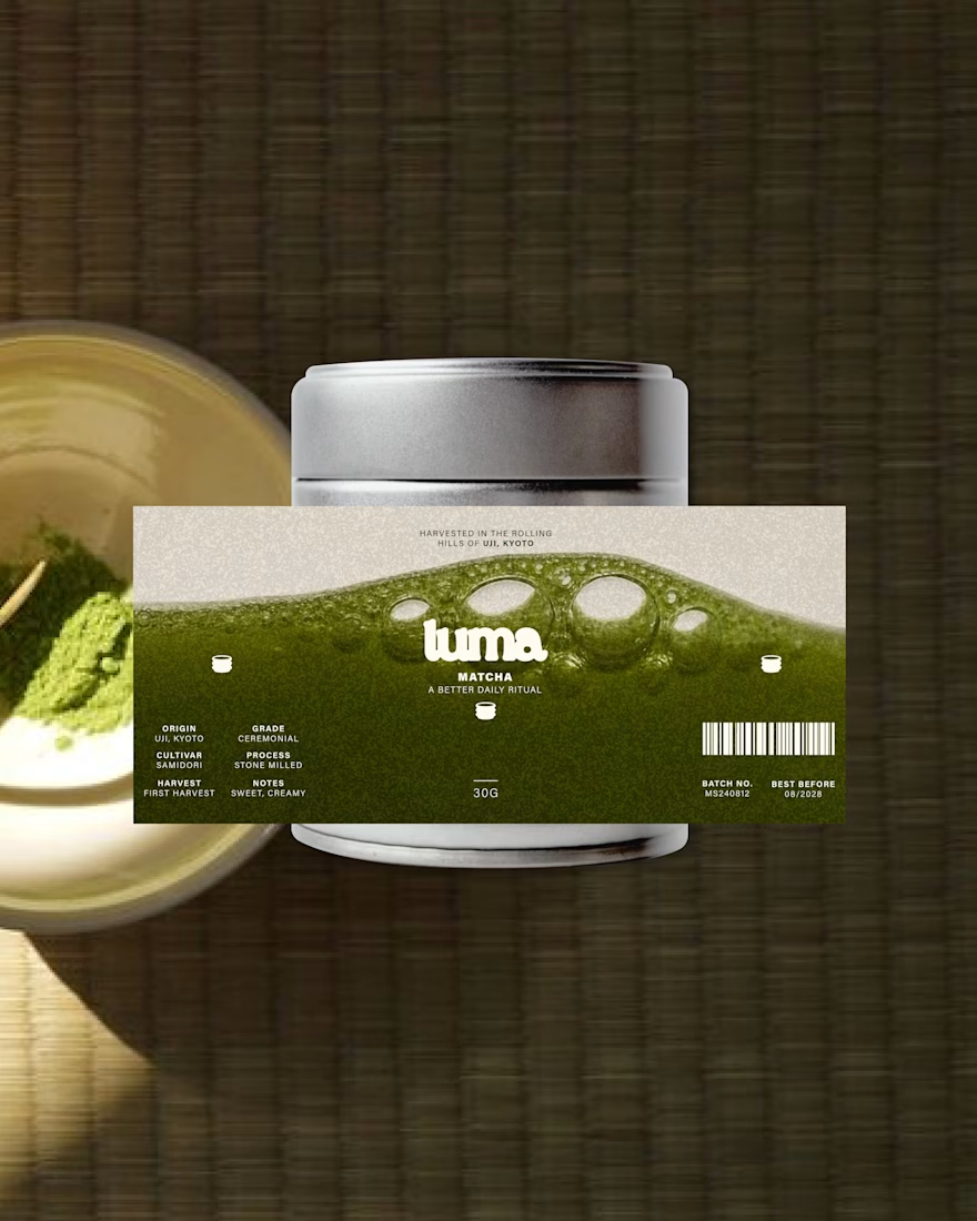
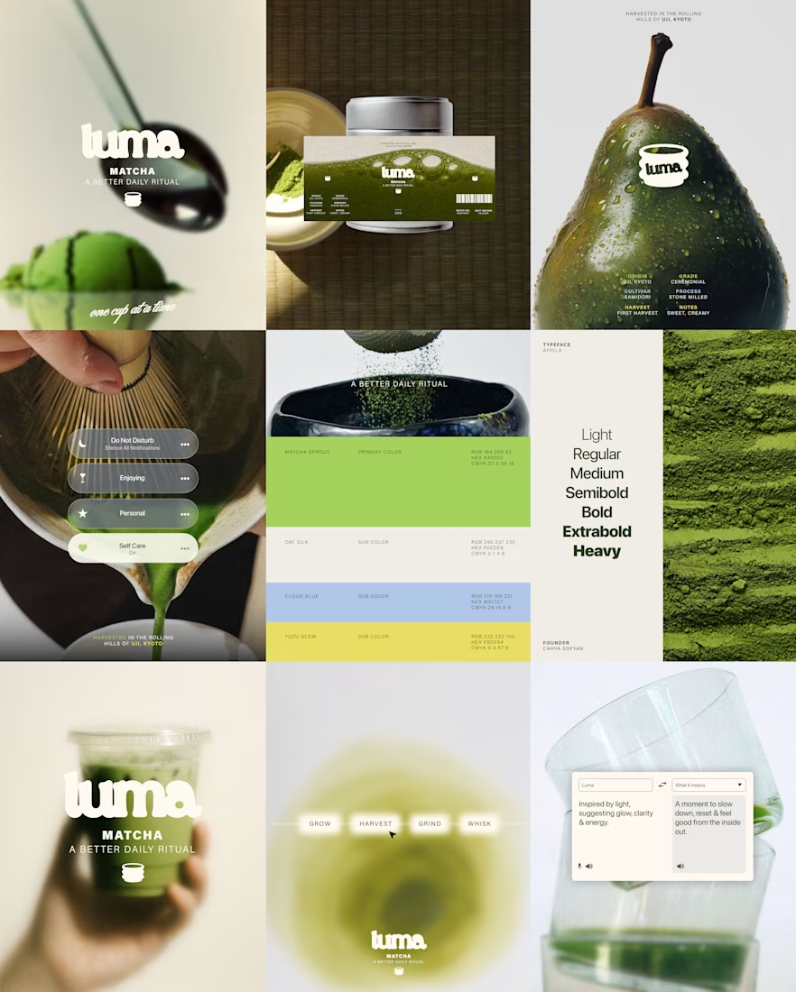

Most of the matcha shelf is muted and ceremonial-looking, so a bright palette is exactly what makes this findable. The trade is that brightness tends to read as everyday latte rather than premium grade, and that shows up in what people expect to pay - was the daily-ritual end the deliberate target rather than the ceremonial one?

Thank you for your comment! I was aiming to move away from the typical matcha brand and give it a more "alive" looking with the color palette, rather than just "wellness" and "healthy"!

Nice work! I'm obsessed with matcha!!! 🍵🍃
Thank you Bella!!!

The tin and the pour make the ritual feel physical, not just a color story. The soft wordmark on the wet tin stays bright without going candy, which is a hard line for matcha packaging.
Thanks Rohan!

Love how the earthy green palette and playful branding come together!
Thanks Zara!

Good Work!!!!
Thanks Farah!

Nice work 🔥
Thanks Damilola!

The way the avocado shot and the matcha jar share that same green undertone ties the whole set together beautifully. Did the photography come together after the brand identity was locked, or were they developed side by side?
Thanks Maty!

fabulous work!
Thanks Nicolette!

I love thisss!! 🙌
Thanks Tan!

Thanks Folorunsho!

Love the branding!!
Thanks Virginia!

Loving this❤️
Thanks Martins!
The network for creativity
Join 1.25M professional creatives like you
Connect with clients, get discovered, and run your business 100% commission-free
Creatives on Contra have earned over $150M and we are just getting started





Related posts



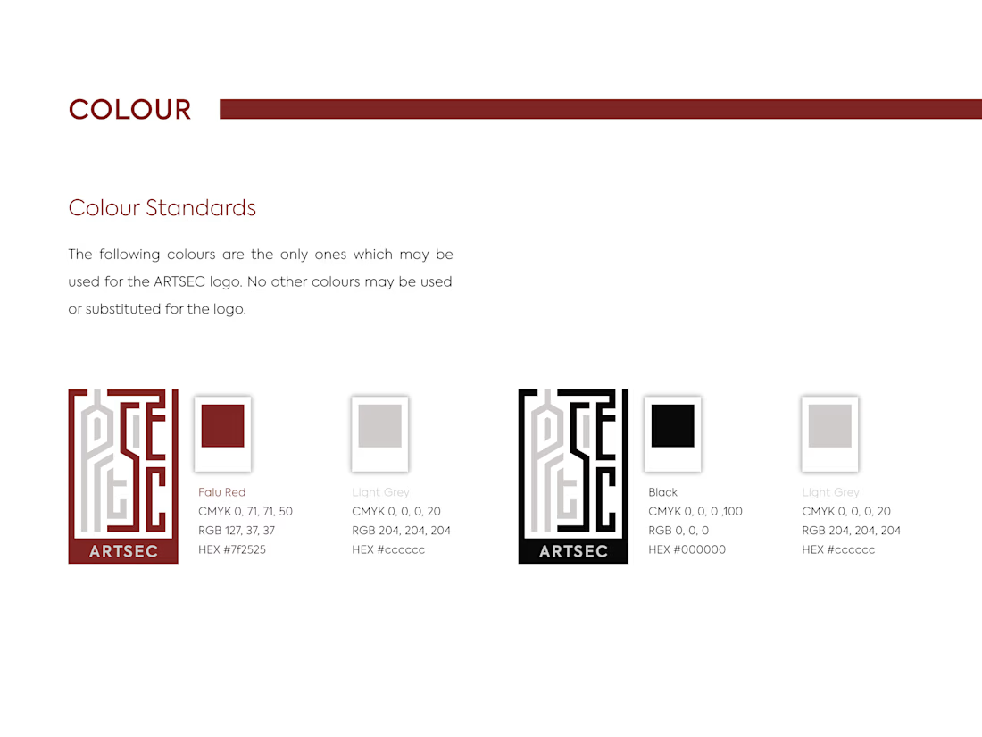
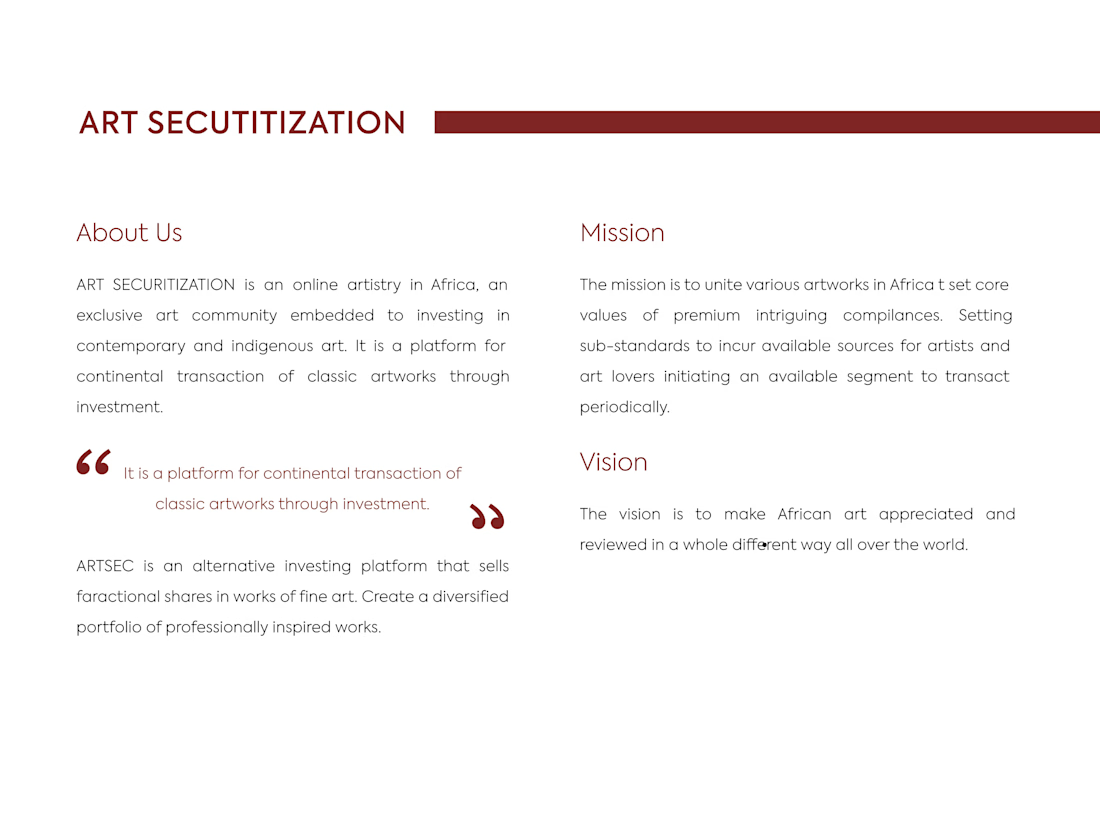
ARTSEC is an art investment platform focused on making African contemporary and indigenous art more accessible to collectors and investors.
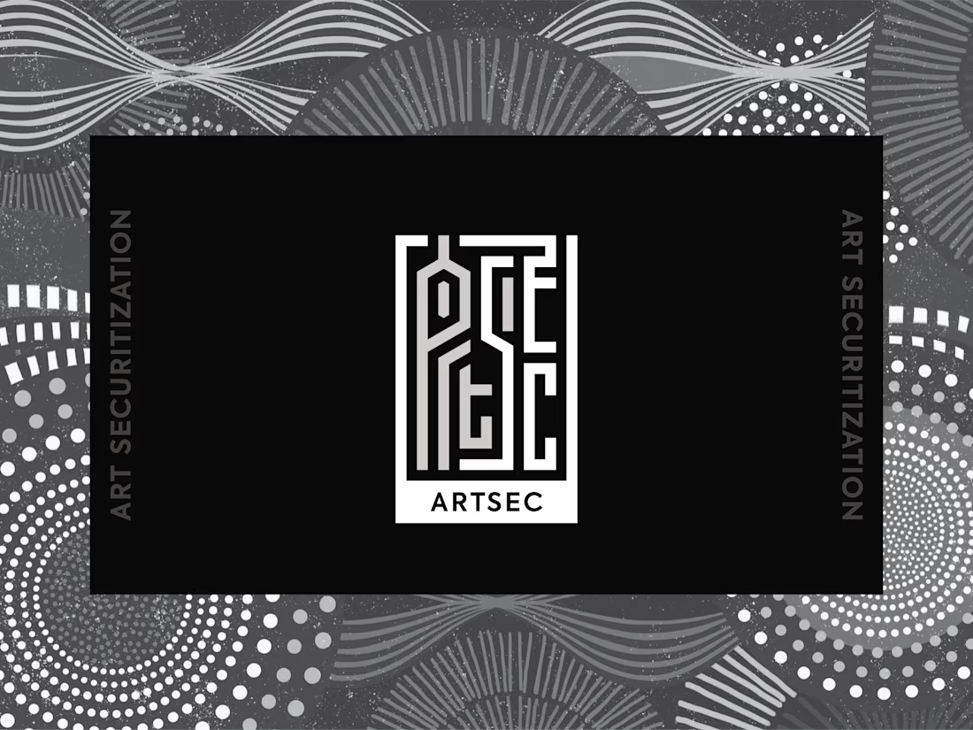
I developed a complete visual identity system for the brand, including the logo, colour palette, typography and usage guidelines.
The identity was designed to give ARTSEC a distinctive, consistent visual presence while reflecting its connection to African art and culture across print and digital applications.


Can't stop looking at this! 😍




Option B feels nothing but premium