The network for creativity
Join 1.25M professional creatives like you
Connect with clients, get discovered, and run your business 100% commission-free
Creatives on Contra have earned over $150M and we are just getting started
Back to feedPost
Yousr — Hot Sauce Brand Identity & Packaging Design
Turning bold flavor into a bold visual identity.
Yusr Hot Sauce is a food packaging project created to translate the intensity, heat, and character of the product into a striking visual experience.
The packaging combines a warm, distinctive color palette with bold typography and expressive graphic elements, creating an identity that immediately communicates the product's spicy and authentic character.
The visual direction was developed around the contrast between the rich red tones of the chili sauce and the warm cream of the label, creating a strong and recognizable presence across the product range.
From the label design to the final product presentation, every element was carefully considered to enhance the product's personality while maintaining clarity and brand consistency.
The final art direction brings the packaging to life through a dramatic food-focused environment, using rich textures, controlled lighting, and carefully composed ingredients to create an appetizing and memorable product experience.
A packaging identity designed to capture attention, communicate flavor, and give Yusr Hot Sauce a distinctive presence.
View the full project : https://www.behance.net/gallery/255675391/Yousr-Hot-Sauce-Brand-Identity-Packaging-Design
#PackagingDesign #FoodPackaging #HotSauce #LabelDesign #FoodBranding #ProductDesign #ArtDirection


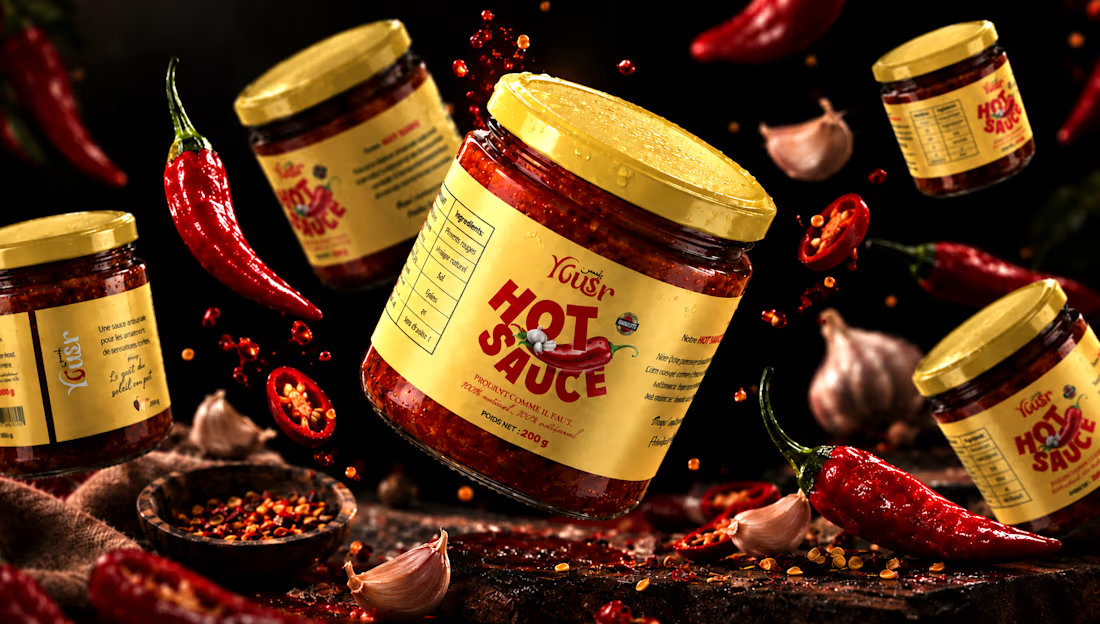

The yellow lid is the first thing that jumps off that dark chili board. Stacking HOT SAUCE in condensed type then carries the heat before the brand name, which is the right order for a sauce on a shelf.

Thanks ahmed 🙏🏻🔥

Thank you, about 5-6 days

Looks fantastic! 🤍
Thank you !

Thank you !

The lighting on the jars does a lot of the work here, warm without tipping into the usual spicy-food-means-red-everywhere trap. Did the client come in with a strong opinion on packaging shape, or did you have room to push that?
Thank you! The goal was to create a visual identity that communicates heat and intensity without relying too heavily on the usual red-on-red spicy food aesthetic. The warm lighting, dark environment, and controlled highlights helped us achieve that balance.
Regarding the...

That product shot with the peppers and garlic is doing a lot of heavy lifting. The warm label against the dark background captures the heat without going into cliche territory. Really solid packaging work.
Thank you, I really appreciate that! The intention was to make the heat feel tangible through the lighting, textures, and ingredient styling, while keeping the packaging itself at the center of attention. Finding that balance between a bold, appetizing visual and a distinctive...
That product shot with the peppers and garlic is doing a lot of heavy lifting. The warm label against the dark background captures the heat without going into cliche territory. Really solid packaging work.
The network for creativity
Join 1.25M professional creatives like you
Connect with clients, get discovered, and run your business 100% commission-free
Creatives on Contra have earned over $150M and we are just getting started





Related posts




Most creative brands try to say everything at once.
More colour.
More shapes.
More visual noise.
But for this identity exploration, the idea was simpler:
Make creativity feel meaningful.
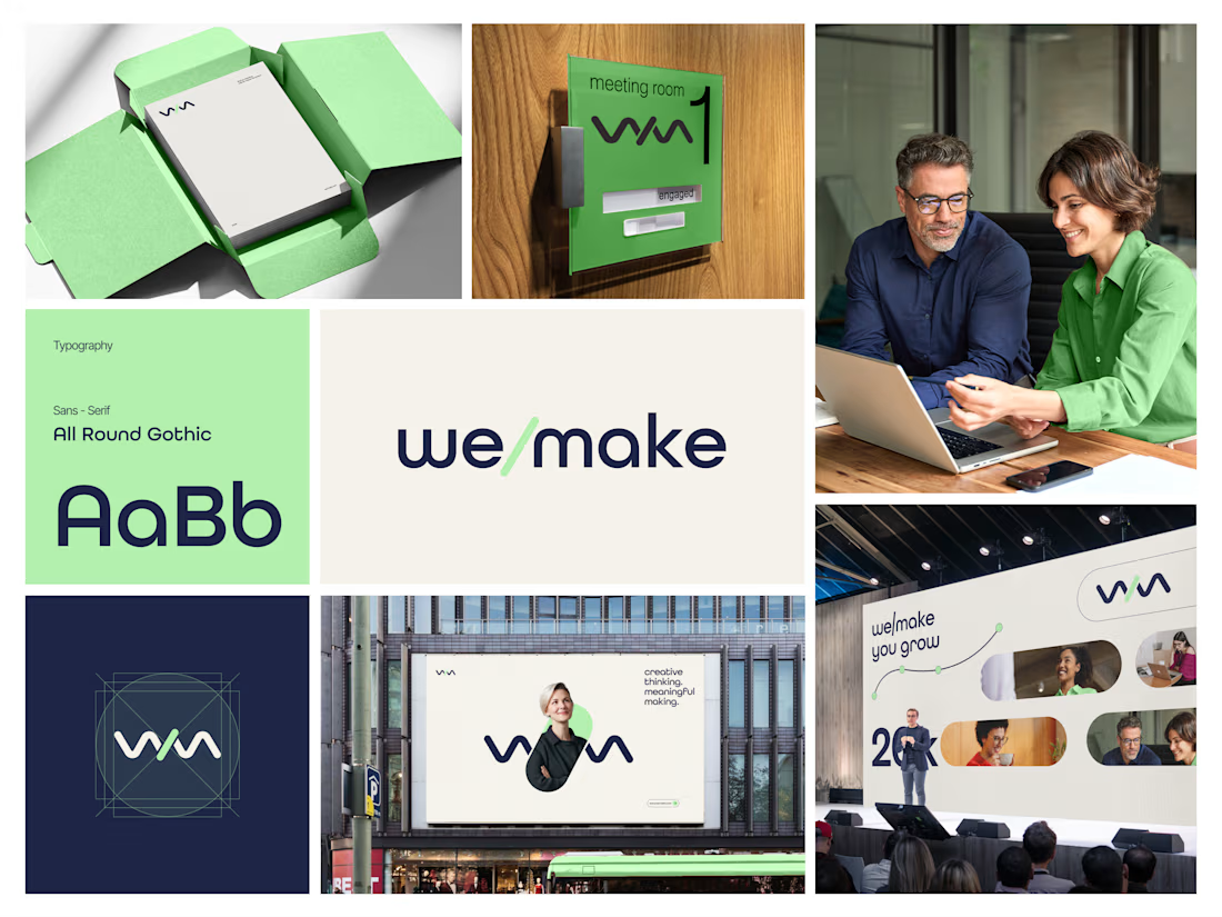
Introducing we/make, a bold, human-centred visual identity built around collaboration, growth, and purposeful making.
The mark is designed as a flexible expression of “we” and “make” coming together.
It represents:
• Ideas turning into action
• People creating together
• Growth through meaningful work
• A creative process that stays clear, warm, and confident
The visual system pairs a deep navy foundation with a fresh green accent, bringing together trust, focus, energy, and optimism.
Rounded typography and soft graphic elements keep the brand approachable, while the structured layouts give it a modern, professional feel.
From stationery and meeting-room signage to campaigns, billboards, and event spaces, the identity is built to work wherever creativity needs to show up.
Creative thinking. Meaningful making.
Would love to hear your thoughts on the visual direction.
What stands out to you first, the logo, colour palette, or overall brand feel?
#BrandIdentity #BrandDesign #CreativeDirection #VisualIdentity #GraphicDesign #LogoDesign

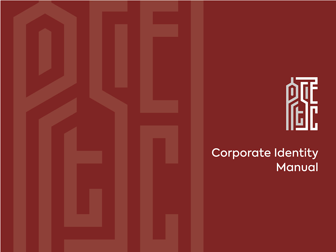
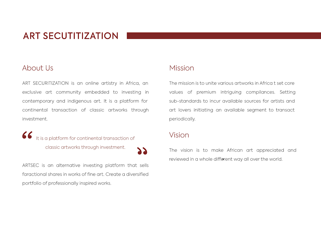
ARTSEC is an art investment platform focused on making African contemporary and indigenous art more accessible to collectors and investors.
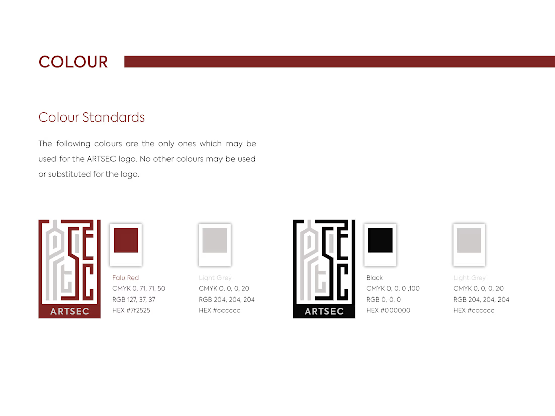
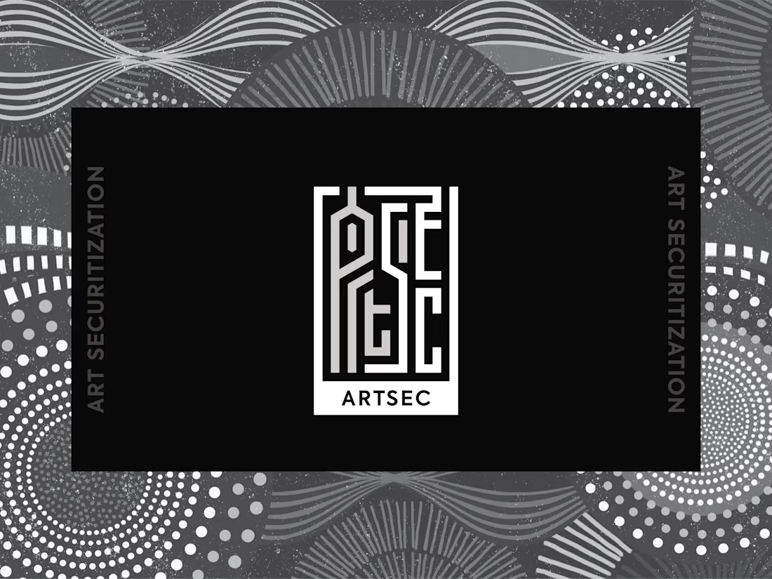
I developed a complete visual identity system for the brand, including the logo, colour palette, typography and usage guidelines.
The identity was designed to give ARTSEC a distinctive, consistent visual presence while reflecting its connection to African art and culture across print and digital applications.
Can't stop looking at this! 😍