The network for creativity
Join 1.25M professional creatives like you
Connect with clients, get discovered, and run your business 100% commission-free
Creatives on Contra have earned over $150M and we are just getting started
Back to feedPost
Taste Test

Which option will you choose and why?
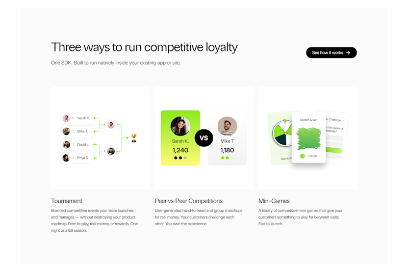
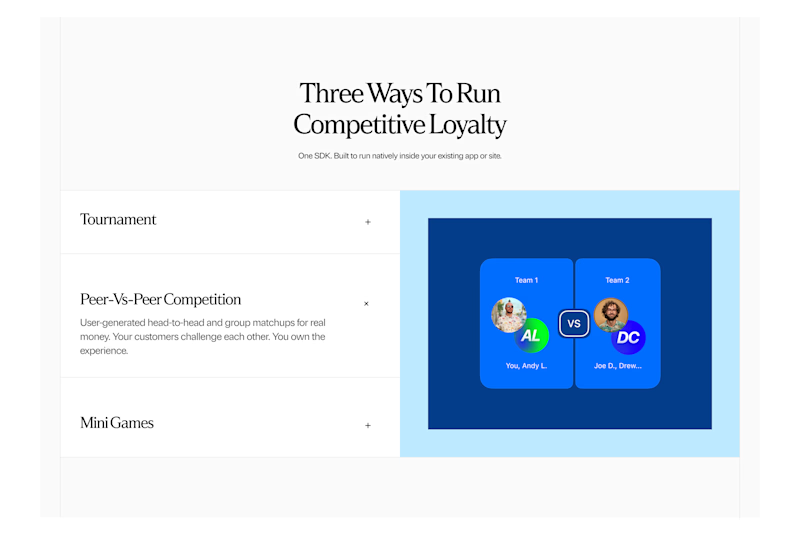
Lucra: How it works Section Exploration

35 voted
76%
11 voted
24%
46 votes
Closed

A looks Good

I like how B is easier to consume

A, where user get what he wants.. he scan or skim..


Both looks great !

a has my vote! the green is super magnetic & vibrant, & the clean design calls me in even more!

I think option B has a lot more room for specific brand expression, whereas option A I feel like I've seen a lot of brands use the same resource, the 3-column grid with illustrations / images for all. And I'm not saying it isn't original, it's just that option B has a lot more...

Option A, structure is overall better and easier to gather information when reading. The B is giving me typical AI vibe. Nice work on option A.


B for me

B looks good

I'd go with A! I really like how the layout guides the eye.

I prefer the look of A. Says three ways and presents 3 clear options.

Making everything visible help users to understand the product faster instead of clicking 3 times to understand

A is more better for me

A makes more sense to me, showing actual mini interface previews for each mode does more explaining than the single centered graphic in B. It answers "how it works" instead of just implying it.

A looks clean
The network for creativity
Join 1.25M professional creatives like you
Connect with clients, get discovered, and run your business 100% commission-free
Creatives on Contra have earned over $150M and we are just getting started

Challenges
View all


Related posts


Should a flower shop ever go black and white?
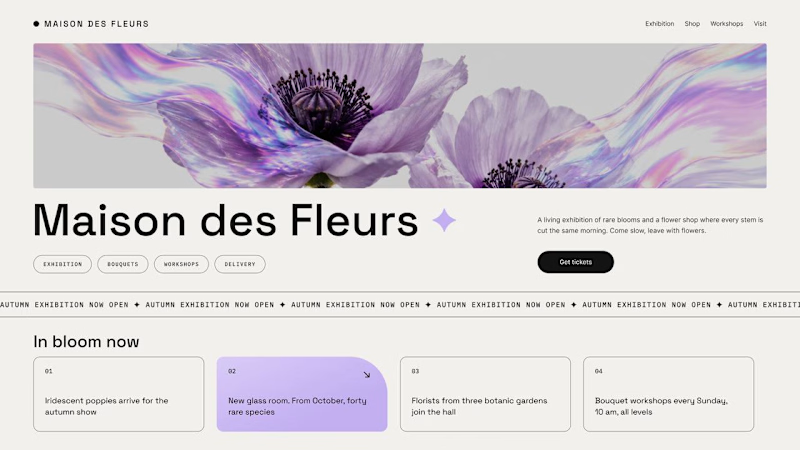
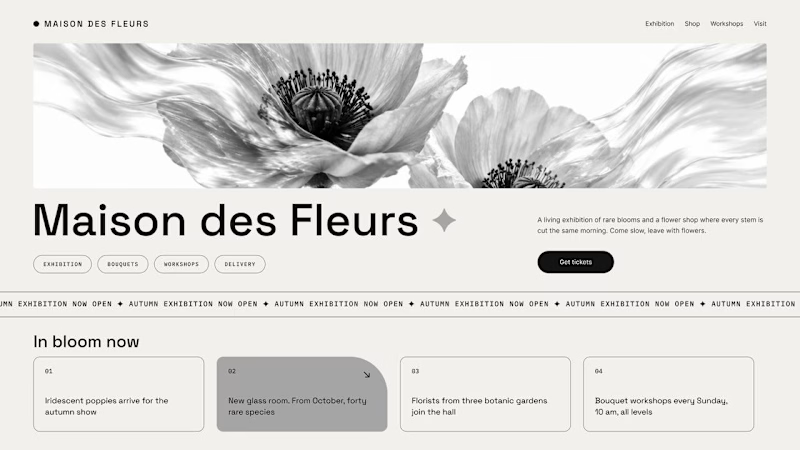
Same flower house, same layout. We only took the color out.
1. Full color. The iridescent petals do the selling: lilac, pink, a little shimmer. The photo is the brand, and every accent on the page borrows from it.
2. Monochrome. No color at all. Shape, texture and typography have to carry everything, and the page suddenly reads like a gallery catalogue.
Color sells the flower. Monochrome sells the exhibition.
Which one would get you through the door?
67 voted
91%
7 voted
9%
74 votes
Closed

The problem with monochrome is that, throughout computer history, it has conditioned users to associate gray and monochrome with being disabled, dysfunctional, or something to ignore and avoid.


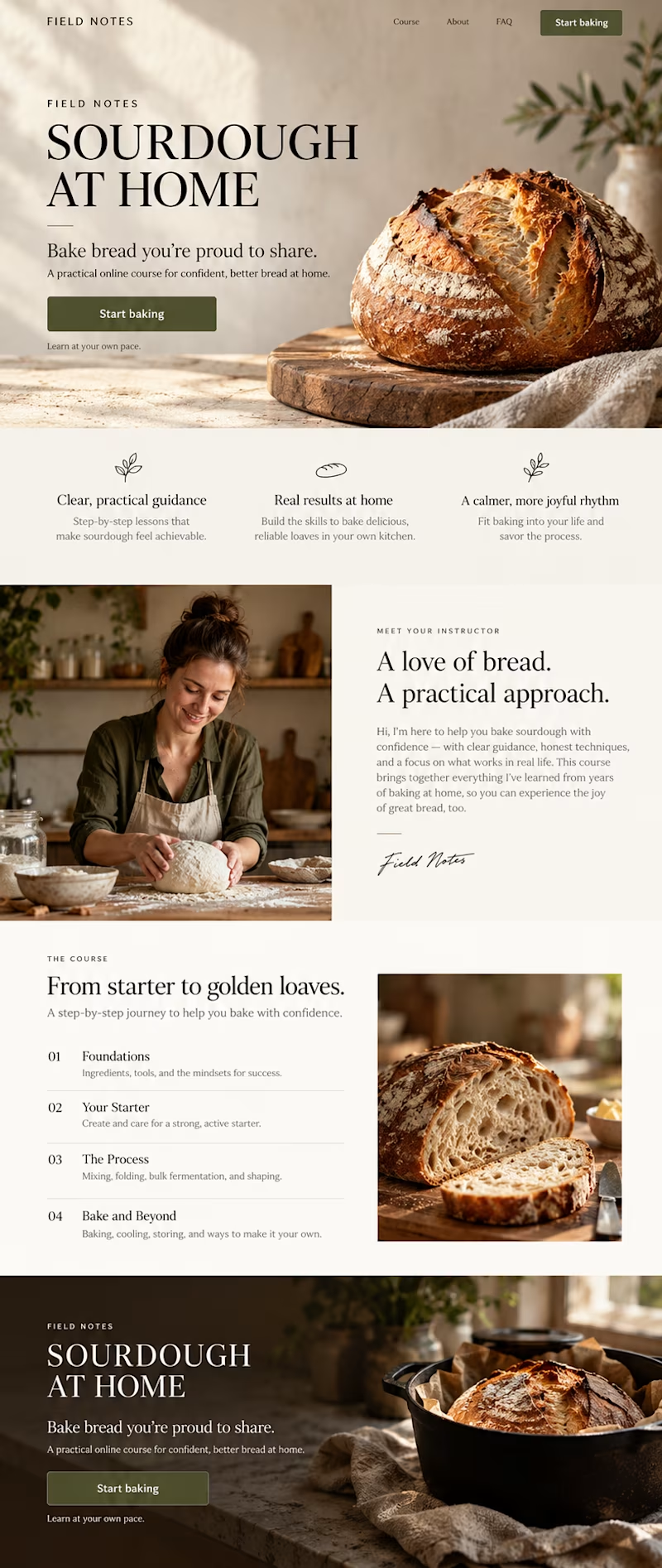
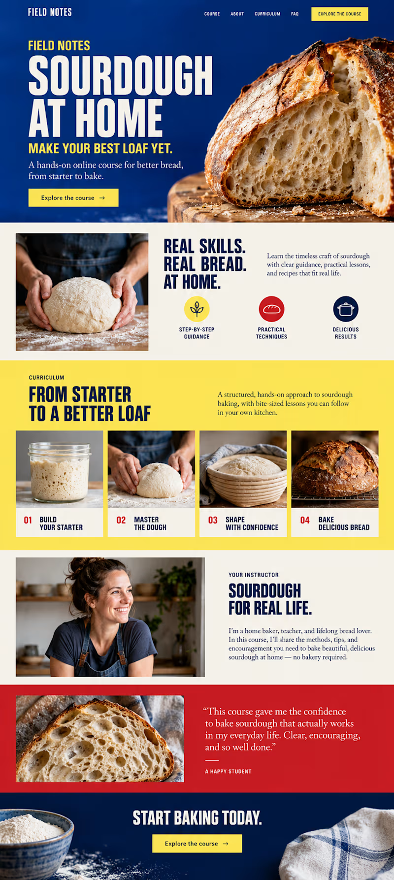
Which direction would you choose for a sourdough course sales page in Kajabi?

34 voted
59%
24 voted
41%
58 votes
Closed

B- Bold color is good

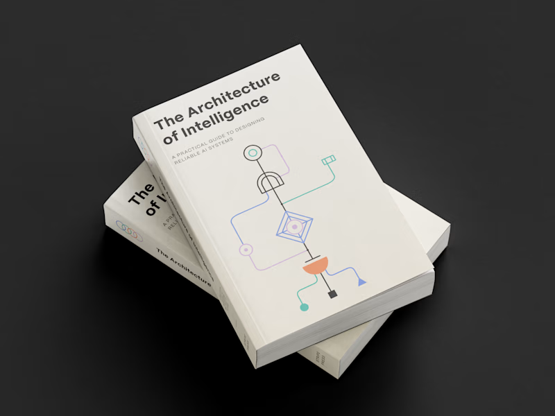
Which book cover design theme speaks the clearest?
6 voted
38%

10 voted
62%
16 votes
Closed