
M Aziz Daiya
Senior Product Designer | B2B2C SaaS, Fintech, MVP Strategy


A “10-minute” website that took me 3 hours: https://summervacation2003.framer.website/
I was inspired by saloon.wtf (http://saloon.wtf) and decided to build my own little version.
It looks like a fairly simple website.
It took me around 3 hours.
Not because the UI was particularly complicated, but because I wanted the details to actually work.
I added a background video, Spotify and YouTube playlists, autoplay, responsive behaviour and a realtime visitor counter using Supabase.
The funny part?
I'd never used Supabase before starting this.
So a small visual experiment turned into a mini frontend + realtime experiment.
That's probably my favourite part of projects like this.
You start with:
“Let me recreate this cool website.”
Three hours later:
“Why am I learning realtime presence?”
Anyway, it's done.
Built in Framer + Supabase.
1
59
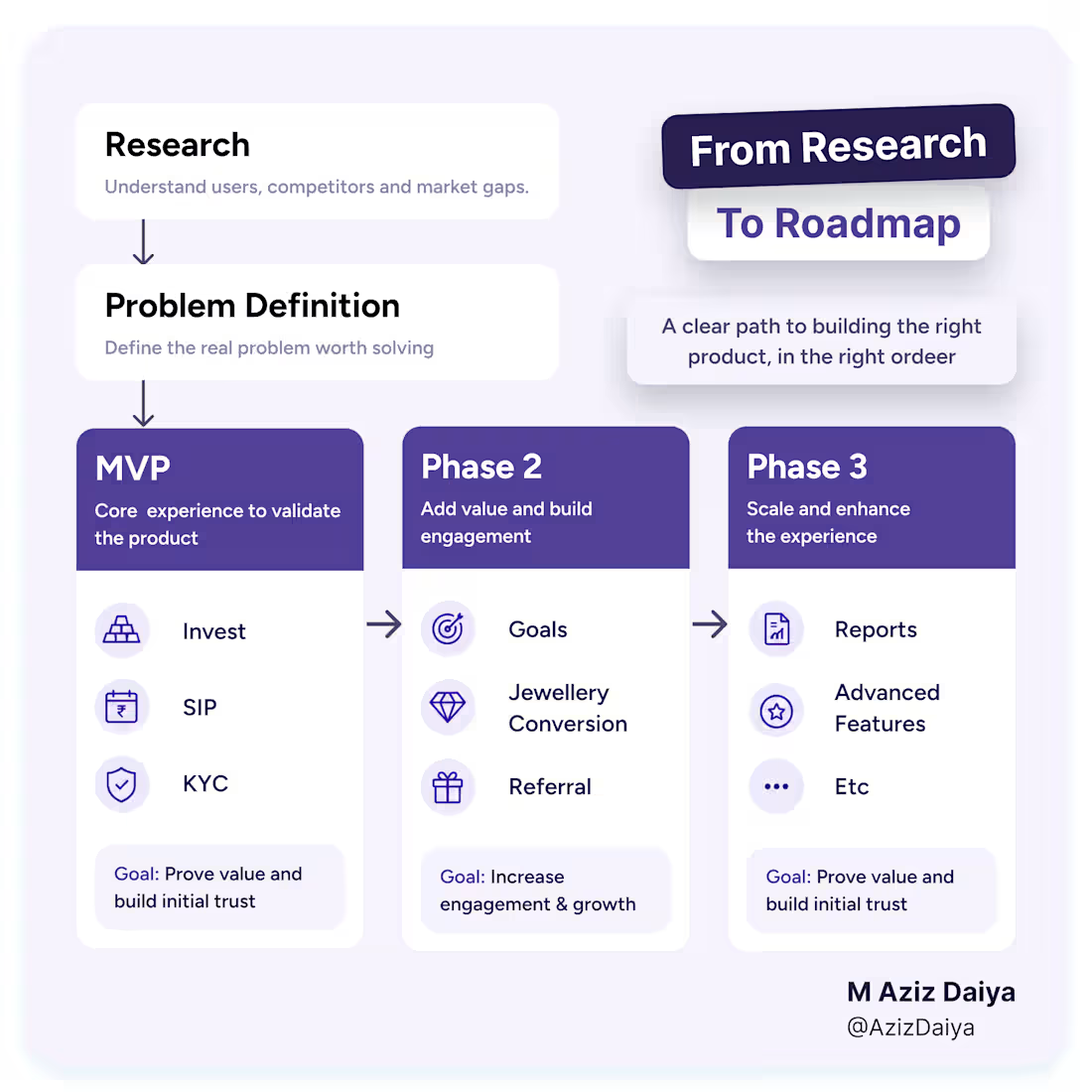
While working on Gold Investment Fintech Application, we had one discussion before starting UI.
Should jewellery be on home screen?
Thinking was simple.
People are saving money to buy jewellery, so why not show it first?
Instead of discussing layout, I asked one question.
"What should a user do first time they open an app?"
If users do not start saving, they never reach the point of buying jewellery.
That changed discussion.
We kept first version focused on one thing.
Start saving automatically.
Once users built that habit, buying gold came next.
Jewellery came after that.
We didn't remove any features.
We just changed when they should become part of journey.
1
127
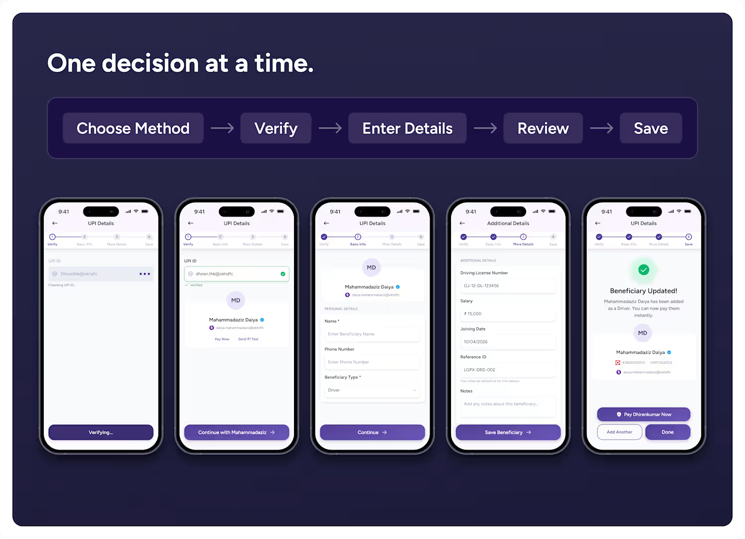
Many fintech forms try to be "complete" instead of being easy to complete.
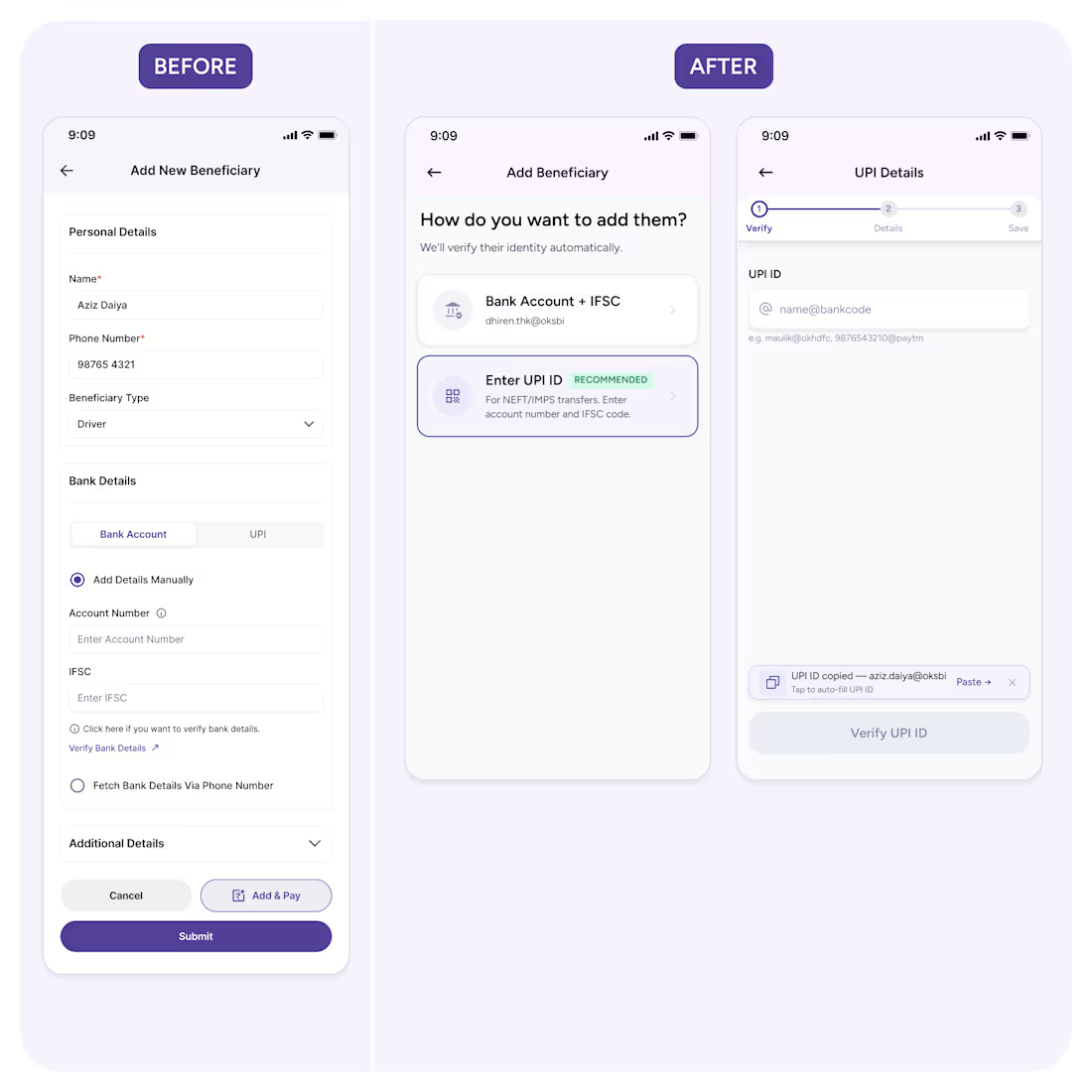
Here's a flow I redesigned for a payments SaaS — the Add Beneficiary screen.
The original put everything on one screen: personal details, bank or UPI selection, verification, additional fields, two CTAs. Nothing was broken. But users had to process the entire workflow before taking the first step.
The fix wasn't fewer fields. It was fewer decisions at once.
New flow starts with one question: "How do you want to add them?" From verification first, details next, save at the end.
The principle: don't make users think about the whole task. Just the next step.
That's the difference between a form that feels long and a flow that feels effortless.
2
69
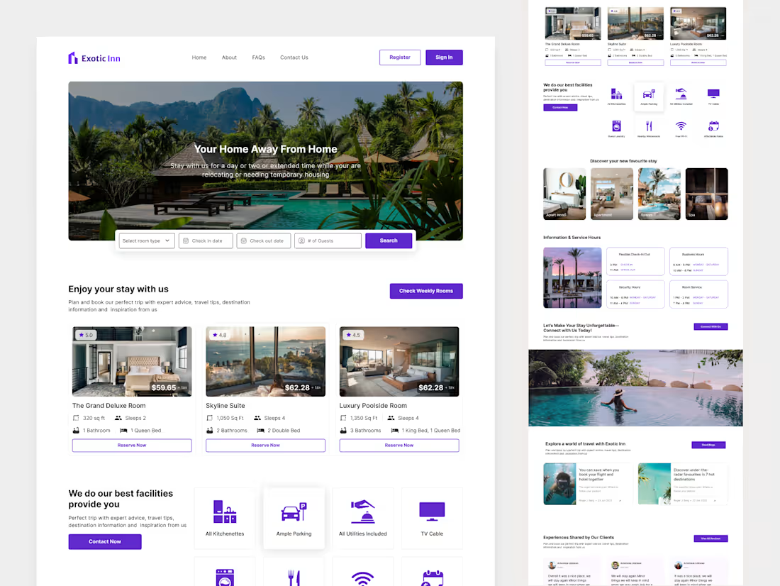
Exotic Inn Hotel Landing Page Design
1
3