M Aziz Daiya
Senior Product Designer | B2B2C SaaS, Fintech, MVP Strategy



A “10-minute” website that took me 3 hours: https://summervacation2003.framer.website/
I was inspired by saloon.wtf and decided to build my own little version.
It looks like a fairly simple website.
It took me around 3 hours.
Not because the UI was particularly complicated, but...


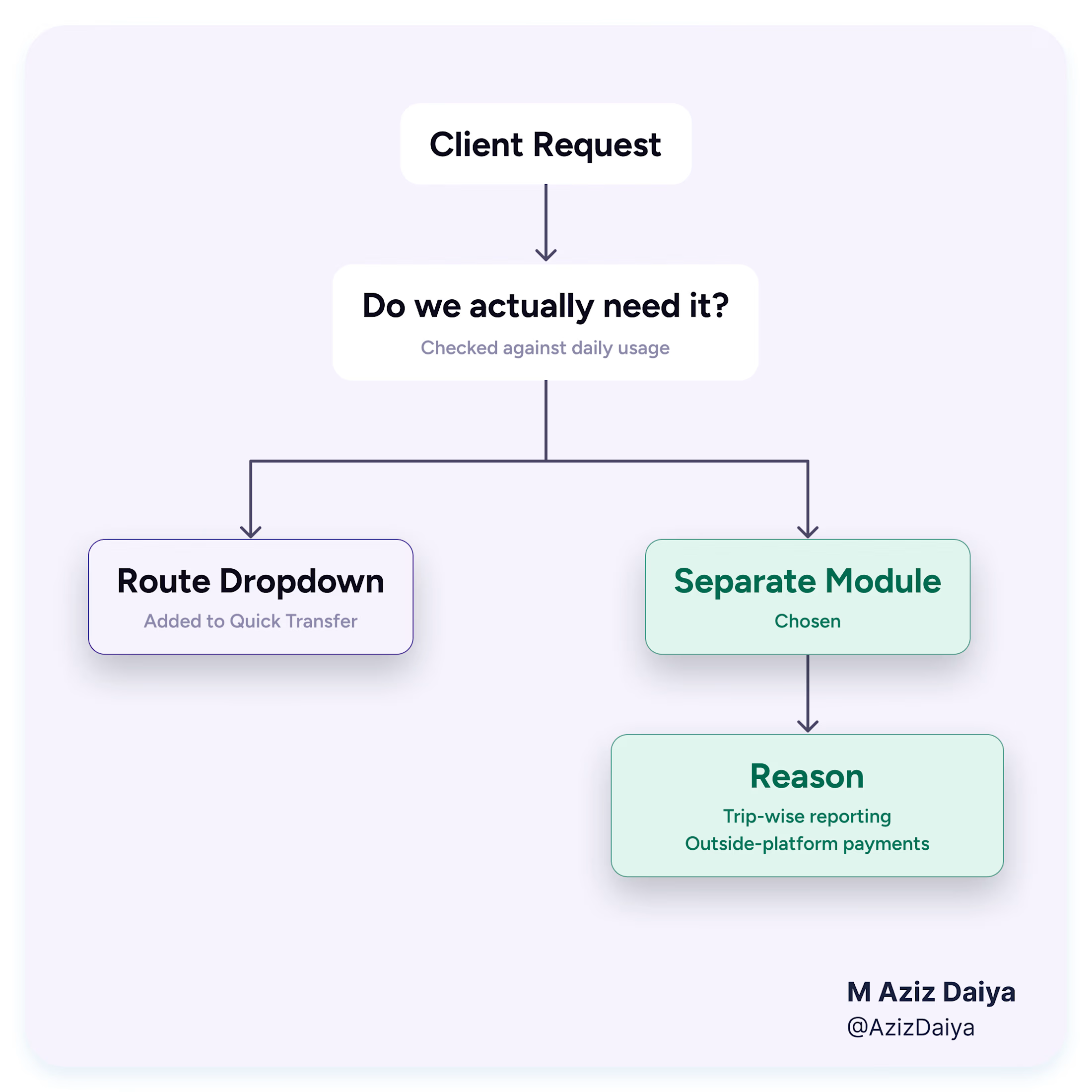
Client wanted “Swipe to Pay” button on the payment confirmation screen. They had another app as reference and liked that interaction for the CTA.
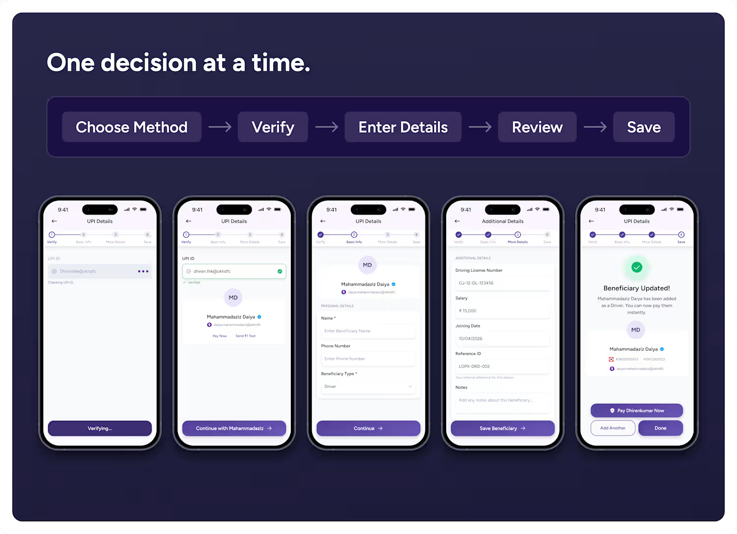
Before touching anything, I asked if this would apply to every payment or only selected ones. This question matter more. Users make...
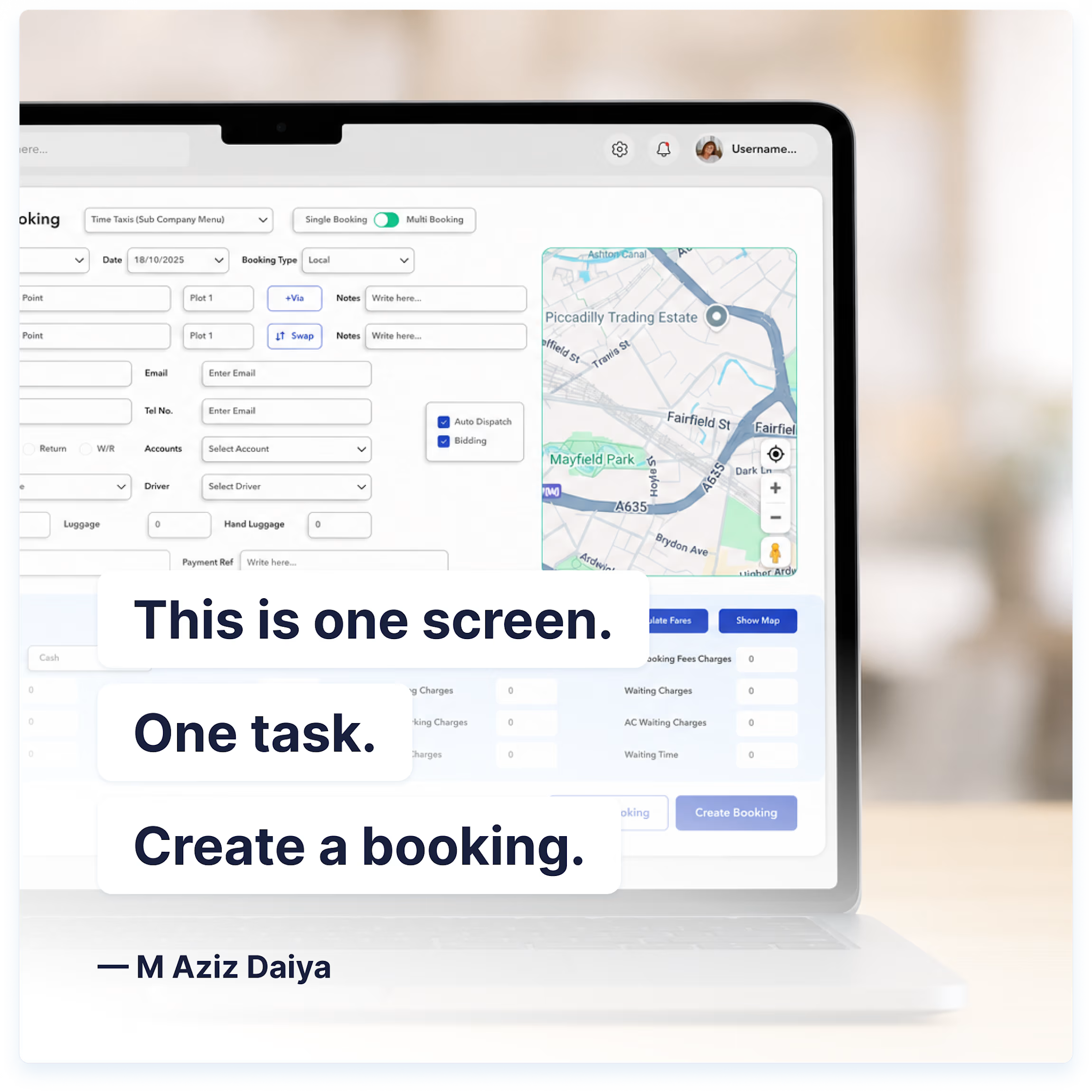
Split a taxi booking flow into two screens. Booking details on one, fare and payment on the next.
Client pushed back. Dispatchers create these bookings all day, and two steps meant two clicks and two loads every single time. For someone doing this dozens of times a shift, that...

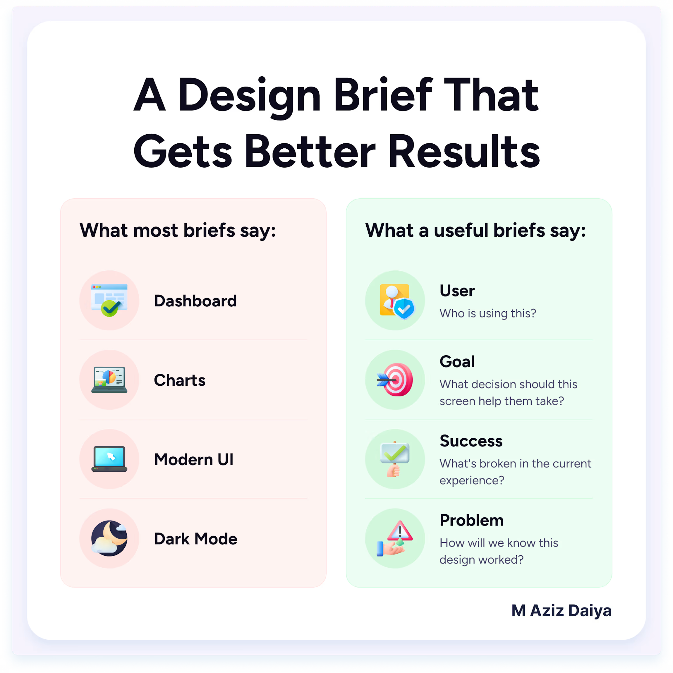
Founder usually knows what they want the product to contain. Sometimes they even have a rough idea of how a screen should work. I do not treat that first requirement as the final answer. Before designing, I understand what user actually needs/wants to do.
For example, on...
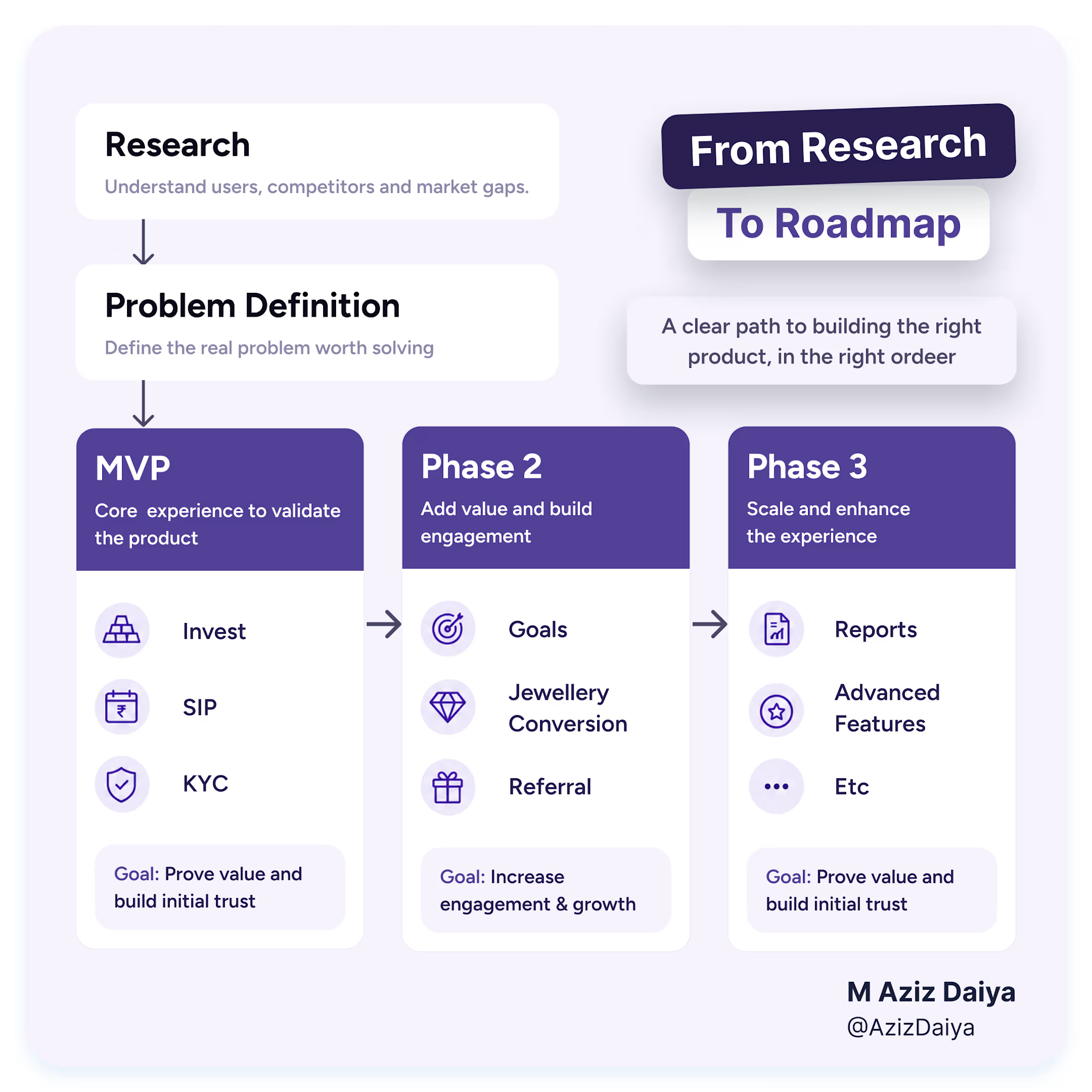
While working on Gold Investment Fintech Application, we had one discussion before starting UI.
Should jewellery be on home screen?
Thinking was simple.
People are saving money to buy jewellery, so why not show it first?
Instead of discussing layout, I asked one question.
"What...