The network for creativity
Join 1.25M professional creatives like you
Connect with clients, get discovered, and run your business 100% commission-free
Creatives on Contra have earned over $150M and we are just getting started
Back to feedPost

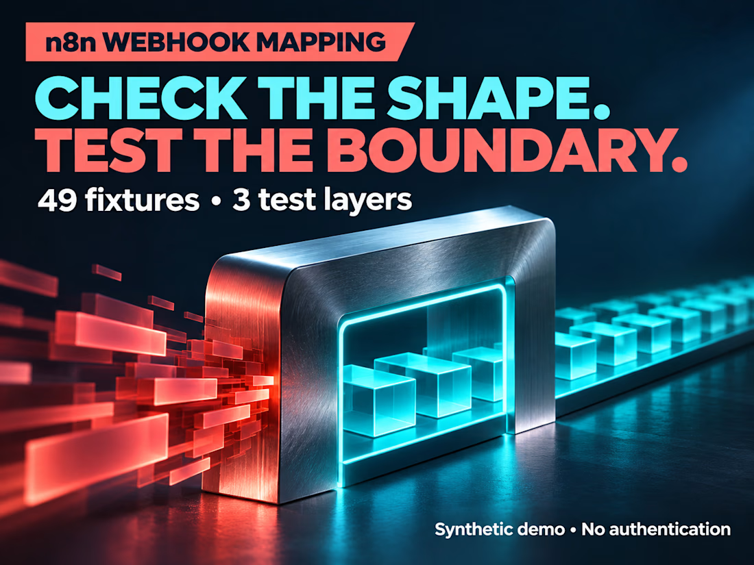
Unit tests can pass while your webhook receives a different input.
In a self-initiated n8n 2.46.6 demo, the direct function rejected JSON null with OBJECT_REQUIRED. The loopback HTTP route converted null to {} before the Code node, so it rejected the request with UNSUPPORTED_SCHEMA instead.
Both paths rejected the input, but the transport changed what the mapping code received.
I tested the same 49 synthetic fixtures at three layers: direct JavaScript, native n8n execution, and loopback HTTP. The documented HTTP expectation accounts for that null-body conversion. Two additional transport checks passed too.
The lesson: test the request path as well as the function, and document intentional differences instead of hiding them behind one green total.
AI-assisted demonstration, not client work. The webhook has no authentication or signature verification and must stay isolated.
Case study, test counts and limits:
https://contra.com/p/sXees3lU-n8n-webhook-mapping-guard


The network for creativity
Join 1.25M professional creatives like you
Connect with clients, get discovered, and run your business 100% commission-free
Creatives on Contra have earned over $150M and we are just getting started





Related posts

A fashion storefront needs to show the outfit and make its individual pieces easy to find.
For FORM, I paired a warm, editorial lookbook with clearly grouped product names, prices, and size choices.
Cream surfaces, charcoal typography, and consistent product cards connect the homepage with the desktop and mobile screen concepts.
One useful design principle from this project: give campaign imagery and shopping details their own readable zones. The collection can have a strong visual presence while the next product decision stays clear.
Explore the complete design case study:
https://contra.com/p/rNPRqooQ-form-fashion-e-commerce-website-design
When exploring a clothing collection, what helps you most: a styled outfit or an individual product grid?

Adorable

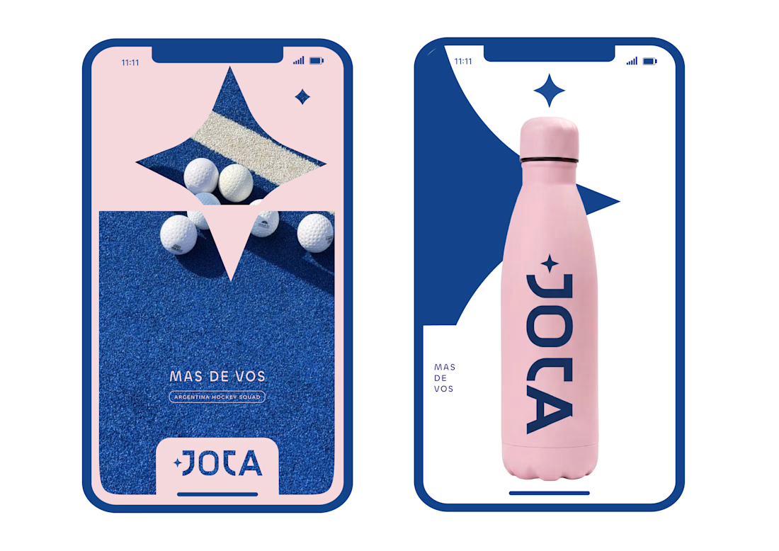
JOTA is an Argentine field hockey brand built for players who play with personality. The founder reached out to rethink how the brand shows up beyond the stick itself.


Wow project
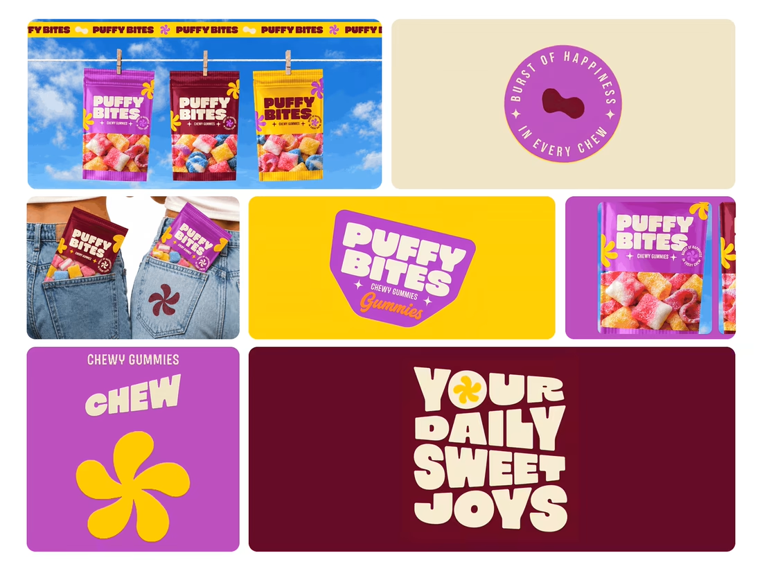
What makes a candy brand recognizable across every pack?
For Puffy Bites, I built the identity around rounded lettering, expressive symbols, and a palette of burgundy, purple, yellow, and cream.
The same visual language carries through pouch packaging, smaller wrappers, campaign imagery, and an animated brand showcase.
One design decision that ties it together: the packaging color changes, while the logo placement, product descriptor, and supporting graphics maintain a consistent structure.
I handled the full client project, from logo and visual identity to packaging and campaign applications.
Which colorway would catch your eye first—purple, burgundy, or yellow?
Explore the full Puffy Bites case study. If you’re developing a candy or snack brand, I’m available for branding and packaging projects.
Love it,
Great work