The network for creativity
Join 1.25M professional creatives like you
Connect with clients, get discovered, and run your business 100% commission-free
Creatives on Contra have earned over $150M and we are just getting started
Back to feedPost
A closer look at Aureva, a Paris-based skincare brand I worked on.
The brief was to create a brand identity and packaging that felt premium yet approachable. I paired distinctive typography with soft earth tones, using color to give each product its own place within the range.
The full case study is now on my profile.
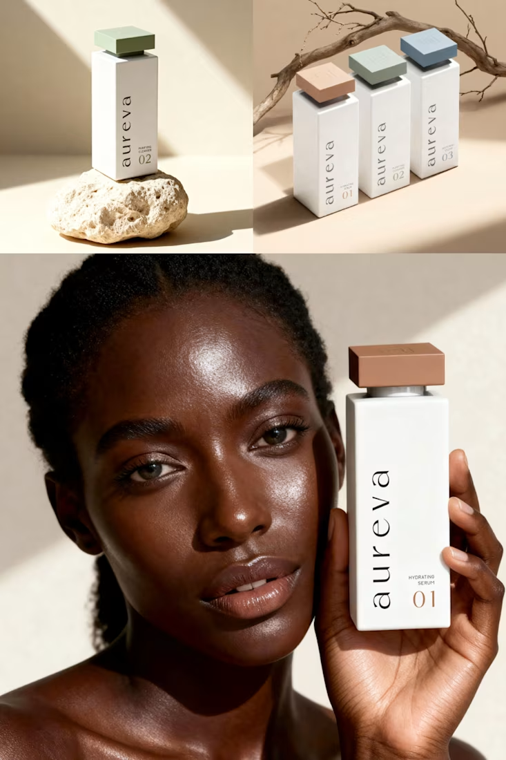

Premium branding

Thank you! Glad you like it!
You are most welcome, is the branding for an actual client?
Yes, it was.

Giving each product its own tone inside a soft earth range is a tricky balance. How did you decide how far apart the colours could sit before the line stopped reading as one family?
I felt the colors could be quite different as long as they stayed soft and natural. The terracotta is warmer than the green and blue, but none feels too bold next to the others. Using the same light base, typography, and layout also gave me more freedom with the colors, but still having the range connected.

That's really show the brand identity great job 🎉🎉🔥🔥
Thank you!
Pardon ❤️

The vertical wordmark on the bottle with the terracotta cap feels premium but approachable, like the brief said. Nice earth tones.
That was, indeed, the intention. Glad you noticed it and you like it! Thank you!
The network for creativity
Join 1.25M professional creatives like you
Connect with clients, get discovered, and run your business 100% commission-free
Creatives on Contra have earned over $150M and we are just getting started





Related posts

What if hairstyles were treated more as a medium for self-expression, not just beauty?
For this premium hair extensions brand, created by a Paris-based hairstylist whose work celebrates the artistry, diversity and individuality of hair, we created a brand that brings the energy of creative editorial hairstyling into everyday life.
In many ways, society is shifting the meaning of luxury. We’re gradually moving toward the idea that luxury is less about how others perceive us and more about how we experience life, what we choose for ourselves and how we express who we are.
Have you noticed this shift in other industries too?
Full project
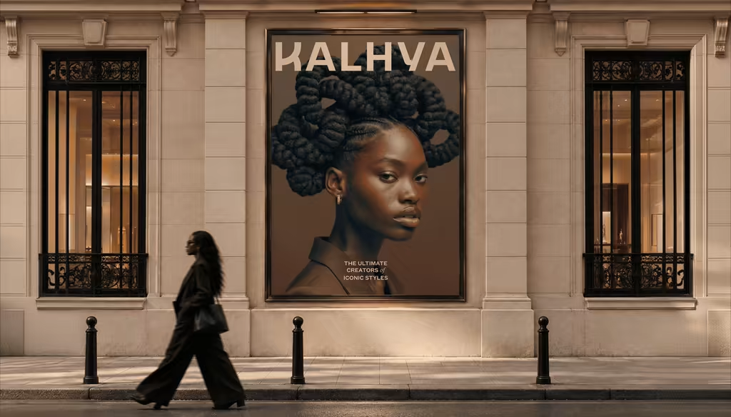
wonderful branding for hair extension brand.

Top 1% of creatives on Contra with a 195 score 🎉 What I'm most excited about is who's showing up because of it: new clients, designers, new conversations, projects I wouldn't have found on my own. Grateful, and ready for more.

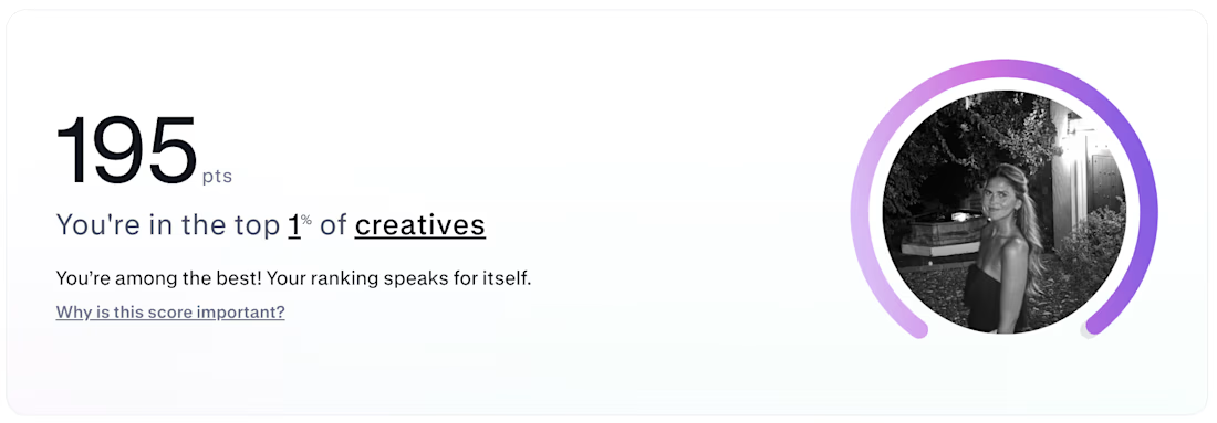

Huge congrats! 🎉 Top 1% is an incredible milestone.

Currently building a new identity for an AI + fintech company in Dubai.
Still early, but this is one of the directions we’ve been exploring for the brand.
The idea was to avoid the usual “AI company” visual language and build something that feels more established, precise, and quietly futuristic.
We’ve been playing with geometry, light, and a much more restrained visual system around the mark.
Still developing this one, so I’m curious:
Would you push this direction further, or keep it this restrained?

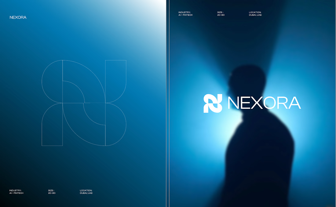
Honestly the logo presentation is impressive