The network for creativity
Join 1.25M professional creatives like you
Connect with clients, get discovered, and run your business 100% commission-free
Creatives on Contra have earned over $150M and we are just getting started
Back to feedPost

One of the easiest ways to improve your brand is to stop making customers repeat themselves.
You know that frustrating experience.
You explain your issue to one person.
They transfer you.
You explain everything again.
Then the next person asks for information you already provided.
At some point, the problem is no longer just the customer service. It is the system behind it.
And customers notice.
A business can have friendly people, a beautiful identity and a well-designed website, but if customers constantly have to chase updates, repeat information or figure out what happens next, the experience still feels disorganised.
Good customer experience needs good systems.
Tell customers what happens after they pay or book.
Give them a realistic timeline so they are not left wondering when you will respond.
Keep customer information organised so your team can see what has already been discussed.
Make payment simple.
Answer common questions before customers have to ask them.
And communicate updates before the customer has to come looking for them.
These things may not sound like branding.
They are not as exciting as a logo reveal or a new visual identity.
But they shape what people say about your business after dealing with you.
Sometimes the strongest brand statement is simply:
“They’re very easy to work with.”
That comes from reducing friction.
So when a business asks, “How can we improve our brand?”
The answer may not be a new logo, new colours or a complete rebrand.
It might be as simple as fixing the unnecessary friction in the customer experience.
Because people remember how easy, confusing, stressful or seamless it was to do business with you.
And that experience becomes part of your brand.
#BrandStrategy #BrandExperience #Branddesign



The network for creativity
Join 1.25M professional creatives like you
Connect with clients, get discovered, and run your business 100% commission-free
Creatives on Contra have earned over $150M and we are just getting started




Related posts

What should a creative agency website actually feel like?
For Orvika, we didn't want another agency site built around the same safe layouts and predictable sections.
We pushed the visual direction further with oversized typography, editorial layouts, bold imagery, and stronger contrast, while keeping the experience structured enough to communicate the agency's work and capabilities clearly.
The goal wasn't just to make it look different.
It was to make the agency feel different.
Designed in Figma and built in Framer.
We're sharing more of the websites and digital experiences we've been working on here over the next few weeks.



Very neat man

💳 Making Financial Products Feel Simple
I designed this finance website for Sendit, with one goal in mind: make everyday payments feel simple, trustworthy, and effortless.
The design focuses on:
Clear messaging and strong visual hierarchy
Trust-focused finance UI
Simple payment interactions
Clean, modern layouts
Conversion-focused sections
A responsive experience designed around the user
For fintech products, good design isn’t just about looking modern. It’s about making people feel confident when money is involved.
If you’re building a fintech, SaaS, payment platform, or financial product and need a website that communicates trust and clarity, I’d love to work with you.


Solid execution on a hard brief.

Most furniture websites try to help you buy faster. This concept for SÖDER ATELIER explores a different idea:
What if the experience helped you choose better?
The design is built around the values shown throughout the concept craftsmanship, natural materials, longevity, repairability, and thoughtful living. So instead of treating the homepage like a catalogue, the experience gives space to:
→ The story behind the pieces
→ Curated collections
→ Craft and material details
→ Long-term value
→ Customer perspectives
→ Clear product discovery
The visual language stays quiet and editorial, letting the furniture carry the attention. Because when a product is made to live with for years, the website shouldn't make it feel disposable.
SÖDER ATELIER — a responsive furniture e-commerce exploration.
🏀 Full Design Showcase – Better View on Dribbble.
↗ Furniture E-commerce Product Website

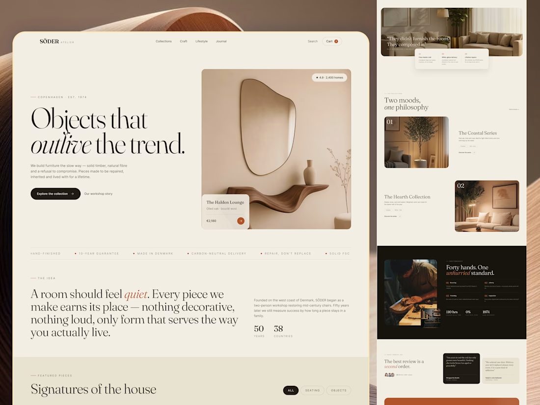

The homepage sells longevity, and Signatures of the house still gives you category chips to browse by. Curious whether the product page carries the craft and repairability fields too.