The network for creativity
Join 1.25M professional creatives like you
Connect with clients, get discovered, and run your business 100% commission-free
Creatives on Contra have earned over $150M and we are just getting started
Back to feedPost

Do you agree? That a stronger business deserves a brand that looks the part...
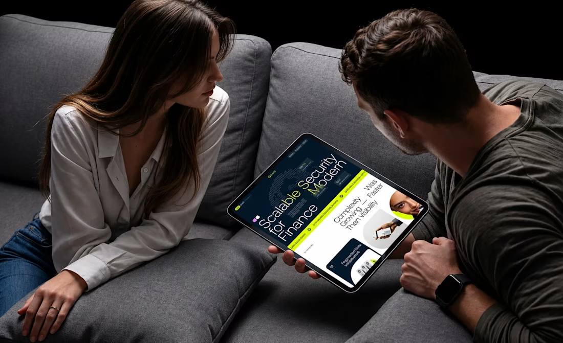
Forti AI had the techand ambition. Our job was to make sure the way the company presented itself reflected the business it was becoming.
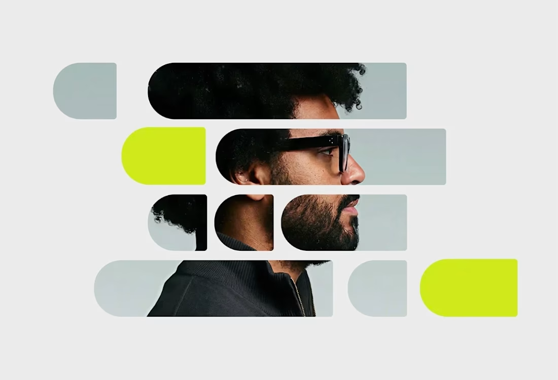
We started with positioning and strategy before touching the visuals, clarifying what the brand needed to communicate, who it needed to speak to and how it could stand apart in an increasingly crowded AI market.
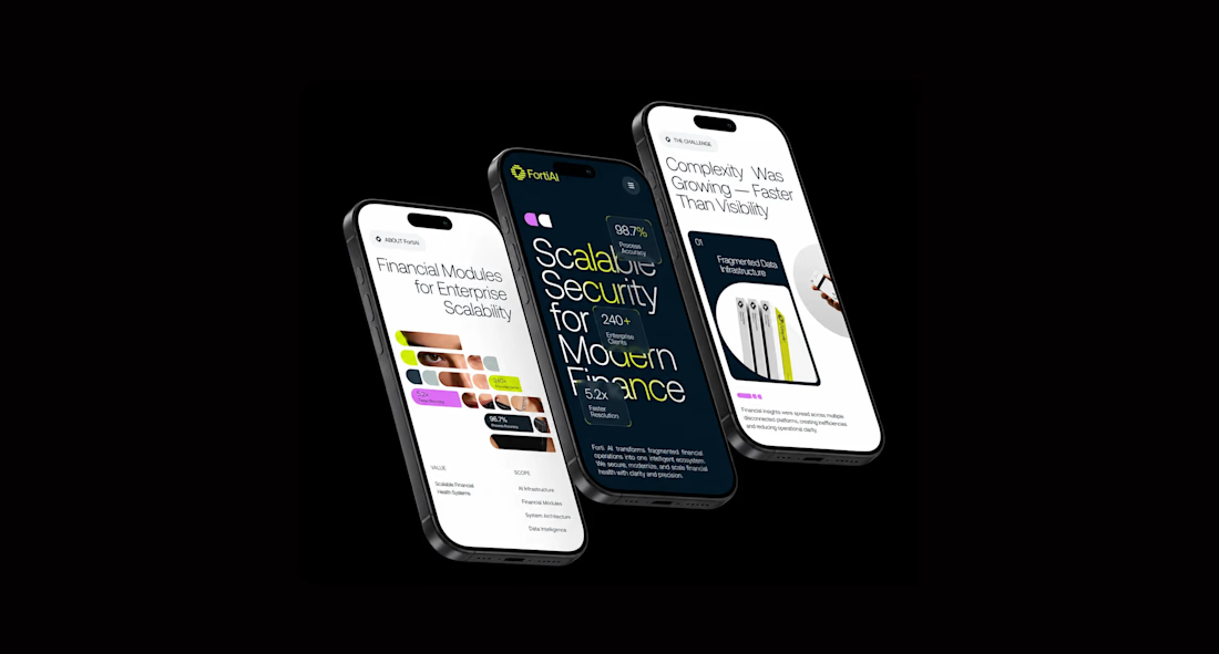
From there, we developed the visual identity and translated it into the website and wider digital experience.
Strategy → Positioning → Identity → Website
Not just a new look. A clearer, more credible foundation for the business to grow from.

Perfect

such a powerful accent color!

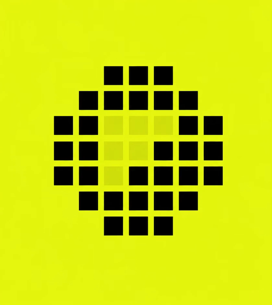
The Strategy → Positioning → Identity → Website sequence makes the work feel grounded rather than decorative. The neon grid language and strong contrast give Forti AI a memorable presence without losing the product focus.

Unique and strong.

Brilliant work

Very creative! ❤️🔥

I love the vibe man, great job!! 🙌

Strategy before visuals is the right order but it is the order clients usually push back on, they want the logo first. Curious how you got Forti AI to sit through positioning work before seeing anything.

Nice Work

Nicely done, awesome work
The network for creativity
Join 1.25M professional creatives like you
Connect with clients, get discovered, and run your business 100% commission-free
Creatives on Contra have earned over $150M and we are just getting started



Related posts

Final direction picked! I love when brands use custom illustration as the main way to communicate with their audience.
Direction discovery should not take more than one week and it should be full of personality! Ready to upgrade your brand?
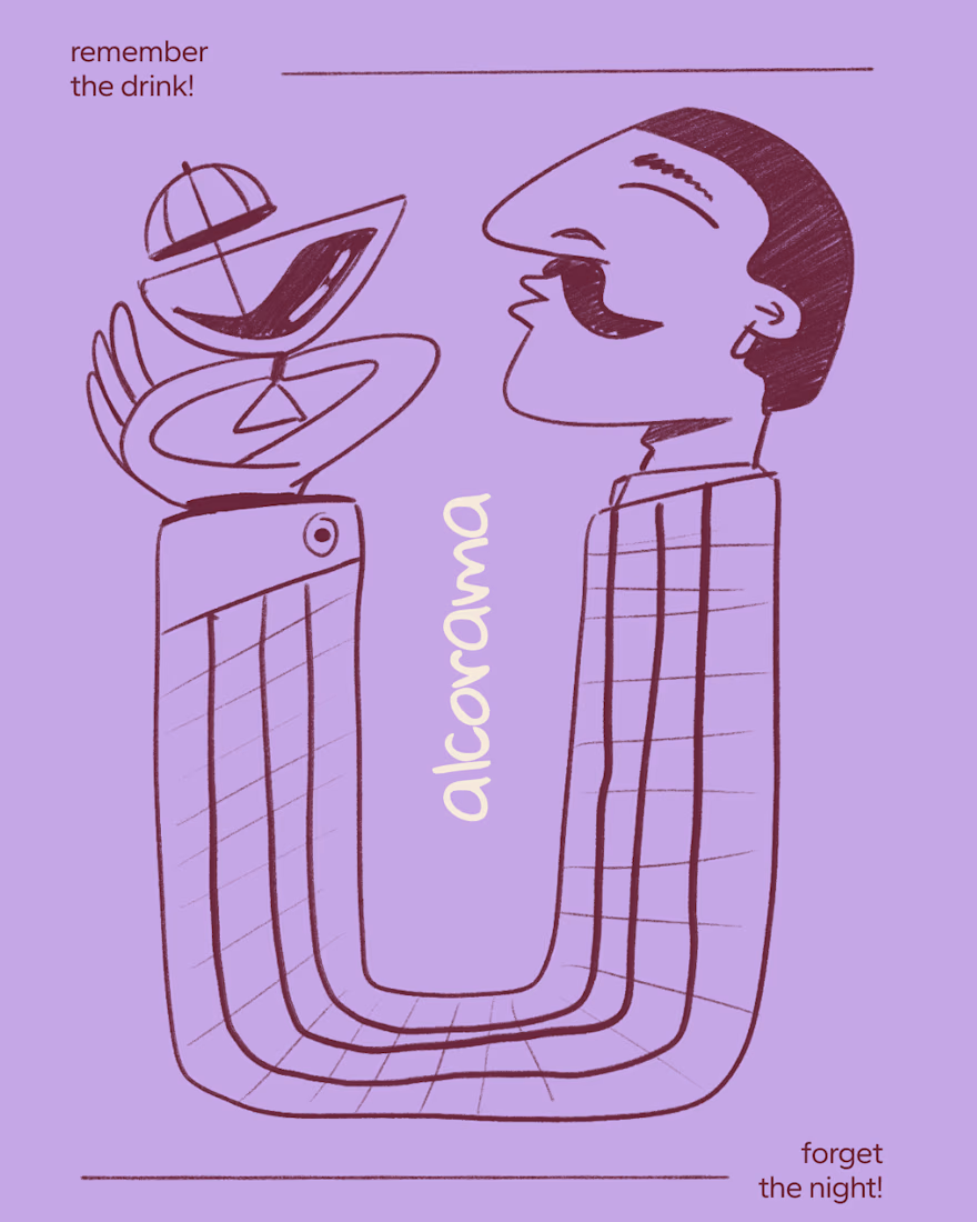
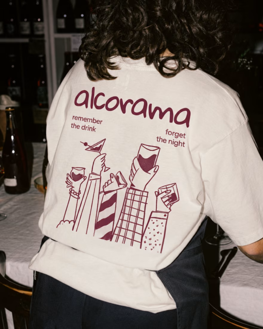
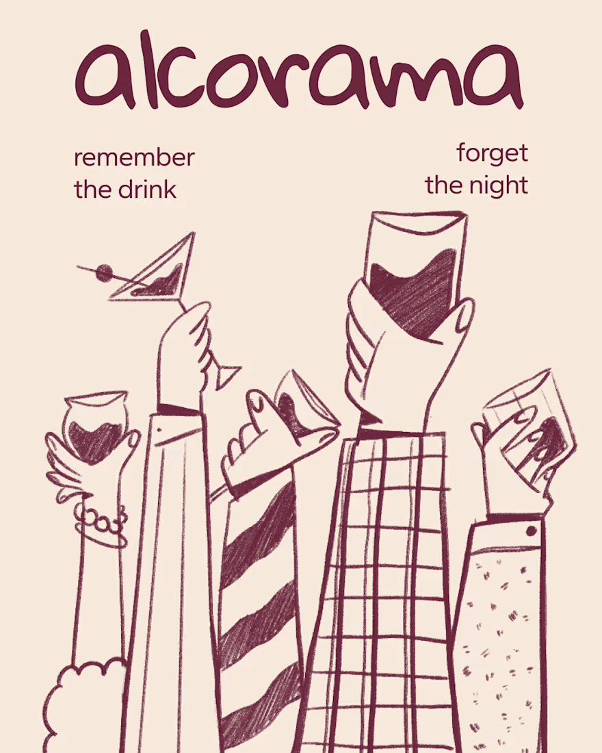
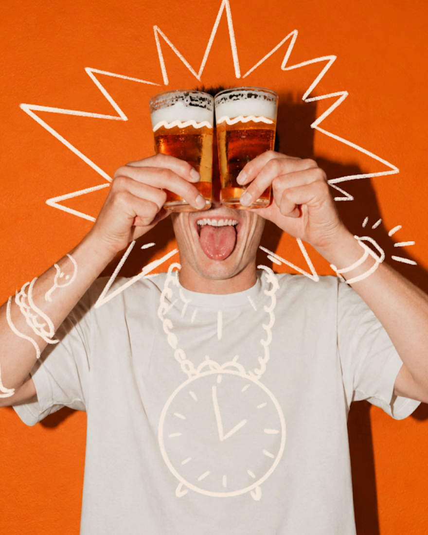

Amazing work!

Ovéa — care with character.
One skincare identity across bottles, jars and tubes. I designed the wordmark, pink-and-cobalt packaging system, campaign applications and digital mockups, then brought the collection into motion.
A consistent visual language, with room for each product to feel individual.
View the full case study. Building a skincare brand? Let’s talk about your identity and packaging.

Love the colour direction and the visual language. Everything feels so well thought out. The overall look is beautiful.

What if a brand identity was the only brief a video tool needed?
Dropped Altair’s world into Unit (closed beta) and got a 15s launch film with warm metals, hard shadows and one eagle.
Prompting felt closer to art direction than rendering.