The network for creativity
Join 1.25M professional creatives like you
Connect with clients, get discovered, and run your business 100% commission-free
Creatives on Contra have earned over $150M and we are just getting started
Back to feedPost

REFORMR — Pilates Studio Brand Identity
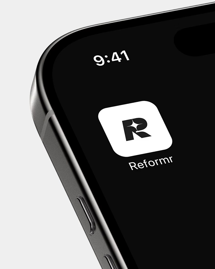
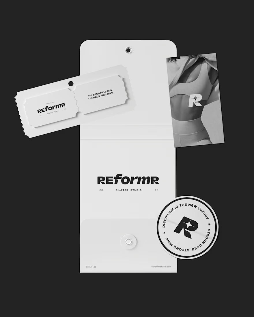
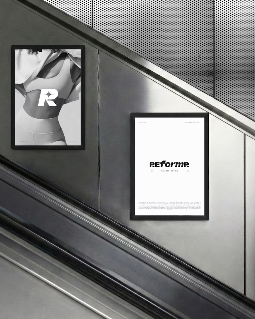
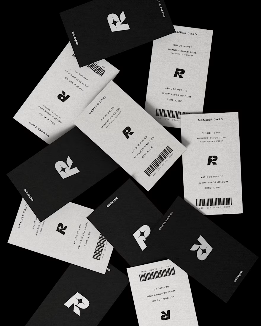
REFORMR is a self-initiated branding concept for a modern Pilates studio, built around movement, balance, and a refined visual aesthetic.
The visual identity combines bold typography, minimalist layouts, and monochromatic art direction to create a premium, contemporary brand. The project explores how a consistent visual language can translate across brand materials and advertising applications.
Scope: Logo design, visual identity, art direction, and mockup design.



T O P


Love how the “R” mark almost reads like a body mid-stretch. Was that intentional, or a happy accident that came out of the exploration?

Such a strong presentation! 💯

adore the simplicity here, it lends such an elegance to the brand.

That's really great brand design and visual design it really has a strong identity that's great Cantarina good job ❤️🎉

The bold R monogram and monochrome palette create a premium identity.


Good work🔥👏👏

you introduced a new way of Pilates brandingg by choosing monochrome color palette.. love it


Love the bold typography and minimal direction. It feels clean, modern, and premium.

The R on the black app tile is the strongest piece here. Monochrome for a pilates studio is brave, most go sage green, and it makes the studio feel more like a gym with standards. Curious whether colour comes in through the space itself.

Love the bold R on the black packaging, Catarina! Is the lettering custom?
The network for creativity
Join 1.25M professional creatives like you
Connect with clients, get discovered, and run your business 100% commission-free
Creatives on Contra have earned over $150M and we are just getting started
Related posts

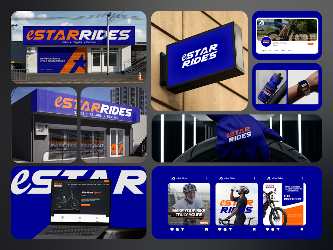
If you sell e-bikes, repairs and rentals, your brand should feel energetic before the customer even walks into the shop.
That was the challenge behind eStar Rides.
The brand needed to feel modern, confident and instantly recognizable across both physical locations and digital touchpoints.
So the identity was built around:
🟠 High-energy orange for visibility and impact
🔵 Deep electric blue for trust and technology
⭐ A bold star-led symbol for direction and recall
🔤 Custom typography with a strong, performance-driven feel
📱 A visual system designed to stay consistent everywhere
Then the identity was carried across:
Storefront signage
Retail environments
Website
Social media
Merchandise
Water bottles
Wearables
Campaign graphics
Digital applications
The goal was not just to make eStar Rides look modern.
It was to make the brand feel established, distinctive and ready to compete.
Because strong mobility branding should communicate:
Energy.
Freedom.
Confidence.
Reliability.
Before a customer even starts comparing options.
eStar Rides
Built for the ride.
What gives the brand the strongest presence?
A. The orange + blue palette
B. The custom wordmark
C. The storefront applications
D. The complete visual system
Drop A, B, C or D below.
If you are building a mobility, automotive, e-bike, transportation or tech-driven service brand and your visuals still feel generic, send me a message.
I help businesses build identities that feel more recognizable, credible and commercially ready.
#BrandIdentity #MobilityBranding #AutomotiveBranding #VisualIdentity #LogoDesign #RetailBranding #CreativeDirection #TransportationBranding



e bikes need branding with this kind of energy,, most of them look like appliance brands


Inspired by, I'm sharing one of my own concepts that wasn't chosen for the final design, but that I absolutely love.
This idea is so good! We all have concepts hiding in our drafts that never get to see the light of day. I think they deserve their moment, too. ✨
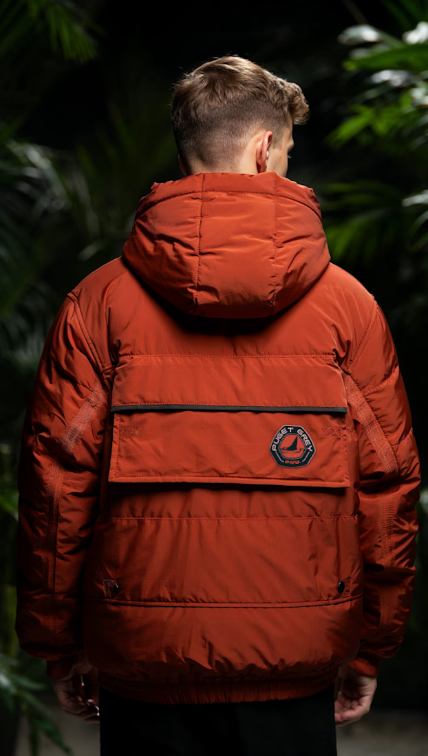
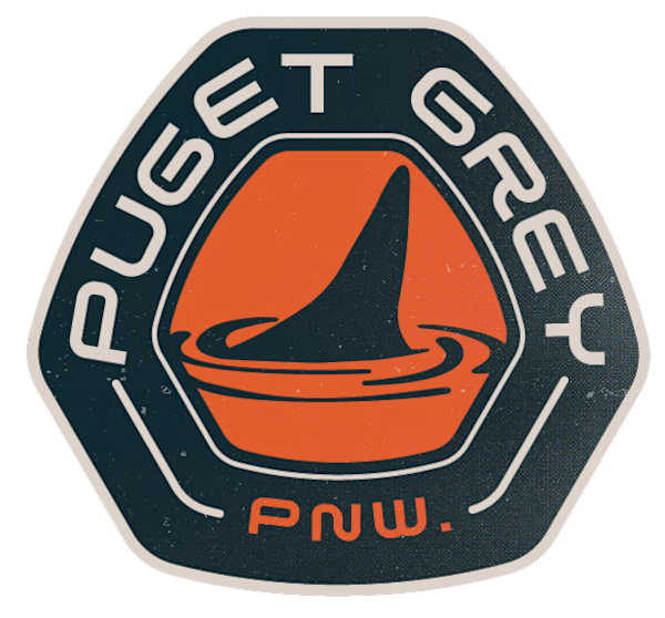
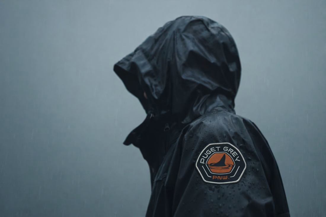

How many concepts die in your drafts folder? 💀
In the spirit of Inktober, a digital sketch that never saw the light.
This was a lettering-inspired brandmark...
