The network for creativity
Join 1.25M professional creatives like you
Connect with clients, get discovered, and run your business 100% commission-free
Creatives on Contra have earned over $150M and we are just getting started
Back to feedPost

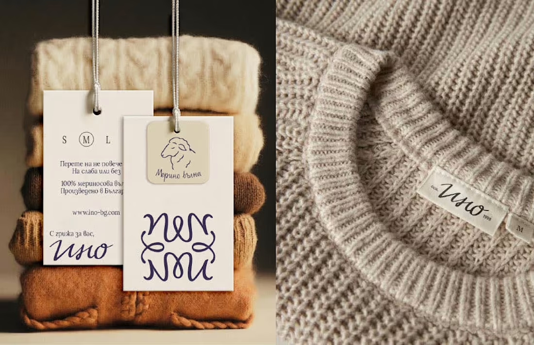
Ino is a Bulgarian family knitwear brand with 25+ years of craft behind it - but its old identity no longer reflected the warmth, quality and heritage at the heart of the brand.
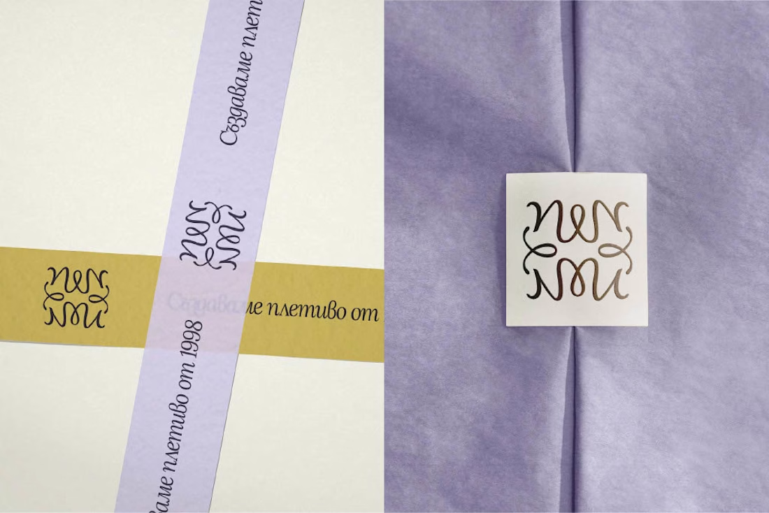
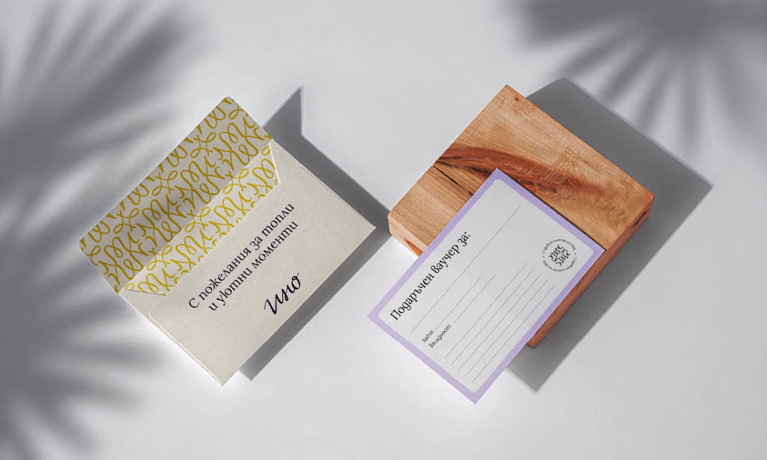
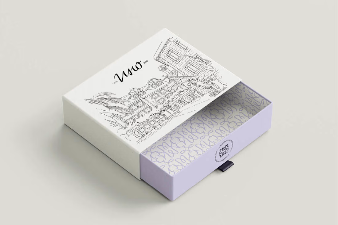
For the redesign, I built the concept around family heritage and personal signature - creating a visual system that feels refined, human and timeless, while giving Ino a more recognizable presence across packaging, social media and brand touchpoints.



Omg, this is beautiful! ♥️
Thank you, Bellaaa 🌷

I really love this logo style 😍
Oh thank youu ✨

Awesome!
Thanks!

Good one here
🙏🙏

The logo is just so lovely! Really great work
Thank youu, appreciate it 🫶

🔥
good work!


Stunning 🤩


Awesome work as always! 👏
Appreciate it ❤️


Love the vibes.
Appreciate it! Loved creating this one

It couldn't have been better! Great work 👏
Thanks 🙏

Wow nice work

Heritage rebrands done well always look easier than they are. Translating 25 years of craft into a packaging system that still feels human is the kind of work that ages quietly and keeps paying. The handwritten typography on the boxes is the move. It signals the maker without screaming artisanal.
Exactly, this core idea of heritage and craft was the natural way for the brand expressing itself the best way and of course, repositioning in the market.

Nice work, keep it up!

Colors, typography, overall design, liked them all! 👍


This is nice btw

nice & stunning

Looks neat. Good taste!

Awesome

Super work

Making it feel heritage was a great call, you can update it without feeling too targeted or planned. I'm curious about one thing: when you were building the visual system across packaging and social touchpoints, how did you decide which elements got to stay handmade/organic vs....
This is the main question with redesign and that’s why it’s harder to execute than designing an identity from scratch. In this case we made a brand audit - what makes the brand recognisable the most among the customers, so it stays familiar but also evolved and repositioned for...

This is so beautiful!

Thankss

this design feels so culture oriented feels realy good

nice work

I feel warm and elegant.
Awesome!

The network for creativity
Join 1.25M professional creatives like you
Connect with clients, get discovered, and run your business 100% commission-free
Creatives on Contra have earned over $150M and we are just getting started
Related posts
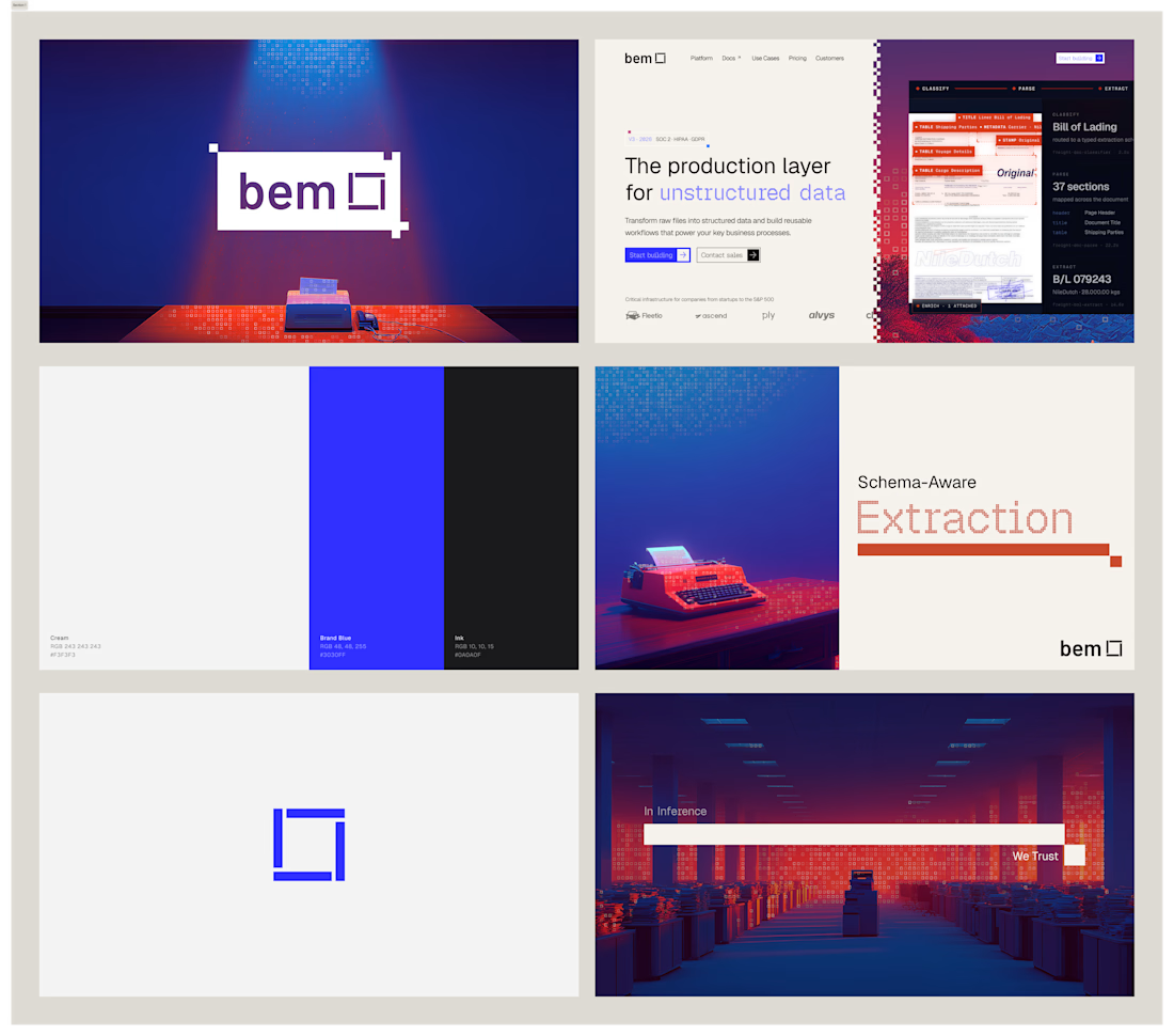
I've had so much fun working on bem. Came in with logo marks and colors, and we're looking for an identity to call home. After doing some research and inspiration exercises, we came up with this concept, which I absolutely love.


Impressive work !

Design Duel ⚡
Two hero concepts. One fashion photographer.
🅰️ Structured split layout 🅱️ Full-screen editorial experience
Which one would you choose for your portfolio? Vote A or B and tell me why.

6 voted
20%
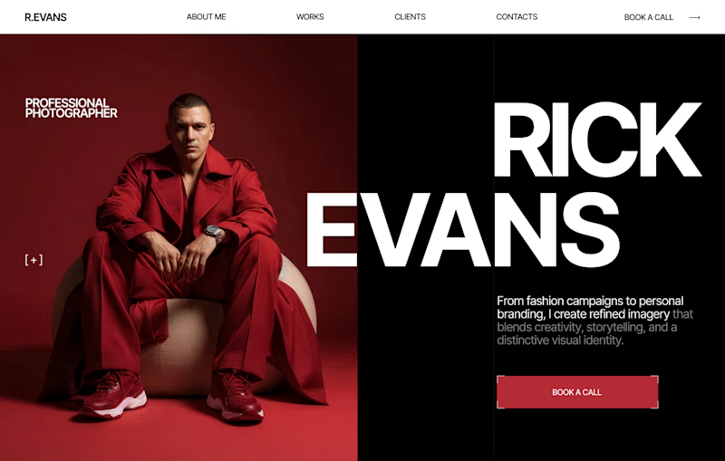
24 voted
80%
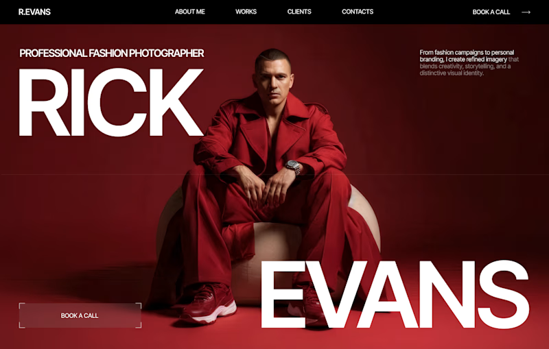
30 votes
Closed
I love your designs so much! 😍

Hello Founders.
Over the past year, we've been creating logos that genuinely improve customer perception. Not generic marks, but thoughtful logomarks that tell the story you want.
Perception is a major factor in customer decision-making, and it's what we focus on heavily in branding.
Here are some logo lockups we've worked on.
We're open for new logo design and branding projects.
Send a DM or email to ► info@donatus.agency

Good job






Trending

Claude
Claude has entered the design space. How are you using Claude Design?

Contra University
Learn from expert creatives how to earn more using next-gen AI tools.
fifaworldcup2026
The World Cup is here and the whole world's watching. How are you designing for the world stage?
creativeaiflow
Creative AI workflows are evolving. What tools do you use, and what are their strengths and weaknesses?
freelancerlife
Freelancer life is wins, pivots, and everything in between. What’s yours right now?