The network for creativity
Join 1.25M professional creatives like you
Connect with clients, get discovered, and run your business 100% commission-free
Creatives on Contra have earned over $150M and we are just getting started
Back to feedPost
Frame it as a design concept/case study, not a live client site something like
"A concept storefront for a luxury literary-inspired silk scarf brand designed and built to explore a premium editorial e-commerce direction: cinematic typography, scroll animation, and a product narrative built around classic literature
https://vellum-editions.netlify.app/


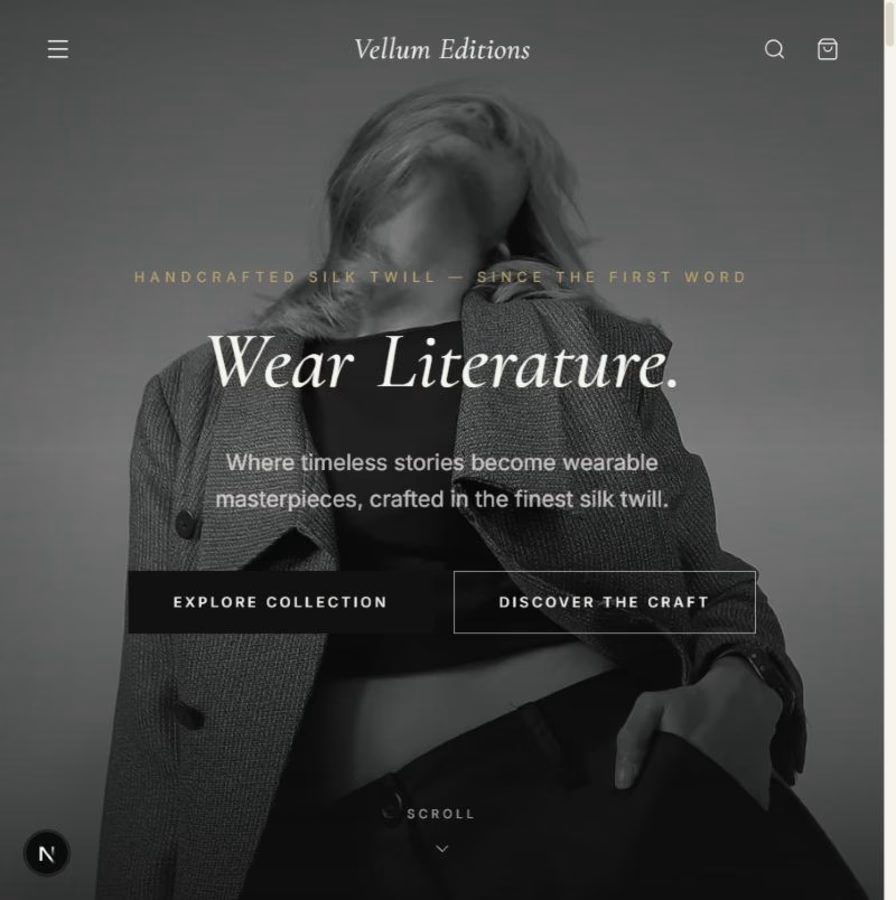


The cinematic typography sounds intriguing—what classic works inspired the product narratives?

Great question — I pulled from The Odyssey, Dante's Inferno, Ovid's Metamorphoses, and Botticelli's muse.
Each scarf's palette and pattern echoes its source — e.g. deep reds/blacks for Inferno. Treated every product like a chapter, so the copy doubles as a literary reference.
The network for creativity
Join 1.25M professional creatives like you
Connect with clients, get discovered, and run your business 100% commission-free
Creatives on Contra have earned over $150M and we are just getting started




Related posts

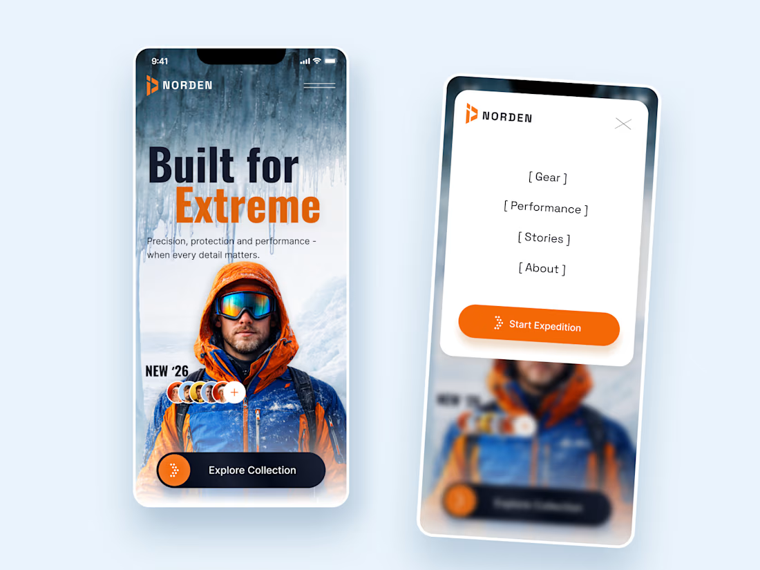
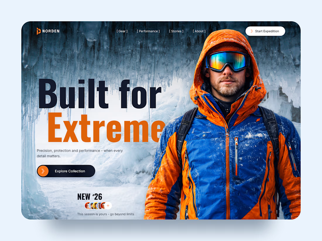
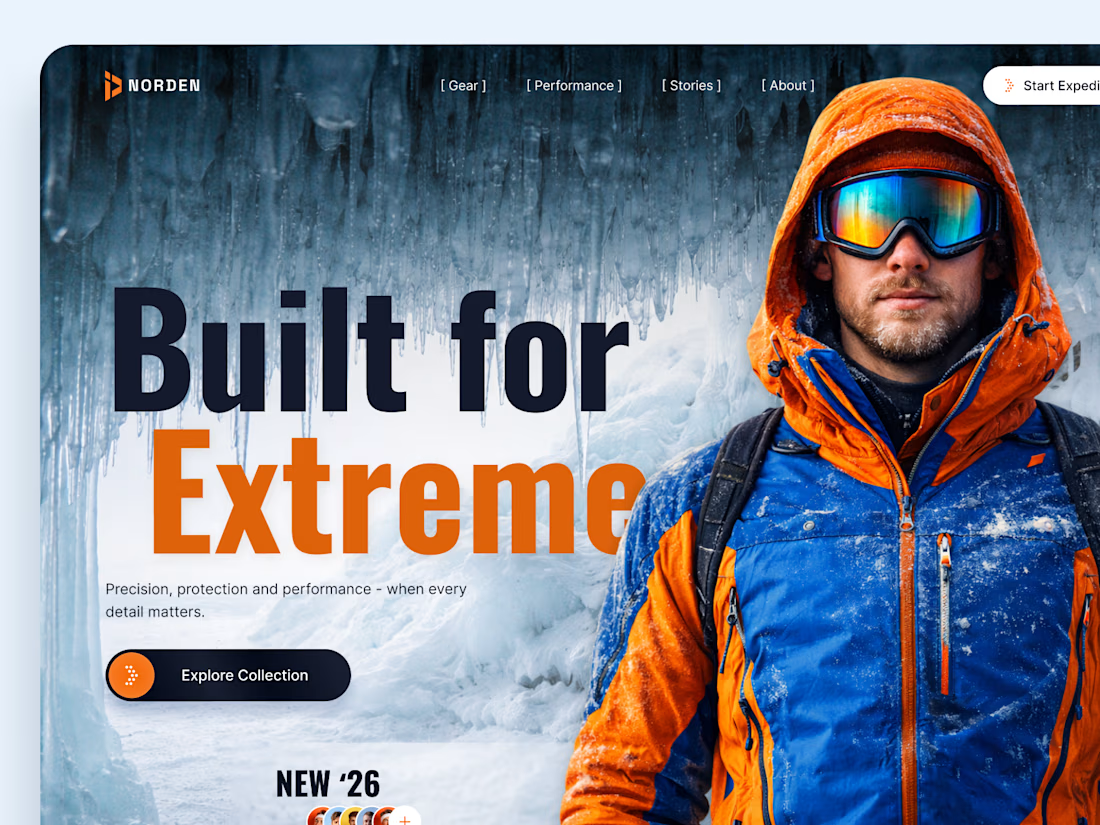
NORDEN — Outdoor Gear Landing Page 🏔️
NORDEN is a premium outdoor gear landing page concept inspired by extreme environments, exploration, and high-performance equipment.
The design combines dramatic icy landscapes, bold typography, and vibrant orange accents to create an immersive experience that captures the spirit of adventure.
Special attention was given to:
A cinematic hero composition featuring an explorer in extreme conditions.
Oversized typography that communicates strength and confidence.
A cold blue-and-orange color palette inspired by alpine environments.
Clear CTAs that guide visitors toward the collection and expedition.
Responsive mobile layouts that preserve the visual impact.
Minimal navigation that keeps the focus on the experience.
The result is a visually striking digital concept that connects outdoor performance with premium product storytelling.
Looking to create a distinctive website for your outdoor, sports, or lifestyle brand? Let's bring your vision to life. ⚡



How did you choose the hero image?


Clean work !