VELORA — Typography-Led Brand Identity System

Gülçin Gümüş


🔍 Project Overview
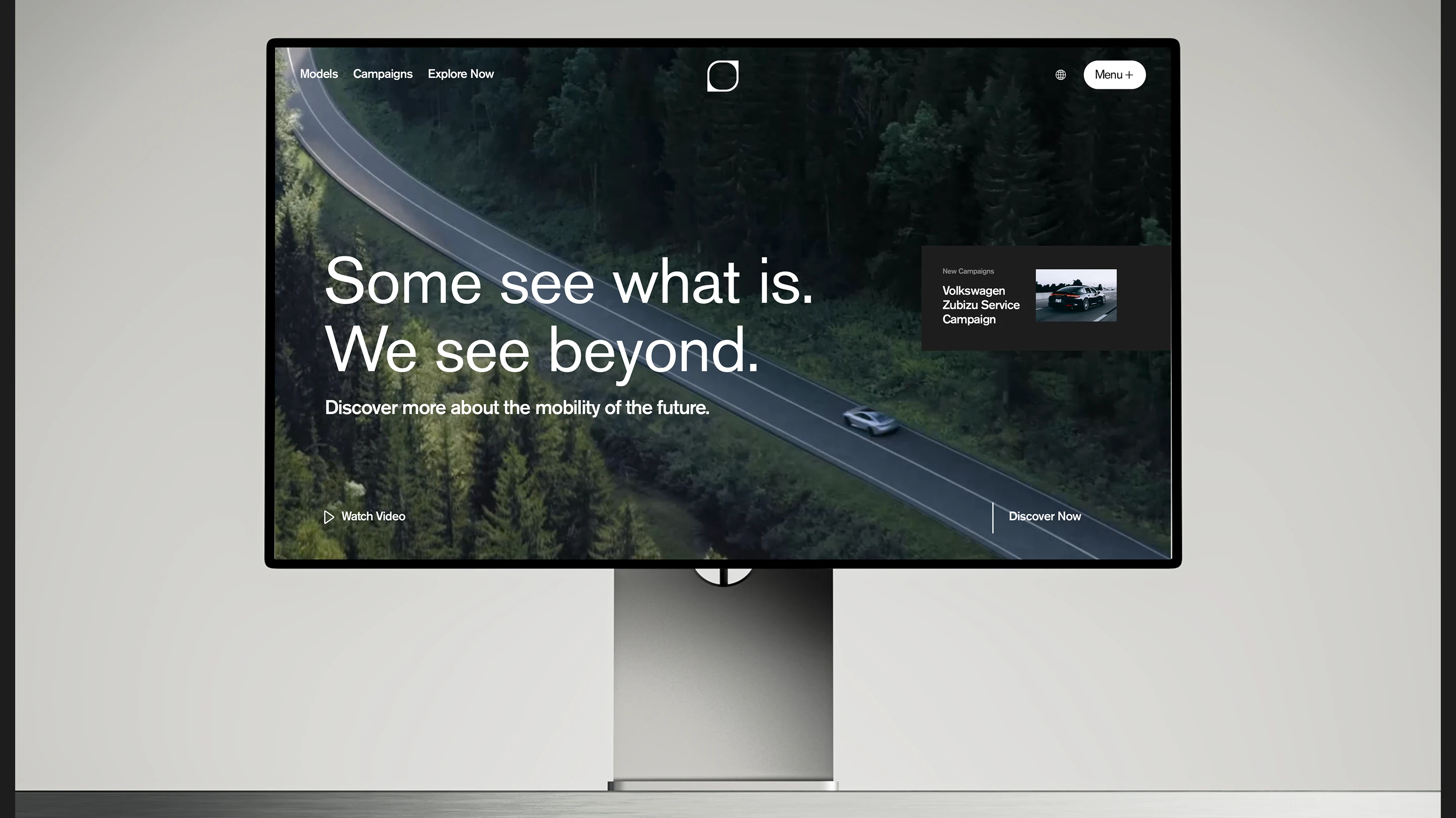
VELORA is a brand identity concept rooted in elegance and restraint. The project explores how minimal design decisions, refined typography, and intentional whitespace can create a brand presence that feels both contemporary and timeless.
⚡ The Challenge
Building a brand identity that communicates luxury without relying on ornament. Every element needed to earn its place: the logo, the type system, the color palette, the layout grid. The goal was a visual language that scales cleanly from a business card to a full website without losing its character.
🎯 Design Approach
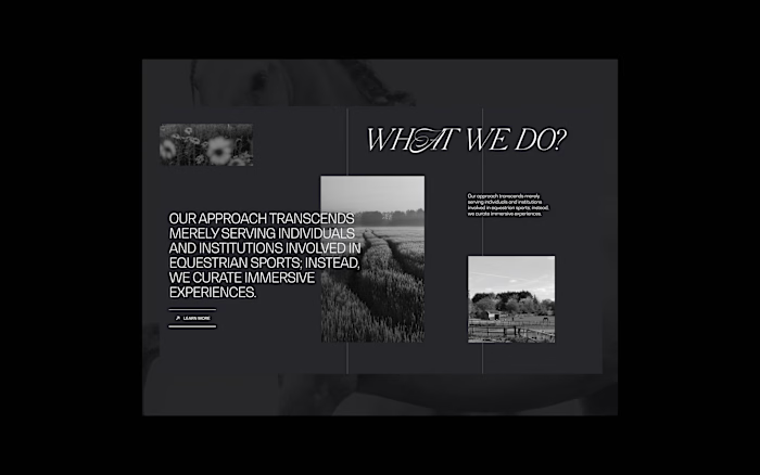
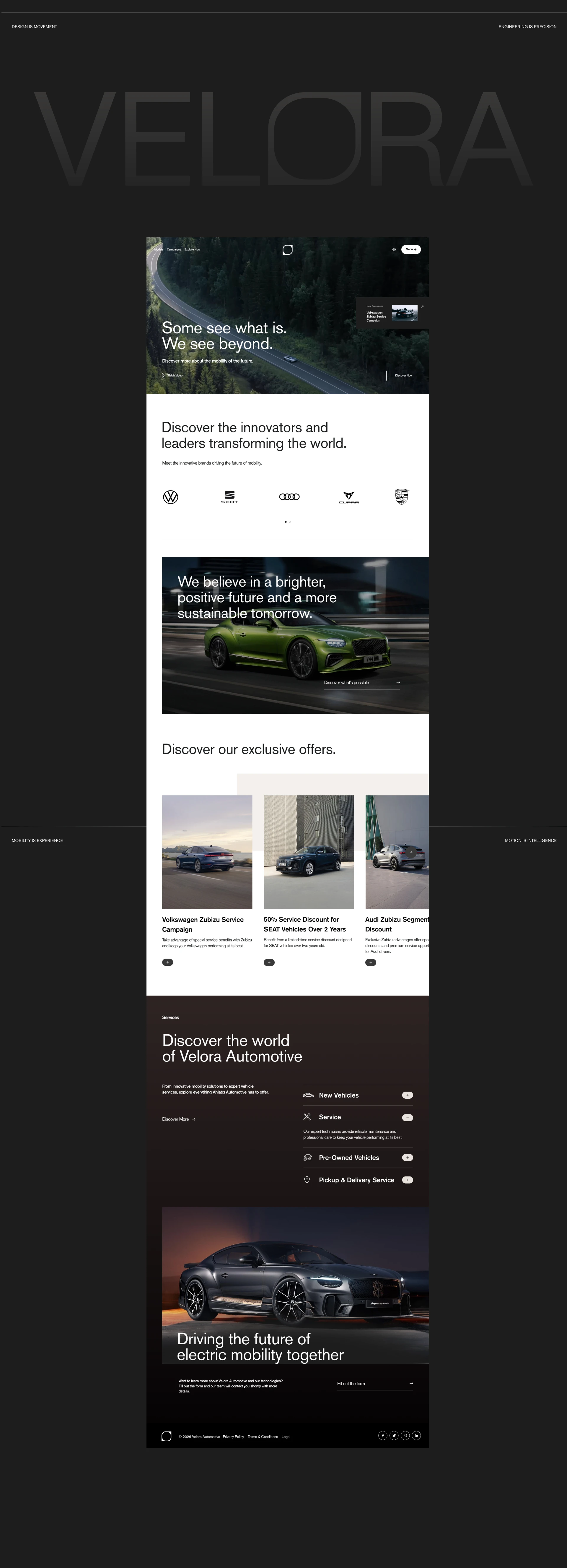
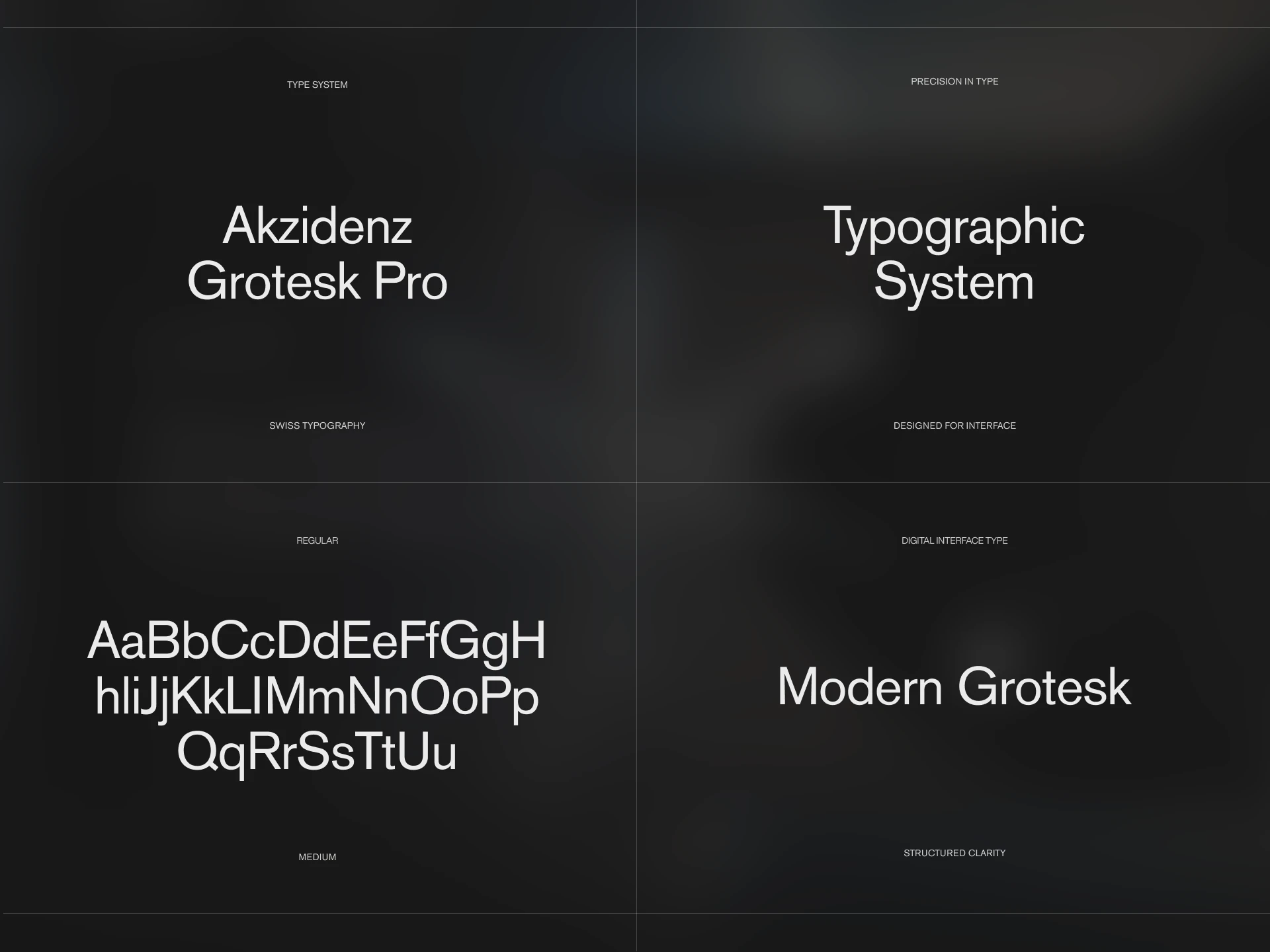
Typography as the foundation. The entire identity is built on a carefully selected type pairing. Headlines carry weight and confidence; supporting text stays quiet and functional.
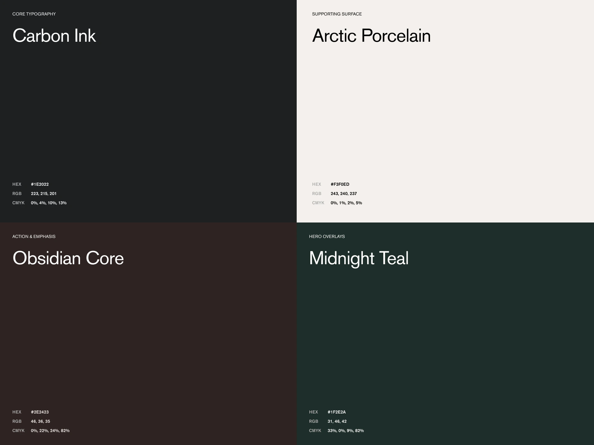
Restrained color palette. Neutral tones with a single accent create visual hierarchy without noise. Color is used as a signal, not decoration.
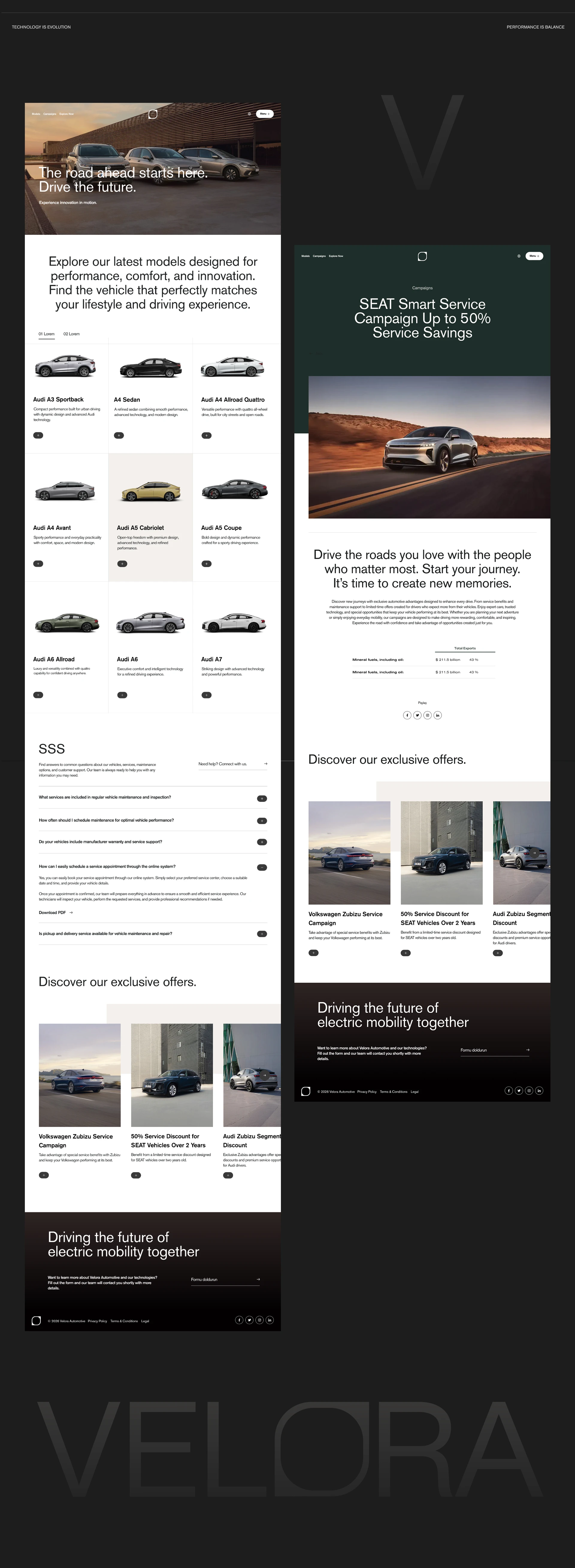
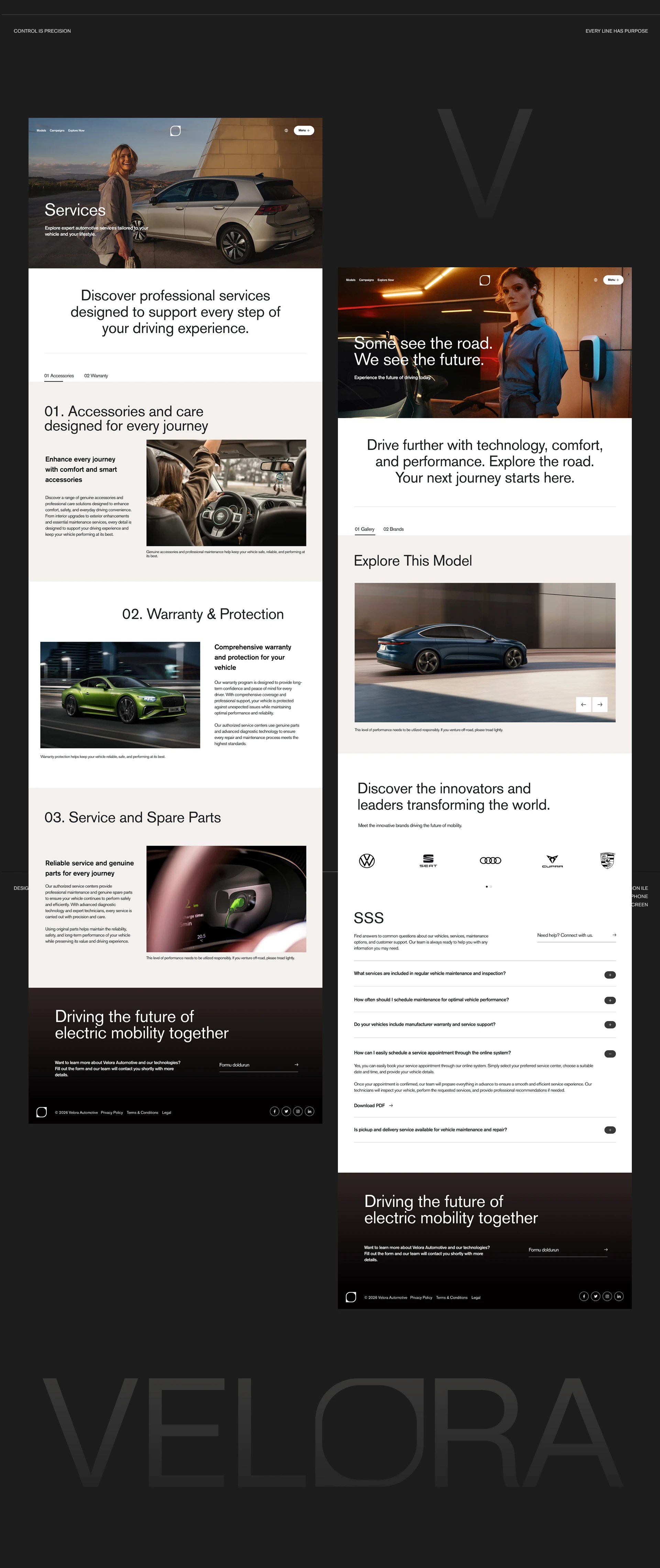
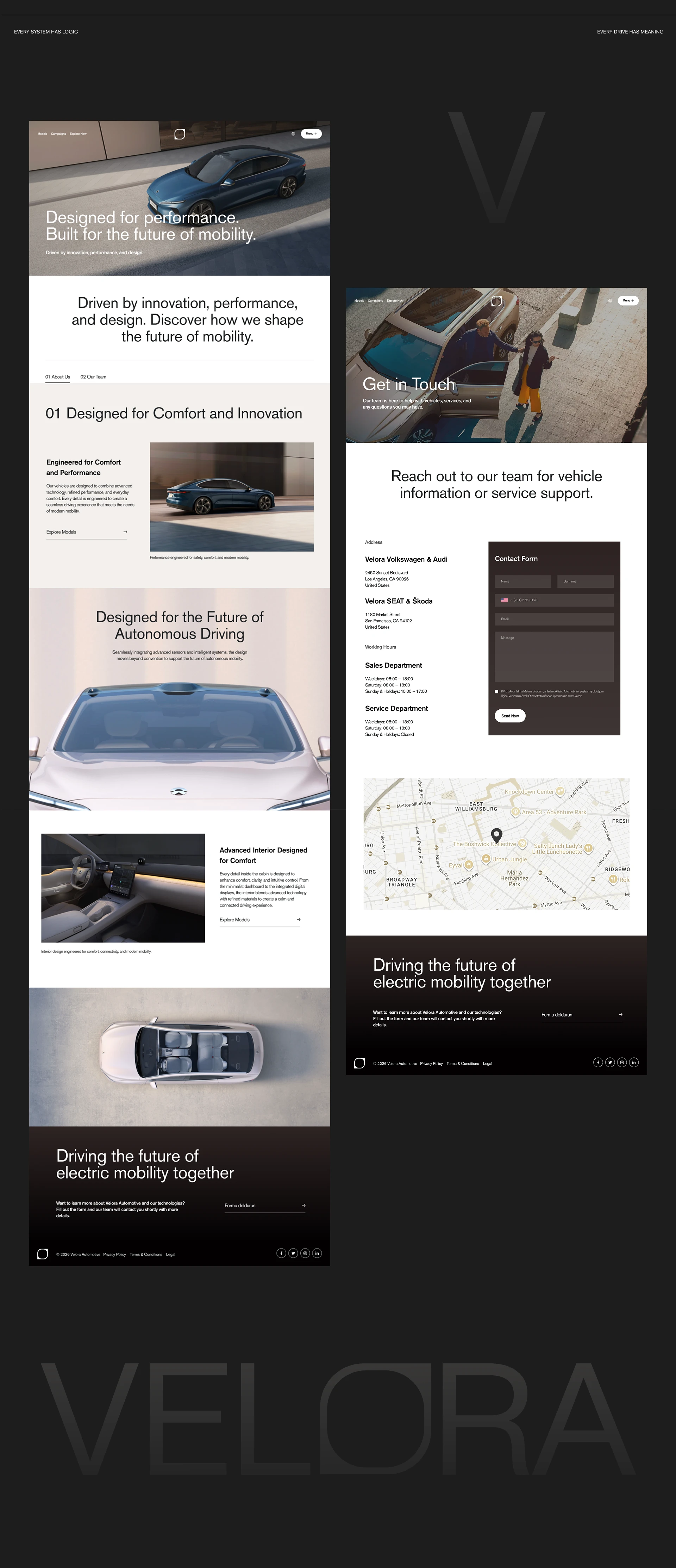
Modular layout system. Every composition follows a grid that allows flexibility across formats while maintaining visual consistency.
✅ Outcome
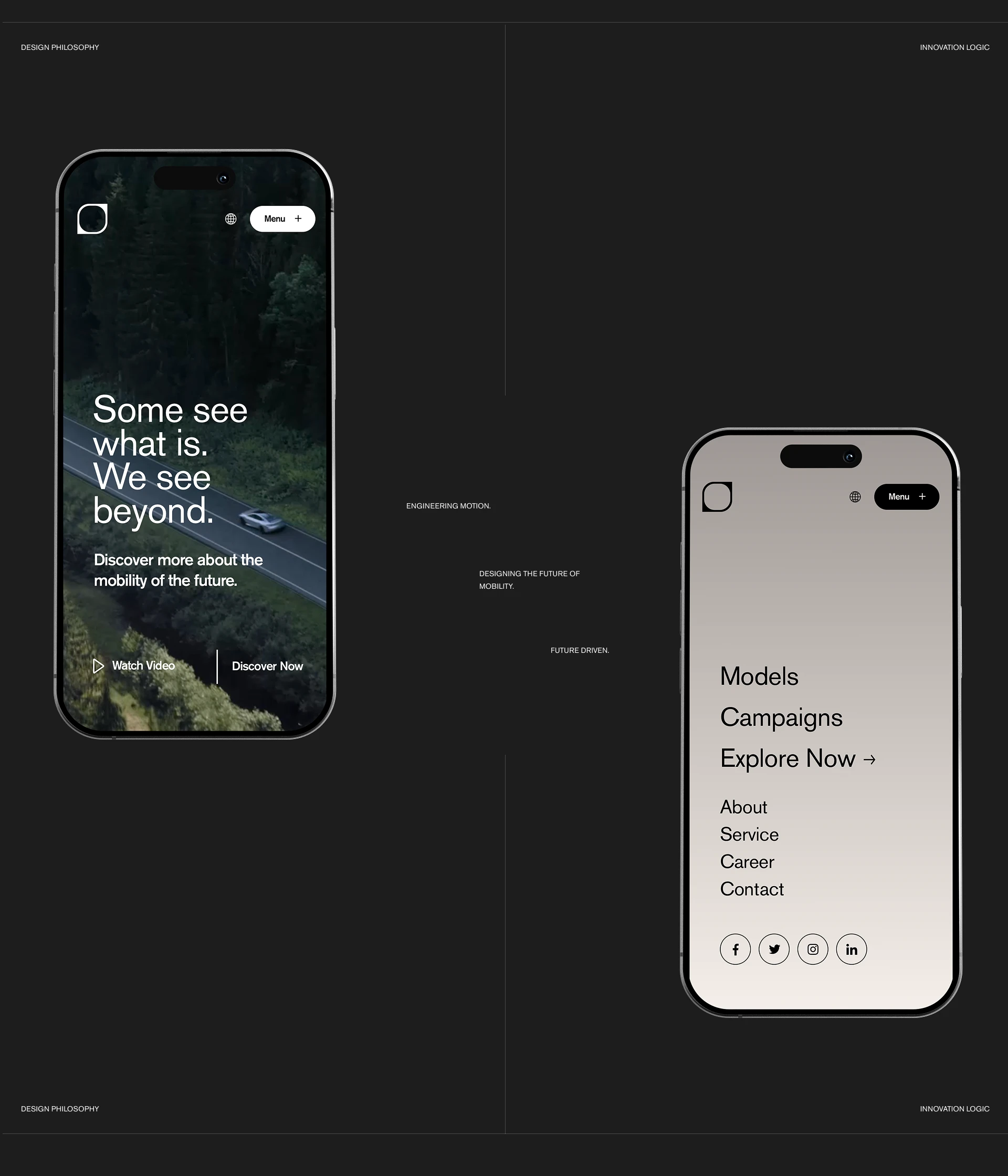
A cohesive brand identity system that proves luxury can be communicated through discipline rather than excess. The visual language is clean enough to breathe and structured enough to scale across any touchpoint.
Like this project
Posted Apr 2, 2026
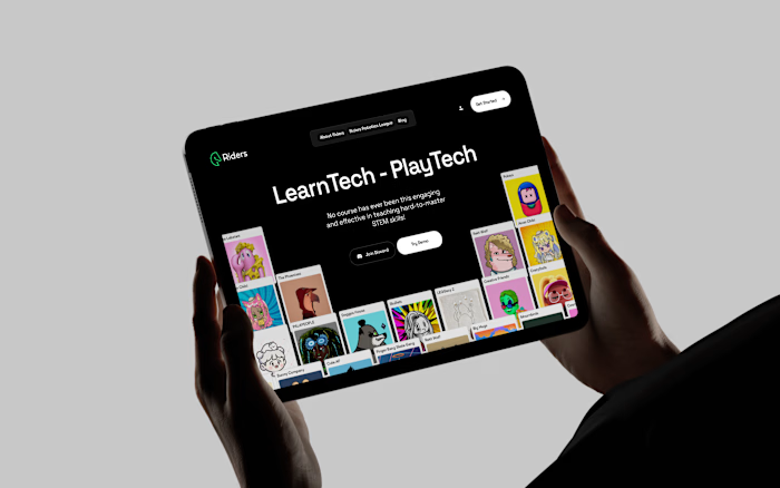
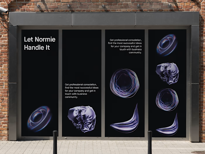
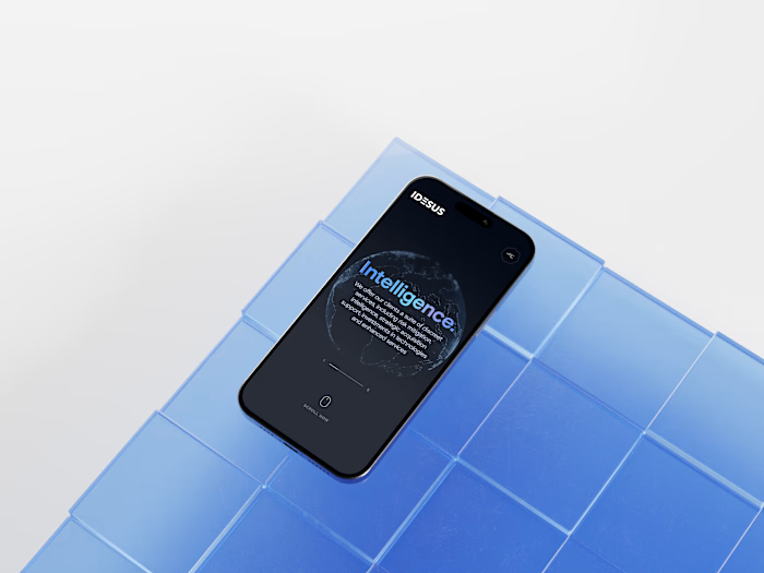
Refined visual identity built around elegance and clarity. Typography-driven layouts, a cohesive color system, and scalable brand assets designed to work seamlessly across digital and print touchpoints.