The network for creativity
Join 1.25M professional creatives like you
Connect with clients, get discovered, and run your business 100% commission-free
Creatives on Contra have earned over $150M and we are just getting started
Back to feedPost

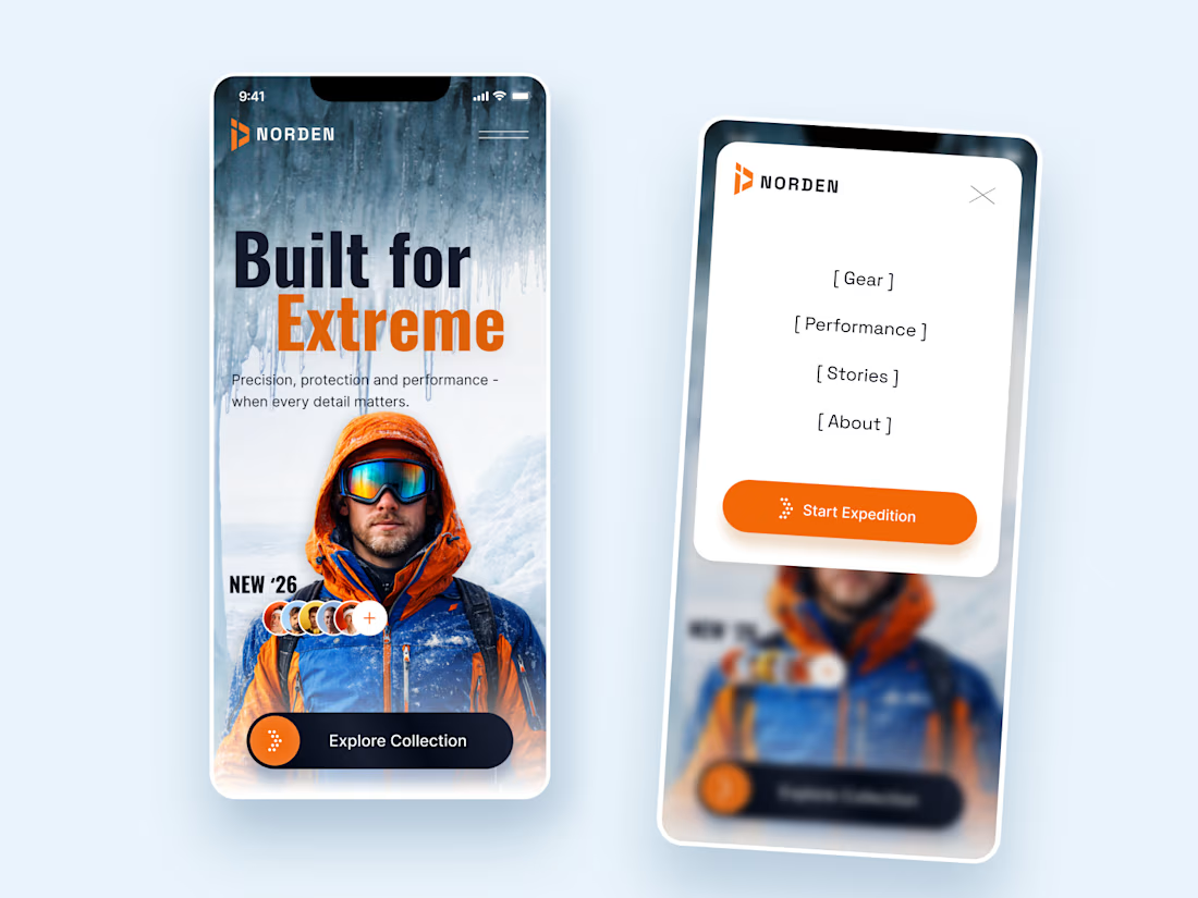
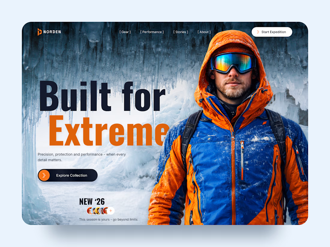
NORDEN — Outdoor Gear Landing Page 🏔️
NORDEN is a premium outdoor gear landing page concept inspired by extreme environments, exploration, and high-performance equipment.
The design combines dramatic icy landscapes, bold typography, and vibrant orange accents to create an immersive experience that captures the spirit of adventure.
Special attention was given to:
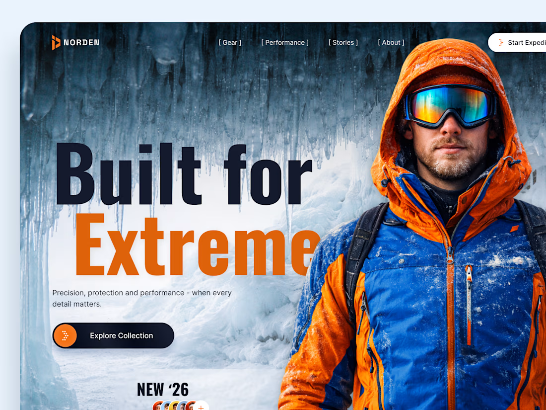
A cinematic hero composition featuring an explorer in extreme conditions.
Oversized typography that communicates strength and confidence.
A cold blue-and-orange color palette inspired by alpine environments.
Clear CTAs that guide visitors toward the collection and expedition.
Responsive mobile layouts that preserve the visual impact.
Minimal navigation that keeps the focus on the experience.
The result is a visually striking digital concept that connects outdoor performance with premium product storytelling.
Looking to create a distinctive website for your outdoor, sports, or lifestyle brand? Let's bring your vision to life. ⚡



The goggles add so much character 😎

This makes me want to go hiking

How did you choose the hero image?
I wanted the hero to instantly communicate adventure and extreme conditions, so we chose an image with a strong explorer presence and a cold, icy backdrop The orange jacket adds contrast and naturally draws attention to the main subject 🏔️


The hero has a great sense of scale ❄️

The orange jacket steals the show 🔥

This feels like a real expedition 🏔️
The network for creativity
Join 1.25M professional creatives like you
Connect with clients, get discovered, and run your business 100% commission-free
Creatives on Contra have earned over $150M and we are just getting started

Challenges
View all


Related posts


A look at the identity we designed for Vetti, a dog health monitoring brand.
There’s a lot of data behind a product like this but the person using it just wants to know their dog is okay.
That’s the balance in the design with a connected dot system that feels precise and warm colors and photography that keep it close to what people care about.
Also, an excellent excuse to spend far too long choosing dog photos.


Engaging website for a New York–based architecture and construction studio, balancing bold typography, immersive imagery and a minimal editorial layout.


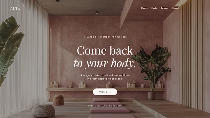
Where should the photo live - behind the words or beside them?
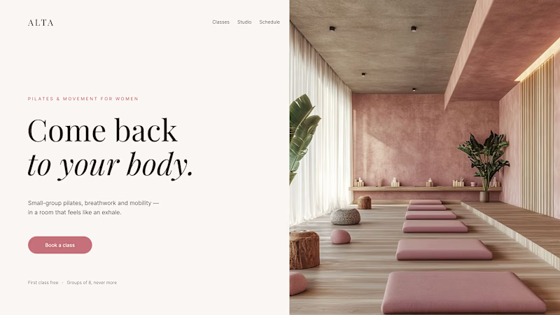
Same pilates studio, same headline.
01 - Photo as the background. Full-bleed atmosphere: the room wraps around the words. Immersive and cinematic, but the text only survives thanks to a darkening overlay laid over the image.
02 - Photo beside the text. A clean split: words on calm ground, the room in its own column. Everything readable at a glance, the trade is a little less drama.
One sells the feeling. The other sells the clarity. Which hero would make you book the class?

80 voted
75%
27 voted
25%
107 votes
Closed

1 nails it


