The network for creativity
Join 1.25M professional creatives like you
Connect with clients, get discovered, and run your business 100% commission-free
Creatives on Contra have earned over $150M and we are just getting started
Back to feedPost

Every space has a story. 🎬
For our latest project with Sheares Hall, we created a brand video designed to capture the energy, community, and everyday moments that make student living feel like home.
Authentic storytelling, cinematic visuals, and content built to connect with the people who matter most.
If your property, hospitality brand, or business is looking for professional video production without the overhead of a large agency, we'd love to connect.


The network for creativity
Join 1.25M professional creatives like you
Connect with clients, get discovered, and run your business 100% commission-free
Creatives on Contra have earned over $150M and we are just getting started

Challenges
View all


Related posts

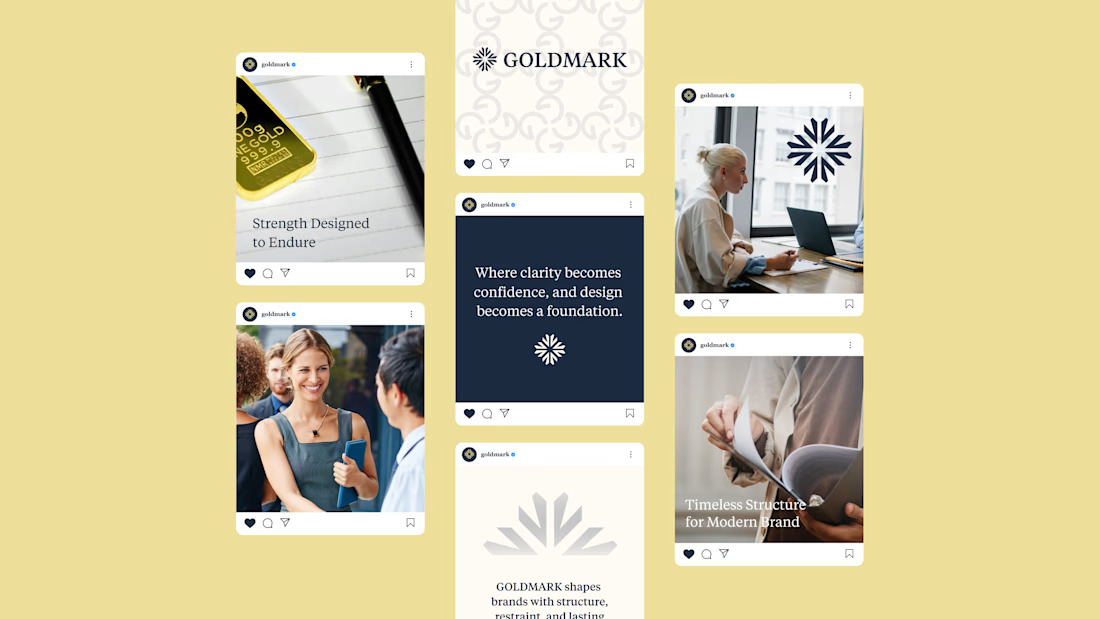
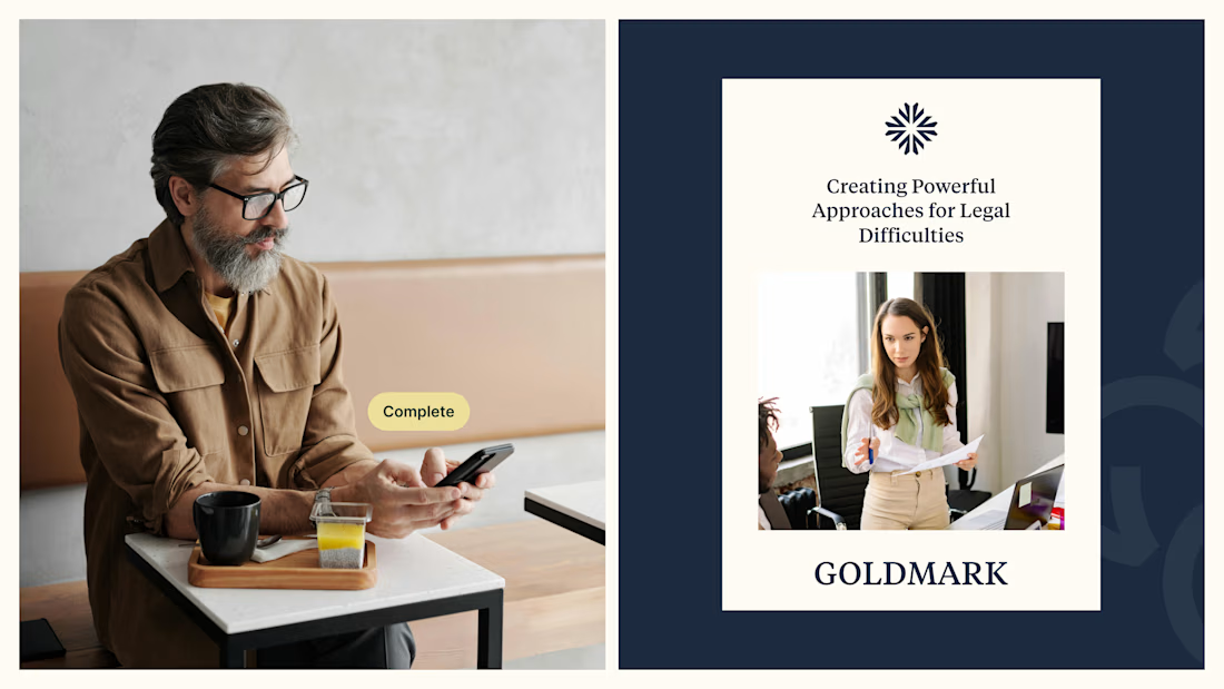
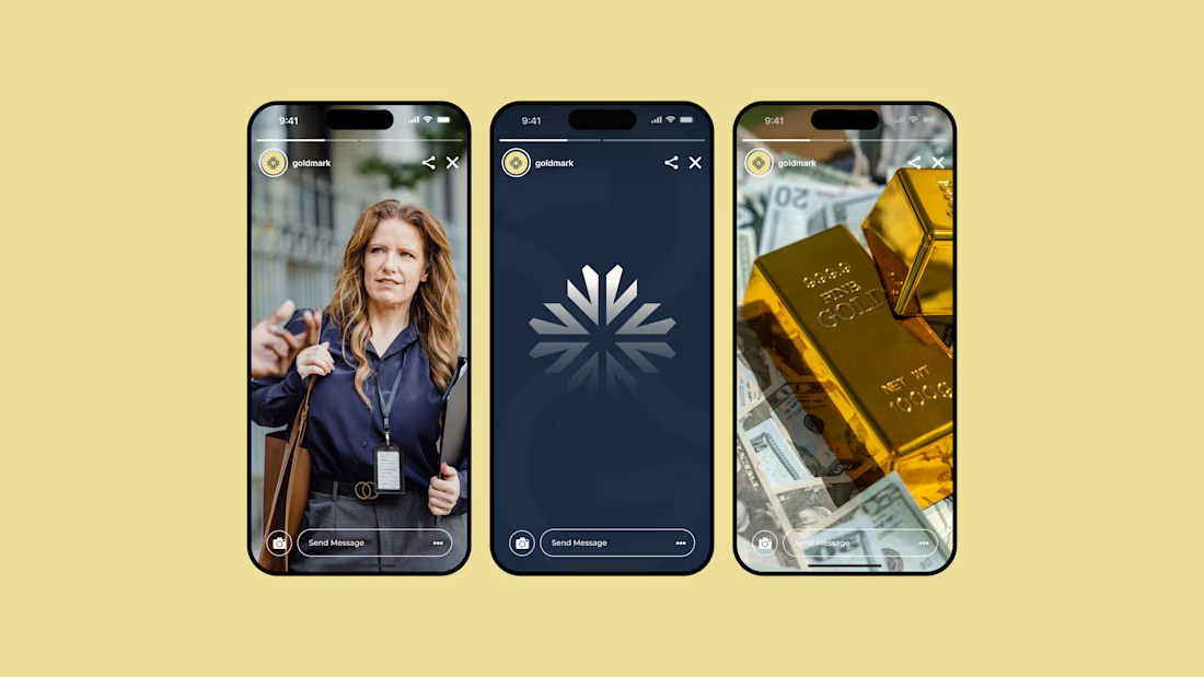
GOLDMARK - A refined identity for modern legal expertise. ✦
A complete branding exploration focused on building a visual language that feels premium, trustworthy, timeless, and confident.
The identity combines a distinctive symbol, elegant typography, and a deep navy + warm gold palette to create a sophisticated presence across digital and print applications.
Services: Brand Identity • Logo Design • Art Direction • Visual System
#BrandIdentity #BrandDesign #LogoDesign #VisualIdentity #Branding #GraphicDesign #ContraPortfolio

What's your one-rule brand? Tell me.
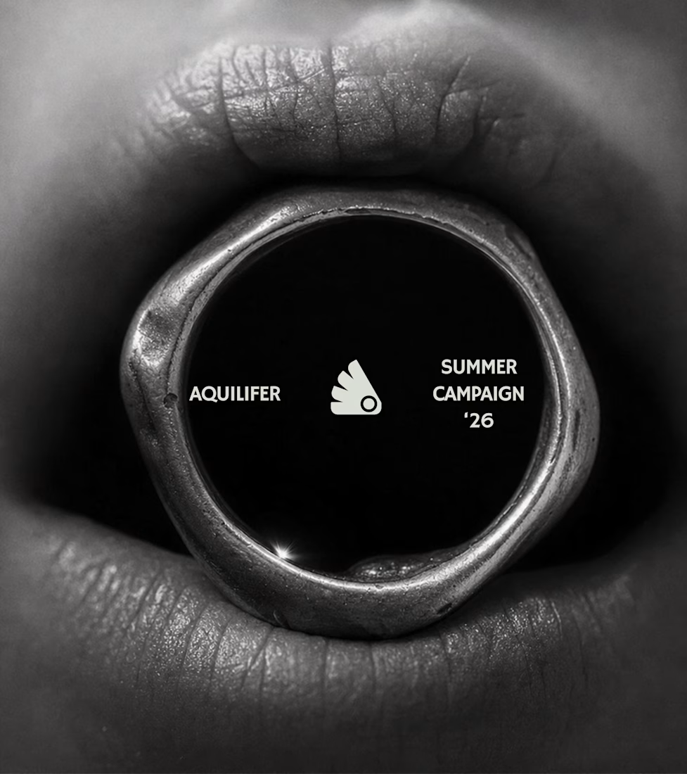
Most jewelry brands photograph the object. This one photographs the grip.
AQUILIFER — a brand I built around one idea: jewelry as something carried, not worn.
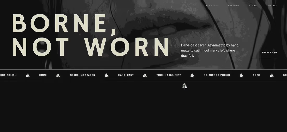
Case study + full site now live.
The name comes from Roman military rank. The aquilifer carried the standard — the one thing the legion couldn't afford to drop.
That single word killed my first direction before I'd finished it.
No polish. No faceted stones.
Hand-cast, asymmetric pieces, tool marks left visible.
Photography went extreme macro, unretouched skin, hands gripping the face instead of posing near it.
Color system: two darks instead of one dark + accent.
#1E1E1E and #27331A let the brand shift register — campaign world to product world — without ever going light.
#D9DED4 stays structural only. Never a fill.
Motion rule on the site: diagonal masks only. No rotation, anywhere.
A spinning object reads as being shown off. This brand is about weight, not display.
Same angle, same easing, top to bottom.
One idea, held all the way through — name, object, photography, palette, motion.
That's the whole pitch for how I work.

Absolutely love your works!

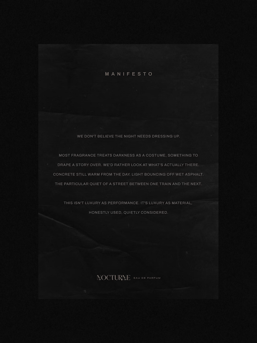
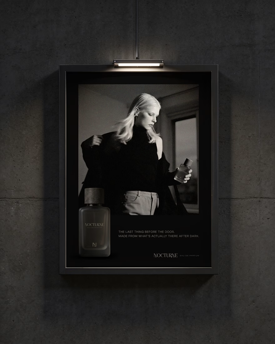
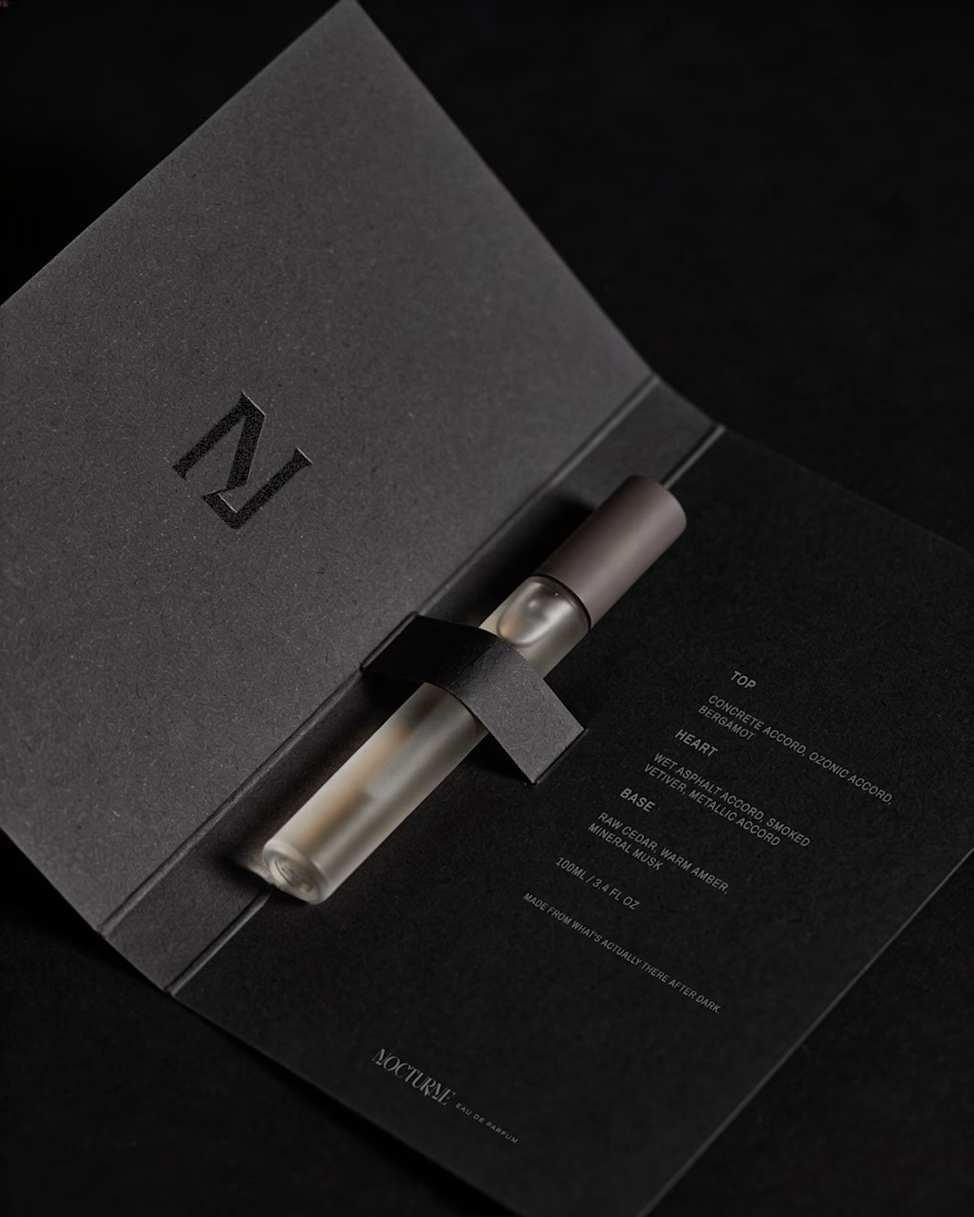
Nocturne is a self-initiated fragrance house I built from the ground up, treated with the same process I'd bring to any client: strategy first, then design.
The brief was familiar: a fragrance inspired by the city after dark. Most fragrance branding solves that with common approaches such as moonlight, mystery, or gold foil details. I wanted to solve it with something more specific: what does after dark actually look like in an urban environment? Concrete, streetlight, wet pavement, the quiet stretch between one train and the next.
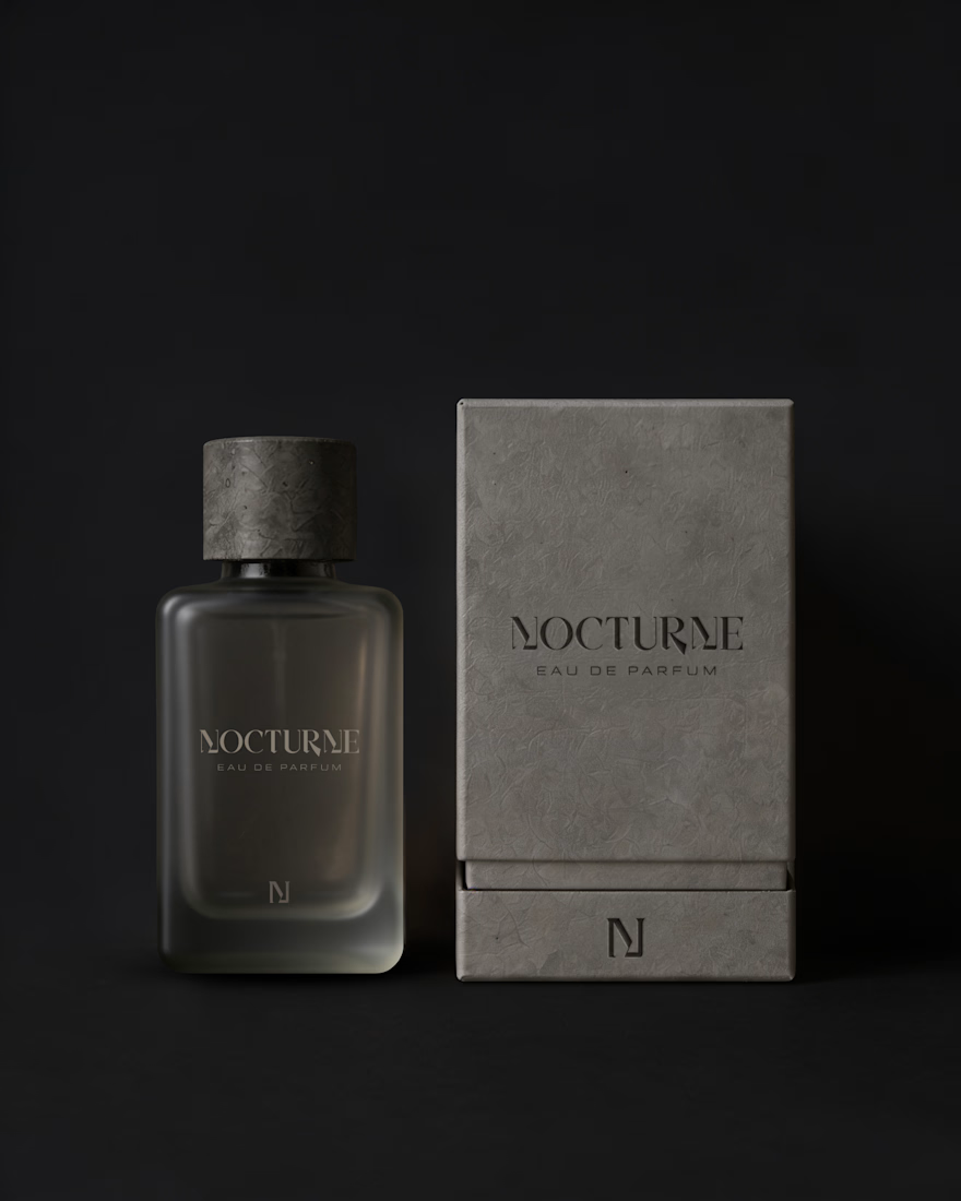
That question shaped everything downstream. An archetype chosen deliberately against category convention, Creator and Explorer rather than the more expected Lover or Magician. A material-first approach to the bottle and packaging. Sandblasted glass, a textured concrete-like cap, no gold, no ornament. And a running checklist I held every decision against throughout the project.
The case study covers the strategy behind Nocturne, not just the finished system: positioning, personality, the reasoning behind each material and typography choice, and how those decisions translated into the bottle, packaging, and campaign work.
I'd love to hear what you think, especially if you enjoy seeing the thinking behind a visual identity as much as the final result.



Good Work!