The network for creativity
Join 1.25M professional creatives like you
Connect with clients, get discovered, and run your business 100% commission-free
Creatives on Contra have earned over $150M and we are just getting started
Back to feedPost
Taste Test

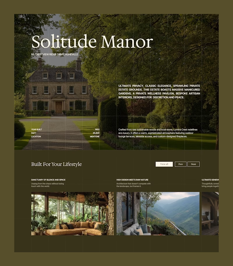
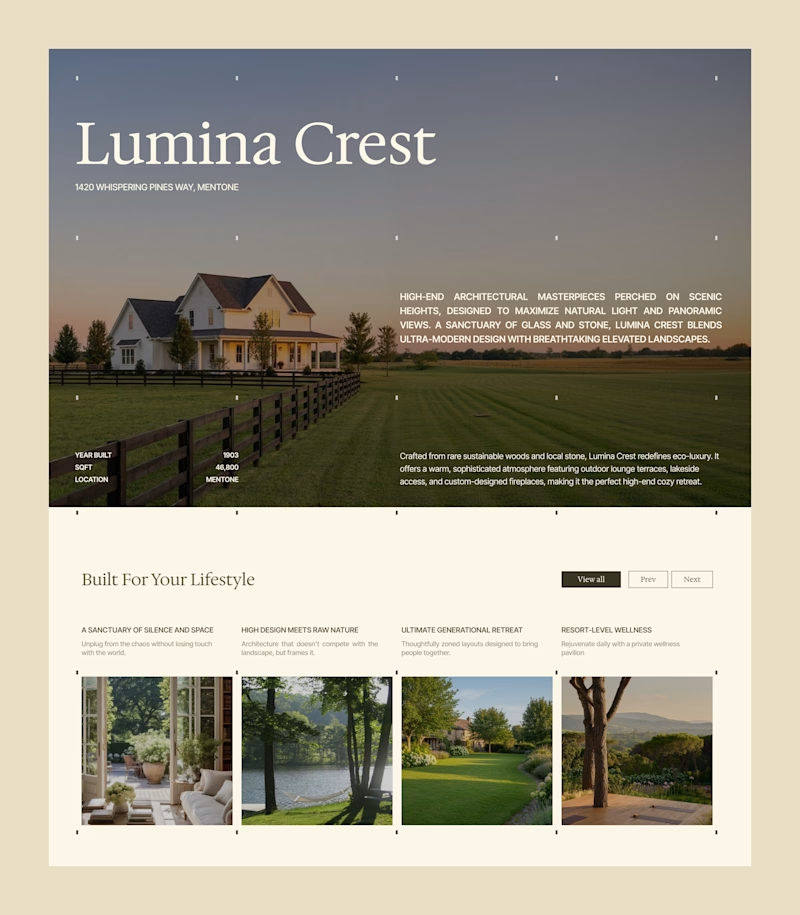
One layout, but two completely different price perceptions. 📐
Look at these two screens. This is exactly how visual positioning works for premium real estate. By shifting the atmosphere from a deep olive to an editorial cream, we change the target audience profile without touching a single line of text.
Which atmosphere cuts through the noise and builds instant authority for a high-end launch?
Work with me: I'm currently tracking projects for the upcoming summer months. If your brand is preparing a launch and needs crisp execution across Identity, UI/UX and Development, send over your project details.
6 voted
50%
6 voted
50%
12 votes
Closed

Upgoating Editorial cream, it is pure creativity!

Both are Amazing!

Olive depth

Will go for Olive depth

something about editorial cream feels more open, free, & inviting. i think the photo you chose to highlight has a lot to do with it, & your phrasing including 'architechtural masterpieces' struck my logical brain along with the right in its imagination: highlighting the...
The network for creativity
Join 1.25M professional creatives like you
Connect with clients, get discovered, and run your business 100% commission-free
Creatives on Contra have earned over $150M and we are just getting started
Related posts

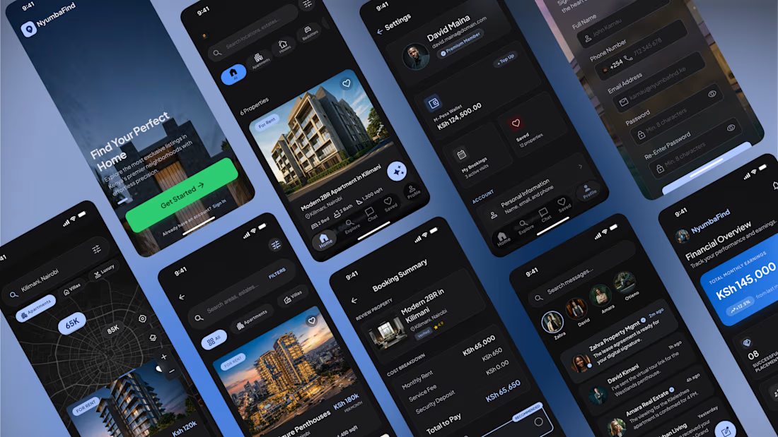
Real Estate Mobile App — UX/UI Design
Designed a modern real estate mobile experience that simplifies the journey of finding, exploring, and purchasing property.
This concept focuses on creating an intuitive, premium experience through clean navigation, personalized recommendations, and a visually immersive interface. Every screen was designed to reduce friction and help users make confident decisions.
What I worked on
• UX Research & User Flows
• Information Architecture
• Wireframing
• High-Fidelity UI Design
• Design System
• Interactive Prototyping
• Mobile App Design
Key Features
🏠 Property discovery with advanced search & filters
📍 Interactive map exploration
❤️ Save and compare favorite listings
💬 Agent messaging & communication
📅 Property viewing scheduler
📊 Mortgage & affordability calculator
🔔 Personalized recommendations
👤 User profile and saved searches
Design Approach
The interface embraces a modern dark theme with carefully balanced typography, generous spacing, and vibrant accent colors to create a premium yet accessible experience. The goal was to make browsing properties feel effortless while maintaining trust and clarity throughout the user journey.
Tools
• Figma
• FigJam
I'm always excited to design products that solve real user problems while delivering polished, business-focused experiences.



I love this premium work 🔥😍

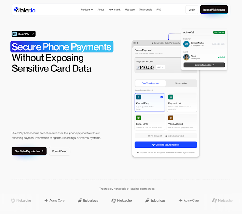
Hard to choose which layout I should go with 🤔

10 voted
31%
22 voted
69%
32 votes
Closed

Hero Section 2

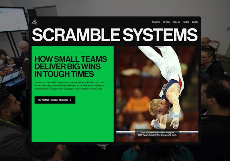
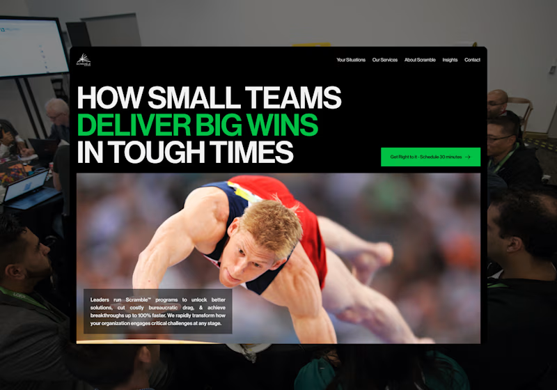
I’m exploring two homepage hero directions for a Scramble Systems concept and testing which layout communicates the message more effectively.
Both directions use the same core idea: helping small teams deliver big wins in tough situations.
Direction 1 feels more structured and modular.
The large brand title creates a strong first impression, while the green content block makes the key message feel direct and contained.
Direction 2 feels more dynamic and action-driven.
The headline becomes the main focus, the green emphasis adds more energy, and the large athlete image makes the concept feel more immediate.
Direction 1: bold, structured, brand-forward
Direction 2: dynamic, focused, action-driven
Which direction feels stronger for a consulting/leadership website?
13 voted
30%
30 voted
70%
43 votes
Closed

Direction 2











Trending

Claude
Claude has entered the design space. How are you using Claude Design?

Contra University
Learn from expert creatives how to earn more using next-gen AI tools.
creativeaiflow
Creative AI workflows are evolving. What tools do you use, and what are their strengths and weaknesses?
freelancerlife
Freelancer life is wins, pivots, and everything in between. What’s yours right now?