The network for creativity
Join 1.25M professional creatives like you
Connect with clients, get discovered, and run your business 100% commission-free
Creatives on Contra have earned over $150M and we are just getting started
Back to feedPost
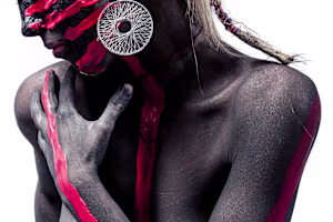
I had the honor of being part of the brand creation back when it was called Valhalla and operated only as an açaí shop. Over time, the business grew and became a well-known burger restaurant in the region.
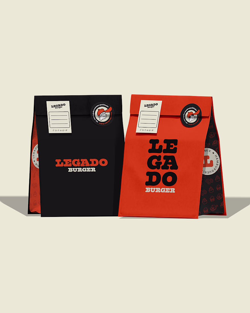
However, there was an important problem: people had difficulty pronouncing and remembering the old name. To preserve the essence and legacy of Valhalla, Legado Burger was born.
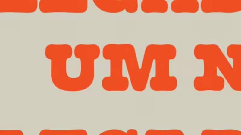
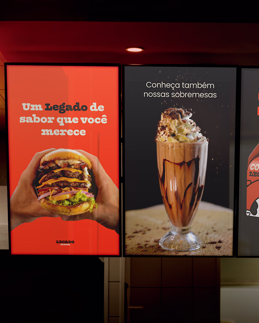
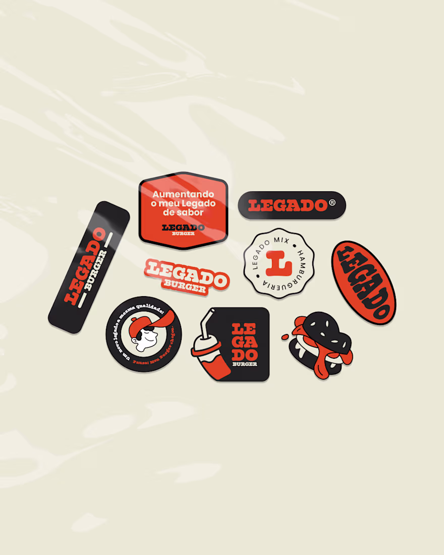
Visually, the changes were also significant. The purple and yellow palette was replaced by black and orange, creating a warmer, more vibrant atmosphere connected to the burger universe. The typography became more rounded, reinforcing the brand’s personality.
In addition, the project gained several custom illustrations and the presence of the mascot Léo, helping strengthen the identity and connection with the audience.
🔥 Full project: https://contra.com/p/F7QsUElk-legado-burger?r=othiagotaos
Beautiful ❤️ work
Thanks!
yummmmmy!
🔥 🔥 🔥
Love this!
Thanks brow!
Amazing work!
Thank you! 😊
This has got character! Loved the colors and overall system. Super responsive.
Thanks a lot for that feedback, bro. Makes you want to order a burger from there, right? hehe
Absolutely! 💯
Great work!
Really like the thinking behind this. The new identity feels way more memorable and connected to the actual experience of the brand. The orange + black works so well here too 👏
That's great feedback, thank you so much!
Smart rename. The Valhalla → Legado move is the kind of brand surgery most agencies fumble — they’d redesign the logo and miss the pronunciation problem entirely. The black/orange swap also reframes the category from mythic-cold to appetite-warm, which is the right semiotic call...
vyudu.com
Vyudu Inc | Luxury Design & Brand Management for Fashion, Beauty, & Tech startups
We manage your digital brand to help you launch attractive websites, apps, content, and ad campaigns to generate online sales.
The network for creativity
Join 1.25M professional creatives like you
Connect with clients, get discovered, and run your business 100% commission-free
Creatives on Contra have earned over $150M and we are just getting started
Related posts
April Brand Designer Recap:
💜 7x Brand collabs posted
💜 1x Passion projects posted
💜 1x Client project posted
💜 491 new followers on Insta
💜 5x Client projects completed
💜 12x New enquiries
💜 7x Discovery calls
💜 2x Clients booked
Total Income: $10650
May is fully booked!! 🥳
Last spot left for June 👀
Great work!
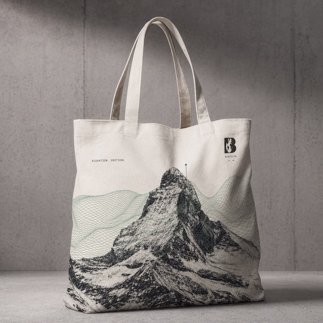
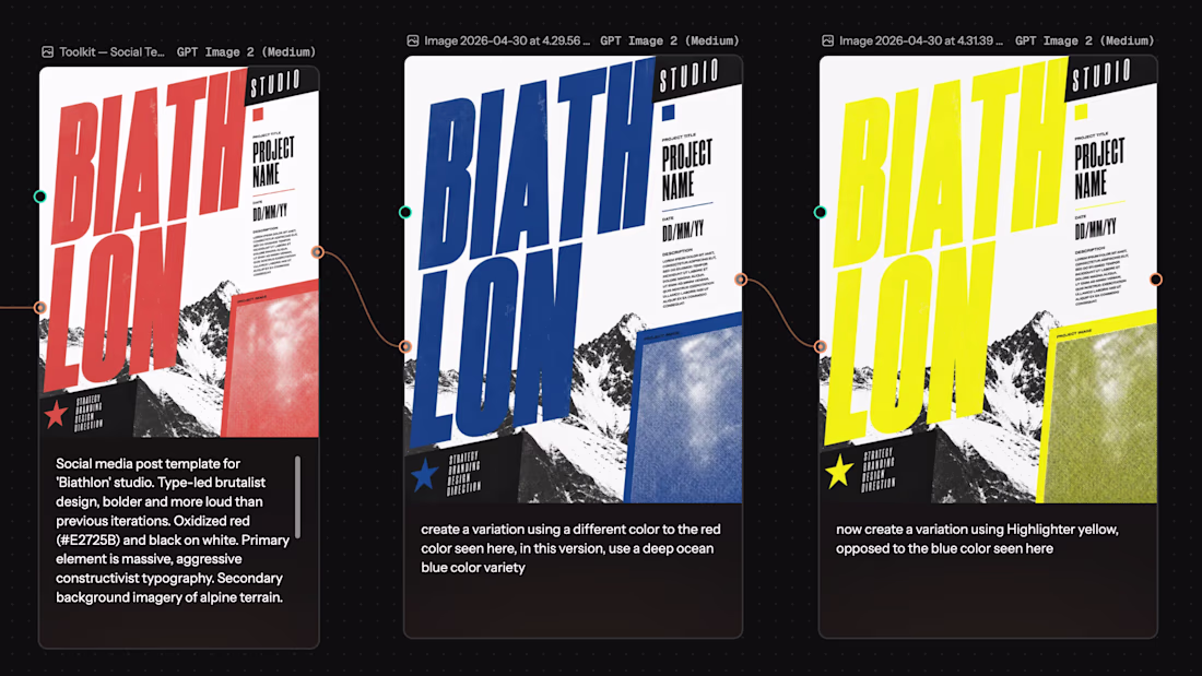
Used my own studio's brand development as the test case for Melius, an AI agent canvas. My results in this video: where it produced work I'd genuinely use and where I'd still bring in traditional production. Overall for early stage brand development, this is one of the most impressive tools I've used.
Excellent breakdown!
As a Social Media Manager, I’m always looking for ways to balance AI efficiency with a professional Structure. Knowing exactly where to step back into traditional production is how we maintain high-fidelity standards and real Visual Trust.
This looks like a game-changer for early-stage Visual Authority!
A few stills from my recent Melius session: the apparel collection and toolkit pieces that came out of one continuous brand exploration.
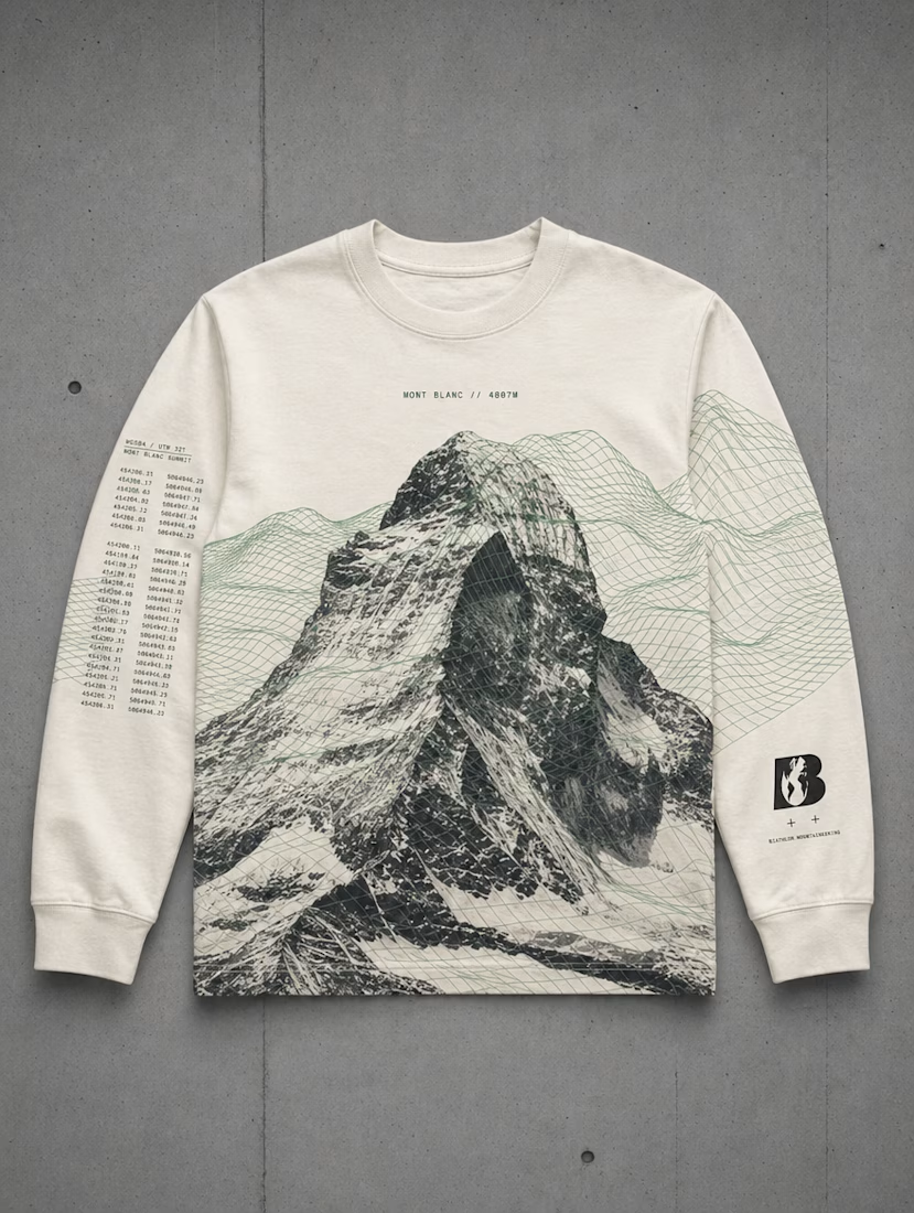
This work is SO fun! I love the sweatshirt design
Trending
Claude
Claude has entered the design space. How are you using Claude Design?
Contra University
Learn from expert creatives how to earn more using next-gen AI tools.
creativeaiflow
Creative AI workflows are evolving. What tools do you use, and what are their strengths and weaknesses?
portfolioreview
The best portfolios tell a story, not just show a grid. Share yours for feedback.
freelancerlife
Freelancer life is wins, pivots, and everything in between. What’s yours right now?