The network for creativity
Join 1.25M professional creatives like you
Connect with clients, get discovered, and run your business 100% commission-free
Creatives on Contra have earned over $150M and we are just getting started
Back to feedPost

Building Solvana, from rough type to final lockup 🧘🏽♂️
Solvana is a self initiated brand identity concept for a yoga studio. This video shows the full logo build in Illustrator.
The brief I set myself: the mark had to feel calm and in motion at once, the way a good flow class does.
What you’ll see:
→ The mark: a single dot and one flowing curve that read as a body mid-stretch
→ The wordmark: I took the crossbars out of the A’s so the letters feel open and light, then reworked the spacing letter by letter
→ The grid: horizontal and vertical guides that lock the mark and wordmark into one balanced system
The video covers the logo. The full Solvana case study shows the rest of the identity: the colour palette, typography and how the brand looks on real touchpoints.
See the full case study here: https://contra.com/p/A6YQ6LOr-solvana-brand-identity-for-a-calm-modern-yoga-studio
If you’re building a wellness, lifestyle or studio brand and want an identity with this kind of intention behind it, send me a message.
#Brand Identity #Logo Design #Brand Strategy #Visual Identity #Wordmark #Typography #Adobe Illustrator #Wellness #Branding #Yoga Studio Branding #Design Process

This is a great example of thoughtful design.
The network for creativity
Join 1.25M professional creatives like you
Connect with clients, get discovered, and run your business 100% commission-free
Creatives on Contra have earned over $150M and we are just getting started



Related posts

What should a beekeeping website explain before asking someone to choose a hive?
For Bee Girl, I designed and built a complete Shopify website around a clear journey: meet the colony, understand what’s inside a nucleus hive, compare the options, and connect with the beekeeper.
Honey yellow, hive black, warm cream, and bold typography bring the same visual language across desktop and mobile layouts.
One design decision that ties it together: the page explains the colony and its five frames before introducing the hive-quantity choices. Education gives the product selection context.
I handled the complete website project for the client through Fiverr, using Shopify. This video walks through the homepage.
Which would you explore first—the hive options, field classes, or the beekeeper’s story?
Explore the full Bee Girl case study: https://contra.com/p/WqNFR67b-bee-girl-shopify-website-design-for-beekeeping
If you’re building a Shopify website for a specialist business, I’m available for website design and development projects.


I'd open the hive options first, but only because the colony section already told me what I'm buying. Explaining the five frames before the quantity choice is a smart order. Teaching before asking someone to choose is so underrated in Shopify stores.

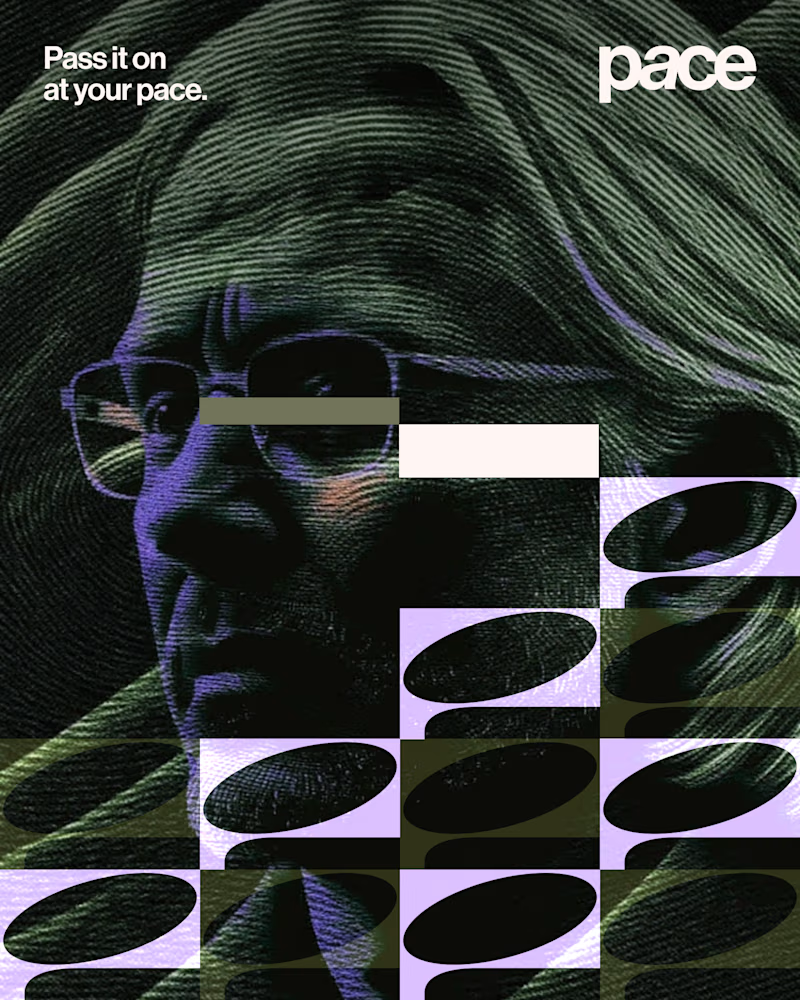
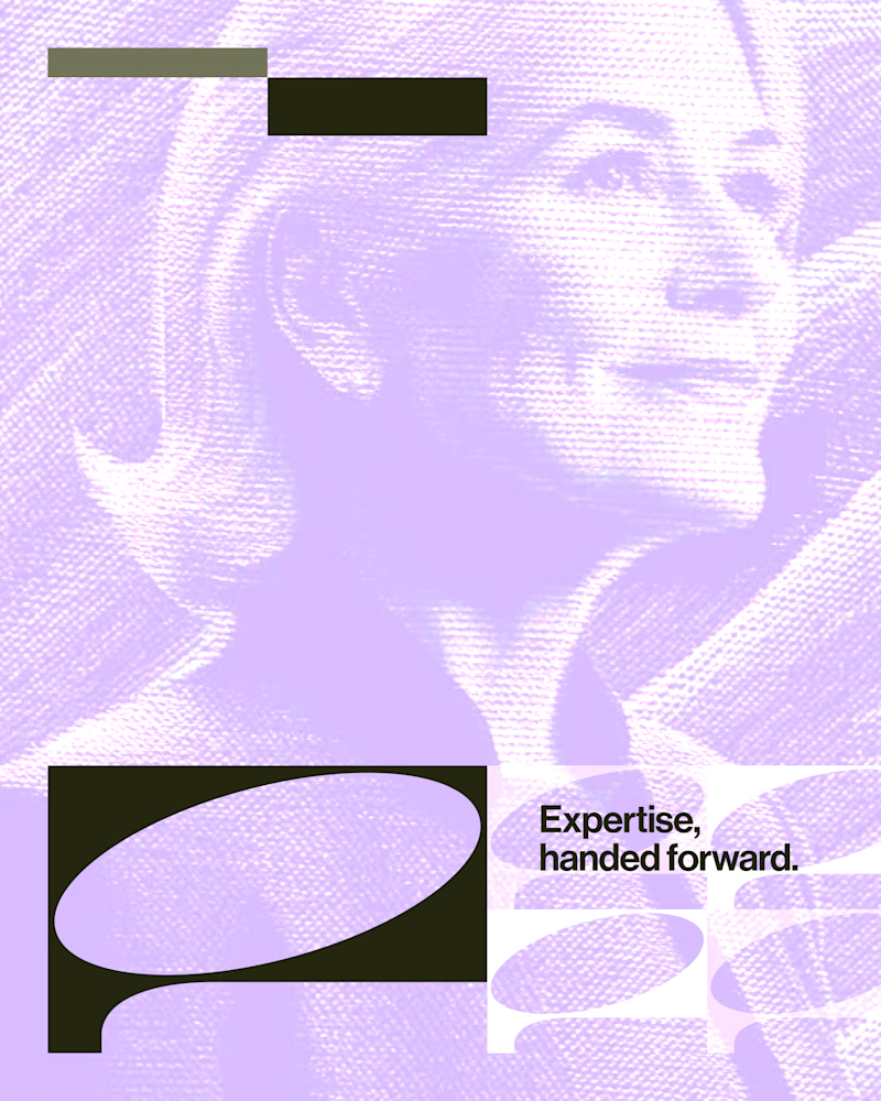
Experimental layouts for Pace. Which one do you like?
23 voted
52%
21 voted
48%
44 votes
Closed

Looks cool.

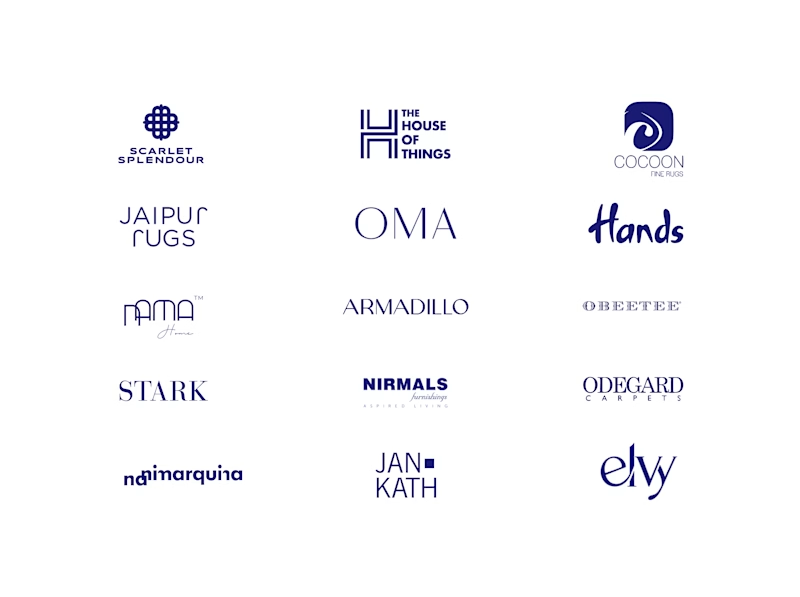
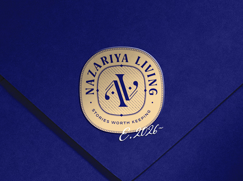
A little look at how Nazariya Living stands apart from its category.
On one side, familiar visual conventions. On the other, an identity with its own character, rooted in stories worth keeping.
We chose not to blend in. :)
Which side catches your eye?


3 voted
30%
7 voted
70%
10 votes
Closed

That side with all the competitor logos in one grid is the slide I'd steal for a client presentation. Nothing explains "why this direction" faster than showing the sea of sameness first. The navy seal wins easily after that.

