The network for creativity
Join 1.25M professional creatives like you
Connect with clients, get discovered, and run your business 100% commission-free
Creatives on Contra have earned over $150M and we are just getting started
Back to feedPost




stunning palette, plus, that's a logo to remember! the layers of thought are so clear.

Great work. Not sure why this is rejected?

That mark alone is stronger than most final logos I see posted here, and the color story underneath is genuinely one of the nicer palettes I've seen this week. What was the client's reasoning for passing on it, a fit issue or more a gut "not quite us" call?


wait this was rejected? it's good

Nice job I don't like dark colors but you do a good job in balancing everything nice work 🎉🎉


Nice work👏🔥🔥


Great work!

I honestly this looked great! Do you mind sharing why they ended up rejecting it? I’m really curious to hear what their feedback was.

The palette and layered mark are really nice.

The colors are so Good😍


🔥 🔥

this is beautiful
btw what tool did you to do this motion

Really solid work 👏 Even the archived directions show such an incredible level of craft and polish.

Nice work man

Curious, what was the reason?

Woww and this is cool

rejected directions are my favourite posts on here. what was the reason it didn't make it?

That APS mark built from little petal-people is lovely, community and care in one symbol. Wild that this was the rejected direction, it is strong enough to be someone's final. Sharing the roads not taken is honestly more useful than only showing winners.

🔥 🚀

nice

The typography choice works perfectly with the symbol.

I love it! Definitely curious to see what the final direction will be.
Nice branding kit I like the color palette you use good job 🎉🎉

This is pretty impressive! Now I’m anxious to see the one that was accepted, or is it just me? 🤲🏽😭

Looks🔥

Awesome

😍

It is looking great... Why was it rejected?

Really clean, nice direction
The network for creativity
Join 1.25M professional creatives like you
Connect with clients, get discovered, and run your business 100% commission-free
Creatives on Contra have earned over $150M and we are just getting started









Related posts

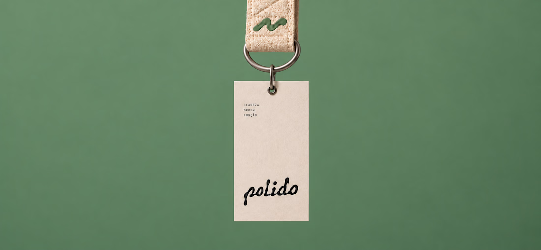
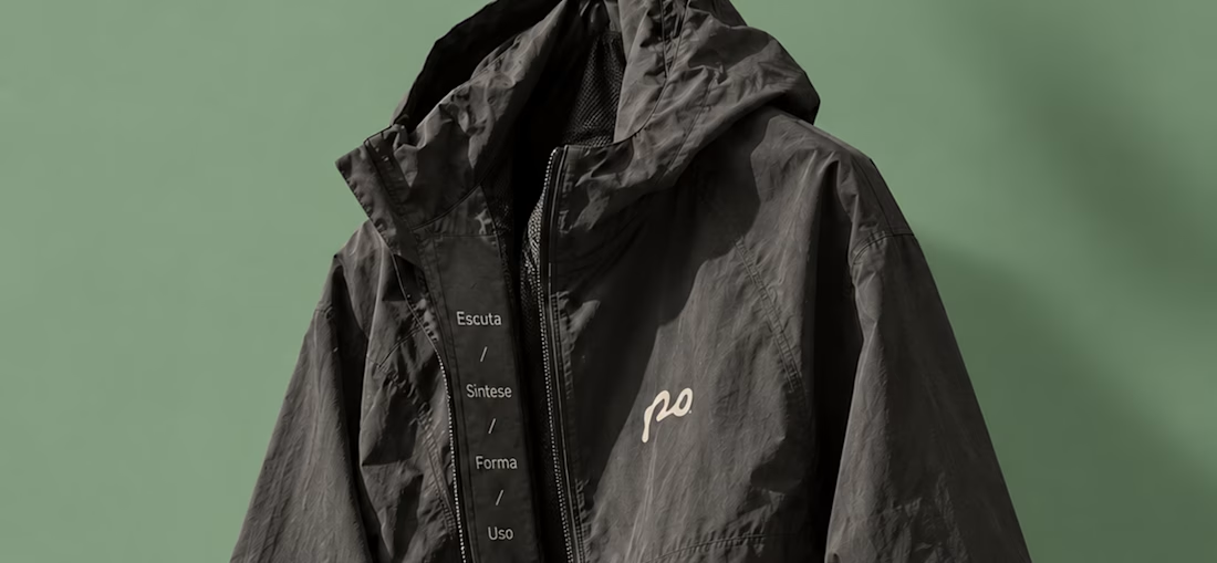
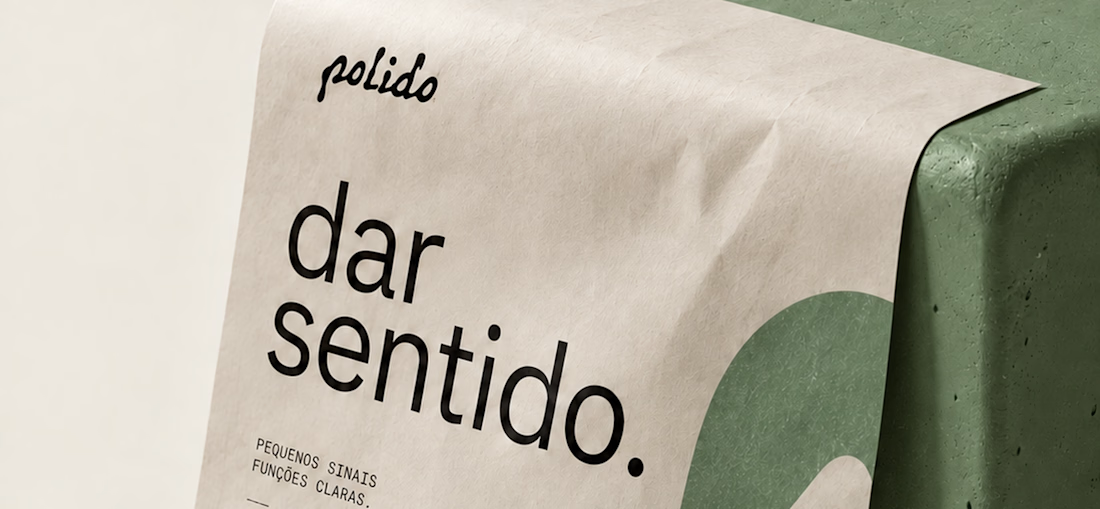
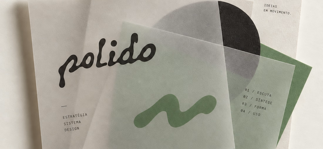
POLIDO — Brand Identity & Visual System
POLIDO is the visual identity of my independent brand design practice, shaped by a process of listening, synthesis, form, and use.
The identity brings together a hand-drawn signature, restrained typography, tactile materials, and a palette of warm paper, graphite, and Basil green.
From printed matter to apparel and physical applications, the project explores how a consistent visual language can adapt to different materials and contexts while maintaining its character.
Scope: Brand Strategy, Visual Identity, Art Direction, and Mockup Design.


High end branding



One letter. Eight personalities. 🔤
I explored the letter S in 8 different directions: soft and rounded, sharp and angular, bold and blocky, and fast like a bolt.
Same letter, same white-on-black treatment. The only thing that changes is the character.
Each mark could suit a different kind of brand, from tech and sports to fintech and lifestyle.
Which S would you pick, and what kind of brand would it belong to? Drop the number below. 👇
Looking for a logo mark or a full brand identity? My services are on my profile.
S letter designs is the best ❤️
Great job Shahwaiz🔥🔥


🌲 Nordhaus | Prefab Timber Homes Website (Framer)
Homes that grow quietly with the forest, now on the web. 🏡
Nordhaus is a website for a Latvian builder of prefabricated timber homes, created in Figma and built in Framer as a responsive site for desktop, tablet and mobile. It brings the brand's calm Nordic character through full-screen photography, a scroll-driven process story, a horizontal model gallery and interactive testimonials.
✨ Template coming soon to Framer.

Wonderful design man