The network for creativity
Join 1.25M professional creatives like you
Connect with clients, get discovered, and run your business 100% commission-free
Creatives on Contra have earned over $150M and we are just getting started
Back to feedPost

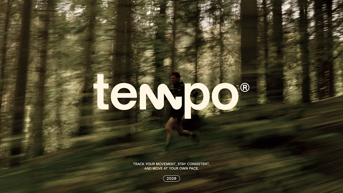
One of my first solo projects for an AI startup, around two years ago.
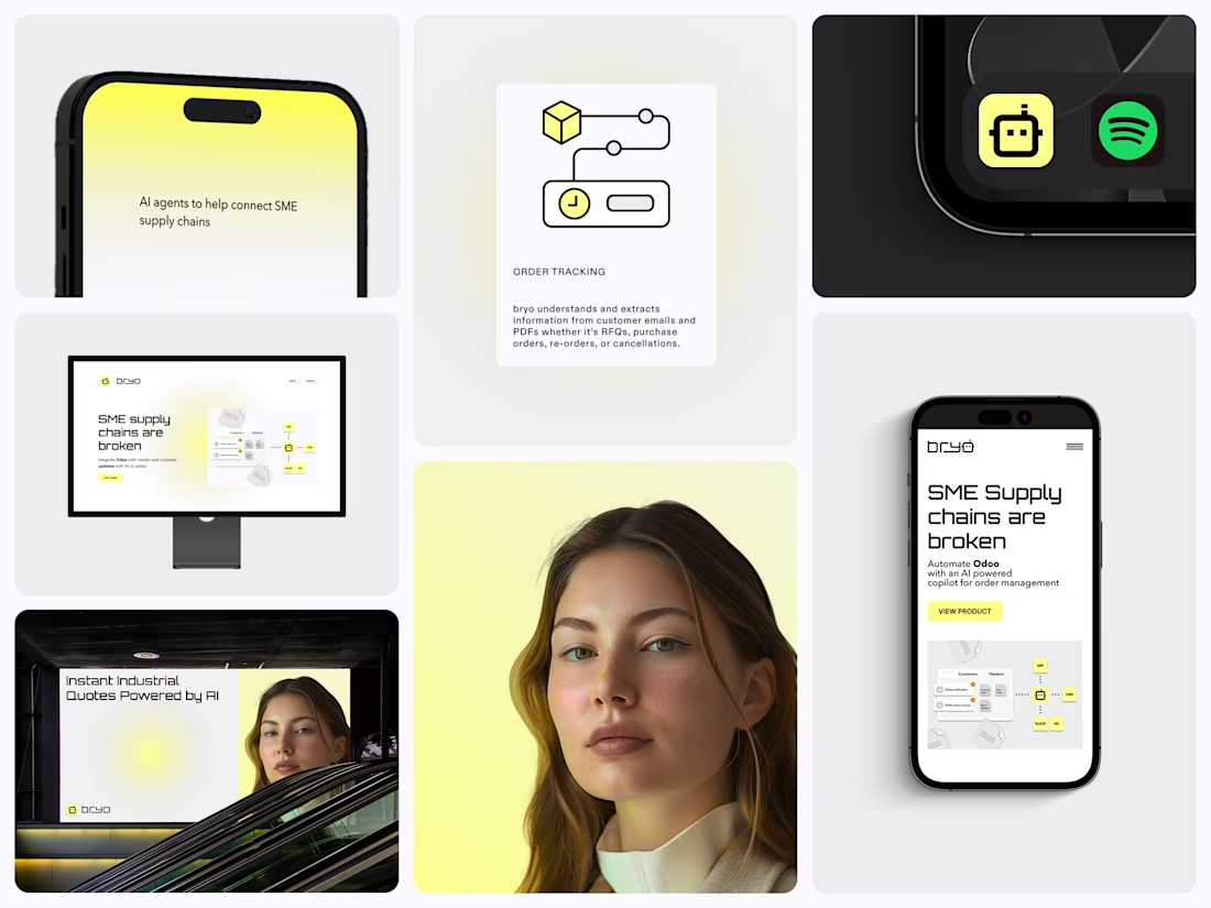
I worked directly with BRYO’s two founders, taking the brand from early strategy through to a complete visual system and the touchpoints they needed to start putting it into the world.
Looking back, there’s a lot I’d approach differently now. But that’s also what I like about revisiting older work. It was a huge learning experience and one of the first projects where I got to think about a brand as a whole system, not just an identity.
And the nice part: it did its job.
The brand carried BRYO through those early two-person stages, and the identity is still part of the company today as they’ve secured funding, grown the team and moved forward with a pretty ambitious vision for industrial AI.
Finally put the full case study together here ↓


Premium Design :)
Thank you Umar!

Going from two founders and an early strategy doc all the way to a full visual system is a huge jump, especially for an AI startup where the product itself is hard to visualize. Looking back now, what's the one part of that early strategy that you'd push back on harder if you did it again?
Looking back now I would have focussed more on tone of voice and copywriting. The visual system worked well but the explanation of the product changed frequently.
Thankfully the design system kept up with this. However, it lead to a lot more work than needed. Part of that...


the yellow phone screen is fun next to the black Spotify card. how many screens did you make?
The yellow was actually a really fun design decison to see work out. Pictures from the job fair and booth designs made bryo stand out.
Screen wise I just created the design system and website for the product. I was not responsible for the application design or dashboard.

Thank you Komu!

Love seeing work that actually grows with the business. Taking a brand from a two-person startup through funding and team growth says a lot about how strong the original foundation w
Rewarding to see your work still serviving after funding and growing!

i love this premium work

Nice work

Having only the required things in UI - is my fav. thing 🙌

I love it!

Very well done

What a creative choice. 👍
How long did it take?

Nice work

Love this kind of reflection. The projects where you're figuring out the system, not just the logo, are the ones that actually teach you how to think as a designer. Early work doesn't need to be perfect to be foundational. Great milestone for BRYO too.
The network for creativity
Join 1.25M professional creatives like you
Connect with clients, get discovered, and run your business 100% commission-free
Creatives on Contra have earned over $150M and we are just getting started



Challenges
View all


Related posts


Like the word mark

Both on-brand. Just two different sides of the same story.
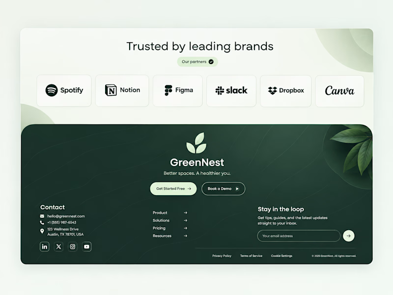
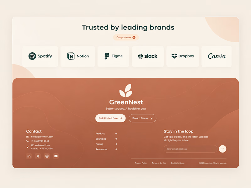
Which color would make you trust "better spaces, a healthier you" more? 👇
44 voted
100%
0 voted
0%
44 votes
Closed


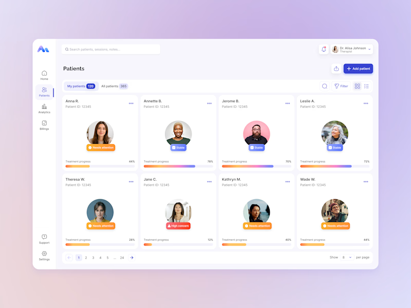
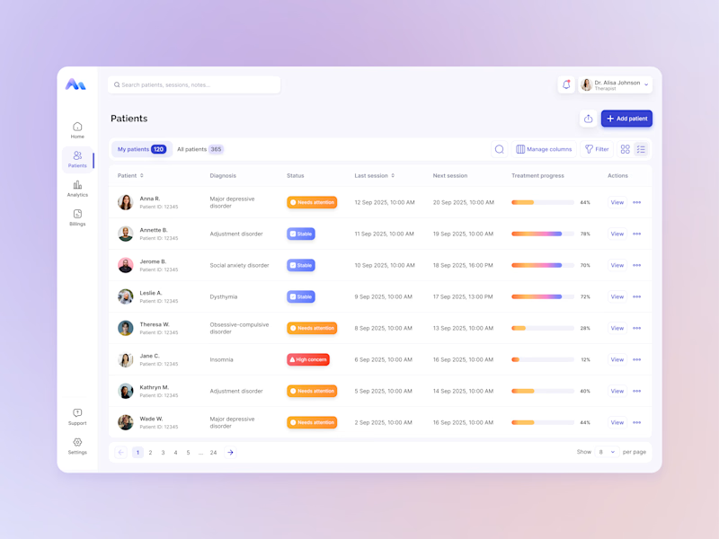
Same data, two different ways to experience it 🤔
I explored two patient list layouts for a mental health platform: a card view and a table view.
Cards feel more visual and personal, but space is limited and adding more information can quickly make them crowded. For complex enterprise products, I often find tables more practical — they’re easier to scan, compare, sort, and can support more columns when users need greater visibility.
For this kind of workflow, I’m leaning toward the table view. Which would you choose — cards or table?
11 voted
55%
9 voted
45%
20 votes
Closed

For a mental-health patient list the choice isn't really card vs table — it's scan-speed vs context. The card wins the first meeting because the photo and name set the clinician's mental model before they touch the row, but the table is what holds up under the daily rhythm of...