The network for creativity
Join 1.25M professional creatives like you
Connect with clients, get discovered, and run your business 100% commission-free
Creatives on Contra have earned over $150M and we are just getting started
Back to feedPost

Everyone thinks a data dashboard should look complicated.
I think that is exactly why most of them fail.
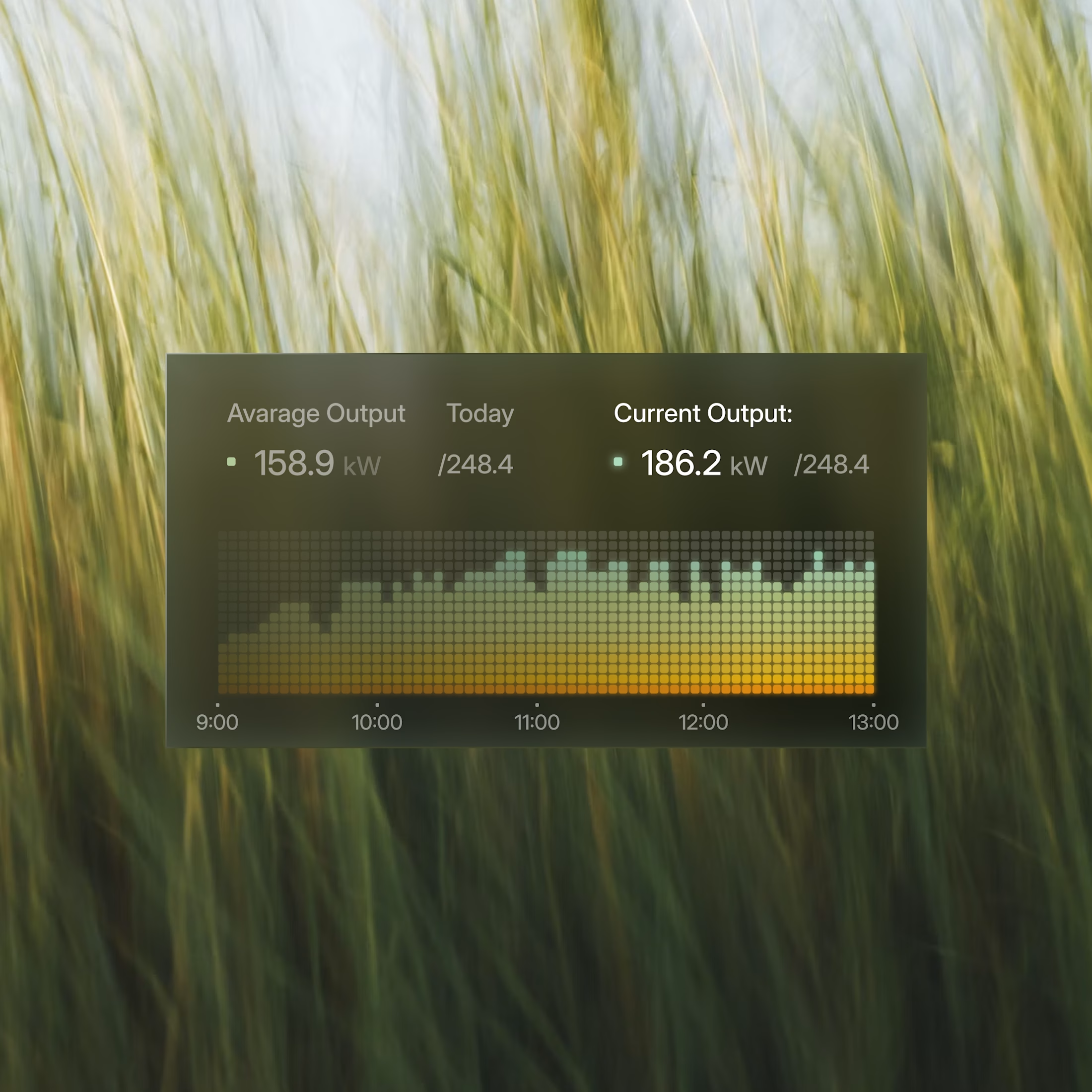
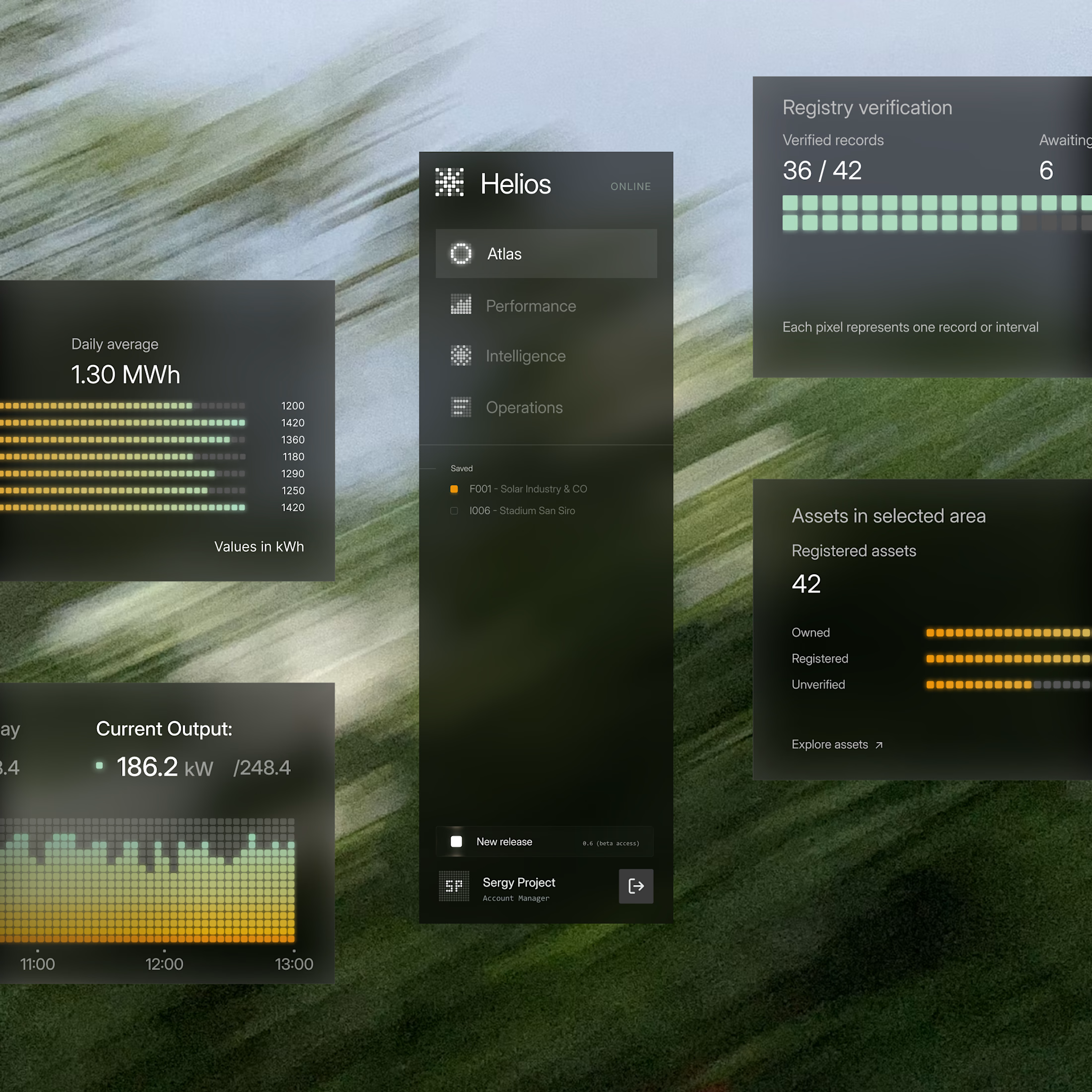
I just finished Helios, a tool that tracks solar energy assets in real time. Dozens of sites, live output, verification records, a wall of numbers. The kind of screen people drown in.
Most designers would make it feel technical. More lines, more glow, more charts. I did the opposite. Every number had to answer one question in half a second, is this good or is this a problem. If it could not, it lost its place.
Because design is not decoration, it is closer to math. It is deciding what to remove until only the truth is left.
Complexity was never the enemy. Confusion is.
Get that right, and people trust you before you have said a word.


helios looks calm. those green bars too?

Love this!

Clean and smooth like butter
The network for creativity
Join 1.25M professional creatives like you
Connect with clients, get discovered, and run your business 100% commission-free
Creatives on Contra have earned over $150M and we are just getting started

Challenges
View all


Related posts

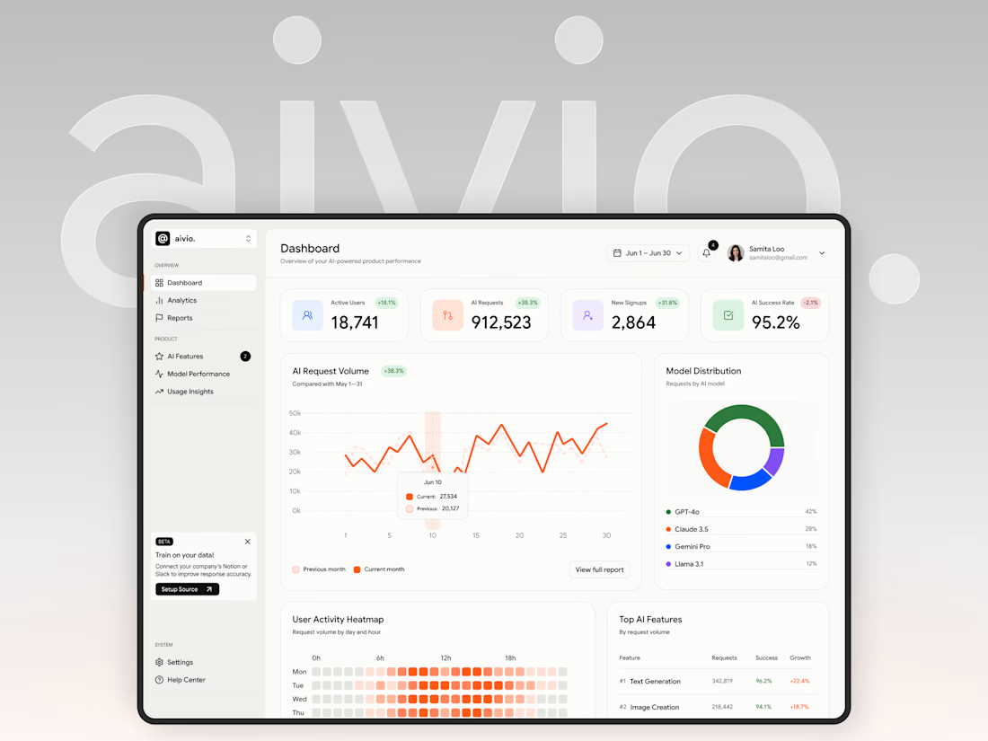
I made this project around a pretty data-heavy product, and I actually really enjoyed working with all that information.
A big part of the process was figuring out different ways to organize metrics, charts, and numbers, and deciding what should be more visible, what could stay secondary, and how everything should work together on one screen.
It was fun to explore different layouts and find clearer ways to present complex information without making the interface feel overloaded.


Choosing what deserves emphasis is the real challenge in data-heavy UI.

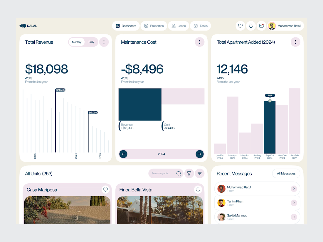
Real Estate SaaS Dashboard
Real estate software often sits on top of a large amount of operational data.
Properties, leads, deals, revenue, tasks and performance all need to be visible without turning the product into an information wall.
For this dashboard concept, the design process started with hierarchy.
The most important metrics get immediate visibility. Supporting information is organized into focused sections, while actions remain close to the data they relate to.
The result is a SaaS interface designed around clarity, decision-making and everyday workflow.
Focus: Real Estate SaaS · PropTech UI/UX · Dashboard Design · Data Visualization · Property Management Software
The goal wasn't to make the product look complex.
It was to make a complex business easier to operate.
Designed by WaxyWeb.
Working on a SaaS or PropTech product?
hello.waxyweb@gmail.com
www.waxyweb.com

great one

Good UI gets attention. Good UX keeps people using the product.
I focus on designing interfaces that feel simple, clear, and intentional, from the first interaction to the final action.
That means:
• Clear user flows
• Strong visual hierarchy
• Consistent design systems
• Responsive interfaces
• Less friction, fewer unnecessary steps
The goal isn’t to make a product look good.
It’s to make it feel easy to use.