The network for creativity
Join 1.25M professional creatives like you
Connect with clients, get discovered, and run your business 100% commission-free
Creatives on Contra have earned over $150M and we are just getting started
Back to feedPost
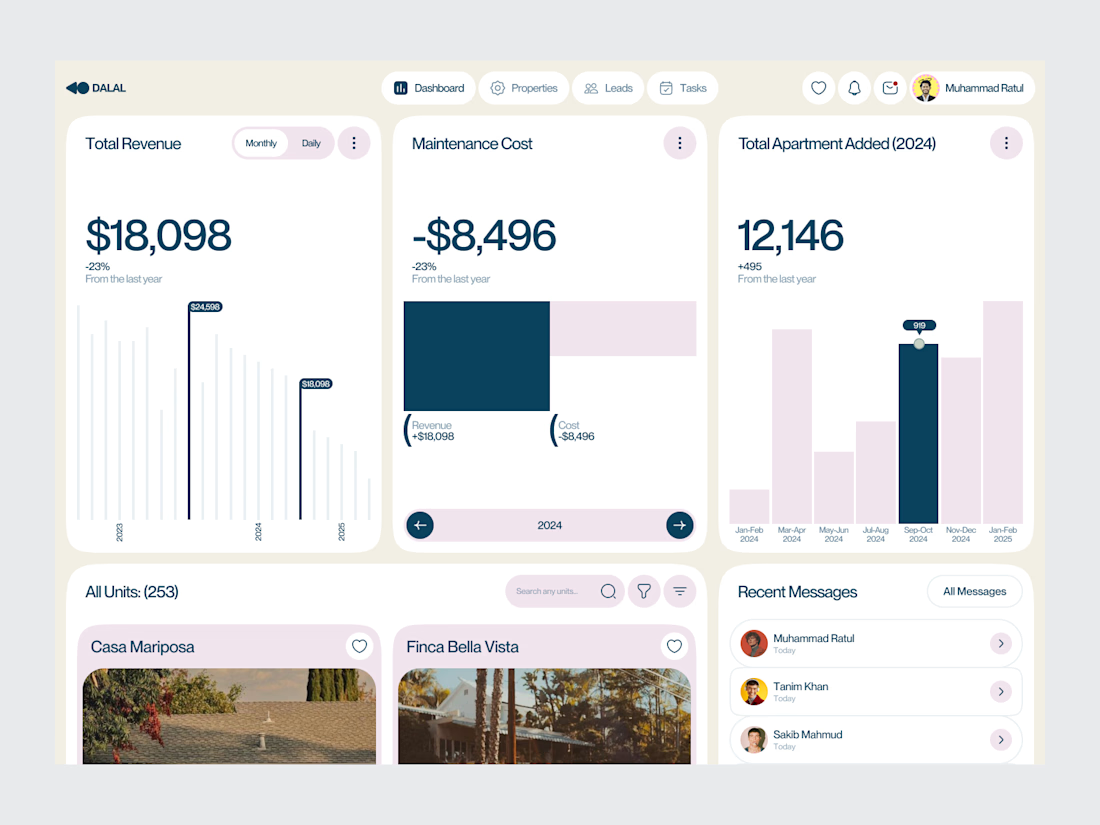
Real Estate SaaS Dashboard
Real estate software often sits on top of a large amount of operational data.
Properties, leads, deals, revenue, tasks and performance all need to be visible without turning the product into an information wall.
For this dashboard concept, the design process started with hierarchy.
The most important metrics get immediate visibility. Supporting information is organized into focused sections, while actions remain close to the data they relate to.
The result is a SaaS interface designed around clarity, decision-making and everyday workflow.
Focus: Real Estate SaaS · PropTech UI/UX · Dashboard Design · Data Visualization · Property Management Software
The goal wasn't to make the product look complex.
It was to make a complex business easier to operate.
Designed by WaxyWeb.
Working on a SaaS or PropTech product?
hello.waxyweb@gmail.com
www.waxyweb.com


Excellent 👌🏻

Awesome 👍

great one
The network for creativity
Join 1.25M professional creatives like you
Connect with clients, get discovered, and run your business 100% commission-free
Creatives on Contra have earned over $150M and we are just getting started

Challenges
View all


Related posts

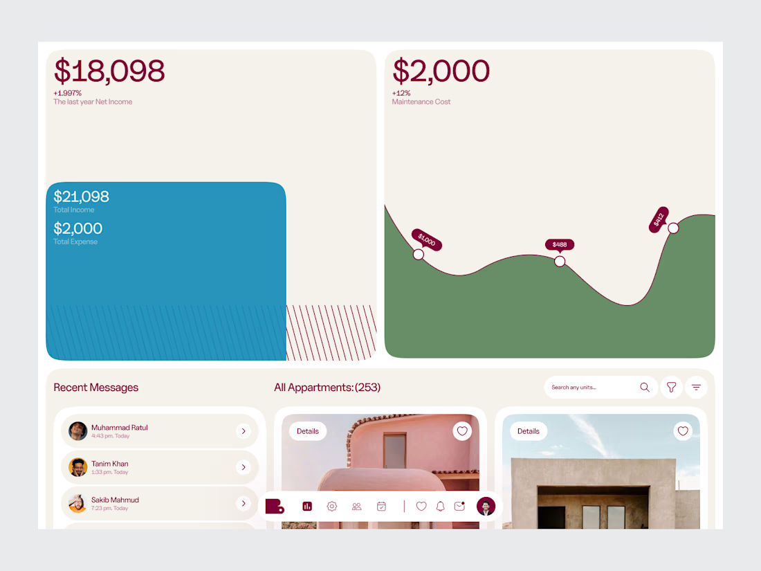
Real Estate Analytics & Listing Dashboard
A PropTech dashboard concept combining property listing management with real estate analytics.
The workspace is structured around the information a real estate team needs to monitor and act on — property inventory, listing activity, performance metrics and business insights.
The design approach puts hierarchy first, keeping a data-heavy product organized without making it feel overwhelming.
Design focus:
• Real Estate SaaS
• Analytics Dashboard
• Property Listing Management
• Data Visualization
• PropTech UI/UX
• Product Design
• Business Intelligence
Designed by WaxyWeb.
Nice

More from ARDA®, a look at the desktop experience.
A, editorial approach to presenting architecture, built around typography, grid and imagery.


When u realize, there are websites with crazy animation but simple web like this has more conversations rate


aftrglo has been live for a month ✨
It's a browser-based tool with animated templates I'm building for designers and creatives who want to present their work online with motion, without having to do it from scratch.
Pick a template -> add your visuals -> play with the settings -> export
Here's what's happened in the first month:
• People are using the thing I made. Aaaa 🥹
Seeing aftrglo in other creatives' posts and projects has been such a joy.
• The feedback is coming in.
People are sharing their impressions, ideas, and wishes. I'm learning how aftrglo fits into their creative process.
• That feedback is helping it grow.
We've spotted a few bugs together, and I've been making fixes and updates along the way.
• The editor is getting a new look.
I've redesigned the controls to make the interface feel calmer and easier to navigate.
• Of course I made more templates 👀
Four new templates and updates to existing ones. More possibilities, while keeping the process simple.
Something that once felt like a distant little dream is now helping creatives with their work. They've told me, and I'm still taking that in.
I’m making it myself, while balancing a full-time job and a life I want to be present for. Progress happens in the time I have, and I’m proud of how it’s growing
Still very much in love with building this ✨