The network for creativity
Join 1.25M professional creatives like you
Connect with clients, get discovered, and run your business 100% commission-free
Creatives on Contra have earned over $150M and we are just getting started
Back to feedPost

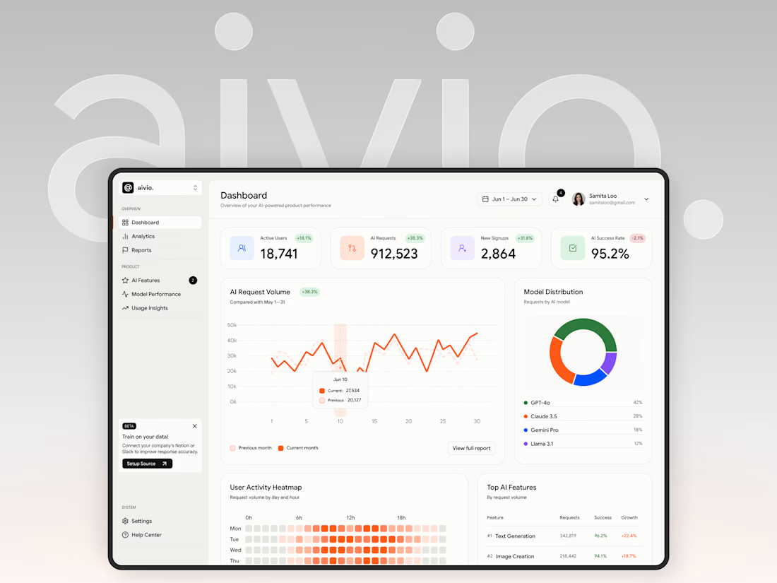
I made this project around a pretty data-heavy product, and I actually really enjoyed working with all that information.
A big part of the process was figuring out different ways to organize metrics, charts, and numbers, and deciding what should be more visible, what could stay secondary, and how everything should work together on one screen.
It was fun to explore different layouts and find clearer ways to present complex information without making the interface feel overloaded.


This is a great example of making dense information feel approachable. The hierarchy between the headline metrics, charts, and activity details gives the dashboard a clear reading path without flattening the product's complexity.

Choosing what deserves emphasis is the real challenge in data-heavy UI.
The network for creativity
Join 1.25M professional creatives like you
Connect with clients, get discovered, and run your business 100% commission-free
Creatives on Contra have earned over $150M and we are just getting started


Challenges
View all


Related posts

Designed a dashboard concept for tracking net worth across every asset type — stocks, crypto, property, pensions, funds, cash, and liabilities — all in one place.
Instead of the usual pie chart or bar graph, the centerpiece is a dial: a single, glanceable gauge showing where your wealth actually sits. Behind it, a quiet grid of every asset category fades in and out of visibility, reinforcing that everything's accounted for even when it's not the focus.
Dark UI, a single confident green accent, and a lot of negative space — built to make a genuinely overwhelming task (seeing your entire financial picture at once) feel calm instead of cluttered.


wow the animation feels super smooth, what is this animation for?


Spent the last few months rebuilding the digital presence for Shiva Group, a multi-brand automotive dealership group running JLR, Mahindra, Triumph, KTM, Bajaj, and MG Select showrooms across North India.
New site architecture, cleaner model pages, a live outlet locator across 50+ locations built entirely on Framer. Genuinely happy with how it turned out, and it's already paying off for them too, with $1.2M+ in vehicle bookings coming through the site in the first month!

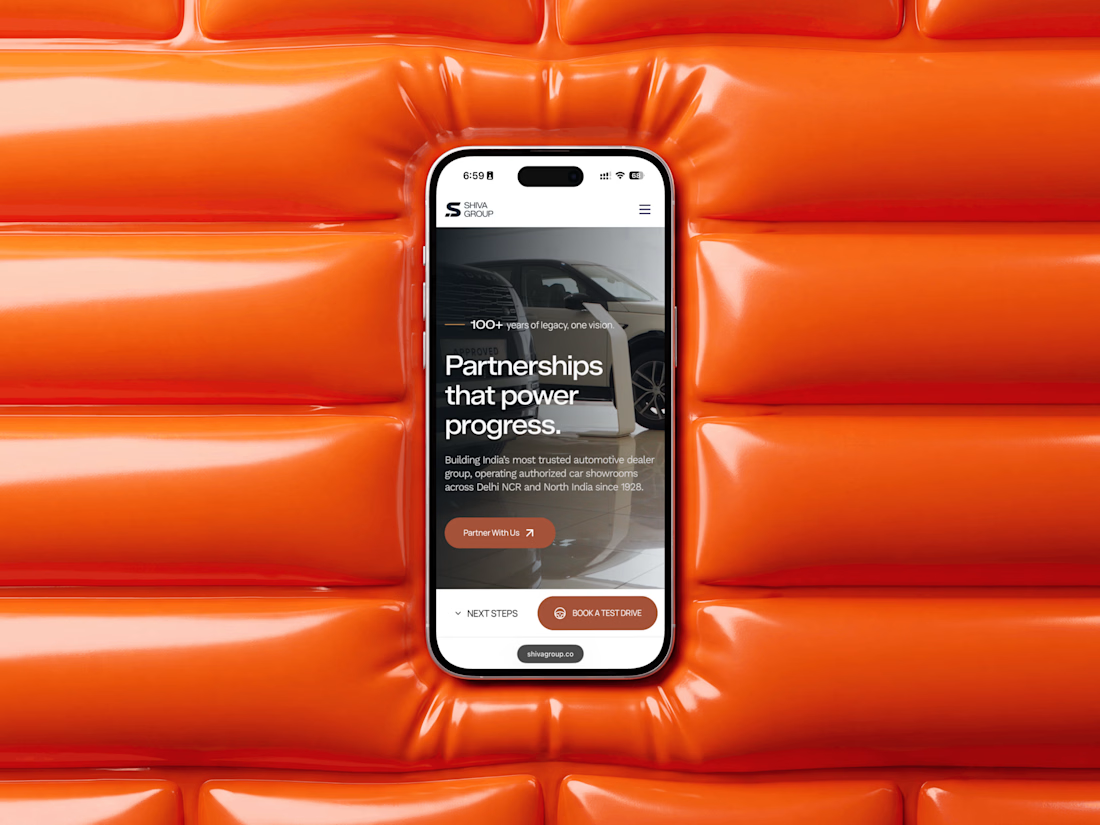

Running JLR, Mahindra, Triumph, KTM, Bajaj and MG under one coherent site architecture without it feeling generic is genuinely hard, those brands pull in very different visual directions. How much did each individual brand's voice have to bend to make the system hold together?

Working on the homepage for Still Blooming, a wedding and floral studio, I explored two different layout directions for the hero section. Same brand, same copy, just a different structure and visual rhythm.
Option 1 : Left Aligned. Text sits on the left with supporting content beside it, giving an editorial, asymmetrical feel.
Option 2 : Centered. Everything is stacked and centered, giving a clean, balanced, more classic hero layout.
Would love your honest UX/UI take which direction feels more elegant, functional, and true to a wedding/floral brand, and why?
22 voted
41%
32 voted
59%
54 votes
Closed

Great Design :)