The network for creativity
Join 1.25M professional creatives like you
Connect with clients, get discovered, and run your business 100% commission-free
Creatives on Contra have earned over $150M and we are just getting started
Back to feedPost

Designed a dashboard concept for tracking net worth across every asset type — stocks, crypto, property, pensions, funds, cash, and liabilities — all in one place.
Instead of the usual pie chart or bar graph, the centerpiece is a dial: a single, glanceable gauge showing where your wealth actually sits. Behind it, a quiet grid of every asset category fades in and out of visibility, reinforcing that everything's accounted for even when it's not the focus.
Dark UI, a single confident green accent, and a lot of negative space — built to make a genuinely overwhelming task (seeing your entire financial picture at once) feel calm instead of cluttered.


The dial is a strong choice for this dashboard because it turns a dense asset picture into one glanceable anchor. I’d keep the surrounding labels extremely quiet so the gauge owns the first read without losing the detail layer.
The network for creativity
Join 1.25M professional creatives like you
Connect with clients, get discovered, and run your business 100% commission-free
Creatives on Contra have earned over $150M and we are just getting started
Trending
retrofuturism
Share your favorite designs from the past exploring the distant future. Or your own take on the aesthetic 🚀
halftone
Dots. Texture. Grain. Let's see your designs using the halftone technique.

Midjourney
Creatives are showing off what they're making with Midjourney.
colorgrade
Video editors sound off: How do you enhance the mood of your video in color grading?
Related posts

Day 8/30 of designing one hero section every day.
Today: Cerro, a single-origin coffee brand. And after three days of building reveal mechanics, this one has almost no interaction at all.
→ The photograph is the design. An overhead shot of a picker at work, dark glossy foliage, red cherries. My only job was to not get in its way.
→ The light does the layout for me. The image funnels attention to the center, so the type sits in the shadowed edges where it doesn't compete. No scrims, no overlays needed.
→ The only motion is an entrance: the wordmark alone on empty plants, then the picker fades in.
Credits: Arbi Khan for the template
Image: Google Nano Banana
Built in Framer
8 down, 22 to go.


A new hero section every day for 30 days is a brutal pace. Eight days in, is it getting harder to avoid repeating yourself, or is the constraint actually making ideas come faster?




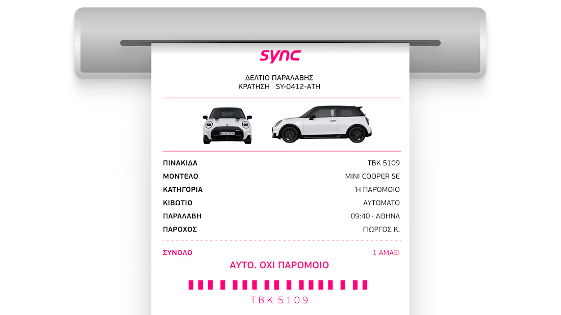
The "or similar" clause is a relic of bad operations.
In car rentals, it’s the standard excuse for a bait-and-switch. You book a specific experience and get whatever is left on the lot.
Design for Sync. We didn't just build a receipt. We built a guarantee. The exact plate, the exact model, the exact car. No "similar" allowed.
If your product can't promise the specific outcome, no amount of brand polish will save the experience.

Bravo