The network for creativity
Join 1.25M professional creatives like you
Connect with clients, get discovered, and run your business 100% commission-free
Creatives on Contra have earned over $150M and we are just getting started
Back to feedPost


New project in progress: the website for Adara, a residential architecture and planning practice in London. We'll post updates as the build comes together.
First, the services section on the homepage. As you scroll, the house comes apart floor by floor, and each service opens on the right, from planning advice to building regulations.


Ugh i love the breakdown 😍
🙏

Amazing presentation
thanks

thank you!

Thats really interactive to look at
🙌

Top tier. looking forward to see results
thanks, next week I will share more posts :)

Can't wait to see Adara come to life, Alex. The house coming apart floor by floor is such a lovely detail
thank you!


Looks super cool
🙌


Great Alex
thanks!
Pardon Alex❤️

Congrats!
👍

That floor-by-floor services reveal is a smart way to make a services list feel like the practice itself. Curious whether the scroll tie points were keyed to each floor's section or driven by a single range so the whole house collapses and reassembles in one gesture.

love it😍
🙌

The house coming apart floor by floor while each service opens on the right is a great way to make planning advice feel tangible. Looking forward to the next updates on Adara.

That floor-by-floor reveal is such a nice interaction. It makes the architecture feel part of the experience

clean animation, is that 3D model or a video?
Thanks! It’s a scroll-driven video, not a live 3D model.

nice

This is really nice how did you get the 3D house animation
Thanks! It’s a scroll-driven video, not a live 3D model.

wowww, this is already stunning!!!
thanks!

Wow, this project is amazing.

Impressive!

Using a scroll-driven video instead of a live 3D model is a smart call. You get the wow effect without the load time. Looking forward to the next updates.
tysm

So good!!

The house coming apart floor by floor as each service opens is such a fitting idea for an architecture practice. Way more memorable than a normal services grid, looking forward to the rest of the build.

The isometric house that breaks apart floor by floor as each service opens is a clever way to explain the offering. It's a smooth scroll interaction that's relevant to the architecture practice. Excellent Framer work, Alex.

Looks good!

The floor by floor split matches the services list really well. Does it hold up on mobile?


Fantastic work

Amazing craftsmanship and thoughtful design decisions

Very creative I love this

Really nice interaction! The floor-by-floor scroll animation makes the services section feel engaging while keeping the design clean and intuitive.
The network for creativity
Join 1.25M professional creatives like you
Connect with clients, get discovered, and run your business 100% commission-free
Creatives on Contra have earned over $150M and we are just getting started
Related posts

🚀 The Keel website is now live!
I designed Keel as a fintech website concept focused on presenting financial products through a clean layout, clear messaging, and a simple user experience.
I’ve also built the website in Framer. Check it out below!
🎨 Built with Framer: https://thekeel.site/
Always happy to hear your feedback!



Nice one

Built this free SaaS portfolio template in Framer a few months ago, and it’s been amazing to see the momentum it’s gaining! 🚀
It’s now ranked #18 in Framer’s Marketing category, bringing in more visibility, views, and commissions.
I’ve shared the full case study here, covering the project and how it came together.
Take a look if you’re curious! 🙌

Outstanding!


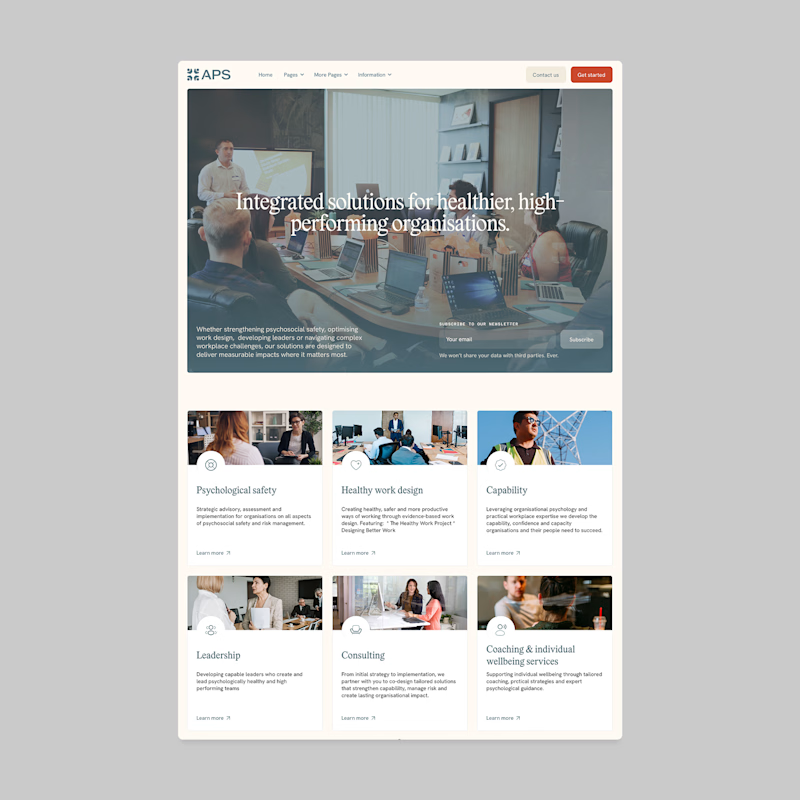
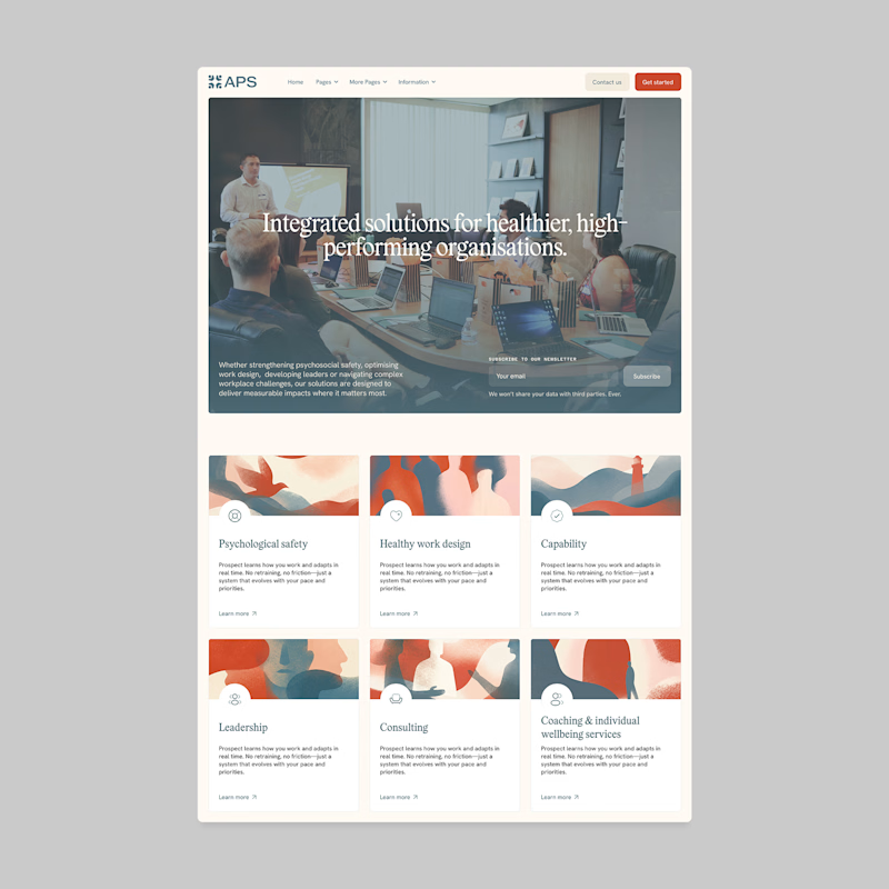
Designers, which direction would you go with: photography or illustration?
83 voted
69%
37 voted
31%
120 votes
Closed

I'll prefer photos, specially talking about organizations in your page, human faces and real scenarios can have a better effect in this case.


