The network for creativity
Join 1.25M professional creatives like you
Connect with clients, get discovered, and run your business 100% commission-free
Creatives on Contra have earned over $150M and we are just getting started
Back to feedPost
Taste Test

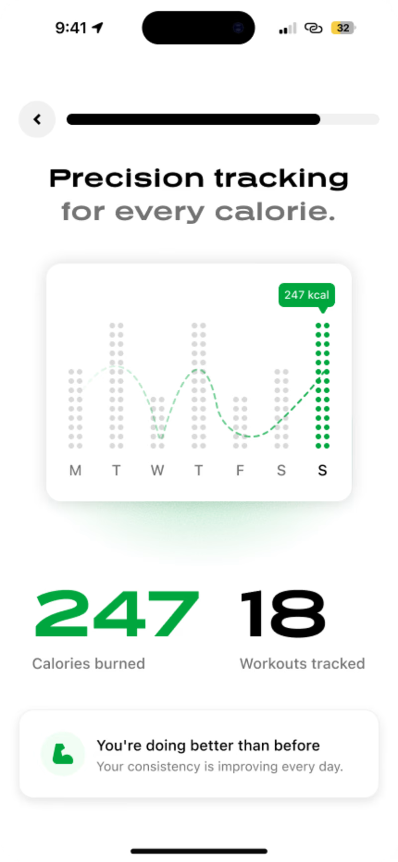
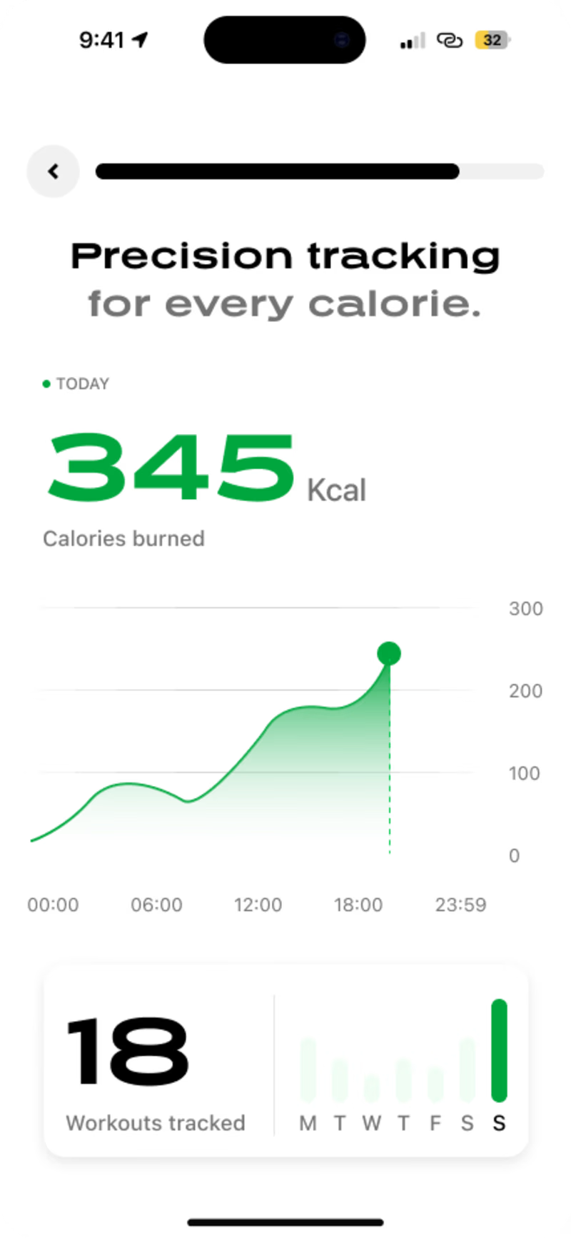
Recently I've been working on a wellness app onboarding.
Here are two different directions I'm exploring. I'd love to hear your thoughts. Which one do you like more? 👇

10 voted
43%
13 voted
57%
23 votes
Closed


Both looks great at design and feels accesible while pishes me to engage. Whilst second option isn't bad, i didn't feel the simplicity and act of engagement on that one. So i will go with the option B

Went with Option A, the encouraging line at the bottom does more for retention on day one than a bigger hero number. New users need reassurance before they need precision.

Option B looks great.


I did go for option B

as a user of fitness apps for years, i had to go for option a! i think highlighting the numerals together makes them clearer to the viewer, showing that the app erases any potential for confusion in asking them to register chart info primarily. great work!

Option B. Even though it looks pretty, the diagram on Option A is hard to understand as it doesn't have the y-axis.


Option B


Option B, I think what many miss about fitness apps, users want to see their progress in a clear visible form, so the progression graph is a win.
The network for creativity
Join 1.25M professional creatives like you
Connect with clients, get discovered, and run your business 100% commission-free
Creatives on Contra have earned over $150M and we are just getting started





Related posts

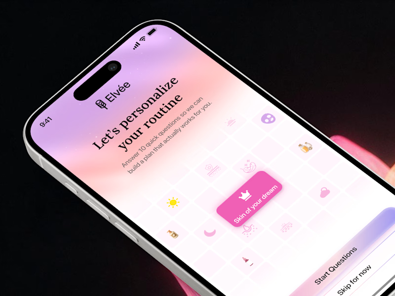
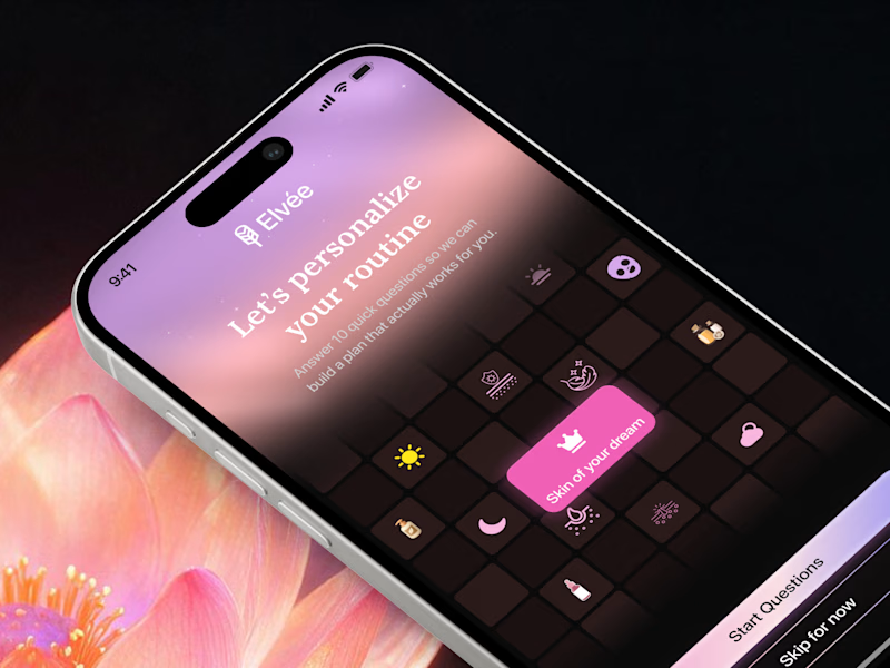
First impressions matter in onboarding 🌸 Which theme sets the right mood for a personalized wellness app? Drop your favorite light gradient or moody dark mode in the comments! 💬

7 voted
47%
8 voted
53%
15 votes
Closed

This year, I worked on a mental health app where I explored using water to represent brainwaves and quality sleep.
I think it communicates the idea much better than the typical green energy orb. 🌊
What do you think?
27 voted
43%
36 voted
57%
63 votes
Closed

Love the energy orb. which one is your pick here?

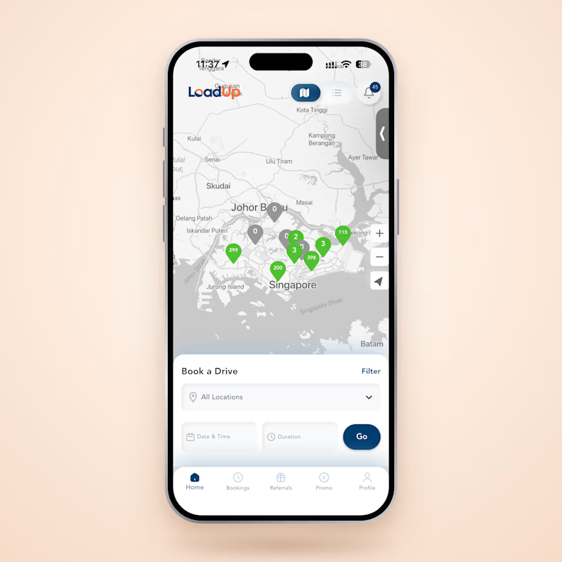
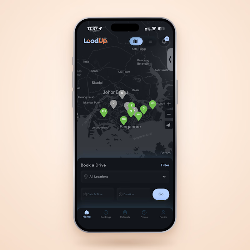
Adding dark mode to LoadUp, a van rental app I built with Flutter (4.5★, 5,000+ downloads).
Same booking screen, two themes. The map, pins and booking flow all have to work in both.
Which one would you use?

3 voted
33%
6 voted
67%
9 votes
Closed

Dark mode. Much stronger visual hierarchy and the green pins are far easier to scan at a glance.