The network for creativity
Join 1.25M professional creatives like you
Connect with clients, get discovered, and run your business 100% commission-free
Creatives on Contra have earned over $150M and we are just getting started
Back to feedPost
Taste Test

hey there 👋 I'm working on an AI startup that matches you with people who dress like you.
I made two intros for the site and honestly, I'm not sure which one to use. I have a slight favourite, but I want to see what everyone thinks first.
which one would you keep?
8 votes
Ends in 1d

I think first one looks clean!
thanks for voting 🙌 clean was the goal, so that's good to hear

For a 'people who dress like you' product I'd lean fast cuts, quick outfit flashes sell the matching idea before anyone reads a word. The grid could make a great second section once people want to browse. What's your slight favourite?
you guessed it, fast cuts is my favourite too 😄 the quick outfit flashes show the matching idea before any headline does. and the grid as a second section for browsing is a really good shout, I'm going to try that. thanks Steven!
The network for creativity
Join 1.25M professional creatives like you
Connect with clients, get discovered, and run your business 100% commission-free
Creatives on Contra have earned over $150M and we are just getting started


Related posts

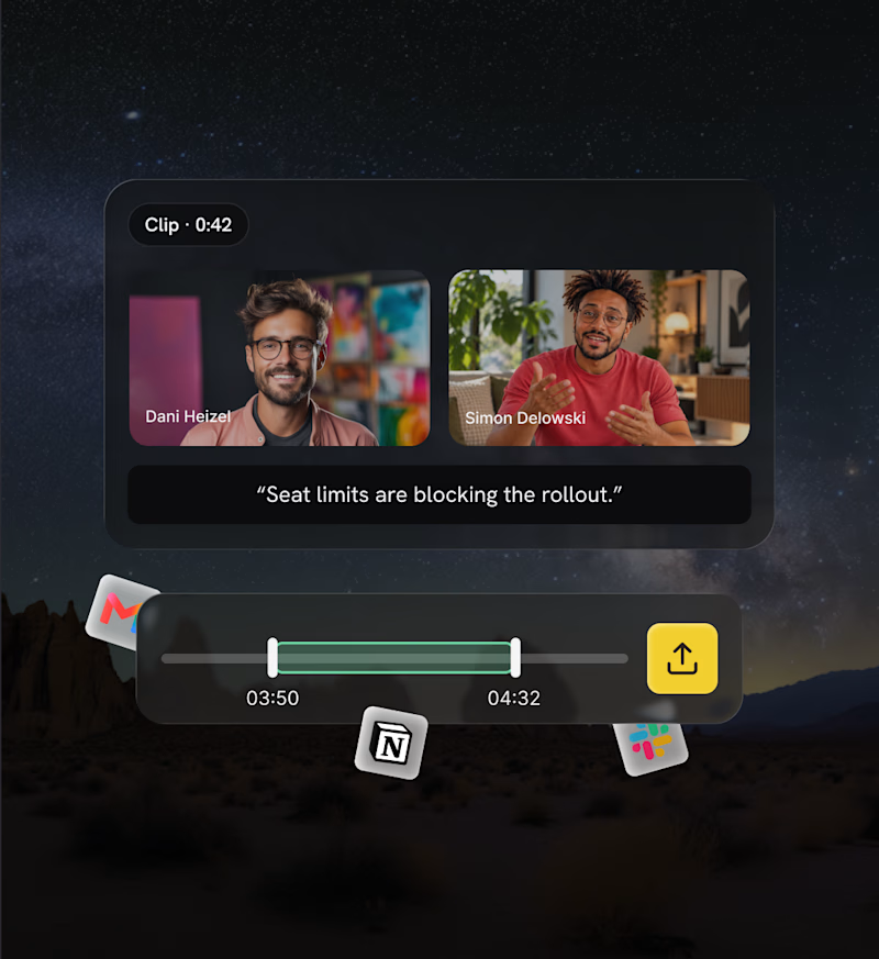
Explored two different approaches for the same section. One focused on human connection, the other on showcasing the product experience.
Both have their own personality, but I'm curious which one communicates the value better from a UI/UX perspective.
Which direction would you go with: 01 or 02? 👀
4 voted
67%

2 voted
33%
6 votes
Closed


human connection one for me, people buy from people first


Amazing!

When working on essential animations like carousels, there's always an inner drive to take things to the next level.
This time, it's a carousel animation for Juice Agency and their project with Metlok.
Which one do you think looks best?

5 voted
31%
11 voted
69%
16 votes
Closed
