The network for creativity
Join 1.25M professional creatives like you
Connect with clients, get discovered, and run your business 100% commission-free
Creatives on Contra have earned over $150M and we are just getting started
Back to feedPost
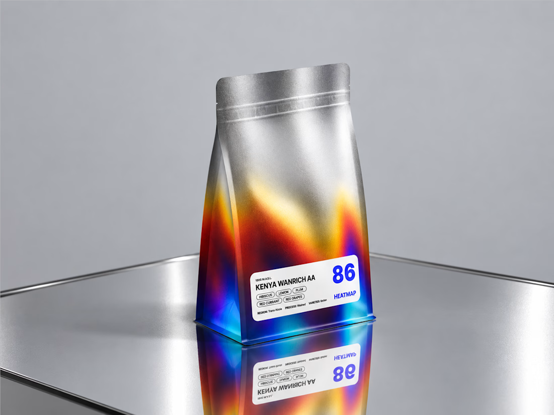
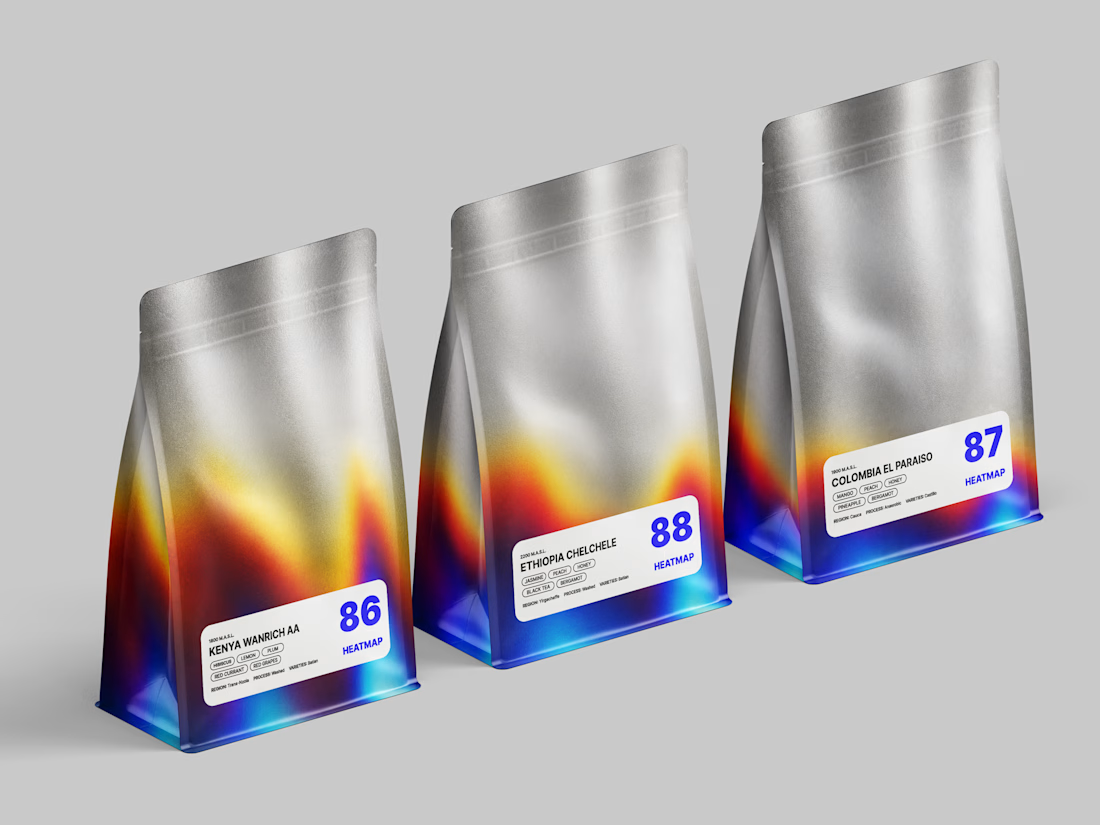
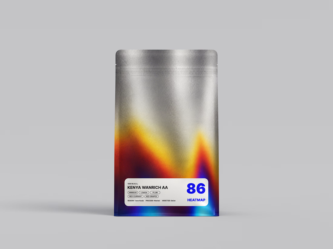
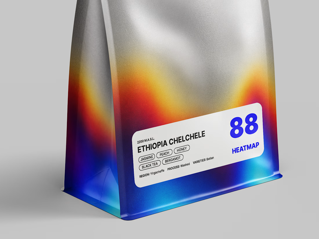
New packaging for a coffee roaster — HEATMAP 🔥
The concept is inspired by heat maps, where color represents temperature.
I connected this idea to the coffee roasting process.

Beautiful work

Thank You, Bella!!

Good work
Thank You, Sharhiar 🙌

Nice idea, love it
Yeeee! Thank You!!


So cool!
Thank You, Abdullah!!

Great concept.
Thank You Anton🙌

Thank You!! 🙌

Creative design
Yeeee! Thank You, Rahman!!

Absolutely amazing!👌
Wooow!!! Thank You!!

Awesome design🔥
Thank You!! 🙌 🔥

Great concept! It would be amazing if the packaging reacted to the warmth of someone's hands once they touched it.
Love that idea! 😄 It would be amazing, although probably quite challenging to pull off in production
Looks like burned titanium and its very cool!
Thank Youuu!! 🔥

this is beautiful, i can only imagine the way it shines on a metallic surface!
Yeeeeah! Thank You!! 😍

The name truly comes alive through the packaging. Such a cohesive concept!
Yeee! Thank You Julissa🙌


Amazing 😍
Thank Youu!! 🔥

Such an interesting concept here. The contrast between the raw metallic finish and the vibrant heat map colors gives the whole design a very distinct feel.
Thank You Very Much!!

Looks good
Thank You Afnan!

Thank you so much! ❤️ I’m so happy the concept came through - translating the roasting temperature into the color spectrum was one of my favorite parts of creating this packaging.


The heat map concept fits coffee roasting so well. Great example of turning process into visual storytelling.
Thank You Very Much!! 🙌

Wonderful creative direction, those muted color tones are pure perfection.
Thank You, Morium 😊 🙌

Interesting Direction Anastasia!
Thank You!!

LOOKS NICE 👍
Thank You Aliza! 😍
The network for creativity
Join 1.25M professional creatives like you
Connect with clients, get discovered, and run your business 100% commission-free
Creatives on Contra have earned over $150M and we are just getting started


Related posts

Not every client comes to me for a brand identity and not all my clients are skincare or cosmetic brands.
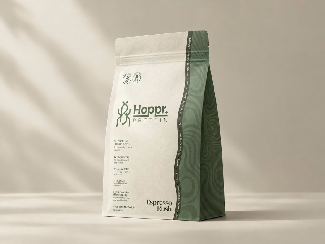
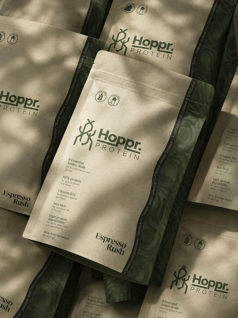
That was the case with Hoppr, a protein powder brand made from crickets. 🦗 YES, CRICKETS!
Sometimes the logo, colors, and visual system are already there and my job is to bring them to life on packaging and see how far I can push them.
I love projects like this because I get to play with typography, layout, and materials while working within an existing identity.
How much freedom do you think a designer should have when working with an established brand?


Great packaging work, nice job

A flower that inflates arrives in the mail.
Next month, a phone made of shell.
STILL LIFE SERVICE. Case study dropping soon.
Which object earns your shelf? Reply below.
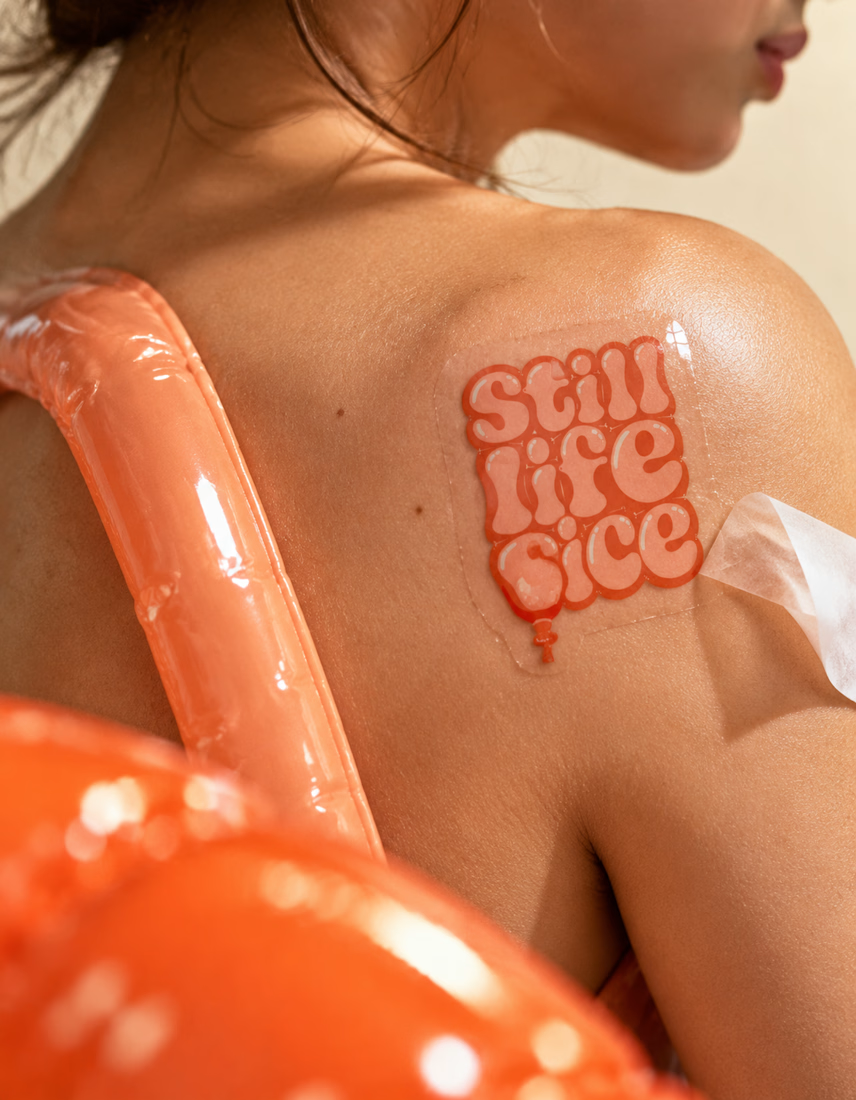
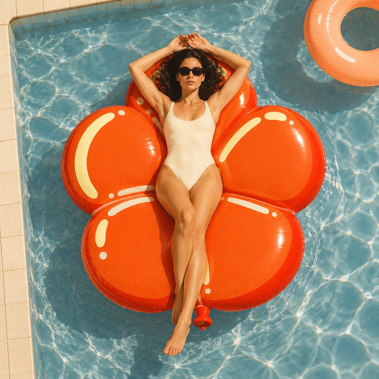
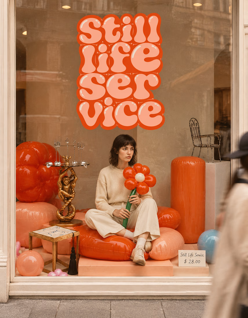

The inflatable flower. Only houseplant I'm guaranteed not to kill. Also, a new object every month is a sneaky good retention hook, people will stay subscribed just to see what's next.

Same design. Which palette? 👀
You picked your favorite preview last time. This time, I’m putting the colors to the vote.
One body-care packaging concept, with the same typography and composition:
A · Rose Cream, Strawberry Sorbet + Plum Jelly
B · Lime Mousse, Coconut Cream + Plum Jelly
Which would you choose and what does it make you feel about the brand?
Both palettes use colors and matching ingredient textures from DCS 654, my library of 654 dessert-inspired colors.
Take a closer look: dcs.mariya.design

7 voted
44%
9 voted
56%
16 votes
Closed

B is absolutely stunning 🎉🎉🎉🎉
Great job Mariya❤️









