The network for creativity
Join 1.25M professional creatives like you
Connect with clients, get discovered, and run your business 100% commission-free
Creatives on Contra have earned over $150M and we are just getting started
Back to feedPost

What if the founder's personal touch became the brand's visual identity?
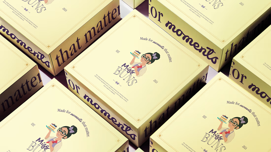
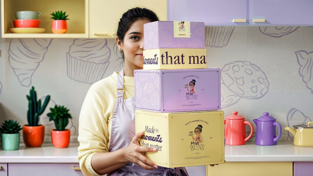
That was the creative direction behind Miss Buns, a patisserie built around personalized treats and delightful customer experiences.
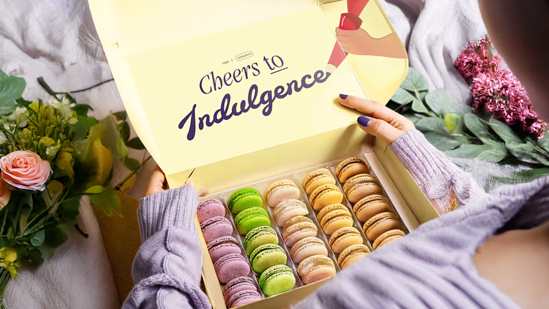
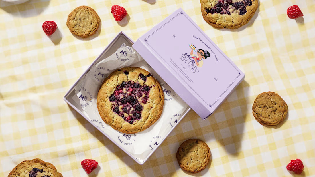
We developed a mascot logo featuring the founder writing the brand name "Miss Buns" with a piping cream container. This idea became the foundation for the wider packaging and touchpoint system, with the founder's handwriting bringing a personal touch to every detail.
Warm, nostalgic and indulgent, the entire experience was designed to feel handmade, thoughtful and made especially for you.
Would you love receiving an order this personal?
The network for creativity
Join 1.25M professional creatives like you
Connect with clients, get discovered, and run your business 100% commission-free
Creatives on Contra have earned over $150M and we are just getting started



Related posts

Ovéa — care with character.
One skincare identity across bottles, jars and tubes. I designed the wordmark, pink-and-cobalt packaging system, campaign applications and digital mockups, then brought the collection into motion.
A consistent visual language, with room for each product to feel individual.
View the full case study. Building a skincare brand? Let’s talk about your identity and packaging.

Love the colour direction and the visual language. Everything feels so well thought out. The overall look is beautiful.

Bondri has been featured by 6 different curators in the past month and I’m still a bit in disbelief.😮
I put a lot of care into every detail of this one, from the illustrations to the packaging to how the day and night variants talk to each other. Seeing it recognized like this means a lot.
What makes you stop and really look at a project when you’re scrolling?
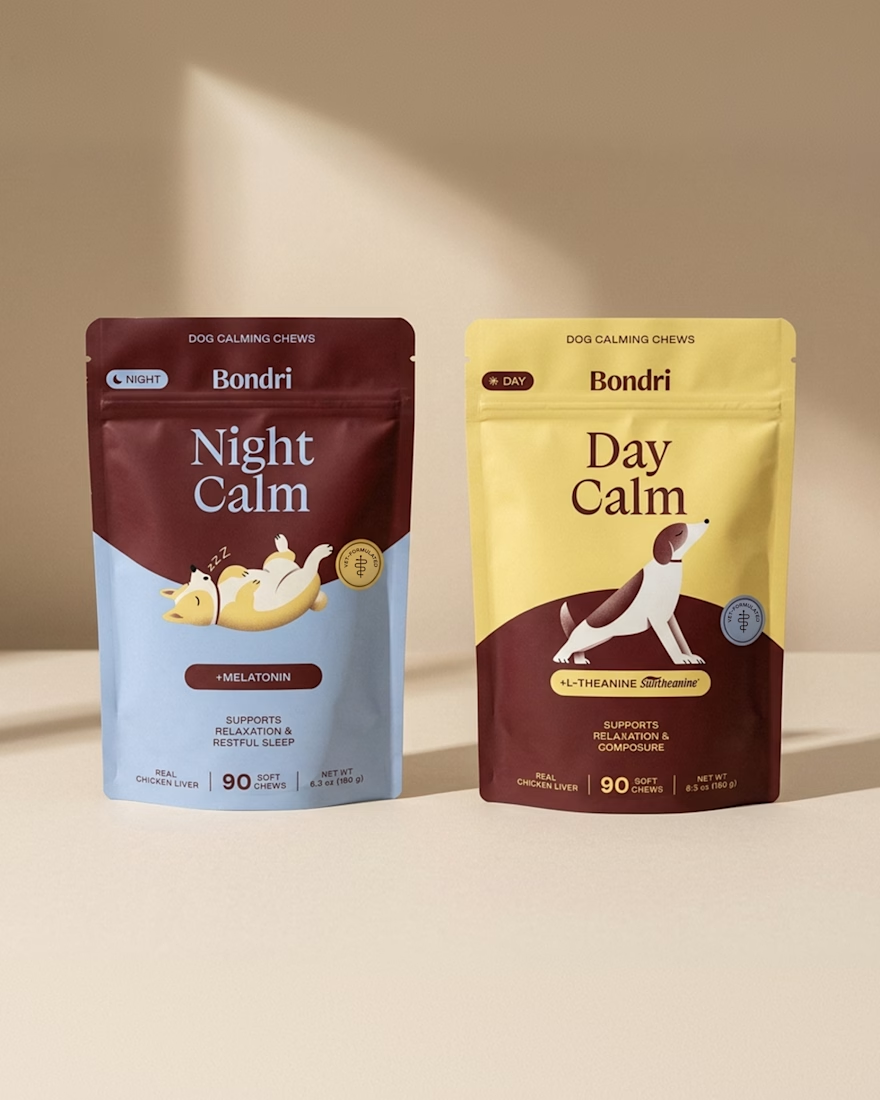
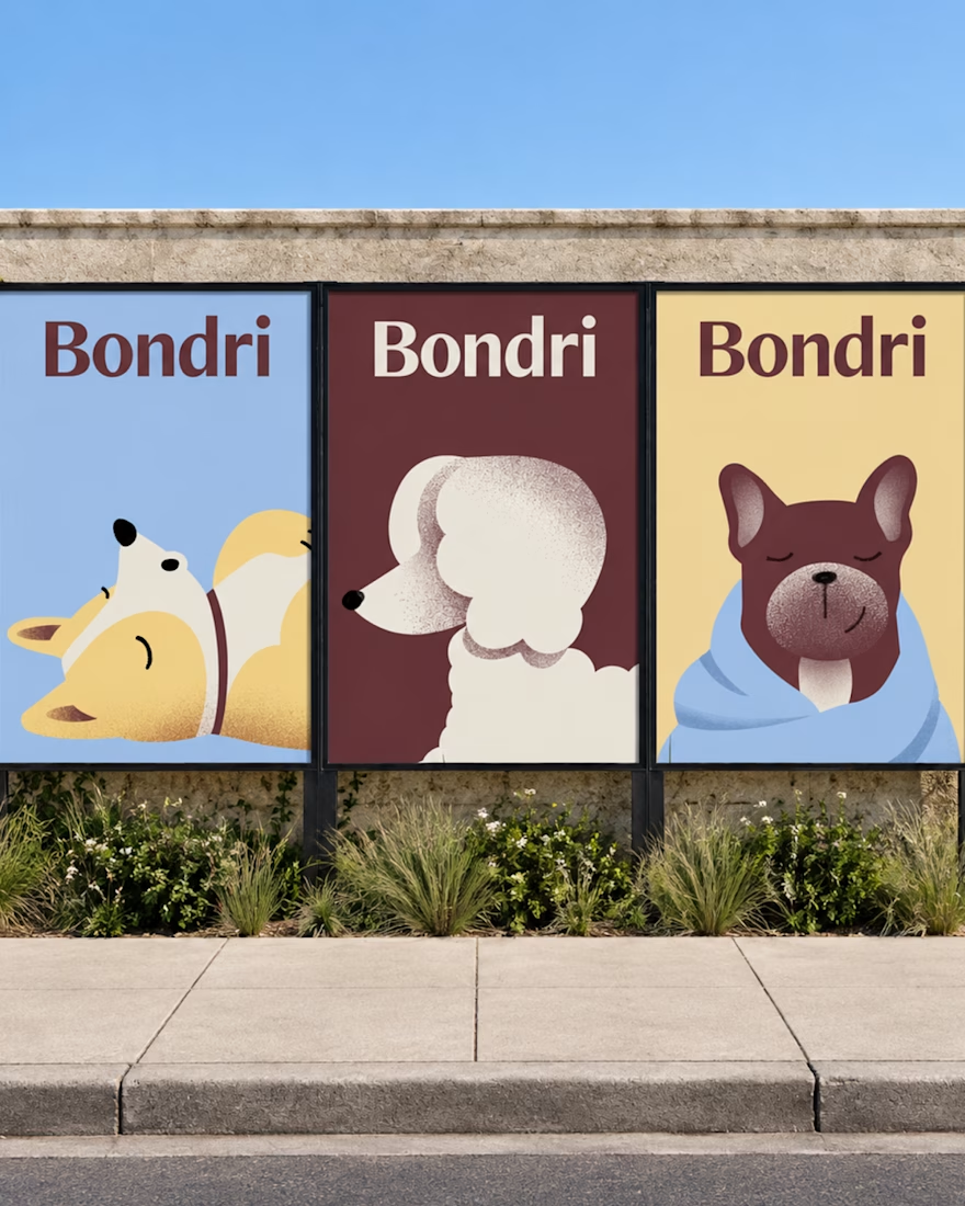
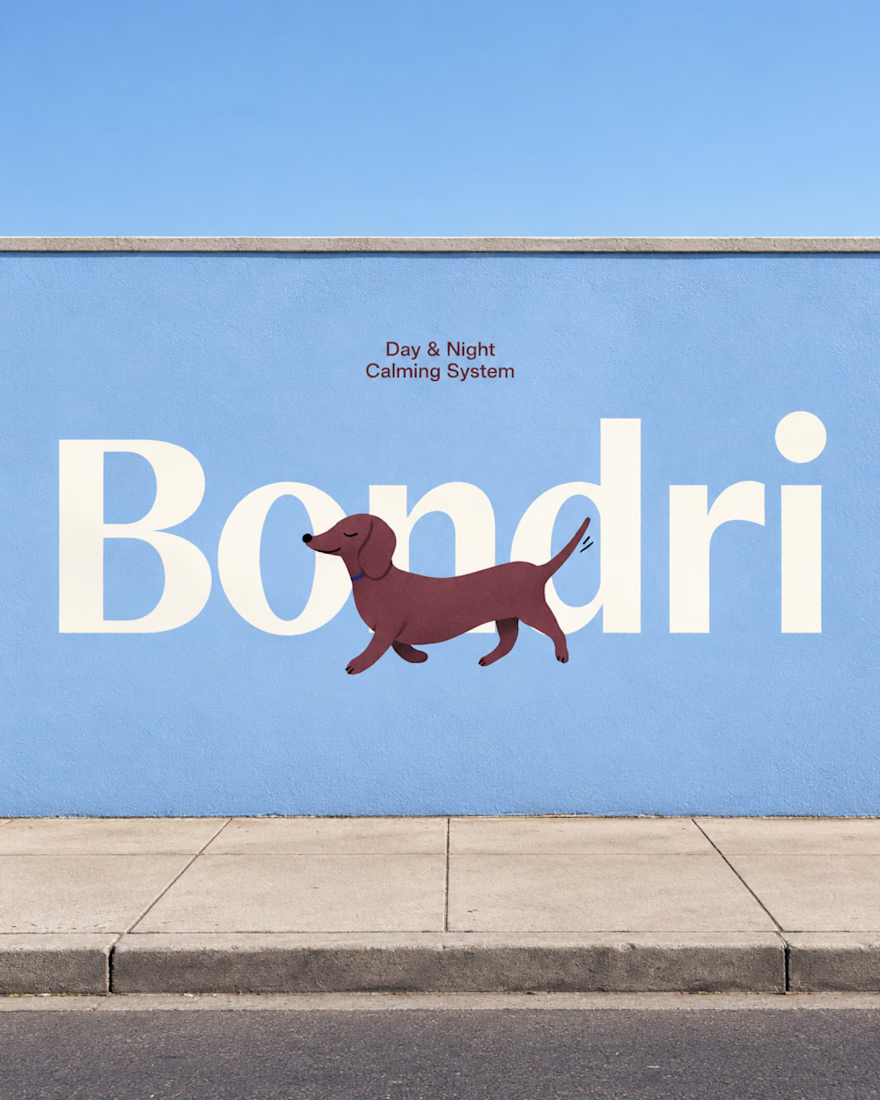

I think it’s the little details that make a project stand out. When everything feels intentional and tells a story, it naturally makes you want to stop and take a closer look. Love how much thought went into this! 👏
Well-done Chantal

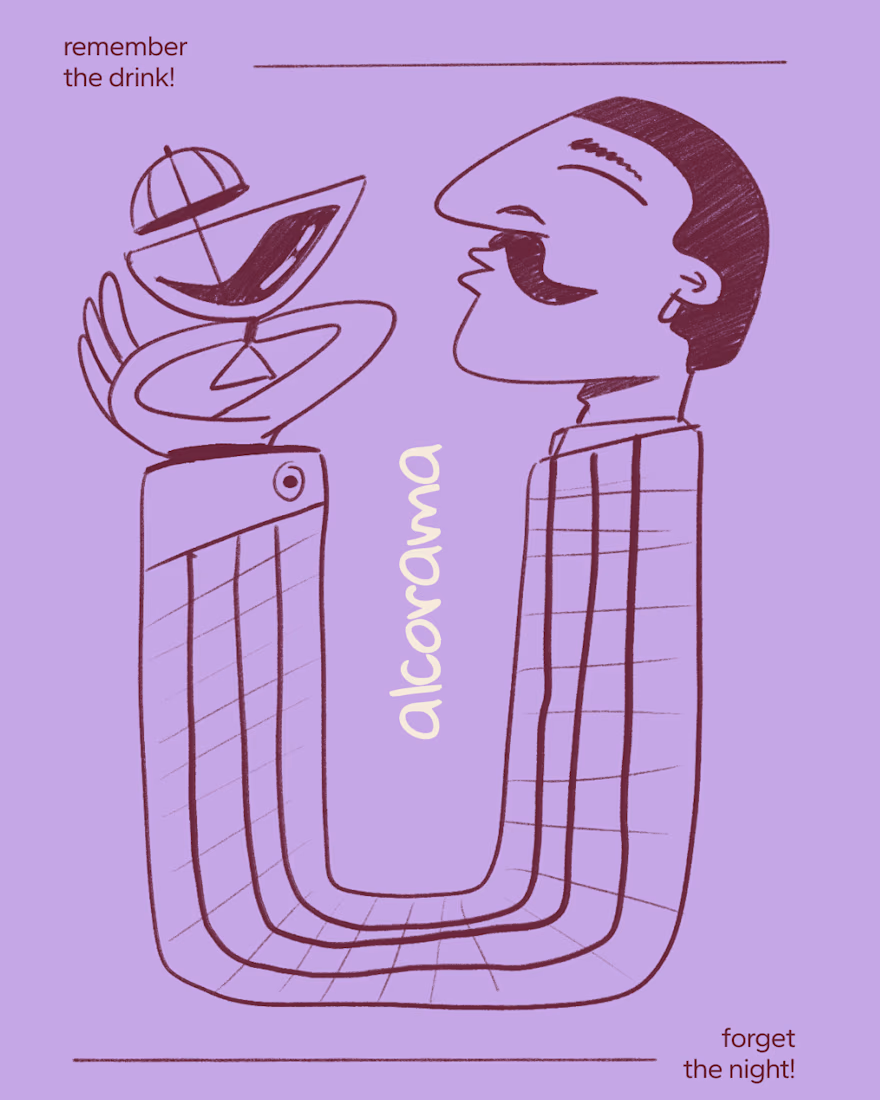
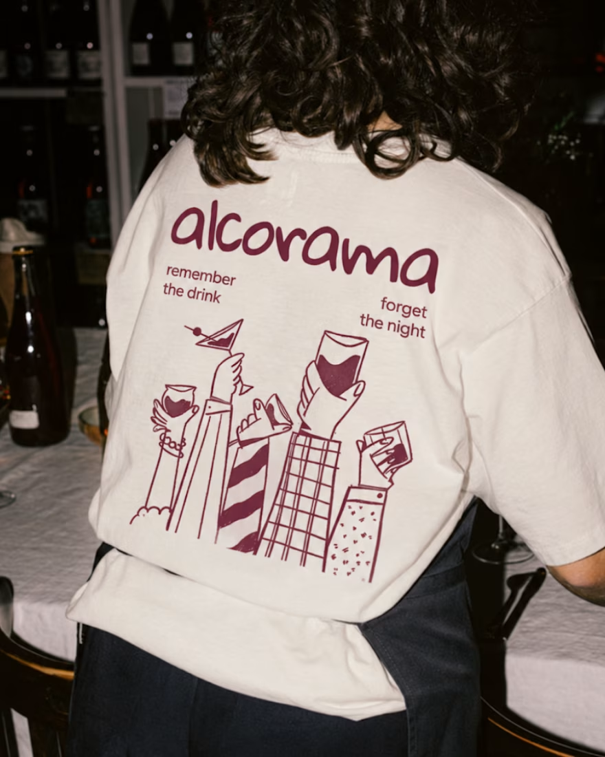
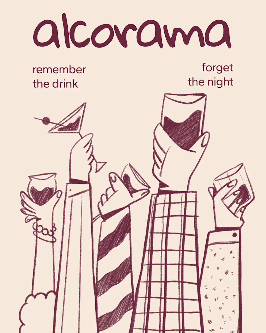
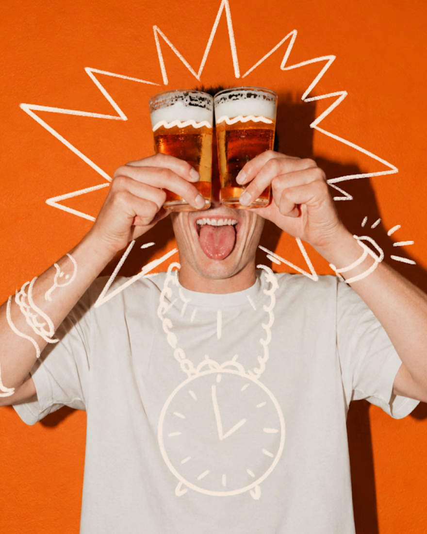
Final direction picked! I love when brands use custom illustration as the main way to communicate with their audience.
Direction discovery should not take more than one week and it should be full of personality! Ready to upgrade your brand?

Amazing work!