The network for creativity
Join 1.25M professional creatives like you
Connect with clients, get discovered, and run your business 100% commission-free
Creatives on Contra have earned over $150M and we are just getting started
Back to feedPost
Taste Test
Which label direction would you have chosen?
These are two routes I explored for a refillable cleaning products brand. The brief had two clear goals: make the brand more recognizable on the label, and introduce scent-coded colors so customers could actually tell products apart at a glance.
The difference:
Contained: the label content lives inside a bold border in the brand's primary color, making it more eye-catching. The scent name sits large at the bottom.
Open: the label is wider, cleaner, more minimal. The scent name sits just below the logo.
Which one works best for you and why? Vote below and once the votes are in I'll reveal which direction the client chose. 👇🏽
14 voted
20%
55 voted
80%
69 votes
Closed


That's an interesting way to experience it, the other direction does create more separation between elements, which reads very differently.

Love contained
The contained option does create a strong focal point, everything pulls toward the brand 👀
Does for me though

Go with the "closed" one! The "contained" one looks too chaotic visually.
Makes sense, the blue area does leave less room to breathe for the rest of the elements.

Open
Noted! Curious what draws you to it specifically 👀

open has more of that breathing room into it. im not sure the correct way to describe it. i think its just better in my opinion
Breathing room is actually a great way to describe it, and for a sustainable cleaning product, that instinct makes sense. Clarity and space communicate something before you even read the label 😄

I don't think there's a loser here. They're both soo good. Such a hard decision to make.
Thank you! Both directions holding up means the foundation is strong. The final call comes down to strategy more than preference.

On the second option (Open), it is MUCH easier to read the product name. On the shelf, this is more important than the color coding. Customers won't buy a product if they can't easily identify what it is.
That's a really valid point, legibility at shelf level is one of those things that gets overlooked in favor of aesthetics. The product name doing its job quickly matters more than most people think.

Photoshop :)

Contained "OPEN" for scent-coded recognition on a shelf, a solid color block beats a thin top bar every time. Open reads premium up close, but the brief needed shelf-speed, not close-up elegance.
Solid point!

2, so impressive
Thanks!

maybe the open one could also have the logo in the center. maybe.
That's an interesting thought, moving the logo to the center would shift the reading flow though, don't you think? 👀

The open version feels better in my opinion. It has a stronger hierarchy and without the borders it has more breathing room and it kind of gives the illusion that the label/bottle is bigger. I also noticed the colors faster on the open version.
That's also better use of the layout. Interesting that the color read faster on that version too. Thank you!

I prefer the Open one. Layout creates a clearer hierarchy, feels more premium, and is much easier to scan at a glance.
Agree! Hierarchy and scannability are exactly what packaging needs to get right.

Open has a better structure and more easy to read for me.
100%
Results are in! 55 for Open. That's 80% and also the version the client chose. Hard to argue with that alignment.
Looking back at the comments, the reasoning holds up: product name, logo, and scent color all read clearly. The main reason Contained didn't make it was exactly what...

nicely done
The network for creativity
Join 1.25M professional creatives like you
Connect with clients, get discovered, and run your business 100% commission-free
Creatives on Contra have earned over $150M and we are just getting started
Trending

Claude
Claude has entered the design space. How are you using it?

Contra University
Learn from expert creatives how to earn more using next-gen AI tools.
Brand Design
The best brand designers are on Contra. Scroll to see what's trending in brand design. What are you building?
creativeaiflow
Creative AI workflows are evolving. What tools do you use, and what are their strengths and weaknesses?
freelancerlife
Freelancer life is wins, pivots, and everything in between. What’s yours right now?



Related posts

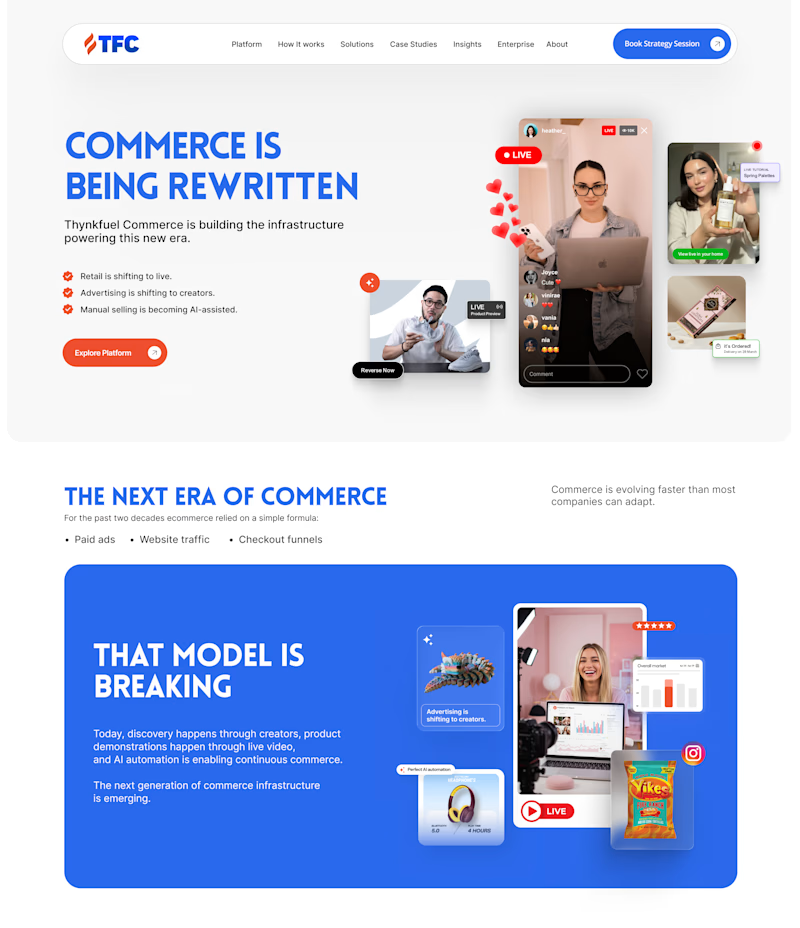
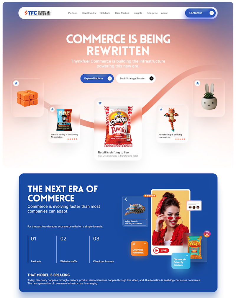
One leads with the platform. The other leads with the product universe.
Which homepage makes you click "Explore Platform"? 👇
18 voted
27%
49 voted
73%
67 votes
Closed

Went with Centered Carnival, the single swooping path pulls your eye straight to the products instead of splitting attention across three photo blocks up top.

Custom Brand Illustrations for Lucra
These are what make a brand system feel considered rather than assembled.

Is that a pool illustration I spy there? Very cool!

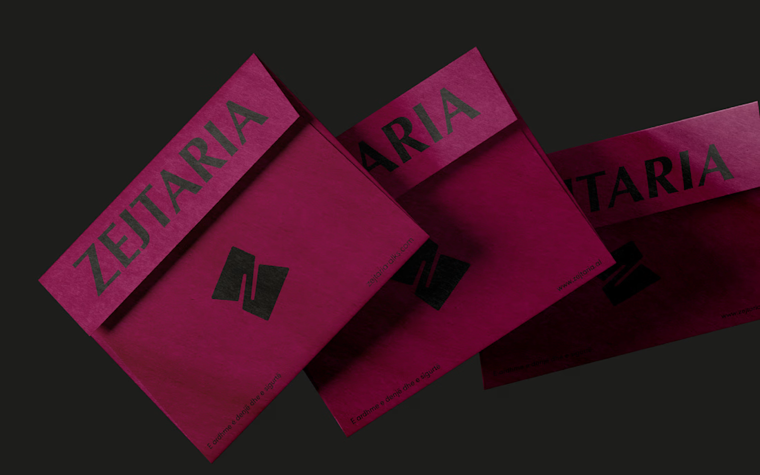
Zejtaria
Brand identity for the Albanian National Chamber of Crafts
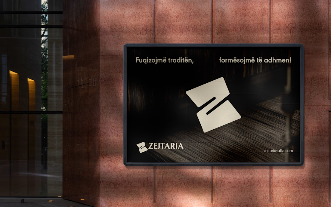
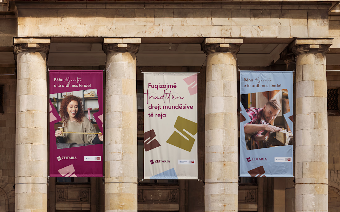
Zejtaria was developed for the National Chamber of Crafts to reposition traditional trades as a serious, viable path — for a generation more inclined to doubt them than choose them.
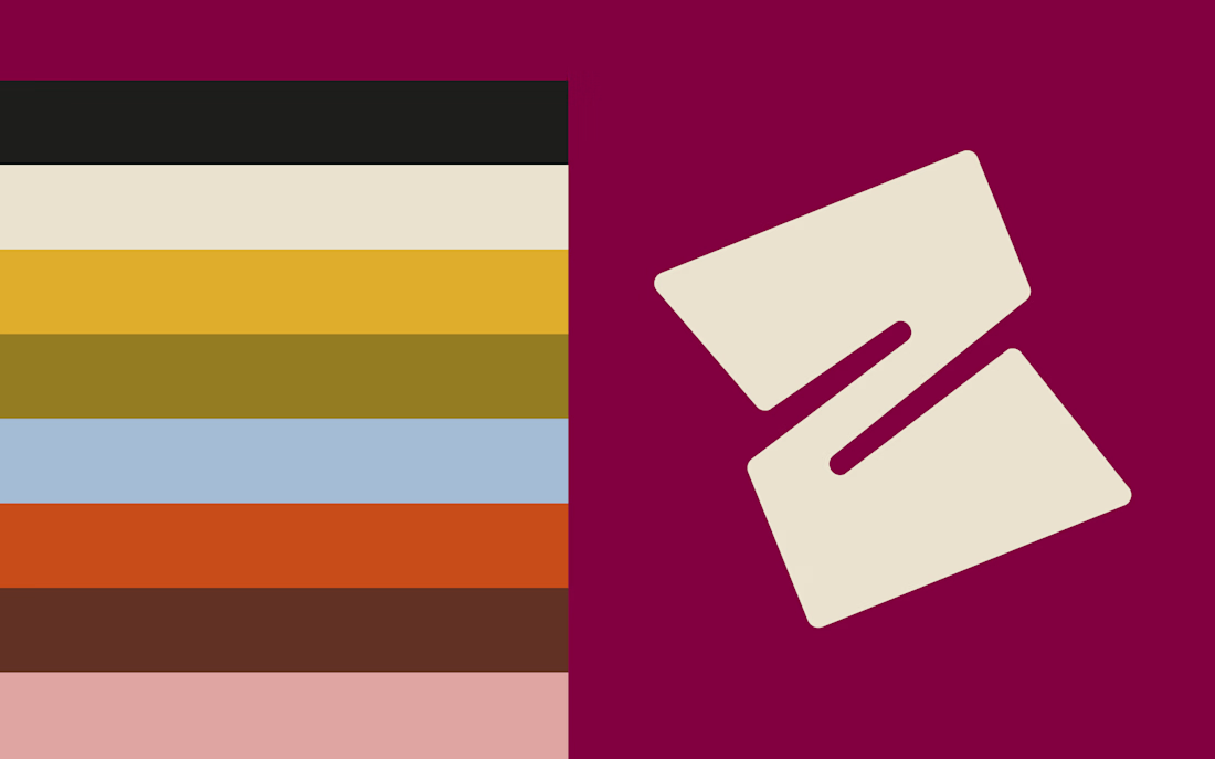
The visual system centers on a single letterform — Z — folded until it opens into a window, a gesture that reads as both a turn of material and an opening.
Across posters, stationery, packaging, and outdoor applications, the identity holds a deep burgundy as its anchor, extending into terracotta, mustard, powder blue, and blush — with the same restraint carried through every touchpoint: no ornament standing in for meaning.