The network for creativity
Join 1.25M professional creatives like you
Connect with clients, get discovered, and run your business 100% commission-free
Creatives on Contra have earned over $150M and we are just getting started
Back to feedPost
Taste Test


Which direction would you take it?
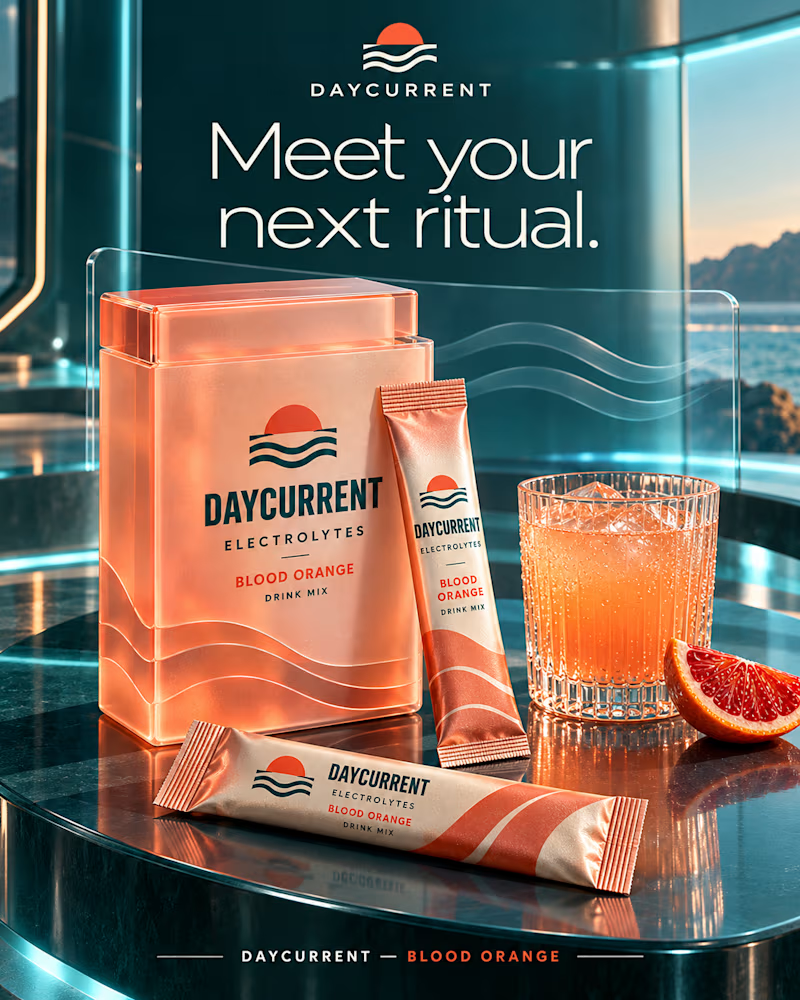
The first sits on dark glass above the sea, frosted peach tin, foil sticks, a ribbed tumbler beaded with cold, teal light on chrome.
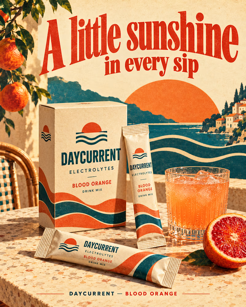
The second is a printed poster, kraft carton on terrazzo, an illustrated coastline behind it, oranges hanging in the corner, red type arched overhead.
One sells a product, the other sells a place.
👇 #packagingdesign #brandconcept #artdirection
3 voted
30%
7 voted
70%
10 votes
Closed

Second one feels modern not just suitable for objects like the first one I choose the second but both of them are great

It’s interesting how much communication and visuals can shift the perception and positioning of a product, even when the branding itself stays the same.
I personally love the second one better, there’s more contrast, and the product really stands out.
With the first option, I...

Paper Riviera looks somewhat timeless and it fits the product better.
The network for creativity
Join 1.25M professional creatives like you
Connect with clients, get discovered, and run your business 100% commission-free
Creatives on Contra have earned over $150M and we are just getting started







Related posts

Two short motion ads for Instaheadshots, an app that turns ordinary selfies into studio-quality professional headshots with AI.
🎬 Ad 1: "Slide to Unlock" (10s)
A product-flow spot. It opens on a glowing slide-to-unlock button, then shows the app's processing and generating screens as a casual selfie becomes a polished headshot. It ends on the brand and a "Try Instaheadshots" CTA.
🎬 Ad 2: "Everyone's Upgrading" (20s)
A social-proof spot. Notification cards stack up as Sarah, Daniel and Priya each post a new profile photo within one week. The punchline is "everyone is using the exact same Instaheadshots to upgrade," which works on FOMO and ends on a clear CTA.
What I did: concept, motion design, UI animation, kinetic typography, sound sync
7 voted
39%
11 voted
61%
18 votes
Closed

Option 2..Depicts what the app does instantly.

Two cuts of the same opener for Pletor 2.0. Same copy, same timing, different composition.
In the first one the words sit at opposite corners and the product cards drift in loose. In the second the cards arrive as tight stacks and the words swap corners.
I keep going back and forth on which one reads faster.
Vote in the comments, 1 or 2.
35 voted
65%
19 voted
35%
54 votes
Closed

2 for me. The tight stacks give the eye one clear place to land, so the message reads quicker. The loose drift in 1 looks beautiful but I found myself chasing the cards a bit

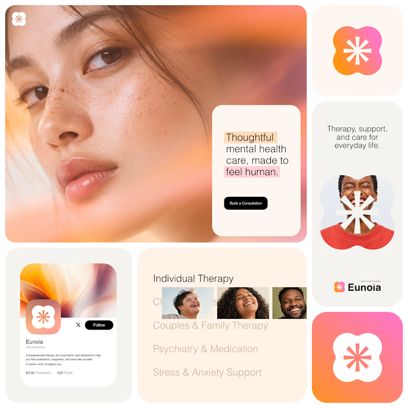
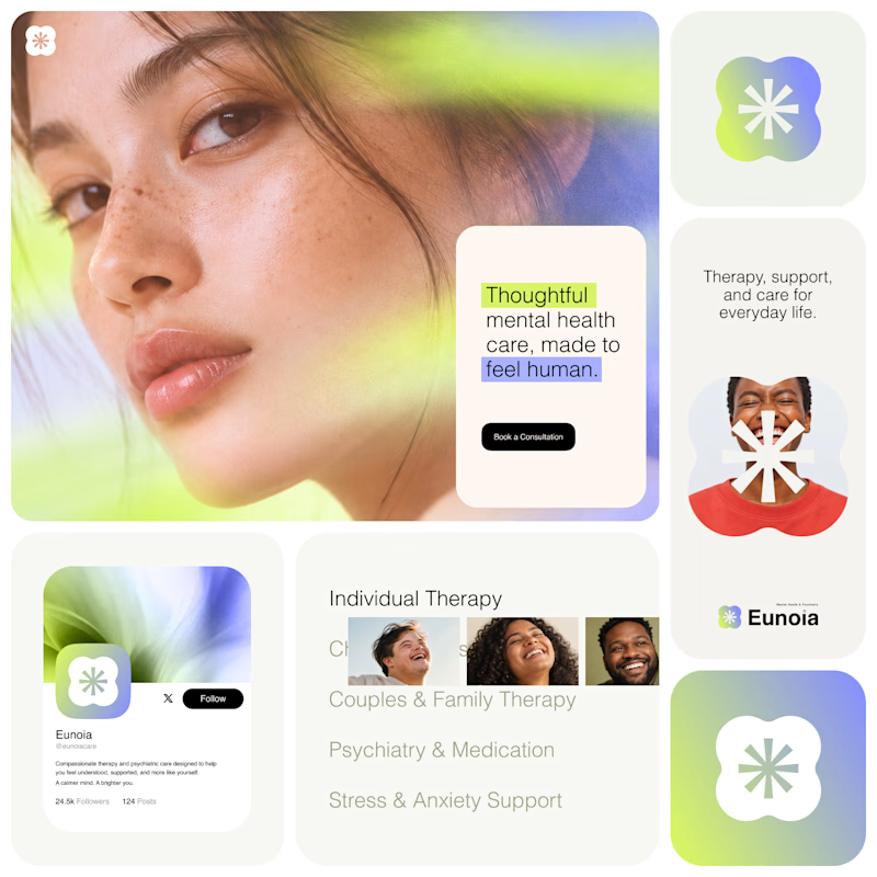
Exploring two visual directions for Eunoia, a mental health & psychiatry brand.
Direction 01 - Warm peach, orange and soft pink tones for a calm, human and comforting feel.
Direction 02 - Lime and periwinkle tones for a fresher, more optimistic and contemporary expression.
Same brand system. Different emotional energy.
32 voted
52%
29 voted
48%
61 votes
Closed

That's impactful, love to see fresh styles