The network for creativity
Join 1.25M professional creatives like you
Connect with clients, get discovered, and run your business 100% commission-free
Creatives on Contra have earned over $150M and we are just getting started
Back to feedPost
Taste Test

Two cuts of the same opener for Pletor 2.0. Same copy, same timing, different composition.
In the first one the words sit at opposite corners and the product cards drift in loose. In the second the cards arrive as tight stacks and the words swap corners.
I keep going back and forth on which one reads faster.
Vote in the comments, 1 or 2.
35 voted
65%
19 voted
35%
54 votes
Closed

2 for me

2 for me. The tight stacks give the eye one clear place to land, so the message reads quicker. The loose drift in 1 looks beautiful but I found myself chasing the cards a bit

Both are kinda same with except few changes!

2 for me. It just felt normal for things to be seen from left to right, considering we read in that direction too!

1st one.

Really nice balance between the idea and the final execution.


tight stacks version wins for me

symetrically 1st looks better

Looks like 1 is better.
The network for creativity
Join 1.25M professional creatives like you
Connect with clients, get discovered, and run your business 100% commission-free
Creatives on Contra have earned over $150M and we are just getting started







Related posts

Important fashion question:
A — Dior Samurai bag
B — 1500s French bag with 18 pockets
Because apparently the real styling dilemma is contemporary luxury vs medieval admin.
Also testing product replacement and batch workflows, swapping products fast while keeping the same scene intact.
2 voted
50%
2 voted
50%
4 votes
Closed

1500s French bag purely for the pocket count, that's basically a tool belt at that point. More curious about the product replacement workflow you mentioned though, how consistent does the lighting and shadow stay when you swap items into the same scene?

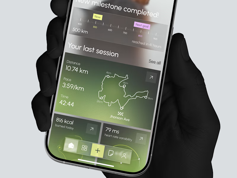
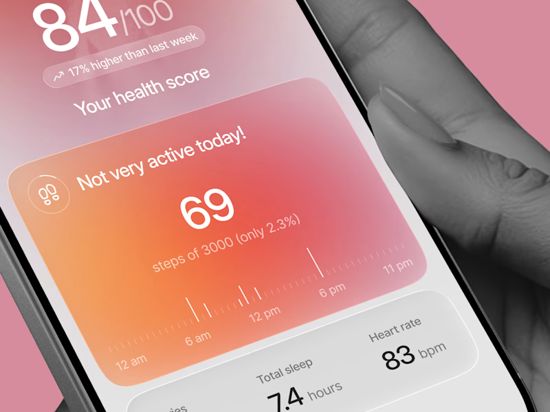
Designed two directions for a health tracking app
Same data, but two very different feelings
One is dark and focused, built for athletes. The other is warm and friendly, built for everyday people
What do you think?
Which one would you open every day, A or B?

21 voted
39%
33 voted
61%
54 votes
Closed

Option 1 gave me a very fin-tech feel and option 2 feels like my health is in danger, sorry 😂

I already submitted my Lovable challenge but I decided to update the landing page and make it look a little bit better by introducing more images to make the page a little bit more interactive especially on the services section, which one do you like: the old one or the new one?
You can test it here: https://carmobifix.lovable.app/
submitted project: https://contra.com/community/KUoCqygQ-i-built-mobi-fix-nairobi-a
43 voted
74%
15 voted
26%
58 votes
Closed

you had credit left ? mine finished...like 4, 5 credits left..😂