The network for creativity
Join 1.25M professional creatives like you
Connect with clients, get discovered, and run your business 100% commission-free
Creatives on Contra have earned over $150M and we are just getting started
Back to feedPost
Taste Test
Important fashion question:
A — Dior Samurai bag
B — 1500s French bag with 18 pockets
Because apparently the real styling dilemma is contemporary luxury vs medieval admin.
Also testing product replacement and batch workflows, swapping products fast while keeping the same scene intact.
2 voted
50%
2 voted
50%
4 votes
Closed

1500s French bag purely for the pocket count, that's basically a tool belt at that point. More curious about the product replacement workflow you mentioned though, how consistent does the lighting and shadow stay when you swap items into the same scene?

Hahaha exactly, 18 pockets is basically medieval utility wear 😂
Lighting consistency is actually pretty good when the replacement is similar in scale and placement, but contact shadows, reflections and occlusion are still the tricky part, especially when the new object has a...

im team medieval admin bag purely for pocket count 😂 but the swap workflow is the real flex. how many iterations before the scene stops breaking?

The network for creativity
Join 1.25M professional creatives like you
Connect with clients, get discovered, and run your business 100% commission-free
Creatives on Contra have earned over $150M and we are just getting started



Related posts

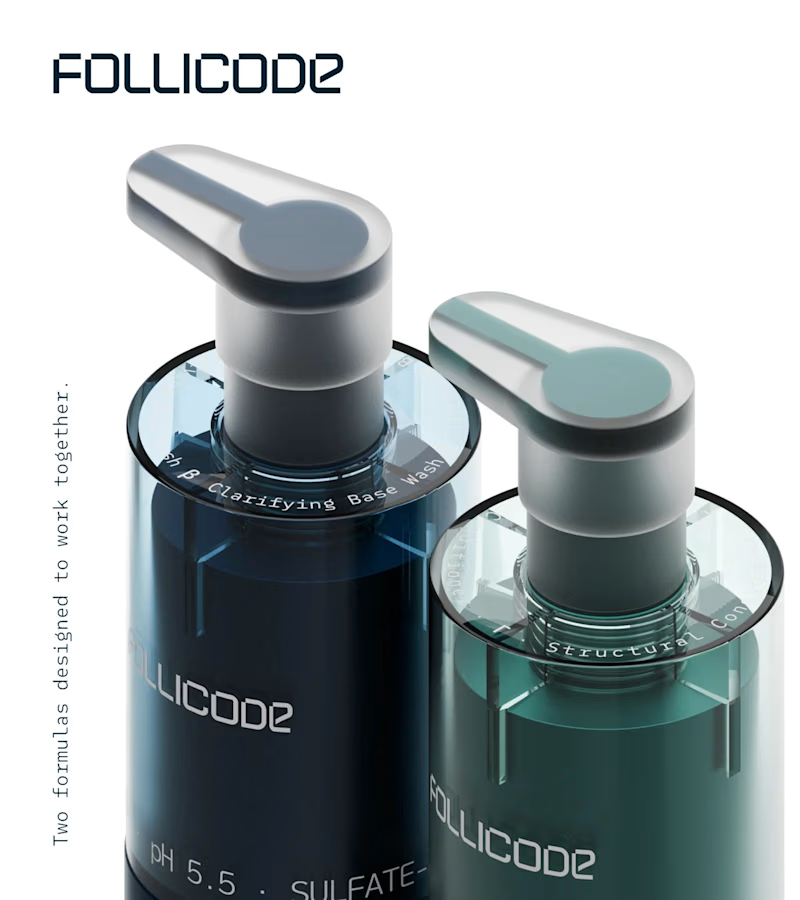
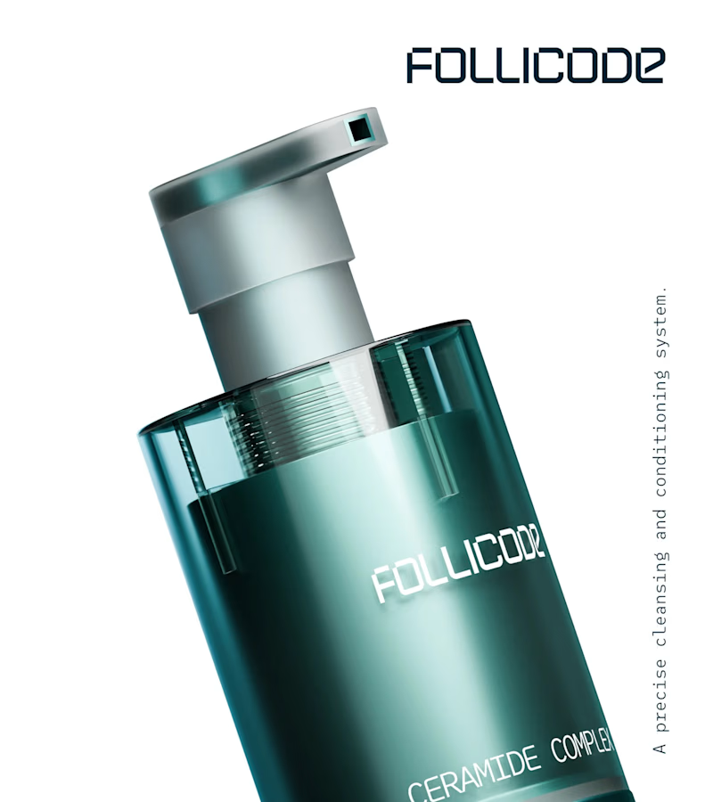
Choose your product hero shot
2 voted
29%
5 voted
71%
7 votes
Closed

Option 2 for me. The single bottle has room to breathe and the FOLLICODE branding reads instantly — it feels like a proper hero. Option 1 is nice for showing the system, but the two bottles compete with each other and the label gets a bit lost in the dark. I'd run Option 2 as...


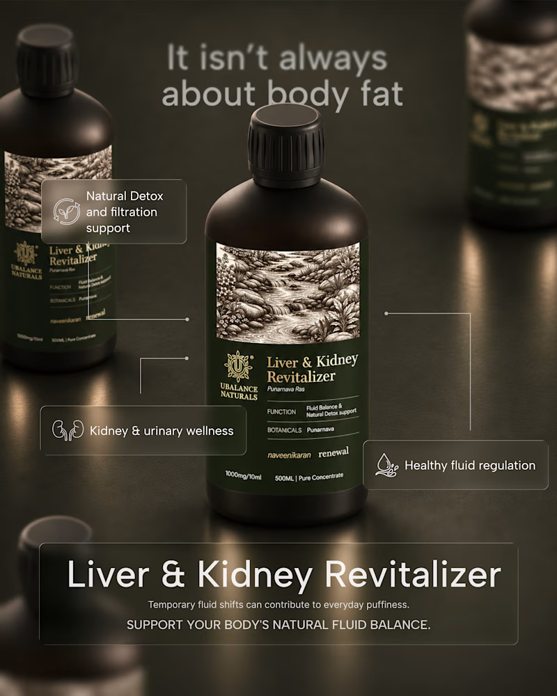
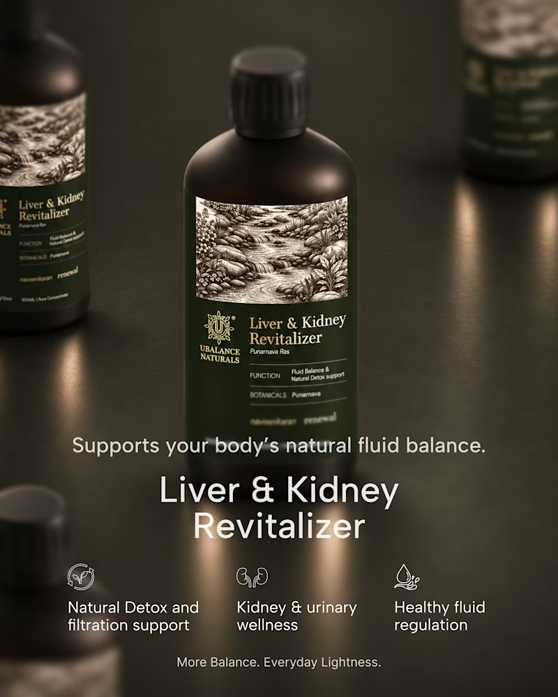
A quick exploration of two different directions for a wellness product ad.
One focuses on the product, while the other brings more attention to the product information.
These are early explorations, just to get a feel for the brand and its visual direction.
I’d love to hear your honest thoughts. Which direction feels more effective, and what would you improve?
1 voted
50%
1 voted
50%
2 votes
Closed
Honest take: the information-first direction wins for me. "It isn't always about body fat" is a proper hook — it speaks to the actual worry behind the product, so it stops the scroll. The product-first shot is gorgeous, but it reads more like a product page image than an ad. One...

These designs were made by the AI in my upcoming design tool for designers.
I don't know which is better, help me decide.
For those wondering where the remaining designs are, I'll drop it in my next post.
2 voted
40%
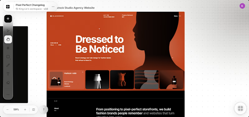
3 voted
60%
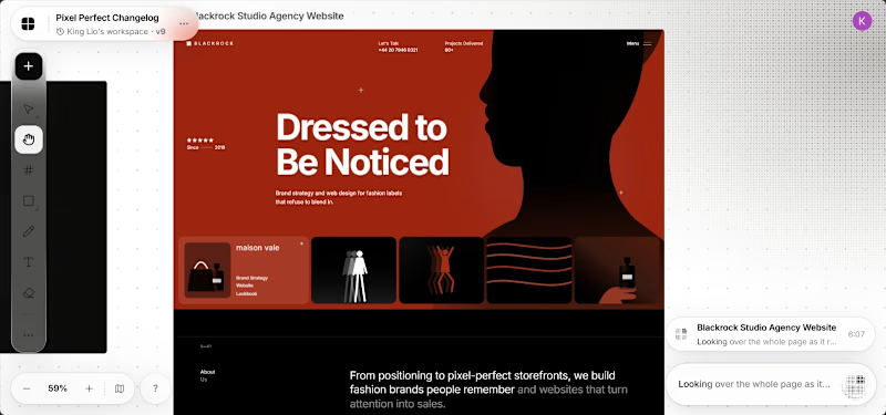
5 votes
Closed

It's the red one for me... Passed the message a lot better than the Orange