The network for creativity
Join 1.25M professional creatives like you
Connect with clients, get discovered, and run your business 100% commission-free
Creatives on Contra have earned over $150M and we are just getting started
Back to feedPost
Taste Test

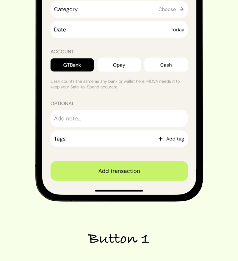
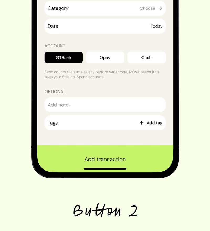


Button 1 reads as the stronger primary action to me—the calmer green and tighter visual weight let the form hierarchy breathe. Button 2 feels more prominent, but its heavier footer-like block competes with the content.

button 2

Button 1.

Button 1 works better and its actually the standard positioning for a CTA, the CTA is a key action that should be noticed without any confusion

Button 1 does the work


Botton 1 works better

Button 1
The network for creativity
Join 1.25M professional creatives like you
Connect with clients, get discovered, and run your business 100% commission-free
Creatives on Contra have earned over $150M and we are just getting started





Related posts

Same product, two first screens. Jockey by TwelveLabs, dark neon or clean white. 1 or 2.
8 voted
17%
38 voted
83%
46 votes
Closed


Which one would you shelf?
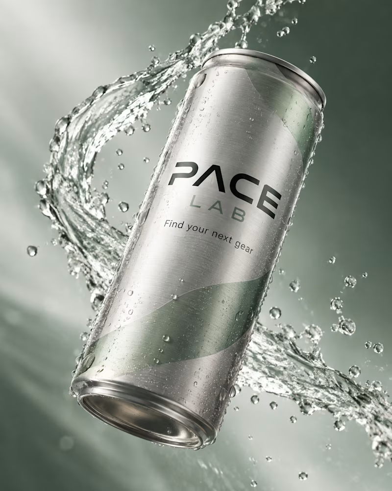
The first is a brushed silver can tilted against deep sage, a ribbon of water spiralling around it, beads of condensation across the metal, type in black and green.
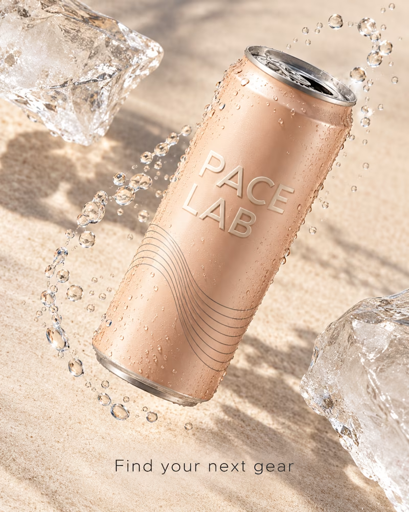
The second is a blush can over pale sand, embossed type, fine linework up the side, two blocks of ice at the edges, droplets in a loose arc.
One sells performance. The other sells recovery.
👇 #packagingdesign #brandconcept #productphotography
5 voted
83%
1 voted
17%
6 votes
Closed
Steel🔥


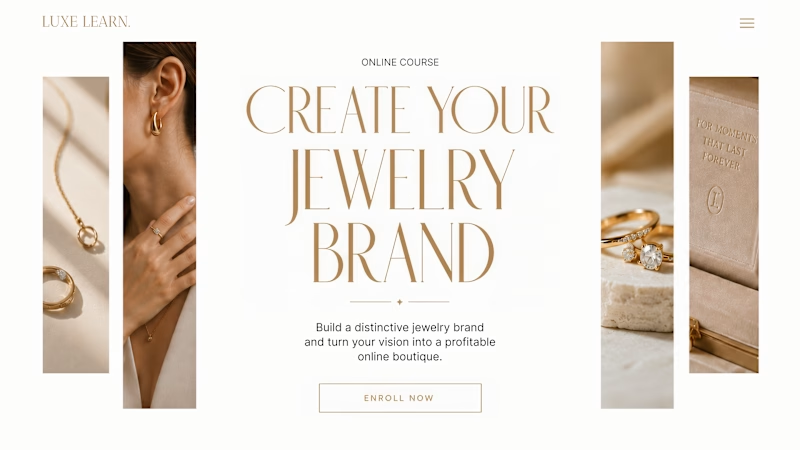
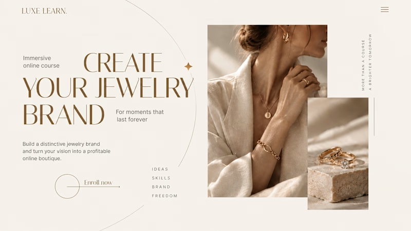
Same course. Same content. But two completely different feelings ✨
Which version would you choose?
27 voted
59%
19 voted
41%
46 votes
Closed

Option 2 is more practical ❤️❤️