The network for creativity
Join 1.25M professional creatives like you
Connect with clients, get discovered, and run your business 100% commission-free
Creatives on Contra have earned over $150M and we are just getting started
Back to feedPost
Taste Test


Which one would you build the range on?
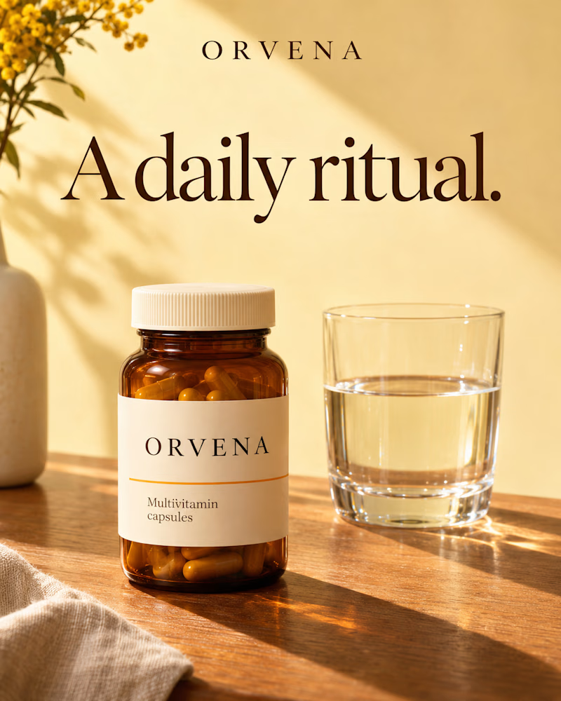
The first is an amber jar with a cream label standing on warm oak beside a glass of water, mimosa in a stone vase at the edge, linen in the corner, low sun laying long shadows across a buttercream wall.
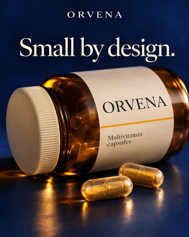
The second is the same jar tipped on its side on deep navy, shot close and low, two clear capsules of golden powder in front, light pooling amber on the surface beneath.
One sells the routine. The other sells the formula.
👇 #packagingdesign #brandconcept #supplementdesign
8 voted
73%
3 voted
27%
11 votes
Closed


Creative!

Both designs look great. I think it's the write-up for the "Daily Ritual" for me
The network for creativity
Join 1.25M professional creatives like you
Connect with clients, get discovered, and run your business 100% commission-free
Creatives on Contra have earned over $150M and we are just getting started



Related posts

Which hero would you choose — 1 or 2?
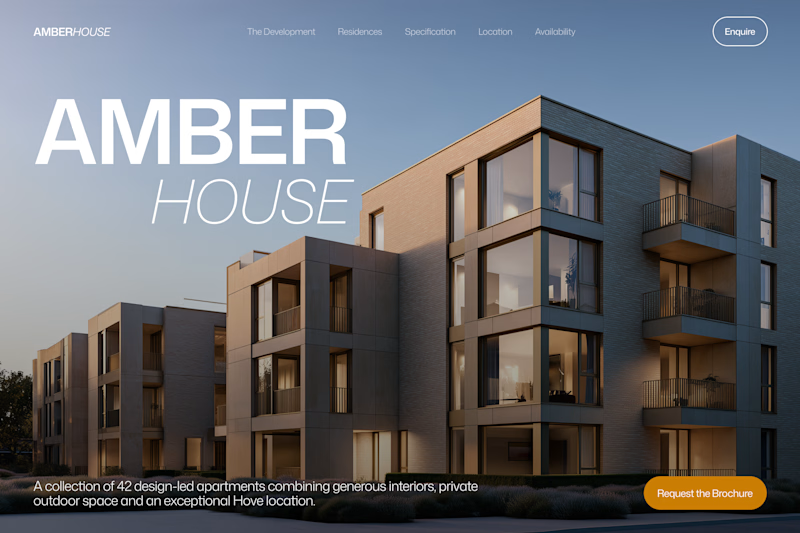
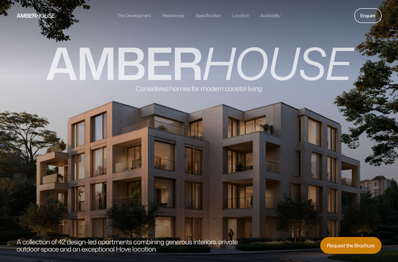
Two directions for Amber House, my real estate website template. The first pairs a closer architectural crop with an asymmetric layout. The second gives the building more breathing room, with a wide view and a centered headline.
Same template, two different first impressions. Which feels stronger to you, and why?
24 voted
59%
17 voted
41%
41 votes
Closed

I will go with Bold & Asymmetric!

Portfolio update: I couldn't decide on a look, so I built both.
A or B? manucabezas.com

11 voted
69%
5 voted
31%
16 votes
Closed

dev mode on dark looks 👌🏻✨

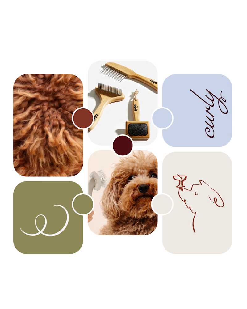
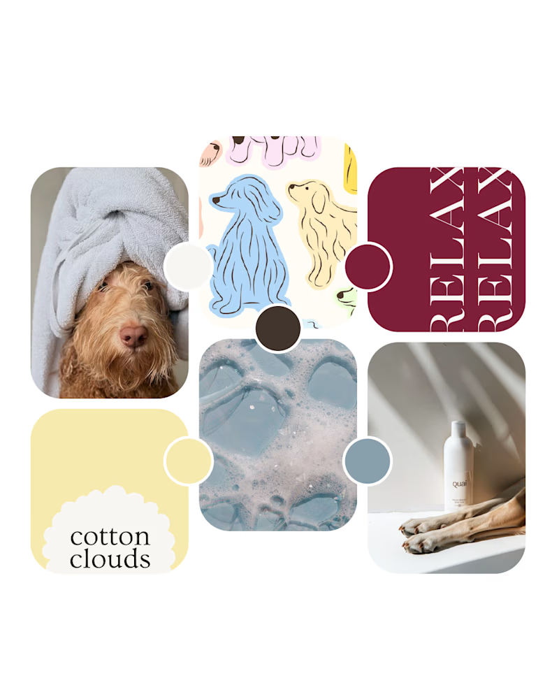
Working on a new brand identity for a curly-coated dog grooming brand!
We're exploring the initial visual directions and atmosphere. Which mood board speaks to you more?
19 voted
66%
10 voted
34%
29 votes
Closed

Option 1 looks amazing!