The network for creativity
Join 1.25M professional creatives like you
Connect with clients, get discovered, and run your business 100% commission-free
Creatives on Contra have earned over $150M and we are just getting started
Back to feedPost
Taste Test


Which one would you put in the catalogue?
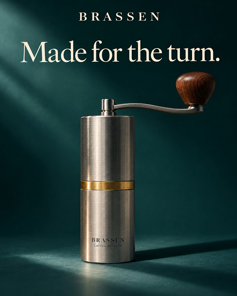
The first is a brushed steel hand grinder with a brass band and a walnut knob, standing alone on deep teal, one shaft of light falling across it from the left, its shadow stretching to the right.
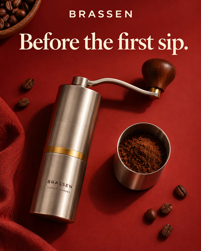
The second is the same grinder laid flat on red, shot from above, its steel cup full of fresh grounds beside it, beans scattered at the corners, a wooden bowl of them at the top, rust linen folding in at the edge.
One sells the object. The other sells the ritual.
👇 #productdesign #brandconcept #productphotography
3 voted
23%
10 voted
77%
13 votes
Closed
The network for creativity
Join 1.25M professional creatives like you
Connect with clients, get discovered, and run your business 100% commission-free
Creatives on Contra have earned over $150M and we are just getting started



Related posts

Which direction should a coffee brand ship, A or B?
Taste Test: two image directions for the same coffee brand, made in one AI brand image pack session.
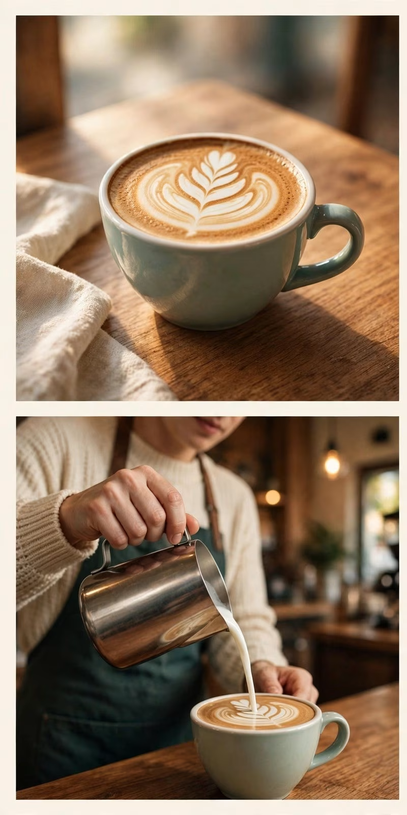
Direction A: warm cafe craft
latte art and a barista pour, wood and morning light, the ritual of the drink
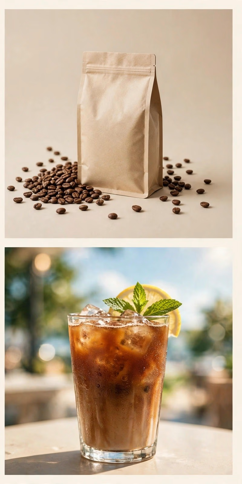
Direction B: clean product
the bag and the beans, one iced coffee against the sky, the product on its own
Vote for A or B below, and tell me why in the comments.
I make brand image packs like this on Contra: 10 images delivered in 24 hours, $49 at launch pricing. The service is on my profile if your brand needs a direction worth testing.

0 voted
0%
2 voted
100%
2 votes
Closed

Same 19 seconds, cut two ways. One is driven by the copy, the other by the shape. 1 or 2.
26 voted
58%
19 voted
42%
45 votes
Closed

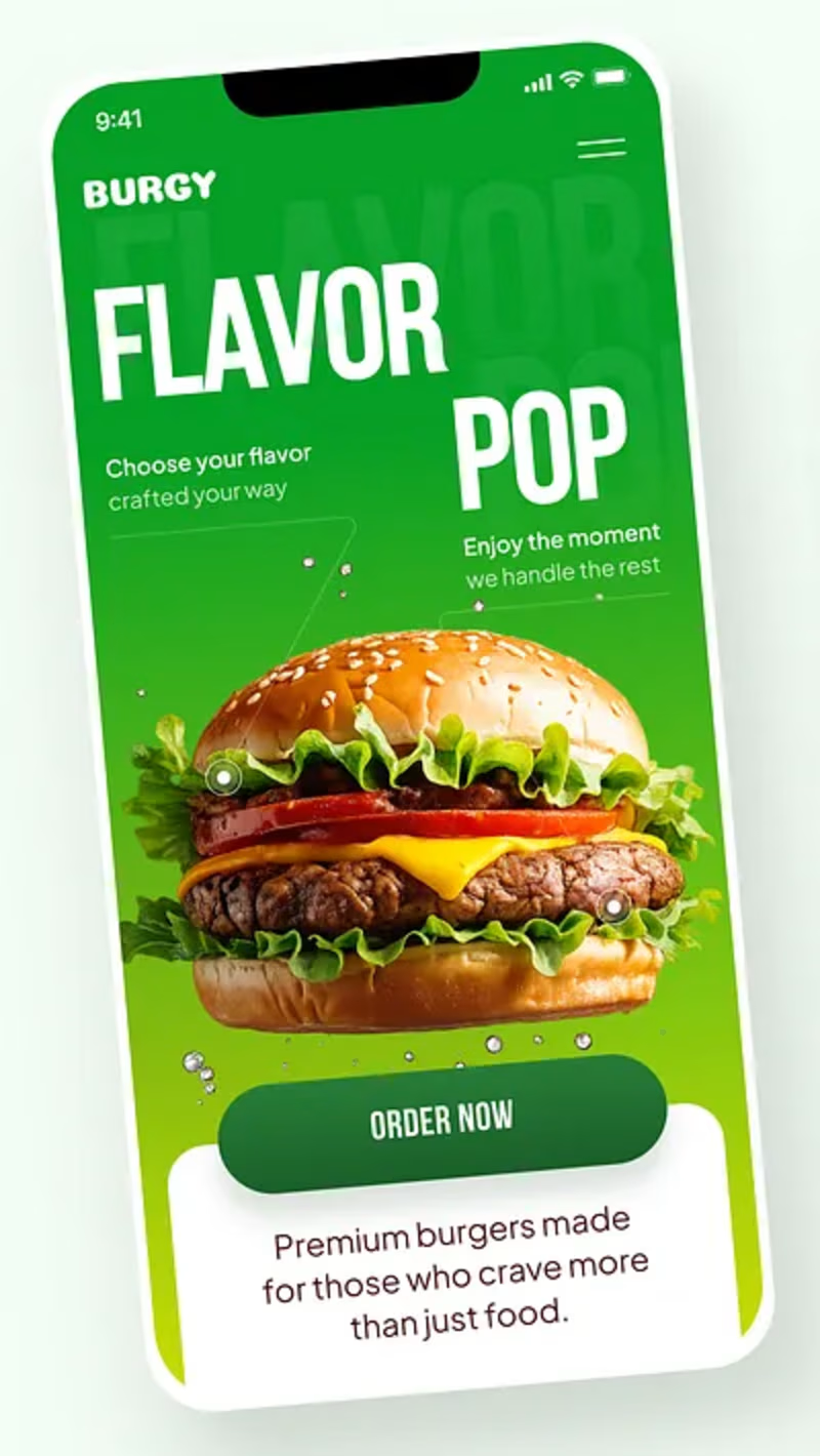
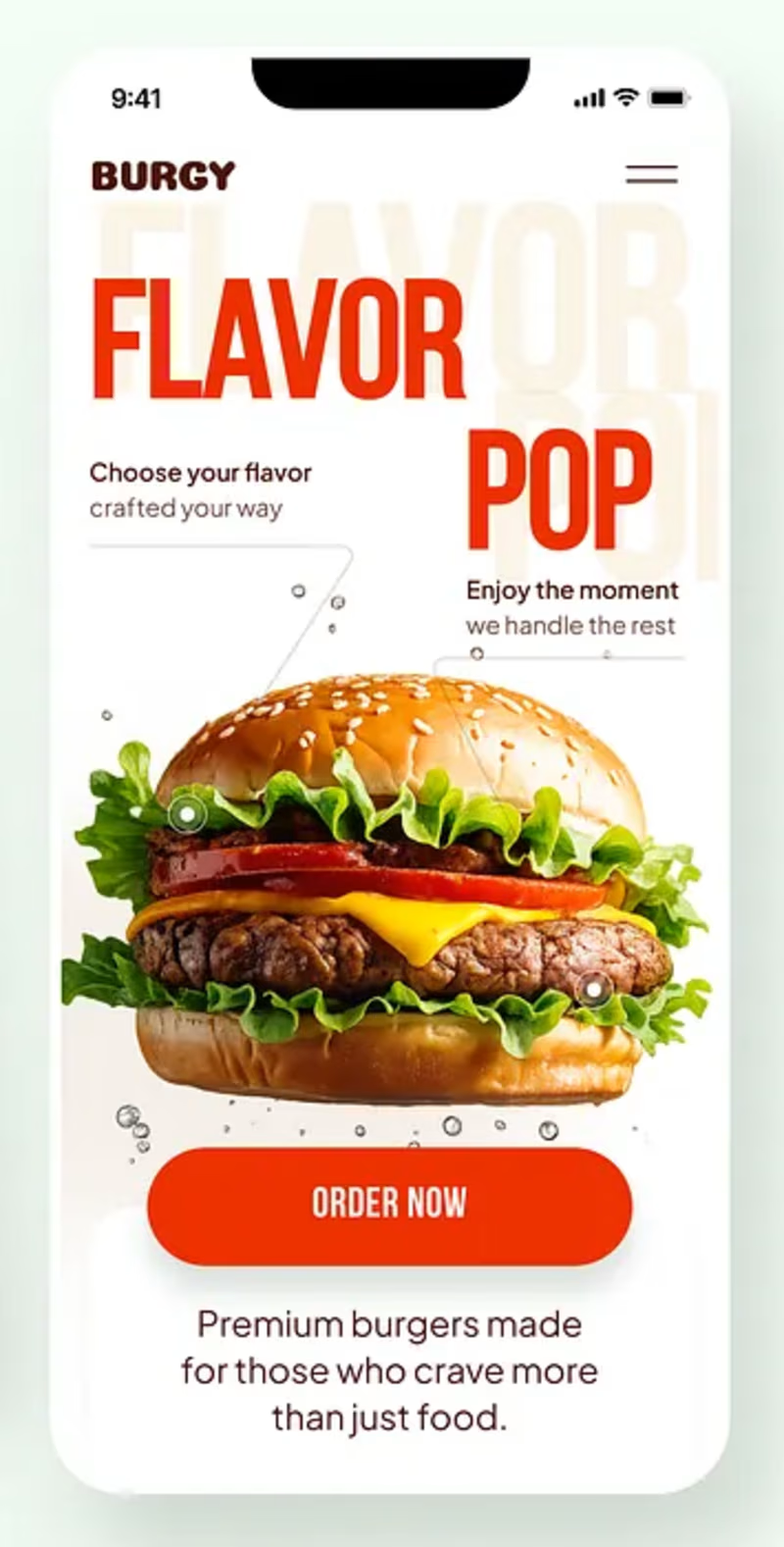
Burgy, a mobile concept for burger ordering. 🍔
Bold type, premium food visuals, and a fast path from craving to checkout.
Two color directions for the hero screen. Which one converts better?
Vote and tell me why 👇
Poll options: 🟢 Green | 🔴 Red
#UIDesign #MobileApp #FoodApp #AppDesign #UX #RestaurantApp


13 voted
43%
17 voted
57%
30 votes
Closed

Green for me, and I'd bet on it converting better too. The red version is loud in the way every food app is loud, while the green makes the burger the hero and the screen instantly recognizable in a feed. The green background also gives the white FLAVOR POP type far more contrast, so the message lands a beat faster.