The network for creativity
Join 1.25M professional creatives like you
Connect with clients, get discovered, and run your business 100% commission-free
Creatives on Contra have earned over $150M and we are just getting started
Back to feedPost
Taste Test
Which one would you launch it with?
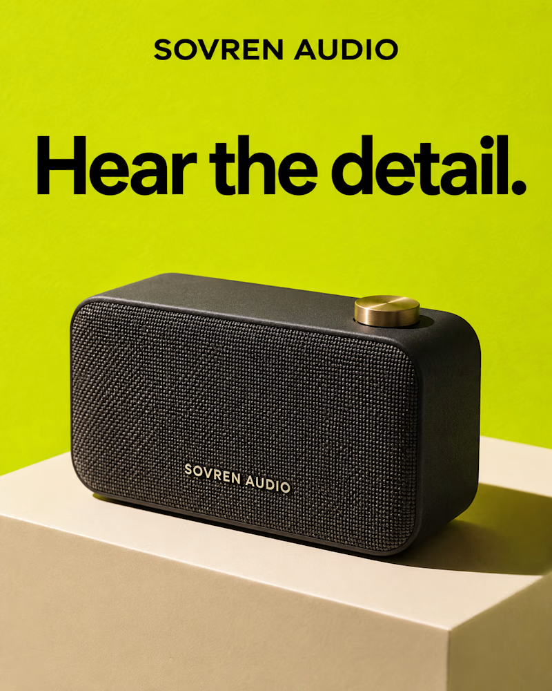
The first is a black woven speaker with a brass dial, set on a cream block against acid green, flat daylight, the wordmark printed small on the grille, a heavy black sans headline across the top.
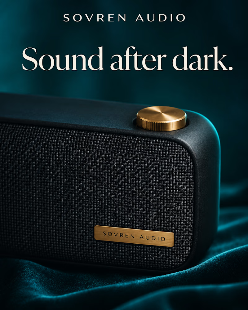
The second is the same speaker shot close and low on teal velvet, the weave filling the frame, a brass plate on the grille and the dial catching the only warm light, the headline in cream serif.
One sells clarity. The other sells mood.
👇 #productdesign #brandconcept #productphotography
3 voted
50%
3 voted
50%
6 votes
Closed

i think dark one is best!

B for me. It feels more distinctive and gives the speaker a stronger premium identity.
The network for creativity
Join 1.25M professional creatives like you
Connect with clients, get discovered, and run your business 100% commission-free
Creatives on Contra have earned over $150M and we are just getting started



Related posts


Which one would you build the range on?
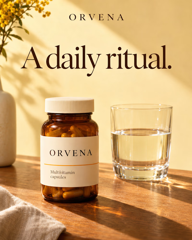
The first is an amber jar with a cream label standing on warm oak beside a glass of water, mimosa in a stone vase at the edge, linen in the corner, low sun laying long shadows across a buttercream wall.
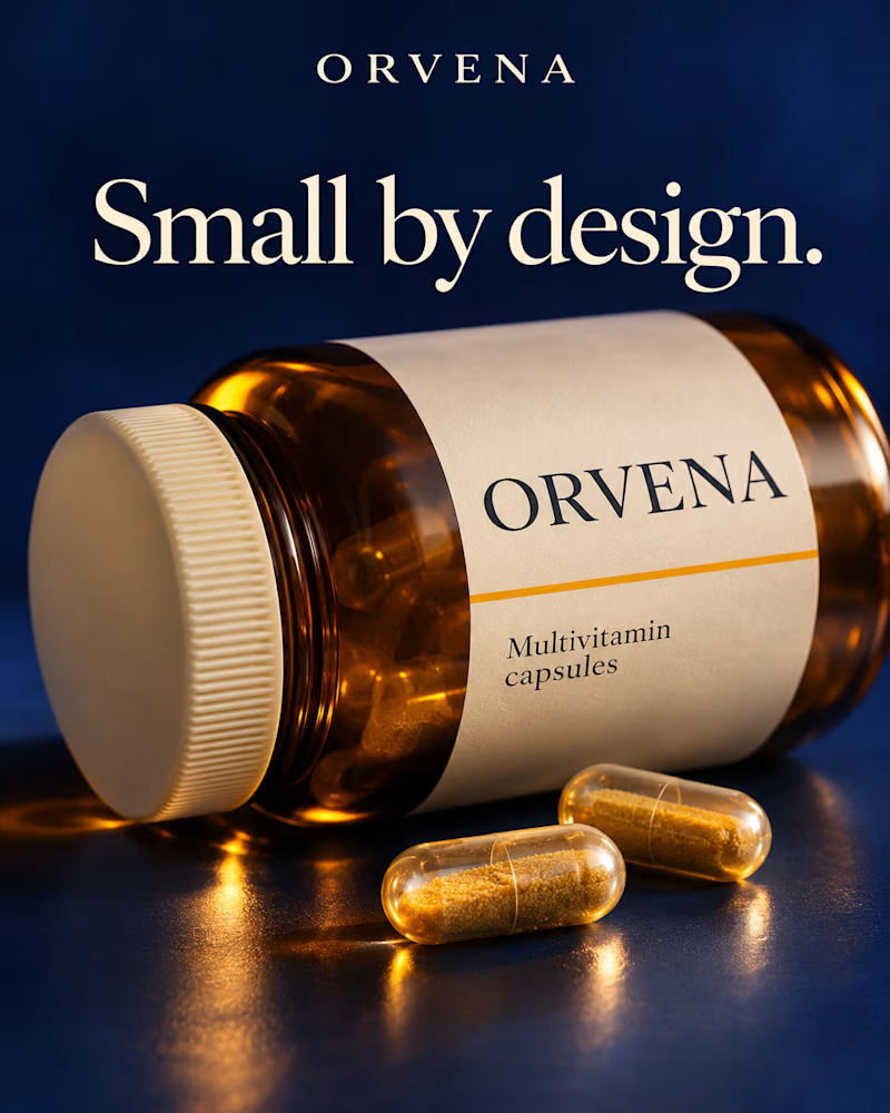
The second is the same jar tipped on its side on deep navy, shot close and low, two clear capsules of golden powder in front, light pooling amber on the surface beneath.
One sells the routine. The other sells the formula.
👇 #packagingdesign #brandconcept #supplementdesign
8 voted
73%
3 voted
27%
11 votes
Closed


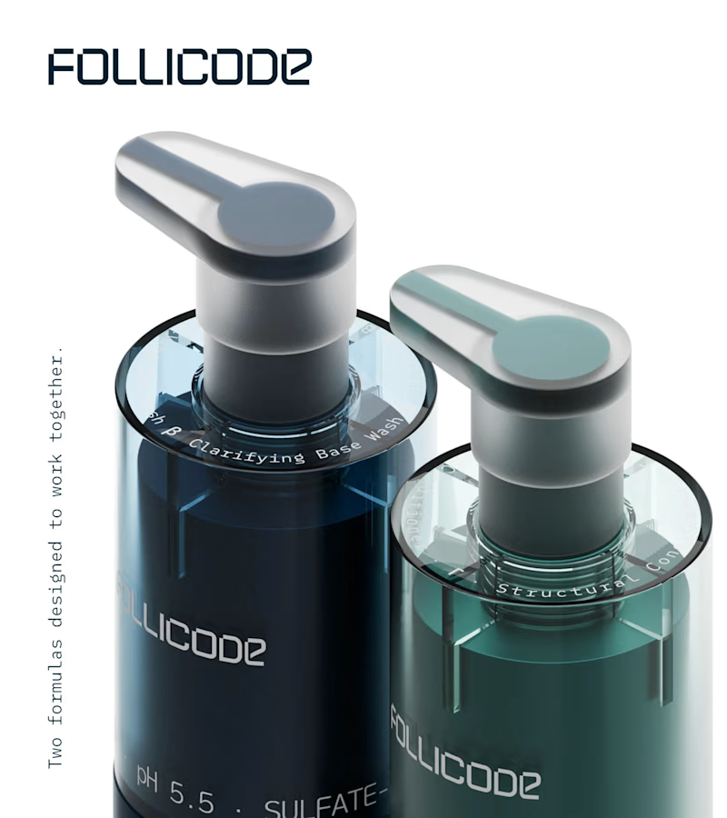
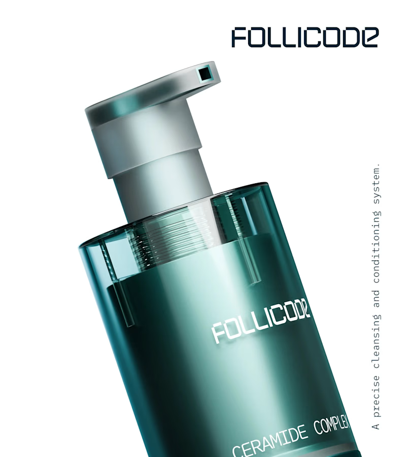
Choose your product hero shot
2 voted
29%
5 voted
71%
7 votes
Closed

Option 2 for me. The single bottle has room to breathe and the FOLLICODE branding reads instantly — it feels like a proper hero. Option 1 is nice for showing the system, but the two bottles compete with each other and the label gets a bit lost in the dark. I'd run Option 2 as...
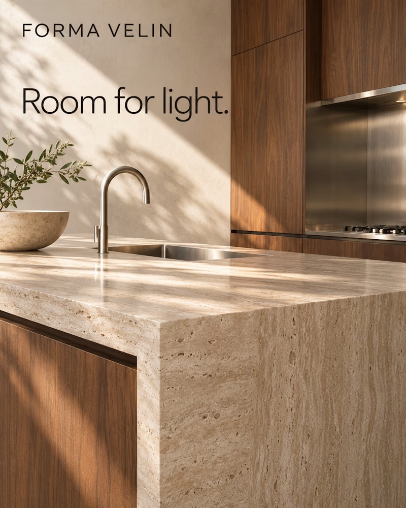
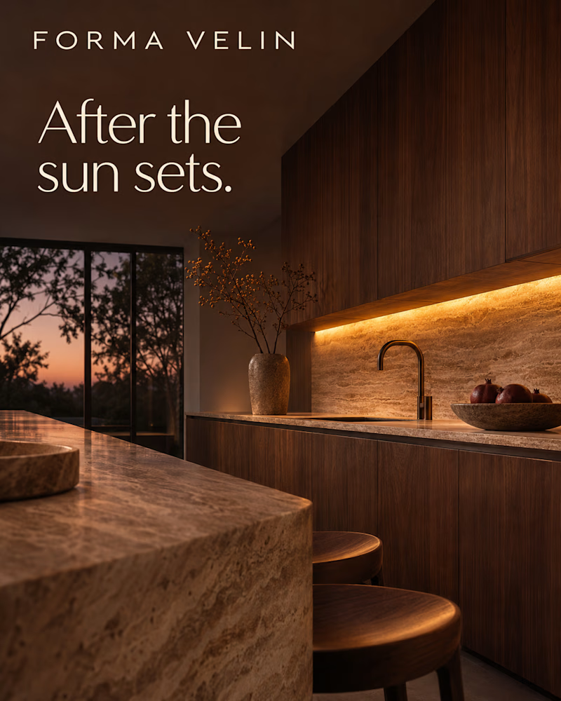
Which one would you sell the kitchen with?
The first is a travertine island with a waterfall edge and walnut fronts, brushed steel tap and sink, a stone bowl with an olive branch, morning sun throwing leaf shadows across the counter and a plaster wall.
The second is the same kitchen at dusk, warm strip light glowing under walnut cabinets onto a travertine splash, a bronze tap, pomegranates in a stone bowl, two wooden stools, the sky turning pink through tall black framed windows.
One sells the morning. The other sells the evening.
👇 #interiordesign #interiorbranding #brandconcept
3 voted
75%
1 voted
25%
4 votes
Closed
