The network for creativity
Join 1.25M professional creatives like you
Connect with clients, get discovered, and run your business 100% commission-free
Creatives on Contra have earned over $150M and we are just getting started
Back to feedPost

Packaging is often the first interaction someone has with a product. Before they read the ingredients or reviews, they're already forming an impression based on the design.
For this supplement brand, the goal was to create packaging that feels:
💪 Clean and professional
🌿 Trustworthy
✨ Premium without being overwhelming
🛒 Eye-catching on crowded shelves and online marketplaces
I always try to balance aesthetics with clarity so the design not only looks good but also communicates the brand's value instantly.
I'd love to hear your perspective:
What do you think has the biggest impact on supplement packaging bold visuals, clean minimalism, or clear product information?
Here's the full project:
https://www.behance.net/gallery/248234409/Supplements-Branding-and-Packaging-Design
Looking forward to your thoughts!
The network for creativity
Join 1.25M professional creatives like you
Connect with clients, get discovered, and run your business 100% commission-free
Creatives on Contra have earned over $150M and we are just getting started











Related posts


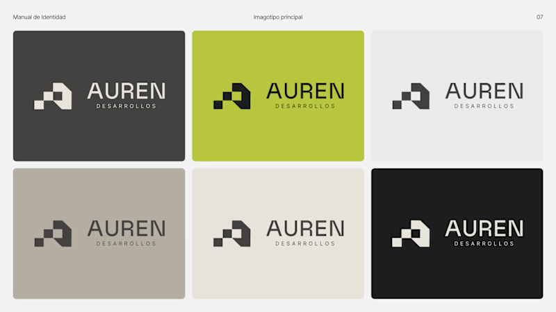
Same brand. Same palette. Two completely different proposals for a real estate developer.
A: An isotype built from blocks. Geometric, precise, the language of construction. It says we build.
B: Custom lettering with movement. Warmer, more editorial. It says we build places you’d want to live in.
36 voted
51%
35 voted
49%

71 votes
Closed

My vote is B, Milagros. Custom lettering with movement has real editorial warmth, which suits a developer selling places people actually want to live in.

New case study is live.
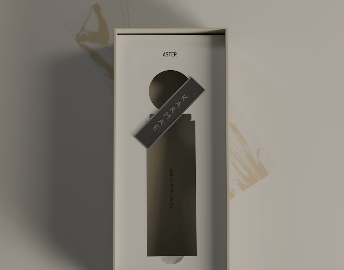
KARMAE is a contemporary fragrance house exploring the relationship between scientific precision and sensory experience. ASTER was developed as the softer side of the brand, combining a restrained visual identity with tactile materials, frosted glass, muted metallics and considered packaging details.
The goal was to create a cohesive brand experience where the identity, product and packaging feel like natural extensions of one another. Alongside the branding and packaging, I also developed the product visuals and final 3D renders in Blender.
A more in-depth look at the concept, design decisions and final applications can be found in the full case study.
Long story short, I really enjoyed bringing this one to life, especially exploring how material contrasts and subtle details could give ASTER its own character while keeping it connected to the wider KARMAE brand.


Beautiful presentation!! and love the product packaging!

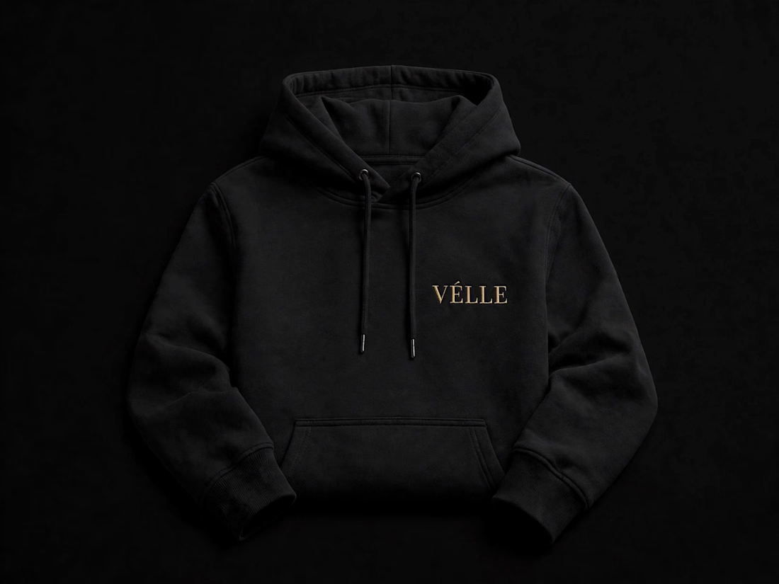
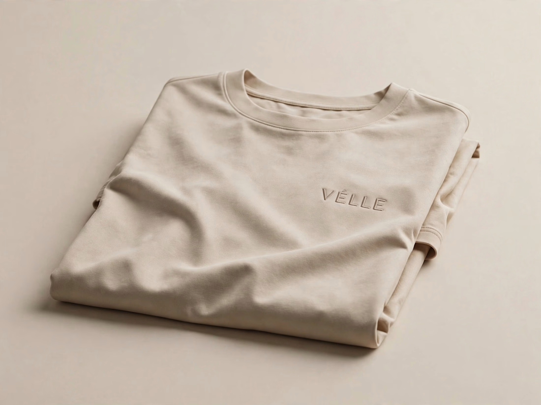
VÉLLE - Minimal Luxury Fashion Brand Identity
A conceptual fashion brand built on quiet luxury and timeless essentials.
What I did:
→ Logo Design (Primary + Secondary)
→ Brand Identity & Color System
→ Product Mockups (T-Shirt, Cap, Tote Bag)
Concept: Less is more. Clean serif typography with subtle accent for premium feel.
Palette: Beige #E8DDD0 / Black #0A0A0A
Full case study on Behance: behance.net/gallery/257321557
Open for freelance projects - DM for fashion branding.

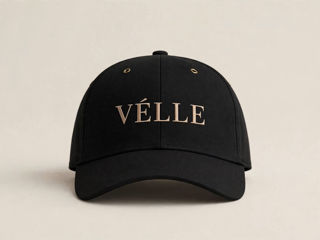
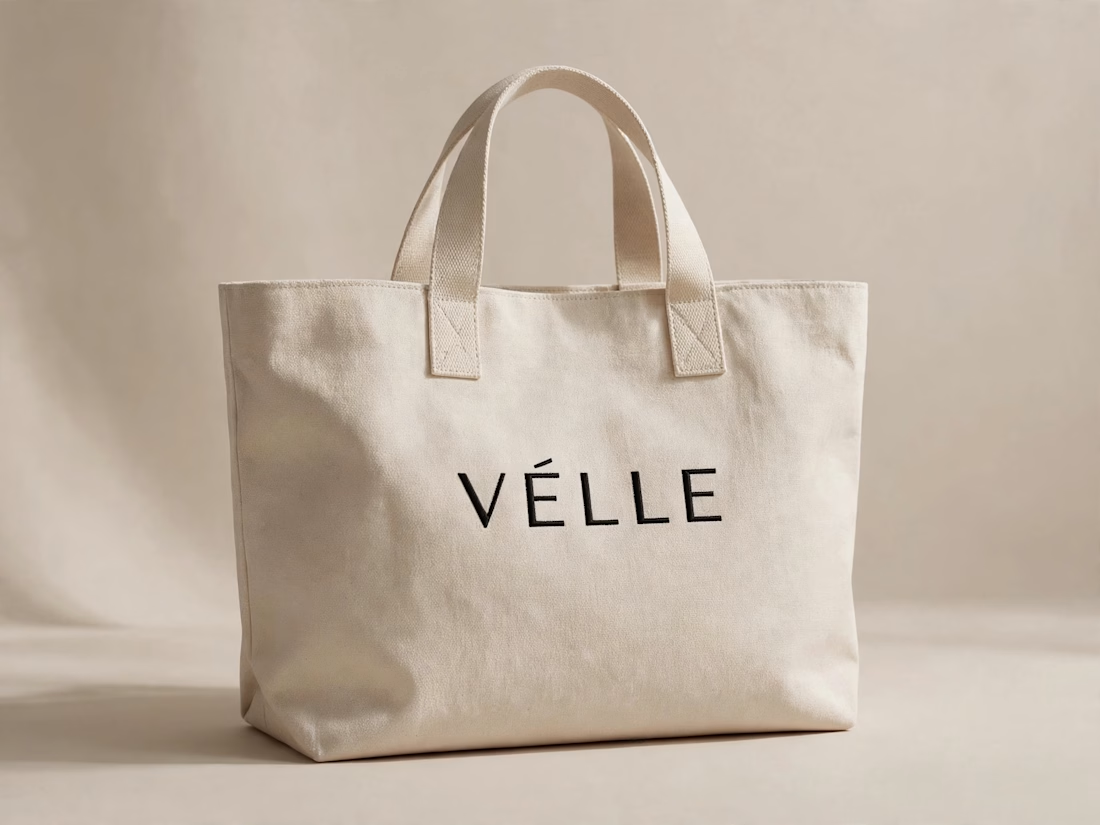

love the minimal direction on this. VÉLLE feels expensive but not loud, the tote and cap mockups are so good