
Md Shahanuzzaman
Packaging & Brand Identity Designer


Are you a US or EU skincare or DTC brand founder tired of packaging files failing at the print press?
I engineer 100% print-ready mailer boxes, product labels, and structural dielines (such as 220x150x60 mm E-Flute boards) with exact CMYK color profiles and matte lamination specs.
Stop risking thousands in manufacturing losses and secure production-ready files that pass factory checks on day one.
Hire me (https://www.behance.net/gallery/257866147/Skincare-Mailer-Box-Design-Structural-Dieline) remotely on Contra (https://contra.com/s/vPEmlLrQ-print-ready-packaging-design-custom-dieline-and-3-d-mockups?r=visiolancestudio)for zero-defect packaging design!
1
1
83
Print-Ready Skincare Mailer Box & Structural Dieline Design
One 2 mm dieline error or wrong color profile can ruin a $10,000 packaging print run. Pretty visuals mean nothing if your files fail at the press.
Problem & Solution:
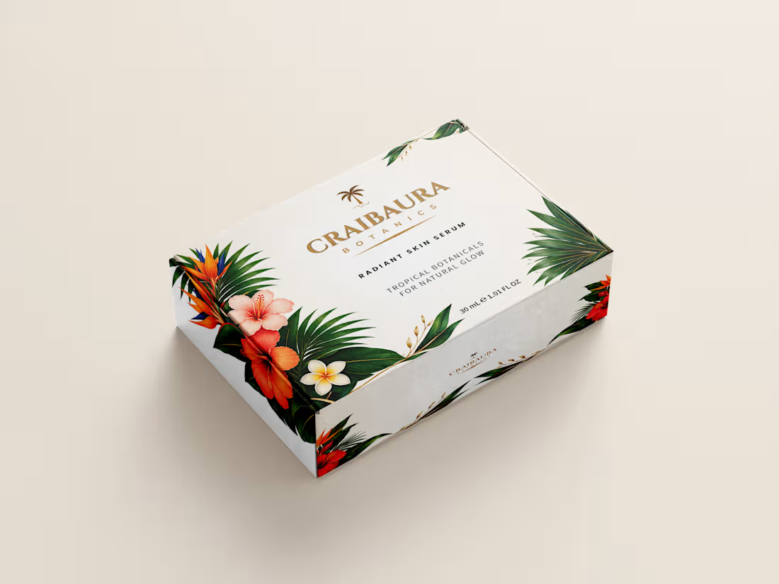
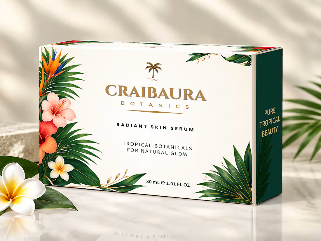
US and EU skincare founders hiring a remote packaging designer need press-ready precision. For Craibaura Botanics Radiant Skin Serum (30 mL / 1.01 FL OZ), I engineered a custom mailer box system for zero-defect global production.
Technical Image Breakdown:
Hero 3D Presentation: Styled view with US/EU dual net-weight formatting that builds instant DTC buyer trust.
Prepress Artwork Sheet: Full dieline layout with the EU e-mark, bleed zones, and exact CMYK ink values ready for press approval.
Open Box Interior: The double-sided layout accounts for 3 mm board folding so the dark green interior and flaps align without ink cracking.
3D Exterior Mockup: Calibrated CMYK color profiles for matte lamination ensure tropical botanicals print cleanly without muddy shifts.
Top-View Layout: Clean top-panel view of the Craibaura Botanics logo on isolated vector layers for accurate Spot UV or foil plate creation.
Structural Dieline: Drawn at 100% scale (220x150x60 mm) for a 3 mm E-flute board with exact cut lines, fold lines, and glue areas to prevent machine jamming.
Available for remote projects; hire me on Contra for packaging files that pass prepress checks on day one.
0
27
Premium Industrial Packaging, Paint Bucket & Drum Labels & 3D Motion Video Ads
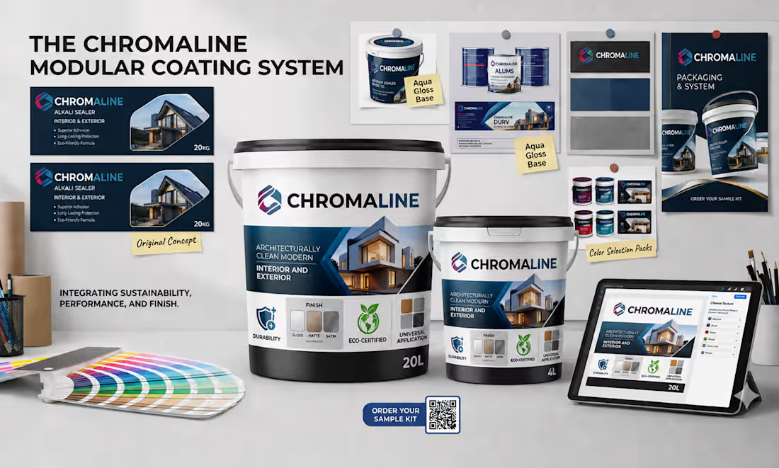
We design, and you grow! Stand out in US and European hardware, construction, and B2B markets with factory-ready industrial packaging. Like the featured 'Choromaline' coating line, we craft strategic branding, print-ready labels, and high-converting ads for paint and chemical brands.
Key Capabilities:
Paint Bucket & Drum Design: Precision labels for 20L architectural exterior paint pails and 200L industrial protective coating drums, highlighting weather protection, color retention, eco-friendly, and anti-fungal specs with clear icons.
Adhesive Tube Design: Modern 300ml cartridge layouts showcasing strong bond, fast-dry, and water-resistant features.
3D Mockups & Motion Video Ads: Photorealistic 3D Ultra HD mockups, Motion ad designs, and motion video ads for e-commerce, social media, and B2B catalogs.
Why Choose Us?
EU & US Compliance: 300 DPI CMYK print-ready vector dielines with accurate net volume and safety icons.
Dedicated Value: Unique creative concepts, high-quality ads, and 24/7 support from concept to print.
Ready to elevate your industrial brand? Message us today with your dimensions or dielines!
#IndustrialPackaging #PaintBucketDesign #AdhesiveTubeDesign #3DUltraHDMockup #MotionVideoAd
0
90
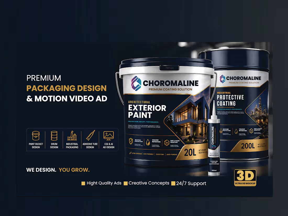
Premium Industrial Packaging and Label Design, 3D Mockup
Premium Industrial Packaging Case Study:
Elevating industrial utility into luxury retail. A cohesive visual system for Chromaline that commands shelf attention and drives E-commerce conversion.
Most people assume industrial products must look boring or messy. We are all used to seeing plain paint buckets and glue tubes that only prioritize basic utility.
When Chromaline approached me, they wanted to disrupt this industry. The objective was to create an industrial design system that rivals global titans, making heavy-duty items look sophisticated while remaining functional for real job sites.
𖥔 Project Objectives
Our goal was to transform standard products into a premium experience. We focused on:
∗ Building a strong corporate identity that commands shelf presence.
∗ Developing Amazon branding and storefront assets for high conversion.
∗ Ensuring the packaging design complies with strict international regulations.
∗ Creating a minimalist packaging look that justifies a higher price point.
∗ The most challenging part of working on this project was getting the texture of the gold foil printing right.
𖥔 Design Thinking & Strategy
I noticed a clear market pattern: too many brands look cheap and fail to stand out on retail shelves. I shifted the focus toward a premium packaging strategy using deep navy, gold, and white. I initially thought the blue color would not be dark, but after testing the print, it came out absolutely perfect.
This specific color palette creates an instant sense of luxury. To ensure site utility, I optimized the visual hierarchy, so safety information remains legible in chaotic factory settings. By integrating sustainable chemical packaging concepts, we met eco-regulations while elevating the brand’s perceived value instantly.
𖥔 The Process: From Concept to Production
My approach went beyond creating a simple label design. I built a smart, cohesive visual system that solves real manufacturing problems.
The workflow began with structural die-line design and technical sketches to guarantee zero production mistakes. I refined every vector illustration and layout detail to perfection, ensuring the paint bucket design, adhesive tube, and tube packaging formats are ready for mass production without leaks.
𖥔 Deliverables & Visualization
We executed a complete visual overhaul across various formats:
∗ High-fidelity mockups: Showcasing the container design in realistic retail settings.
∗ Amazon assets: Optimized A+ content and EBC design layouts to maximize click-through rates.
∗ Production-ready files: Consistent industrial branding across all sizes, from small tubes to large industrial drums.
∗ Commercial design: Applied standards to every product listing and print design to turn utility into a luxury experience.
This project proves that utility products don't have to look dull. By using a clean style and smart material choices, we built a product packaging system that protects the product and makes the brand look expensive before the customer even opens the package.
As a professional designer, I focused on creating assets that drive sales and build long-term trust.
Available for new branding and packaging projects. Let's collaborate to build your custom visual system.
0
53