The network for creativity
Join 1.25M professional creatives like you
Connect with clients, get discovered, and run your business 100% commission-free
Creatives on Contra have earned over $150M and we are just getting started
Back to feedPost
A client once sent me a dieline with the wrong measurements. I finished the design and sent it, and the printer returned the file. I fixed it and sent it again. Since then, I check the dieline before I start.
After 8 years of designing packaging and labels, I made THALVENE, a skincare jar and label concept, to show how I work: 50 ml and 30 ml jars, a lid label, a back label, and print-ready files with bleed and safe margins.
Has a printer ever sent your label file back? If you own a skincare or private label brand in the US or Europe and sell in online stores or on your own site, see the full case study in the first comment.
#SkincarePackaging #PrivateLabel #LabelDesign
skincarepackaginglabeldesignprivatelabelPackaging DesignBrand DesignGraphic DesignAdobe DimensionAdobe IllustratorAdobe Photoshop


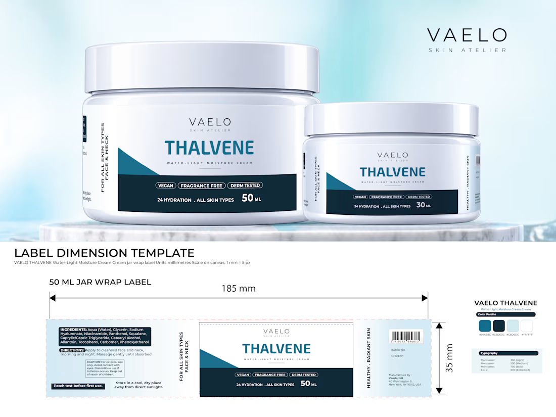

Here is the full THALVENE case study, with the jar mockups, label layouts and the print template:
If you are planning packaging for a skincare or private label line, tell me what you...
The network for creativity
Join 1.25M professional creatives like you
Connect with clients, get discovered, and run your business 100% commission-free
Creatives on Contra have earned over $150M and we are just getting started



Related posts


Is text on album covers really tacky?
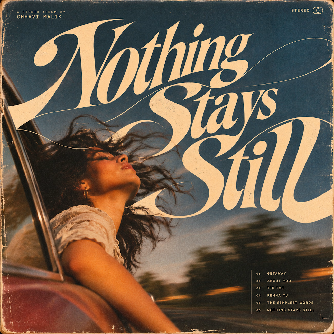
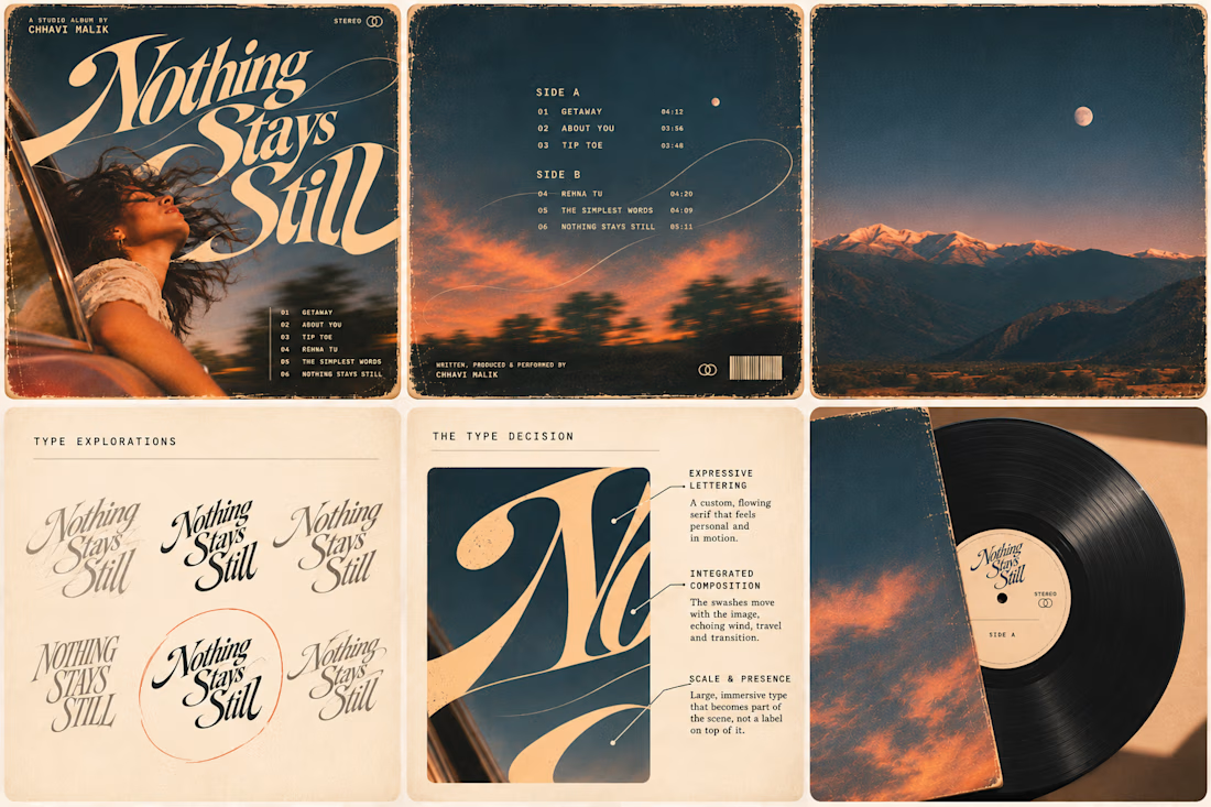
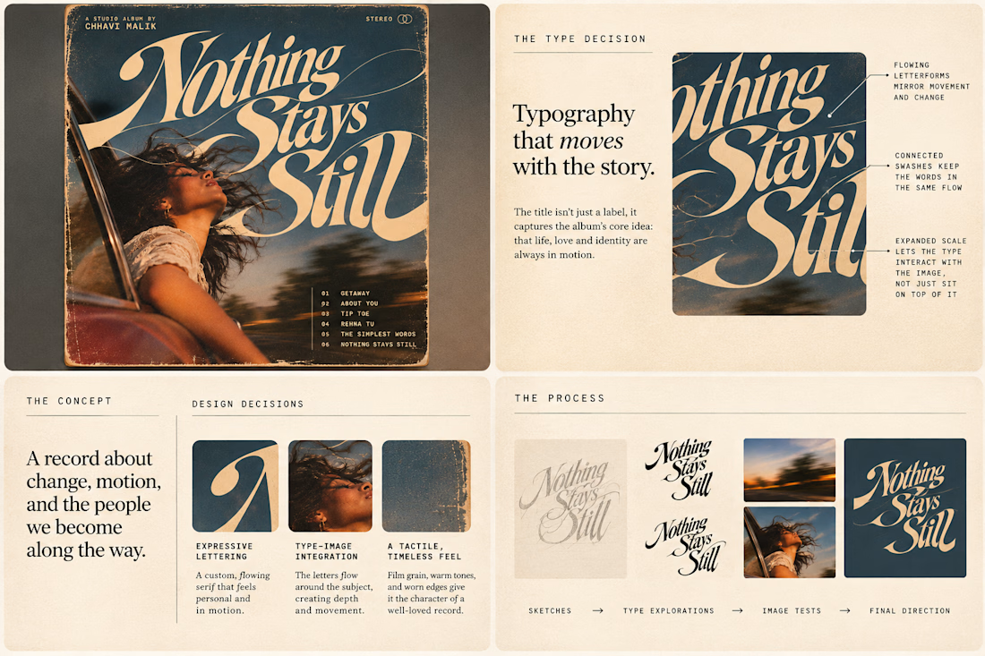
This question has been doing the rounds on X and I have to say, I'm firmly on the other side of that argument. I've always loved seeing typography become part of the artwork rather than just a title sitting on top of it.
So I wanted to put that idea to the test with an imagined album called Nothing Stays Still, inspired by change, fleeting moments and everything in between:)
I played around with the lettering until it felt expressive, a little restless, and inseparable from the photograph.
Because I think badly considered typography is tacky. Typography itself? Give it a chance :)
What's an album cover where the type really makes it for you?


Brand work for HauntChain
I'm loving building this brand and the results so far
A deFi platform with some gamification


That's cute ❤️

What happens when a hummingbird gets translated into thread, then into pixels, then dropped into the sky?
Design exploration of the day: Relic Signal.
Bayer dithering, difference blend, five brand colors, one tiny messenger.
Craft on one side, static on the other.