The network for creativity
Join 1.25M professional creatives like you
Connect with clients, get discovered, and run your business 100% commission-free
Creatives on Contra have earned over $150M and we are just getting started
Back to feedPost
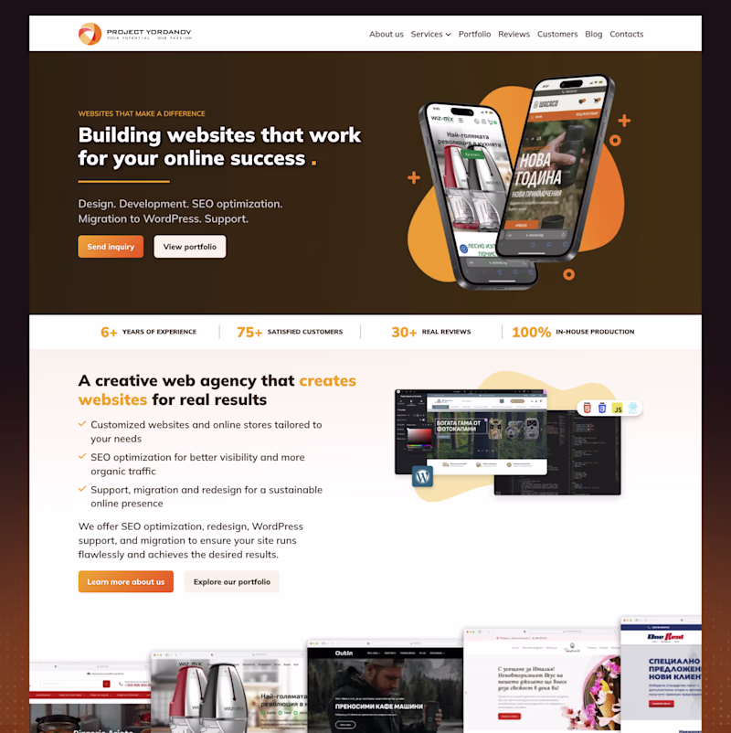
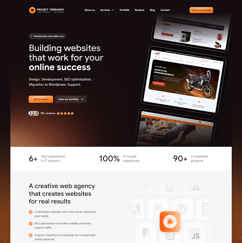
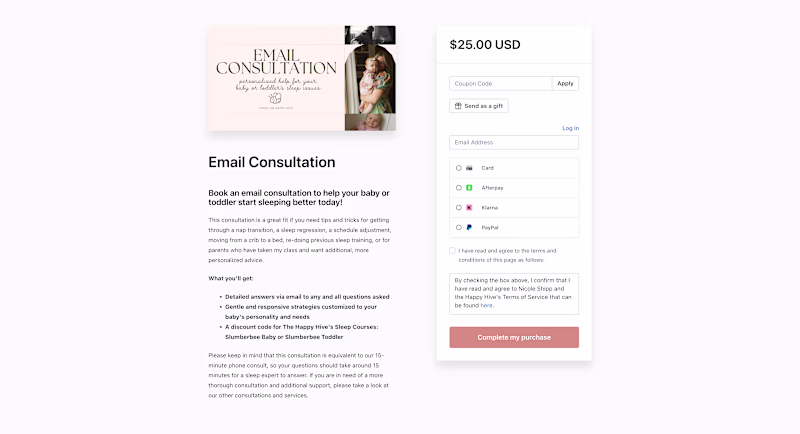
Taste Test
Recently redesigned a website for a web agency with the goal of making it feel cleaner, more modern, and more premium - while keeping the original identity.
Curious what you think
Which version do you prefer?
20 voted
14%
118 voted
86%
138 votes
Closed
Nice work
lovely work
Your after definitely nailed it and gave them a more premium feel
The after version hits different. Way more premium and clean, love the upgrade ✨
After, showed clear usage of space in a design.
The after one looks more premium.
specially i liked proper blank space. look like clean site!
"After" rocks...Clean & Flawless layout
The After is super dope and clear
The after version hits different — way more polished and trustworthy! 🔥 The dark tones give it that premium edge clients actually pay for.
Love this
The new design looks much more succinct and focused.
Both looks greats 😍
This looks really Great!
You rockkk girl
There's so much more breathing room in your revised design, and you totally nailed preserving the existing brand. Nice work!
love this!
Great work
Good Work 😍
Great work on the redesign! It definitely feels cleaner and more modern while still keeping the original identity intact. I personally prefer the new version — it looks more premium and polished.
I definitely prefer the after
The new version seems more user-friendly! Great job!!!
After
Yours looks really good
The before is perfectly serviceable. It does the job, and it's fine. But just that, "fine". The after is next level. It takes the website from being an afterthought into the core of the business. And for a web agency, this is exactly what i'd look for as a client.
The after version feels much more refined and premium. The cleaner layout and stronger visual hierarchy really elevate the overall experience.
The after is the classic one... Amazing work
The network for creativity
Join 1.25M professional creatives like you
Connect with clients, get discovered, and run your business 100% commission-free
Creatives on Contra have earned over $150M and we are just getting started
Related posts
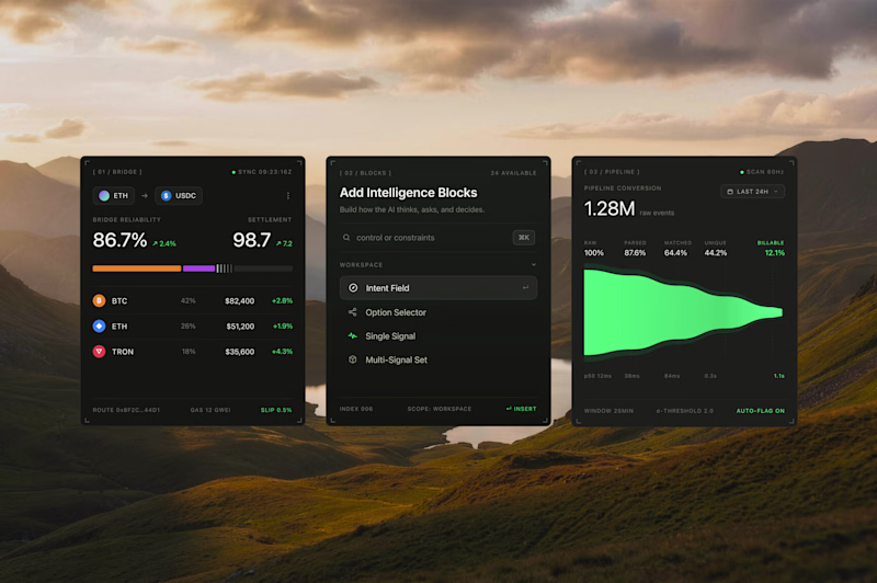
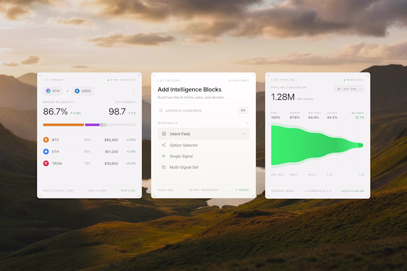
Interface cards for a recent product design project, what would be the best direction? Dark Mode or Light Mode? ⚡️
69 voted
68%
32 voted
32%
101 votes
Closed
Both look great, but i will go for the dark mode
My client generated over $100K with their old checkout page and a $45 product 😳
This redesigned version doesn't just look better, it introduces:
- stronger value positioning
- strategic cross-sells
- added value
This alone creates opportunities to significantly increase average order value (AOV) and even support higher pricing (2x current price).
Great design isn't just about aesthetics, it can directly impact revenue (if you study how).
Do you think Version 1 would convert and better present a higher price?
16 voted
44%
20 voted
56%
36 votes
Closed
At the end results matter.
Zero experience in the UI design industry.
But creativity, imagination, AI, and @Wonder made it possible.
🔥 Introducing "TourMe"
🧠 The idea:
A website for people who love to travel, explore, and discover different countries.
🙌 Problem:
People often have to jump between multiple websites to find travel information about a country they want to visit.
😊 Solution:
A website with multiple features for different countries:
• Weather
• Currency
• Best places to visit
• Popular restaurants
• Traditional foods
• Hotels and places to stay
• Activities
• sim cards
• and many more
💯 WORKFLOW:
• Explained my idea in ChatGPT and generated a prompt
• Used Wonder Chat to create UI concepts and website designs
• Refined everything manually using Wonder's tools and AI features
• Used Shader, Wonder Chat, Properties, and other tools
• Used Figma templates as references
• Explored different Wonder features and workflows
• Generated images using Wonder Chat
• Used Opus and Fable for generation
🙌 Others:
• Uploaded webpage screenshots and used Wonder Chat to recreate similar layouts
• Used Pinterest for inspiration and images
🎉 Wonder MCP:
• Connected Wonder MCP with Claude
• Claude helped create parts of the website
• Used GitHub to publish the website
TourMe Website:
https://aymdaking.github.io/TourMe1122/
Wonder File (Check page 1 and Page 2):
https://app.wonder.so/angelo-pacaanas/files/019f21e1-b614-7ae0-96ce-16e3fb4f1b80
🧠 UNEXPECTED:
• I didn't expect copying designs from Figma to Wonder to be so easy
• There are many Shader modes to choose from
• Prompt-to-UI worked even without UI design experience
• Wonder MCP worked smoothly with Claude
• Wonder Chat is more than a UI generator—it also helps answer questions and guide ideas
• Multiple image generation models are available (my favorite is Nano Banana)
• Easy to move, edit, and rearrange elements
• Lots of useful tools that are simple to learn and use
Challenges
View allTrending
Claude
Claude has entered the design space. How are you using Claude Design?
Contra University
Learn from expert creatives how to earn more using next-gen AI tools.
fifaworldcup2026
The World Cup is here and the whole world's watching. How are you designing for the world stage?
creativeaiflow
Creative AI workflows are evolving. What tools do you use, and what are their strengths and weaknesses?
freelancerlife
Freelancer life is wins, pivots, and everything in between. What’s yours right now?