
pro
Catarina Vilhena
Brand & Digital Designer
Ready for work
Catarina is ready for their next project!


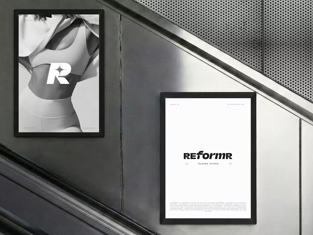
REFORMR — Pilates Studio Brand Identity
REFORMR is a self-initiated branding concept for a modern Pilates studio, built around movement, balance, and a refined visual aesthetic.
The visual identity combines bold typography, minimalist layouts, and monochromatic art direction to create a premium, contemporary brand. The project explores how a consistent visual language can translate across brand materials and advertising applications.
Scope: Logo design, visual identity, art direction, and mockup design.
1
7
174
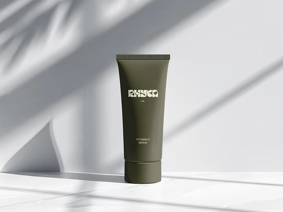
Rhyen Lab: Brand Identity & Packaging for a Skincare Brand
Rhyen Lab is a skincare brand built around science-backed formulas and a sensorial, human approach to beauty. The challenge was to create an identity that feels clinical enough to be trusted, yet warm and expressive enough to stand out in a crowded market.
I designed a custom wordmark with fluid, organic letterforms that echo the texture of serums and oils, paired with a bold monogram “R” for compact applications. A palette of deep olive green and soft cream keeps the brand grounded, natural and premium, while macro photography of skin and product textures reinforces the sensorial tone.
The system was applied across packaging for the Vitamin C Serum, Facial Cleanser and Moisturising Day Cream, ensuring consistency across tubes and bottles.
Deliverables: Logo & monogram · Visual identity · Color palette · Packaging design · Art direction
7
5
199
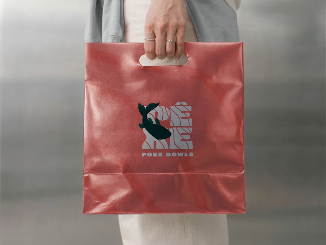
Pêxe: Brand Identity & Packaging for a Poke Restaurant in Lisbon
Pêxe is a poke bowl restaurant in Lisbon, built around fresh fish and a quick, takeaway-friendly experience. The client wanted a brand that felt young, playful and easy to recognise, one that could stand out on the street and also work on small items like stickers and sleeves.
Concept
The identity is inspired by water and the texture of fish. I created a custom wordmark where thin wave-like lines run through the letters, giving the logo movement and a sense of the sea. The accent on the “Ê” adds a local touch and makes the name feel more distinctive.
Secondary mark
For smaller spaces and packaging, I designed a compact version of the logo with a fish illustration cutting through the lettering. It works as a symbol on its own and adds personality to the brand.
Colour & pattern
I paired a deep green with a bright coral red. The green feels fresh and grounded, while the coral brings warmth and makes the food look more appetising. The wave lines from the logo were turned into a subtle pattern that appears across the packaging, tying everything together.
Applications
The identity was applied across the shopfront awning, bowl sleeves, lid stickers and paper bags. The tagline “Your poke to go” reinforces the takeaway side of the business and gives the packaging a friendly, direct voice.
Result
A consistent and recognisable brand that works from the street to the table, with a flexible system that can grow with the restaurant. [Add: “The restaurant opened in (month/year)” or a short client feedback line, if you have one.]
My role: Logo design, visual identity, illustration, pattern, packaging design and signage.
1
76
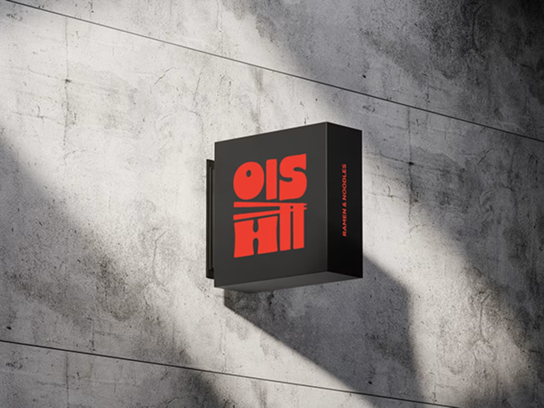
Ramen Brand Identity
Oishii is a self-initiated branding project exploring the visual identity of a modern ramen brand. The concept combines Japanese-inspired aesthetics with a contemporary visual approach, creating a distinctive and cohesive identity across brand applications.
The project explores visual direction, typography, colour, and brand elements to build a memorable identity for a food brand.
2
6
165