The network for creativity
Join 1.25M professional creatives like you
Connect with clients, get discovered, and run your business 100% commission-free
Creatives on Contra have earned over $150M and we are just getting started
Back to feedPost

Rhyen Lab: Brand Identity & Packaging for a Skincare Brand
Rhyen Lab is a skincare brand built around science-backed formulas and a sensorial, human approach to beauty. The challenge was to create an identity that feels clinical enough to be trusted, yet warm and expressive enough to stand out in a crowded market.
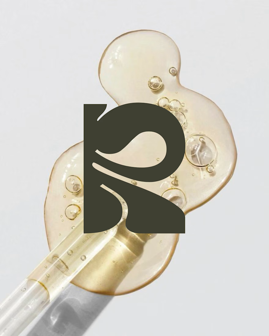
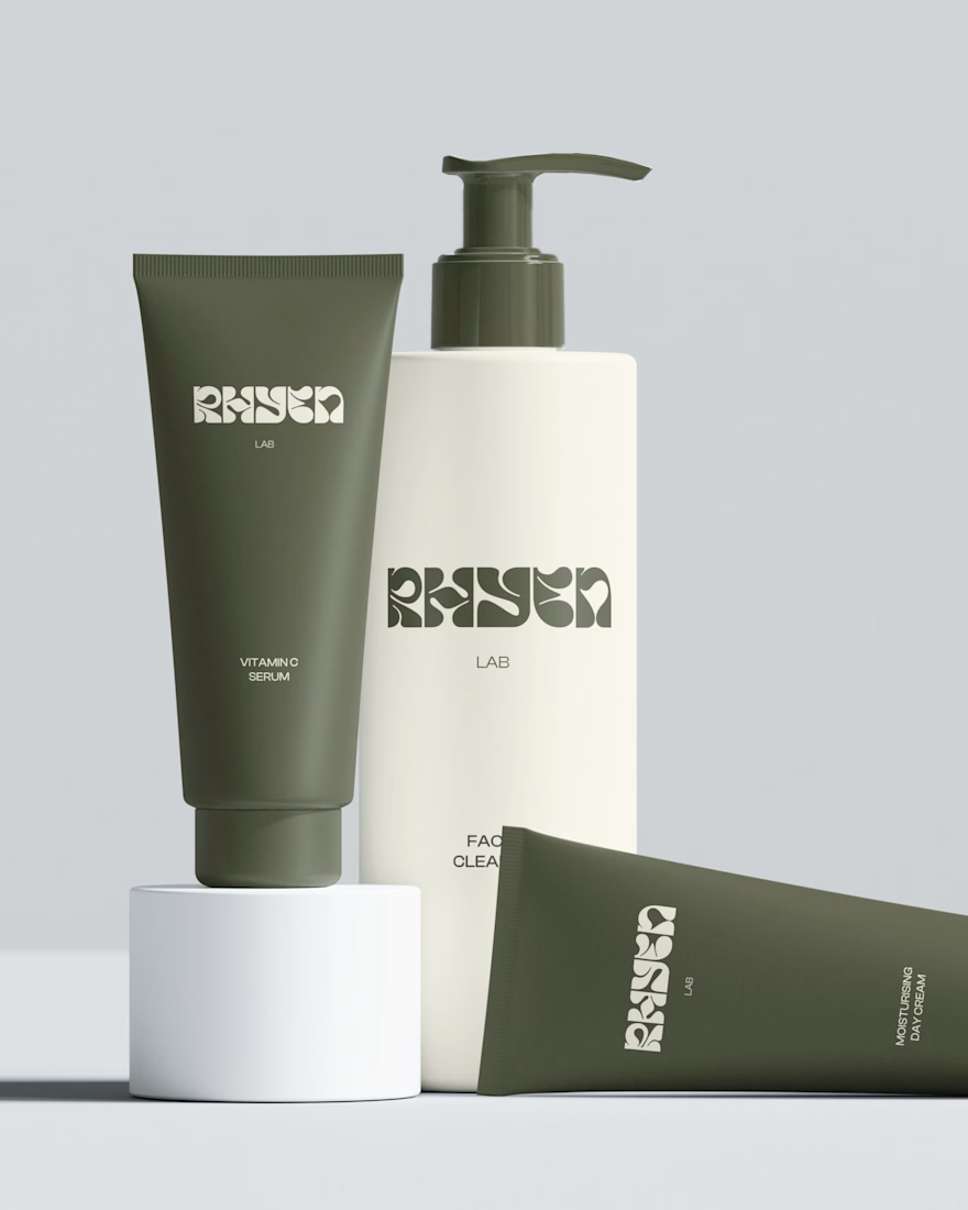
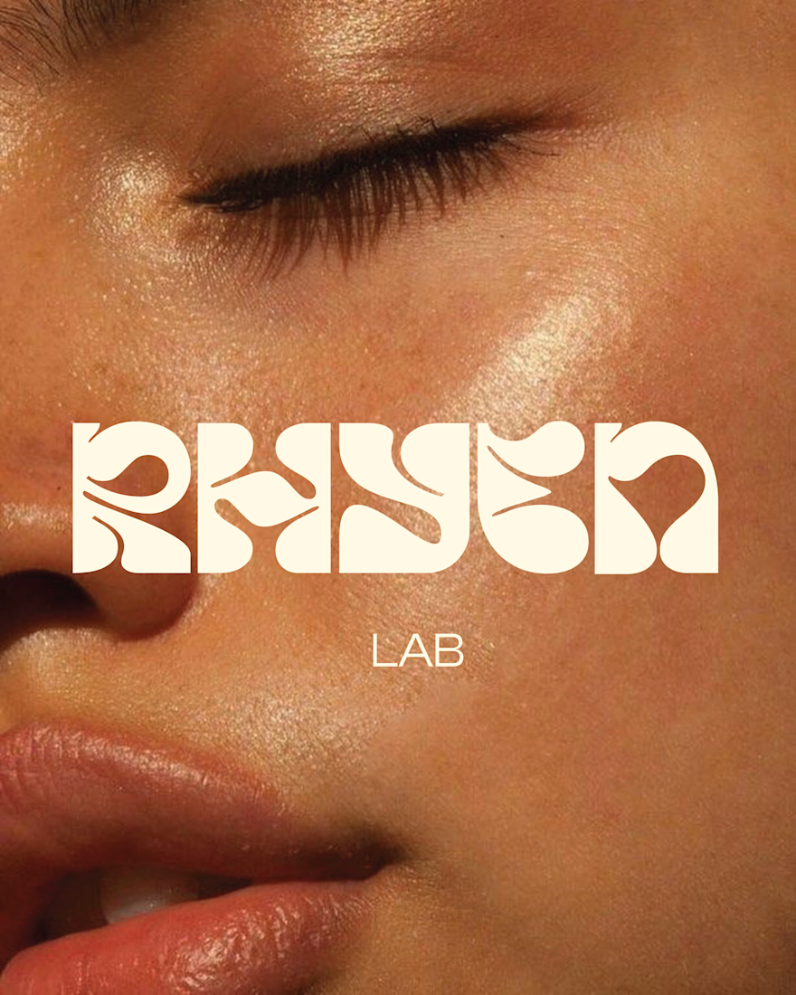
I designed a custom wordmark with fluid, organic letterforms that echo the texture of serums and oils, paired with a bold monogram “R” for compact applications. A palette of deep olive green and soft cream keeps the brand grounded, natural and premium, while macro photography of skin and product textures reinforces the sensorial tone.
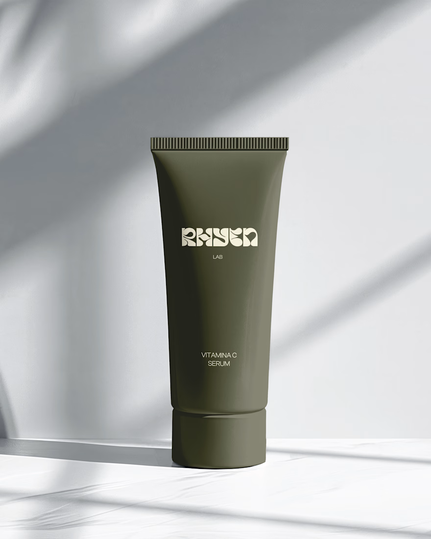
The system was applied across packaging for the Vitamin C Serum, Facial Cleanser and Moisturising Day Cream, ensuring consistency across tubes and bottles.
Deliverables: Logo & monogram · Visual identity · Color palette · Packaging design · Art direction



The olive and cream with that fluid wordmark lands the clinical but warm balance really well. Something I learned designing skincare for Amazon and Shopify is that tubes get judged at thumbnail size first, so the product type and the active need to read on the front panel even...
Thanks so much! I kept the wordmark dominant and the product name secondary to keep the packaging minimal. You’re right that legibility at thumbnail size matters, and I’d definitely increase the product name and active for e-commerce versions. Thanks for the insight!

So cool!!
Thank you Celia! 🙌

Thanks Ergin! Glad the R caught your eye.
The network for creativity
Join 1.25M professional creatives like you
Connect with clients, get discovered, and run your business 100% commission-free
Creatives on Contra have earned over $150M and we are just getting started

Challenges
View all


Related posts




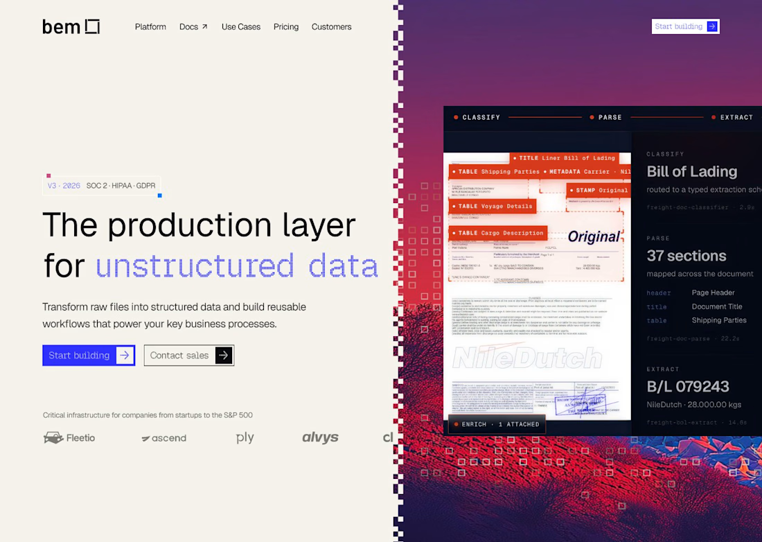
For bem, our Document Mode images start neutral, with the red/blue treatment and pixel dissolve applied later in Figma. If your campaign needs several formats, keeping that treatment editable lets you adjust the finish without regenerating the photograph.

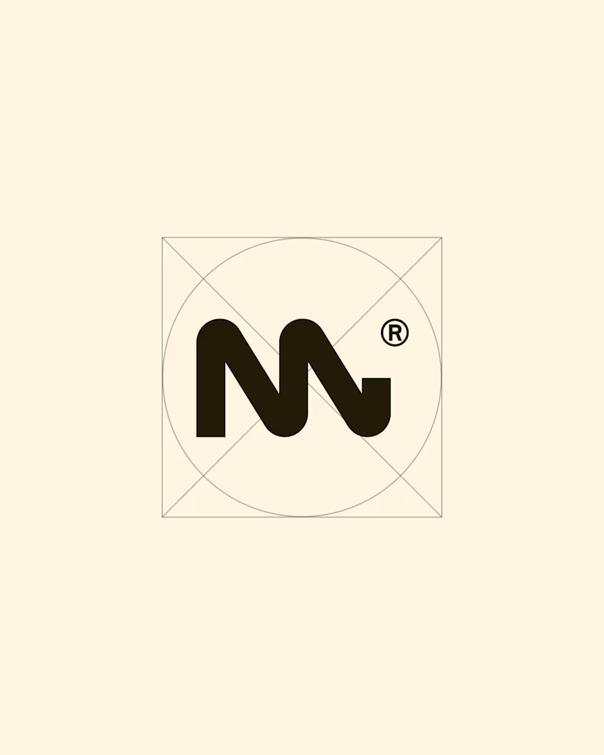
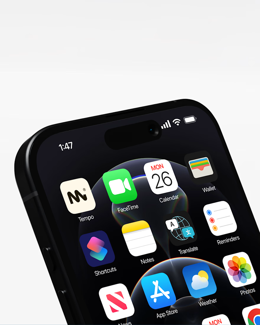
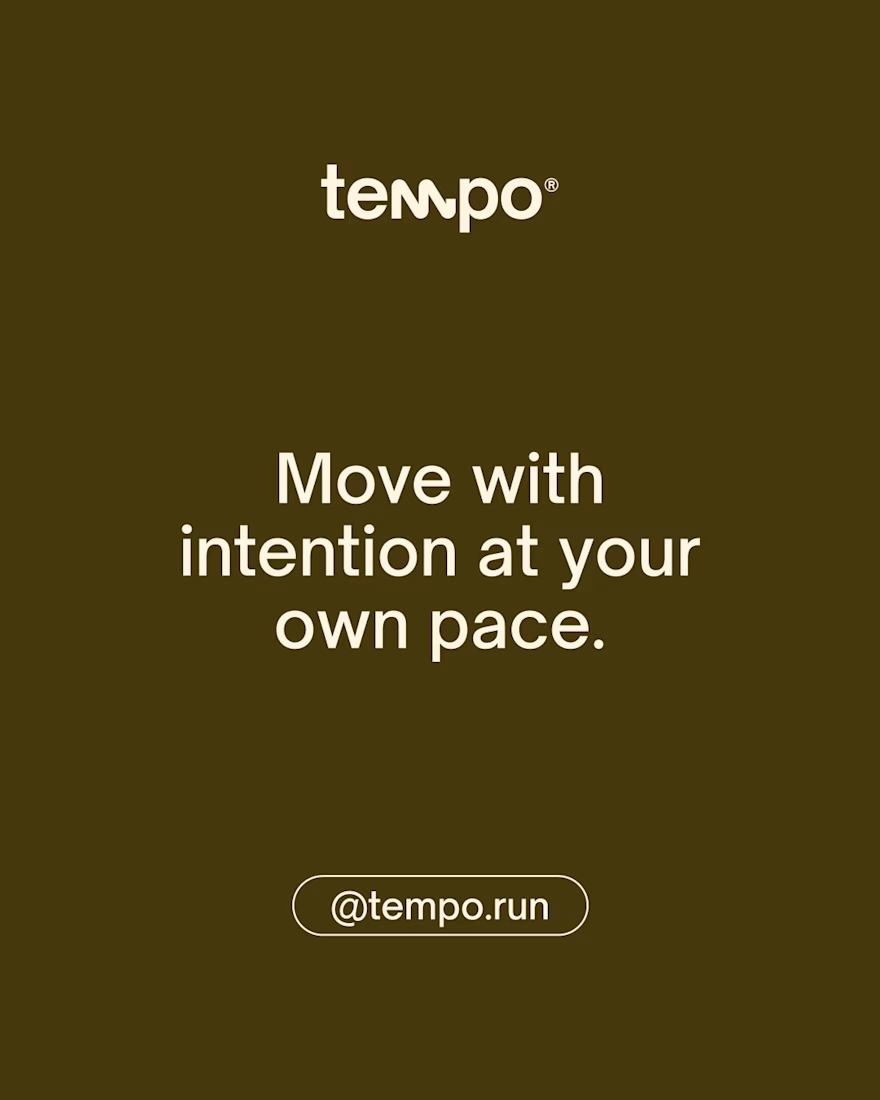
TEMPO | Run Event Brand
TEMPO is a running event platform designed to help people move at their own pace. It focuses on creating a more personal and balanced running experience, where participation matters more than competition. Each event is designed to feel calm, human, and connected.

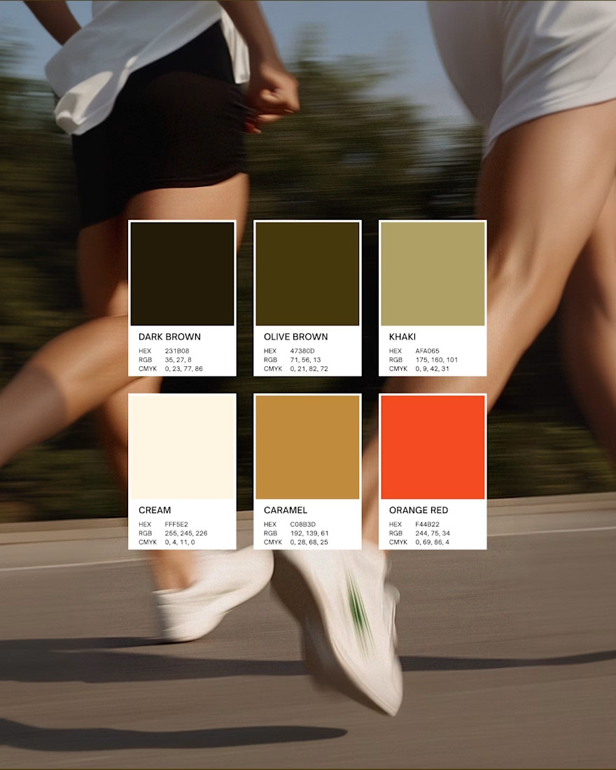

wonderful branding. Like the color palette most here