The network for creativity
Join 1.25M professional creatives like you
Connect with clients, get discovered, and run your business 100% commission-free
Creatives on Contra have earned over $150M and we are just getting started
Back to feedPost

Ramen Brand Identity
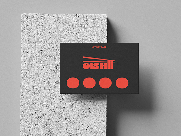
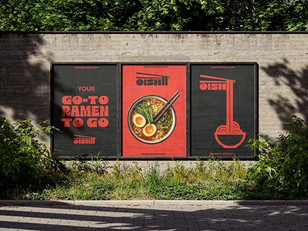
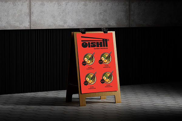
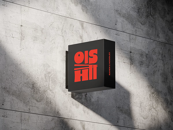
Oishii is a self-initiated branding project exploring the visual identity of a modern ramen brand. The concept combines Japanese-inspired aesthetics with a contemporary visual approach, creating a distinctive and cohesive identity across brand applications.
The project explores visual direction, typography, colour, and brand elements to build a memorable identity for a food brand.



Nice work!!

Cool

Love how the Japanese references feel modern and not cliché. That red palette is great.


wordmark is cool!

Love how the chopsticks sneak into the wordmark. It makes the name feel like it’s already eating. Also great range, going from the calm Rhyen Lab identity to something this loud. Do you have a preference between the two worlds?


Loved waht you did with the "ii", turning them into ramen. Right on point

Really nice work!


That's really feels that was coming from Japan when look at it before reading the post I thought that was a sushi brand great job Catarina 🎉🎉🎉

The logo is simple yet distinctive, with a bold personality that stands out!


Love the mix of Japanese-inspired style and modern branding. The identity feels cohesive and memorable.

I love that chunky typography and logo!!

That red and black combo is so bold, the street sign and the poster would stop me right away. The bowl circles in the logo are a fun detail.


Red and black with the bowl inside the circle mark is a classic ramen move, but the vertical poster with the type stacked like a shop sign is what makes it feel like a real place. Would the menu follow the same stacked type?

Lovely identity, great colour palette


which font you use for this logo?

Love a self-initiated brand project. The Oishii identity feels fresh for a modern ramen brand.

Love the presentation, congrats Catarina!!!

The red and black palette is so strong. The menu board and sign mockups feel like one real brand, very cohesive. 👏

The network for creativity
Join 1.25M professional creatives like you
Connect with clients, get discovered, and run your business 100% commission-free
Creatives on Contra have earned over $150M and we are just getting started
Related posts

What if your biggest streaming platform got a Halloween makeover? 🕸️
As Halloween is closing by, I decided to do a short campaign teaser for one of the biggest streaming platforms.
I redesigned their logo and played with the wording as part of their brand messaging in a spooky theme for the upcoming Halloween event.
I retained the brand consistency across the typography and overall logo shape and changed few details within.
Any twitch streamers, viewers or halloween celebrants here?

Fun concept and perfect timing. The spooky wordmark twist still feels on brand, nice one.

Any good words for the packaging.



New case on the profile: 3 Pokemon cards rebuilt as interactive Rive Animation
The brief we gave ourselves was simple. Catch that feeling of tilting a holo card, just on a screen.
So the eyes follow your cursor, every card has three moves, and the background switches between idle and action. There’s a pack to open and a randomizer that deals you a card.
Have a look at how it all came together 👇


Damn good work! How long did it take to make?