The network for creativity
Join 1.25M professional creatives like you
Connect with clients, get discovered, and run your business 100% commission-free
Creatives on Contra have earned over $150M and we are just getting started
Back to feedPost

Pêxe: Brand Identity & Packaging for a Poke Restaurant in Lisbon
Pêxe is a poke bowl restaurant in Lisbon, built around fresh fish and a quick, takeaway-friendly experience. The client wanted a brand that felt young, playful and easy to recognise, one that could stand out on the street and also work on small items like stickers and sleeves.
Concept
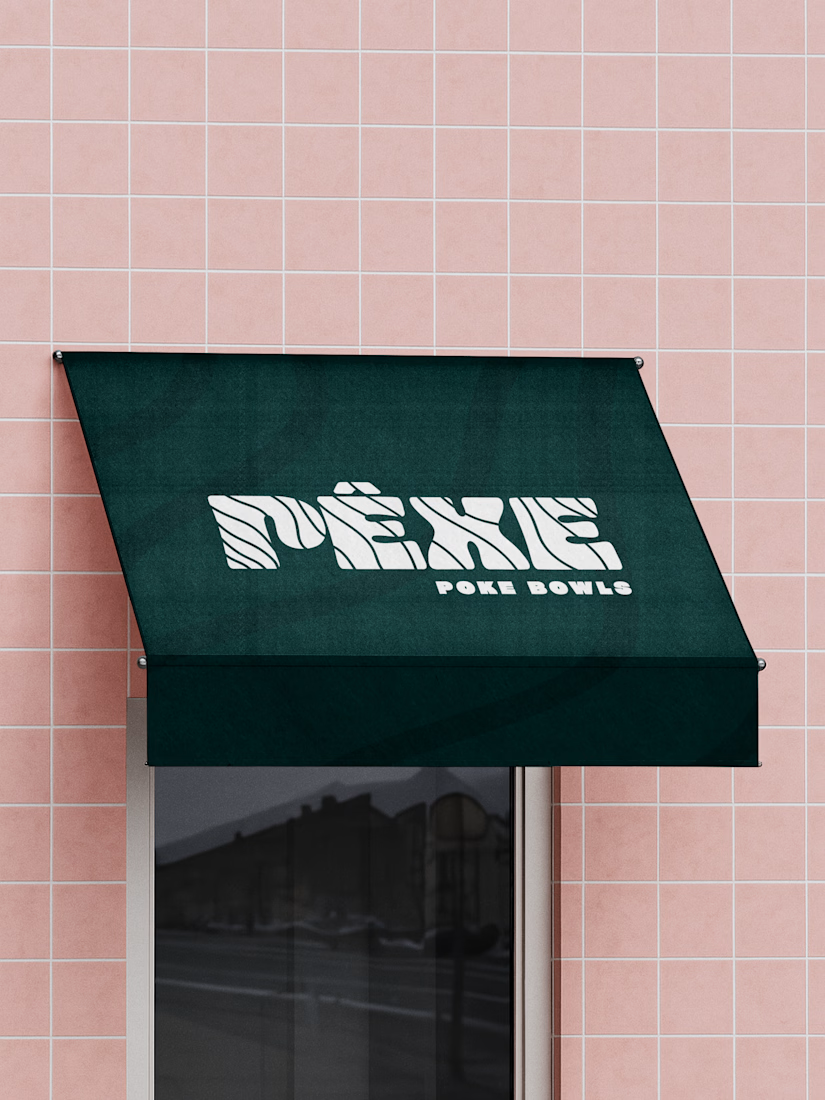
The identity is inspired by water and the texture of fish. I created a custom wordmark where thin wave-like lines run through the letters, giving the logo movement and a sense of the sea. The accent on the “Ê” adds a local touch and makes the name feel more distinctive.
Secondary mark
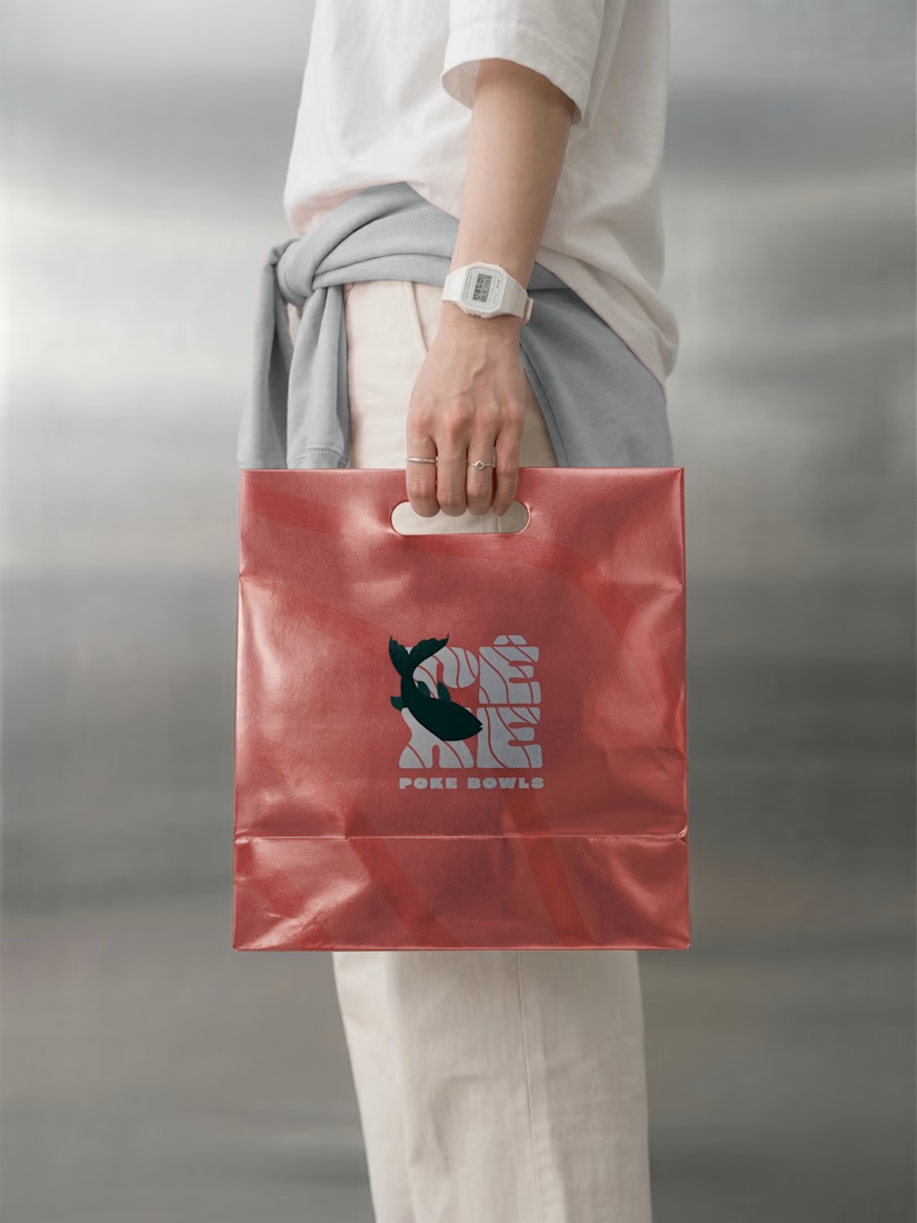
For smaller spaces and packaging, I designed a compact version of the logo with a fish illustration cutting through the lettering. It works as a symbol on its own and adds personality to the brand.
Colour & pattern
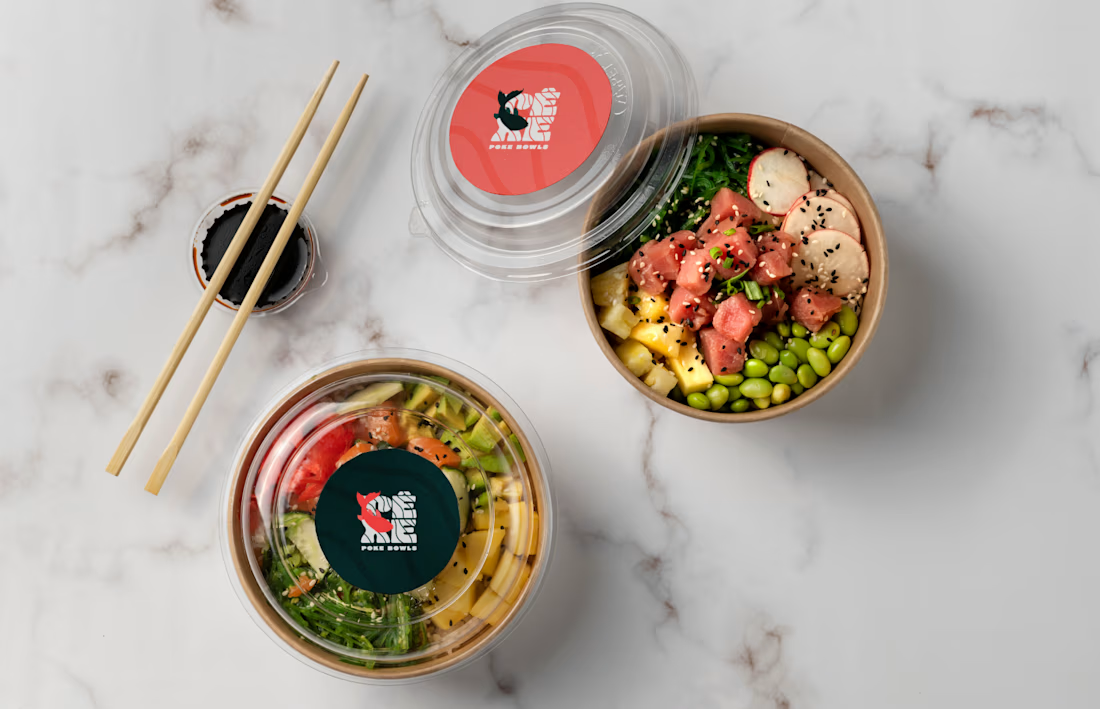
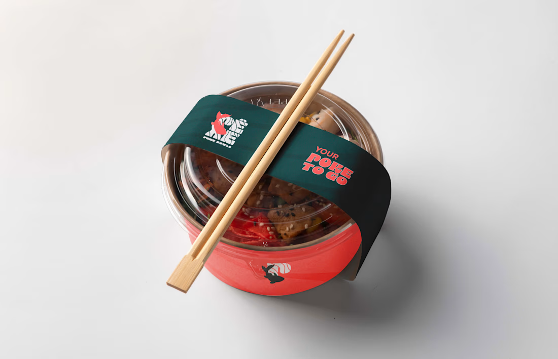
I paired a deep green with a bright coral red. The green feels fresh and grounded, while the coral brings warmth and makes the food look more appetising. The wave lines from the logo were turned into a subtle pattern that appears across the packaging, tying everything together.
Applications
The identity was applied across the shopfront awning, bowl sleeves, lid stickers and paper bags. The tagline “Your poke to go” reinforces the takeaway side of the business and gives the packaging a friendly, direct voice.
Result
A consistent and recognisable brand that works from the street to the table, with a flexible system that can grow with the restaurant. [Add: “The restaurant opened in (month/year)” or a short client feedback line, if you have one.]
My role: Logo design, visual identity, illustration, pattern, packaging design and signage.


The network for creativity
Join 1.25M professional creatives like you
Connect with clients, get discovered, and run your business 100% commission-free
Creatives on Contra have earned over $150M and we are just getting started
Related posts

A little more about the inspiration behind Tindara.
I wanted the identity to have a connection to Tindari, Sicily. The Madonna di Tindari statue was the starting point for the symbol, while Sicilian decorative patterns inspired the graphics around it.
For the colors, I chose mustard yellow, deep green, and burgundy, balanced with cream. I wanted to bring some of that warmth and richness into the packaging, while keeping the different elements comfortable together.
For me, these references are what give the project its character and sense of place.



A little behind-the-scenes look at a brand identity coming together.
I'm currently working on a new identity for a coworking space in Austin, TX, with a vintage-inspired direction, warm colors, and a logo that brings a bit of nostalgia into a modern setting.

Carrying the vintage idea onto the coasters and the dot pattern gives the identity somewhere to live besides the logo.

Two warm ups today, both might become full case studies:
Parlata: an audio-postcard service that records and archives local dialects. Every recording becomes a small printed card with a QR link.
MODULO: an Industrial IoT brand. Olive, navy, one wobbly blob.
One is warm and human. One is technical and playful. Which would you want to see go all the way?
31 voted
63%
18 voted
37%
49 votes
Closed

Love it