Ayesha Rana
Social Media Visual Designer | Photographer



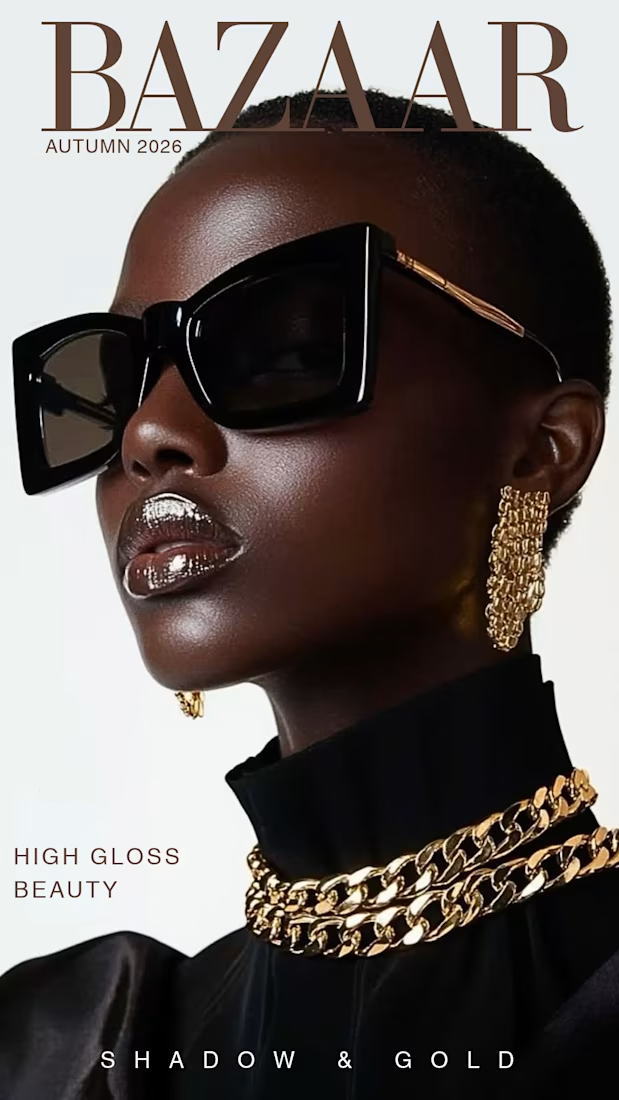
What makes a design look like a $10k editorial campaign instead of a basic graphic?
Precise typography and clean spacing. This concept proves that strong art direction doesn't need unnecessary clutter to look expensive. Available worldwide for remote creative direction and layout design.


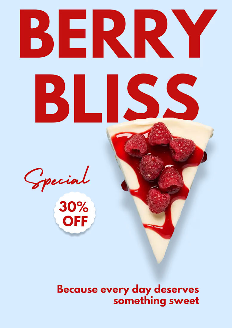
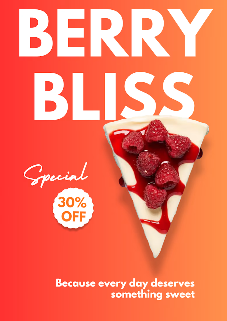
A/B Visual Test: Food Design Strategy
Exploring how color psychology changes product perception for a sweet treat poster.
Concept 1 (Vibrant Coral): Built for high visual impact and immediate commercial urgency.
Concept 2 (Minimal Slate Blue): Built for editorial clarity and modern...
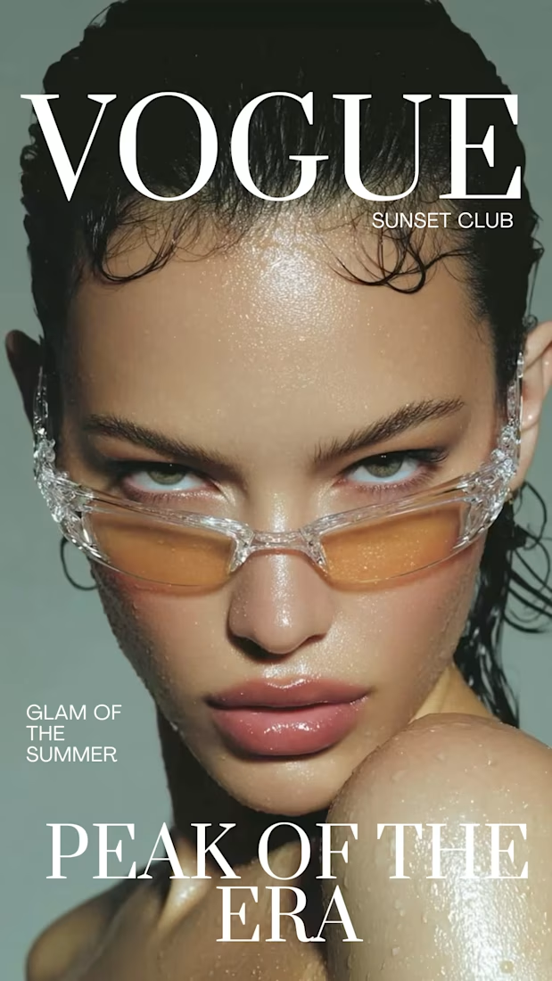
Would you pick this up off a magazine shelf?
A fashion cover concept built around glossy beauty, translucent frames, muted tones, and oversized editorial typography. I wanted the design to feel bold without becoming loud keeping the imagery at the center while letting the...
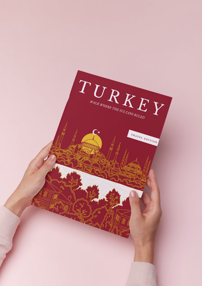
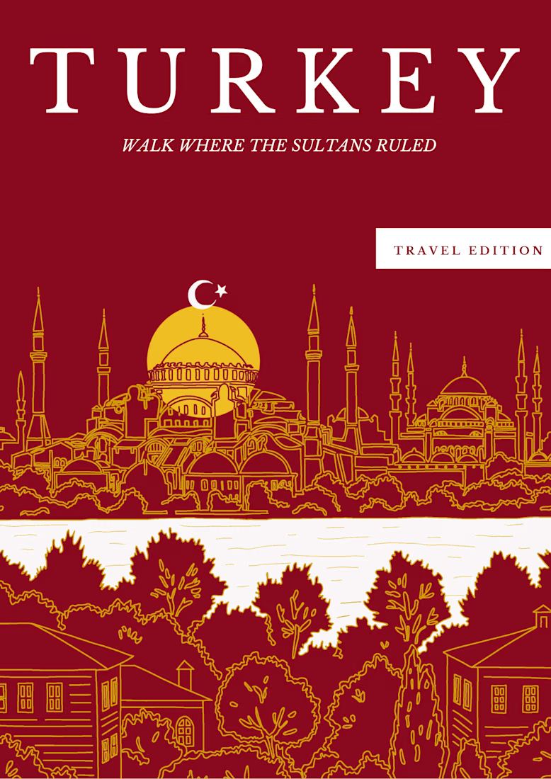
A travel guide cover inspired by Turkey.
For this concept, I wanted to bring together Turkey’s rich architecture and history with a warm, editorial feel.
I created the illustration, typography, layout, and color palette from scratch — keeping the design simple, distinctive, and...
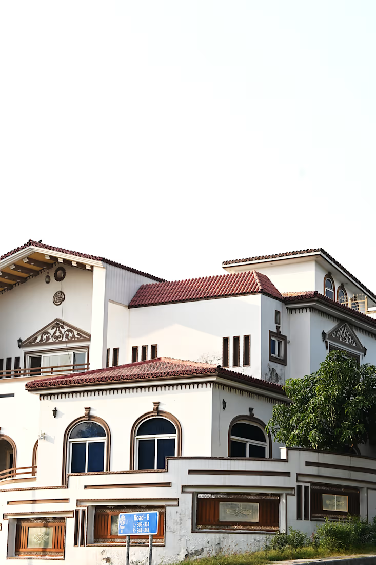
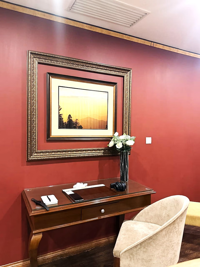
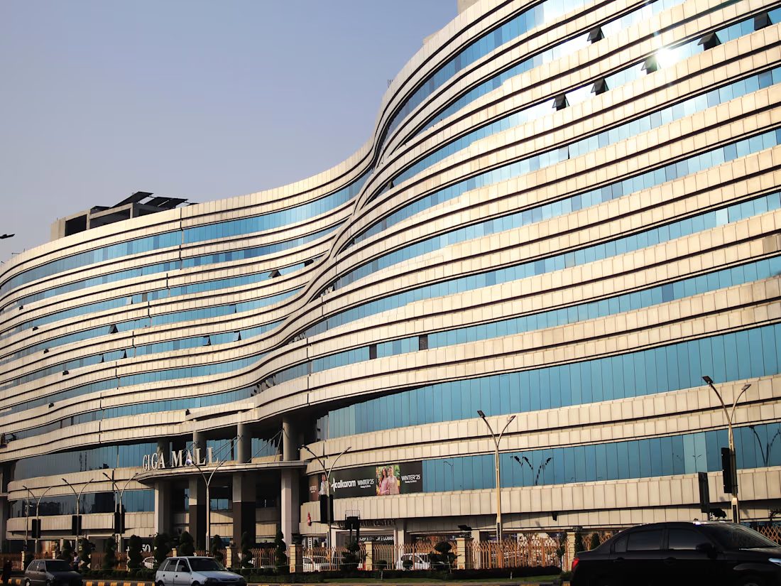
Modern spaces don't need to be loud to make an impression.
For this set, I focused on the quieter side of modern architecture — clean lines, controlled spaces, strong shapes, and the relationship between architecture and everyday life.
From a residential exterior to a contemporary...