The network for creativity
Join 1.25M professional creatives like you
Connect with clients, get discovered, and run your business 100% commission-free
Creatives on Contra have earned over $150M and we are just getting started
Back to feedPost

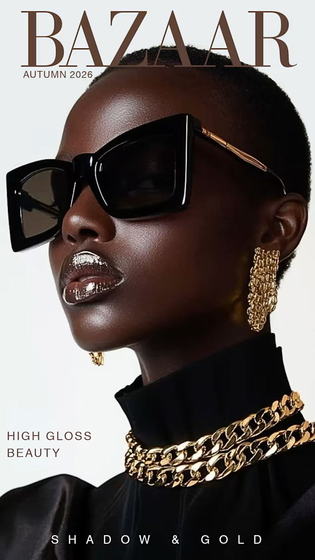
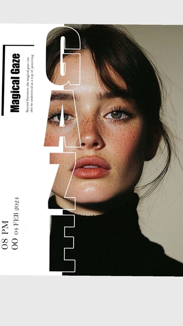
What makes a design look like a $10k editorial campaign instead of a basic graphic?
Precise typography and clean spacing. This concept proves that strong art direction doesn't need unnecessary clutter to look expensive. Available worldwide for remote creative direction and layout design.


The network for creativity
Join 1.25M professional creatives like you
Connect with clients, get discovered, and run your business 100% commission-free
Creatives on Contra have earned over $150M and we are just getting started





Related posts

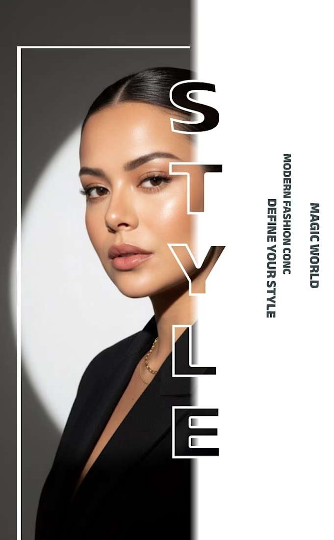
✨ Modern Fashion Poster Design - STYLE ✨
Designed a clean, high-fashion poster concept focusing on bold typography and minimalist aesthetics.
Concept: Modern Fashion | Define Your Style
Tool: Canva / Photoshop
Style: Luxury, Minimal, Editorial
Open to feedback and freelance work!
#GraphicDesign #PosterDesign #FashionDesign #Canva #ContraCommunity
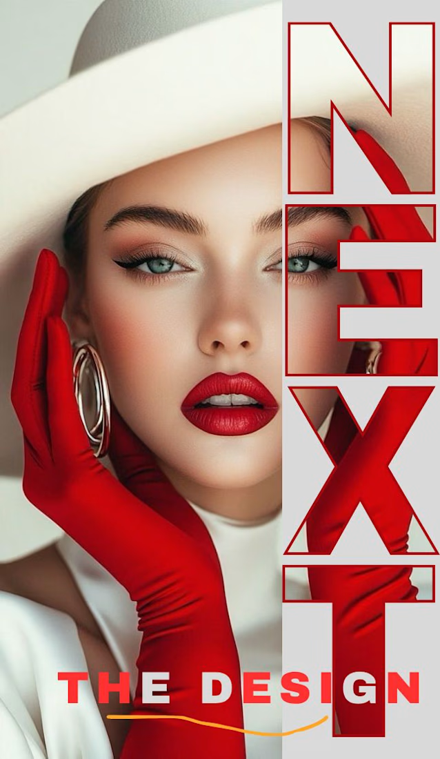
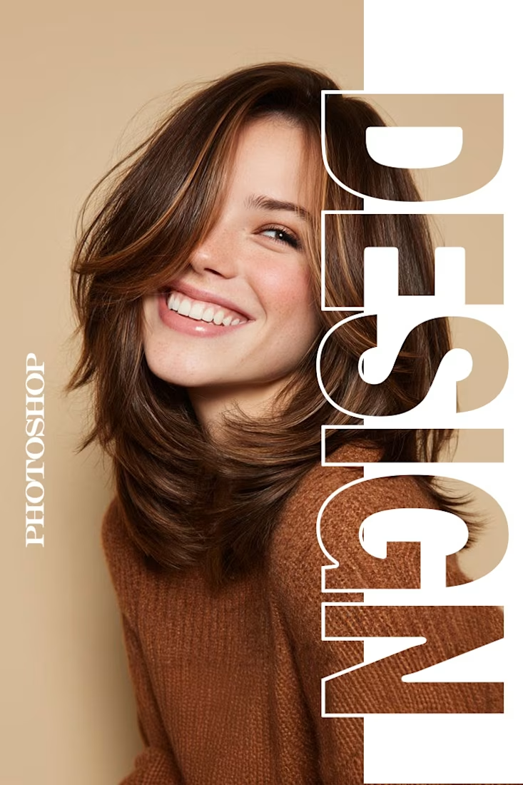

The way you let the bold type dominate the empty space really drives the luxury feel.

A new visual direction for Friedrich Naumann Foundation - Jordan.
I developed a visual sub-identity for the “Nau Media” project, a media training initiative focused on digital communication, human rights-sensitive media, and combating misinformation.
The goal was to build a distinct visual system that could stand on its own while remaining connected to the broader FNF Jordan identity.
This is an initial look at the project. The full visual identity and its applications will be shared soon.


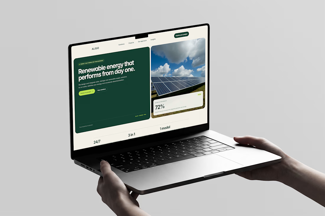
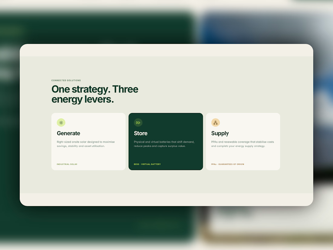
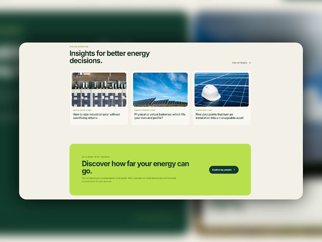
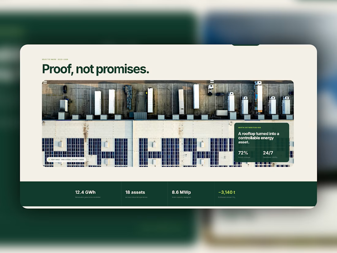
Meet Alisio, my latest Framer template for renewable energy and sustainability businesses.
Deep greens, warm neutrals, bold typography, and a bright lime accent give it a distinctive visual identity. Dedicated service pages, CMS project case studies, and an insights blog help businesses explain what they do and showcase their work.
Designed for desktop, tablet, and mobile, with reusable components and subtle motion throughout.
Take a closer look at Aliso, or make it your own.



Love this!