Ayesha Rana
Social Media Visual Designer | Photographer



What makes a design look like a $10k editorial campaign instead of a basic graphic?
Precise typography and clean spacing. This concept proves that strong art direction doesn't need unnecessary clutter to look expensive. Available worldwide for remote creative direction and layout design.


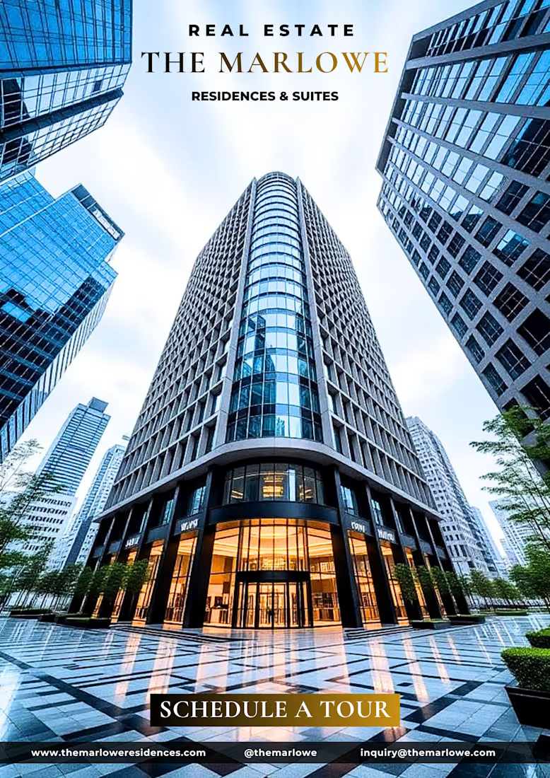
The Marlowe Residences & Suites
A luxury real-estate branding concept designed for a modern high-rise property.
The identity is built around strong typography, minimal composition, and warm gold accents inspired by the building's lighting. The result is intentionally polished...
A/B Visual Test: Food Design Strategy
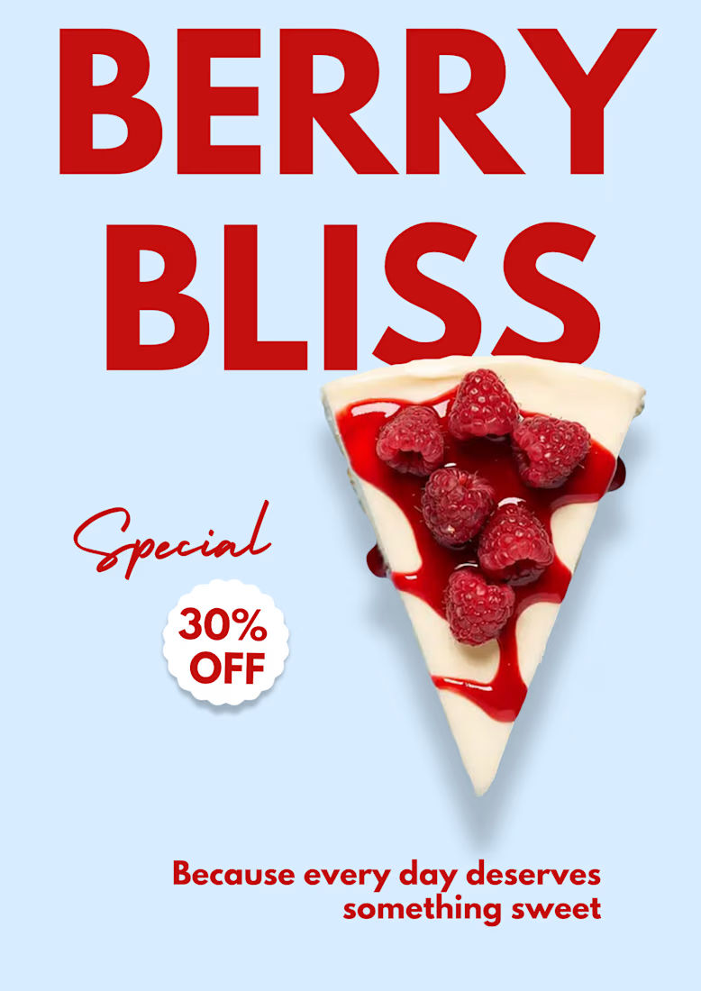
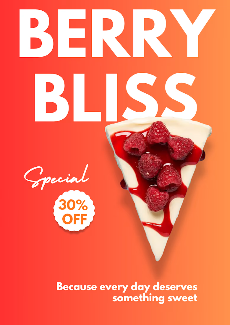
Exploring how color psychology changes product perception for a sweet treat poster.
Concept 1 (Vibrant Coral): Built for high visual impact and immediate commercial urgency.
Concept 2 (Minimal Slate Blue): Built for editorial clarity and modern...
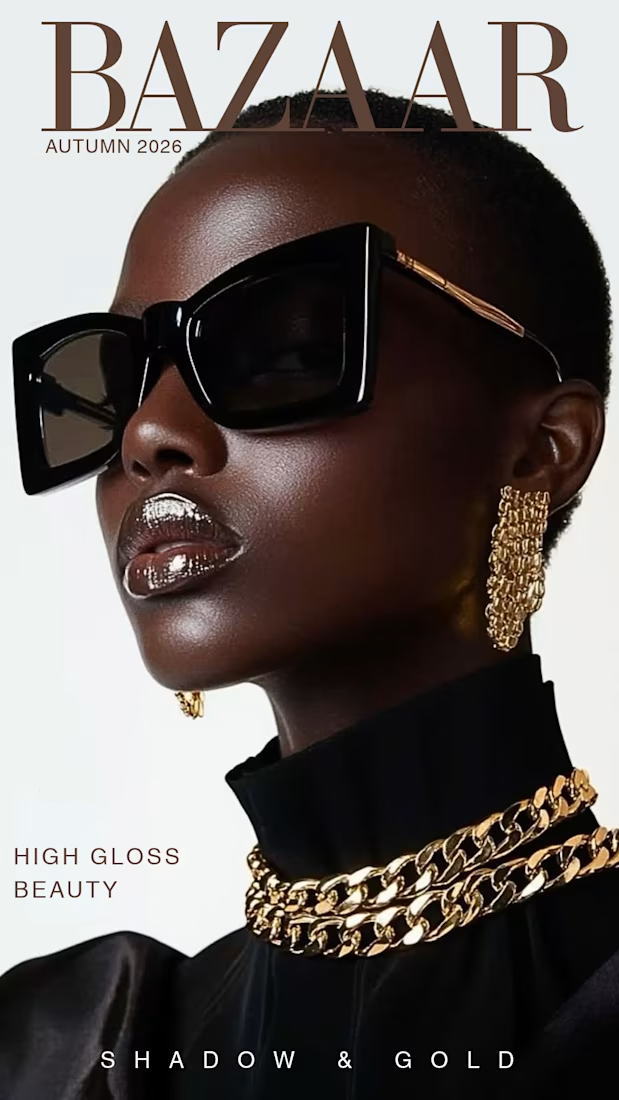
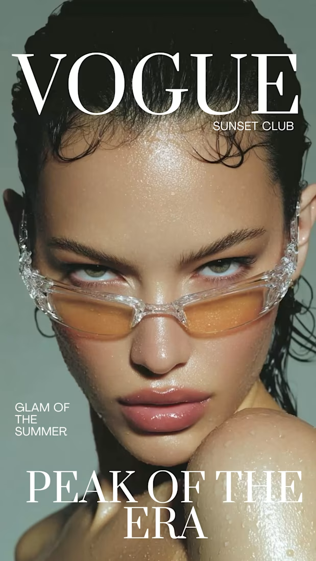
Would you pick this up off a magazine shelf?
A fashion cover concept built around glossy beauty, translucent frames, muted tones, and oversized editorial typography. I wanted the design to feel bold without becoming loud keeping the imagery at the center while letting the...
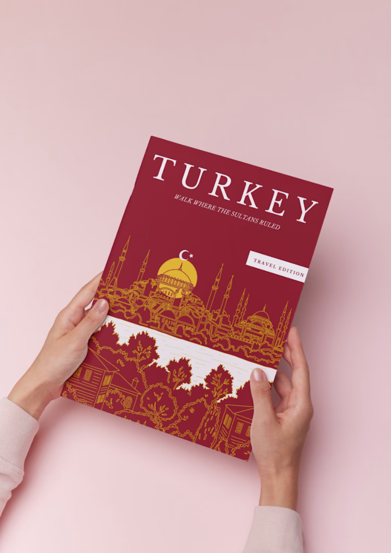
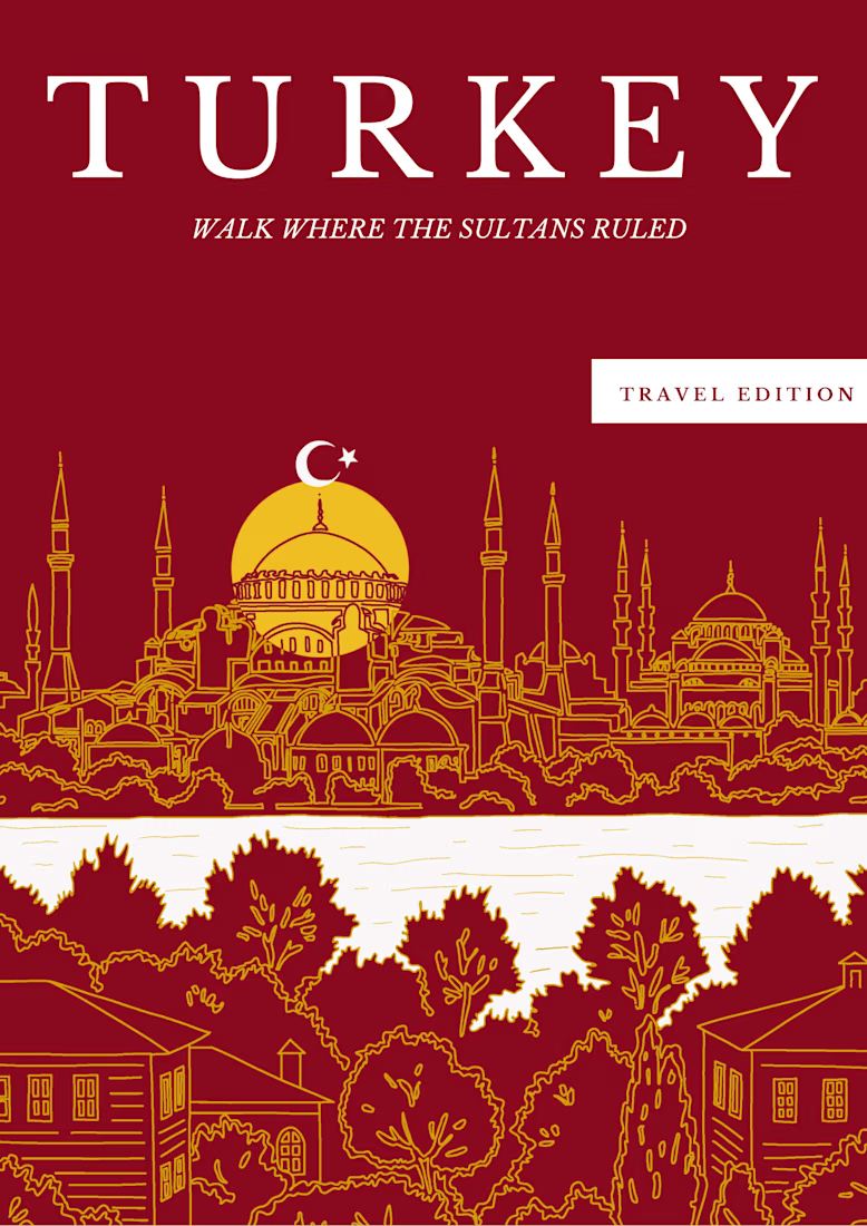
A travel guide cover inspired by Turkey.
For this concept, I wanted to bring together Turkey’s rich architecture and history with a warm, editorial feel.
I created the illustration, typography, layout, and color palette from scratch — keeping the design simple, distinctive, and...