Areeba Rasheed
Fixing messy, confusing, and mismatched identities
Ready for work
Areeba is ready for their next project!



Which logo would you trust with a Rs 500,000 diamond purchase?
I redesigned a luxury diamond brand's logo
Their jewellery is world class. GIA certified. Sold across two continents.
Their logo did not know that.
So I built them one that does.
Two interlocked D's in a classic...
0 voted
0%
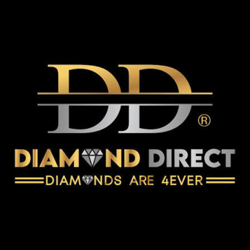
2 voted
100%
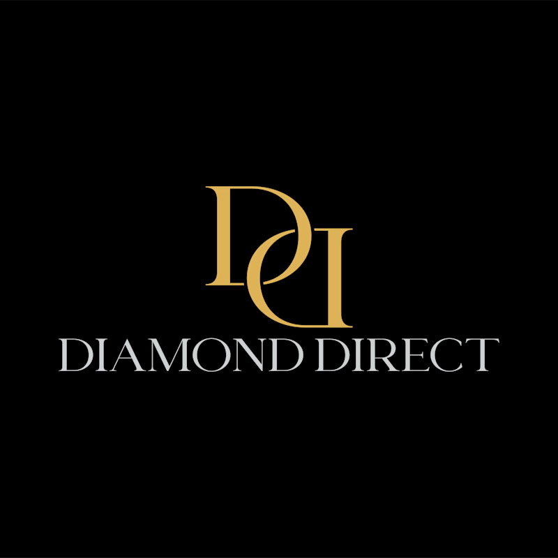
2 votes
Closed
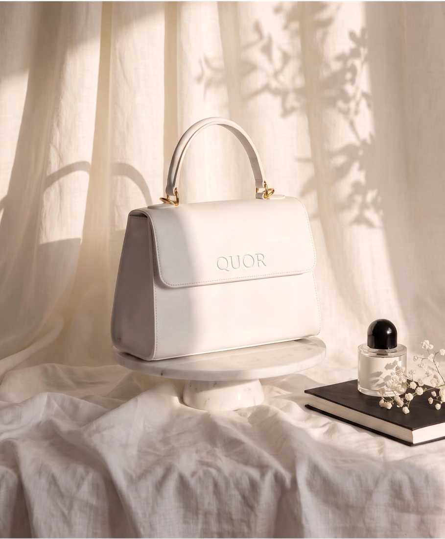
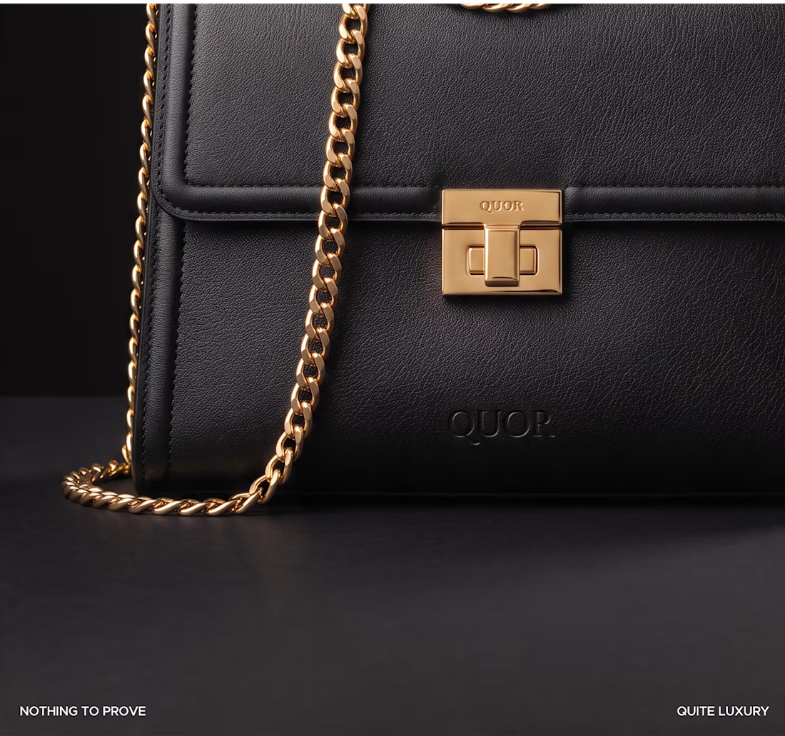
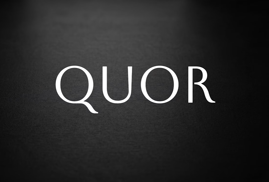
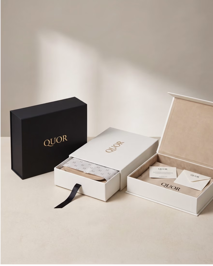
Quor, a leather goods identity built on restraint.
Most brands try to say more. Quor says less, on purpose black and white, nothing else. No seasonal palette, no extra noise to manage. Every decision runs through texture, proportion, and one small embossed stamp instead of loud...
Every "cool" font choice doesn't equal a strong logo.
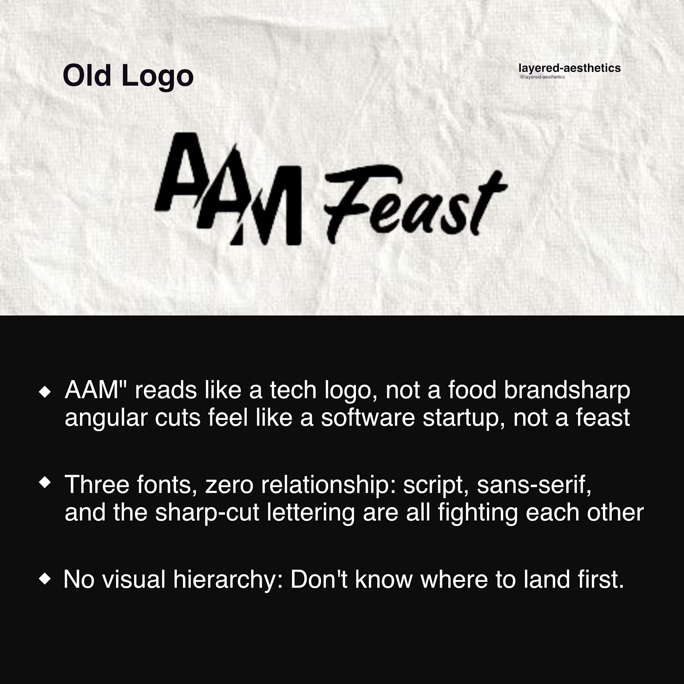
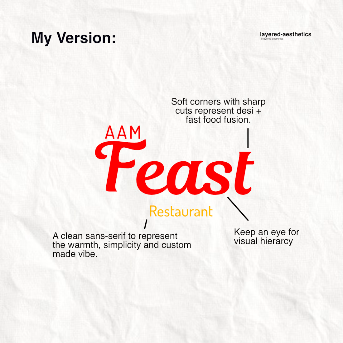
This is AAM Feast, a desi + fast food hub, and their first logo had three unrelated fonts, zero hierarchy, and a name that looked like a tech startup wearing a restaurant's clothes.
Here's what a real fix looks like: one...
I found a pizza place called The Oven. 4.8 stars, people genuinely love it, one review literally thanks them for bringing good food to the city. And they had nothing online except a Google listing. No website. Barely 200 followers on Instagram.
A business that's already earned...
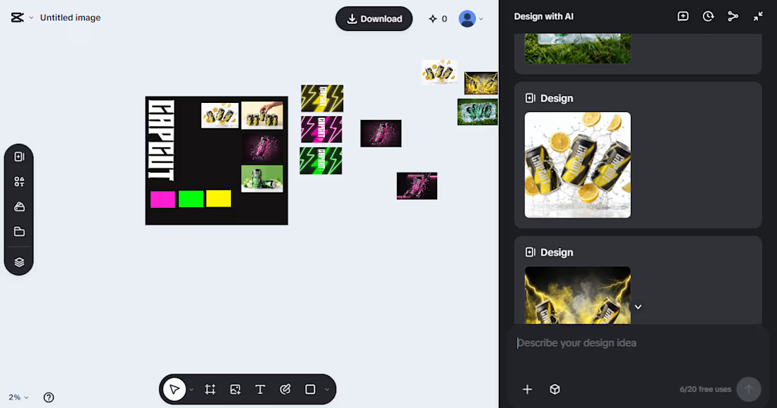
Direction A — CapCut as a Different Industry
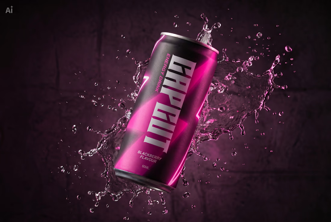
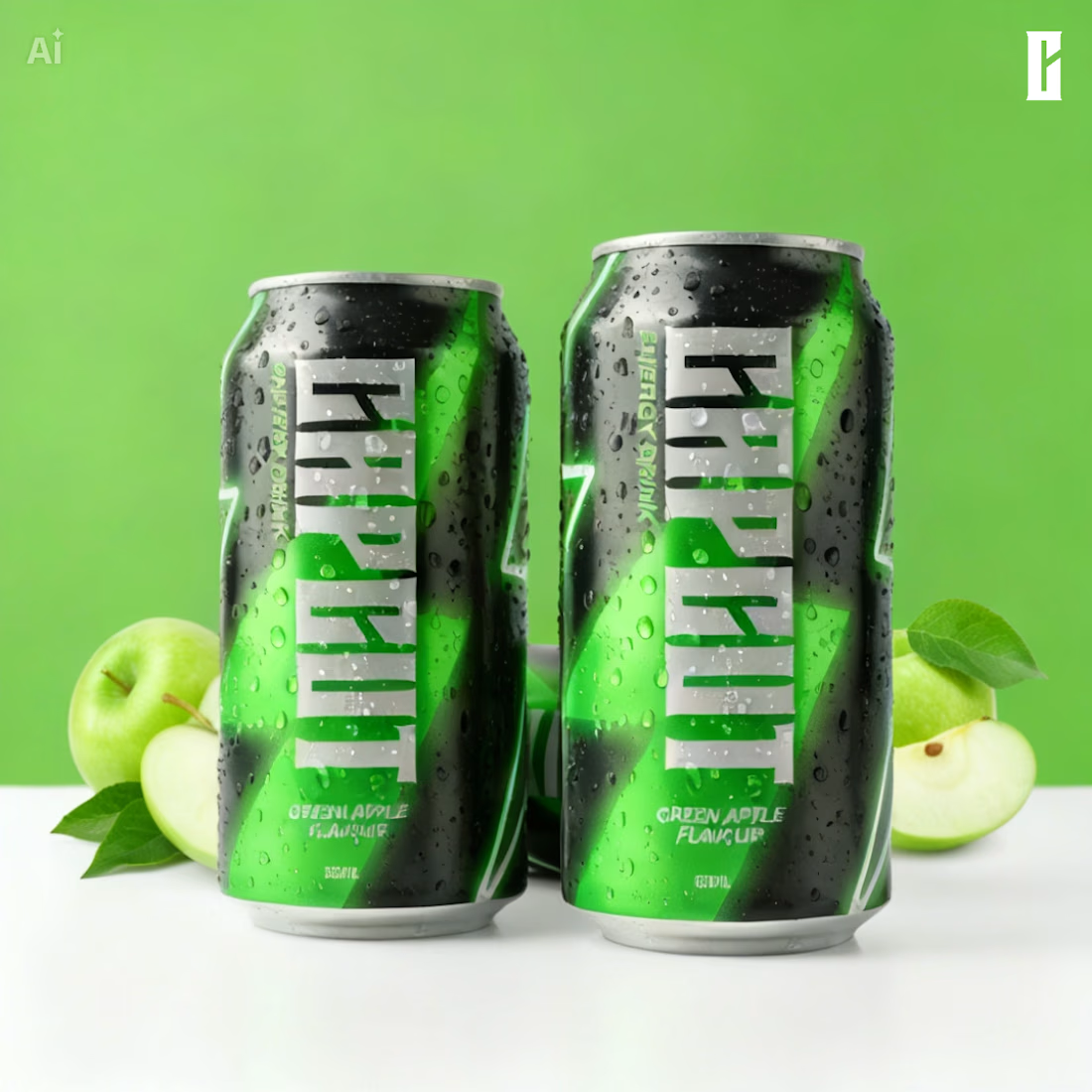
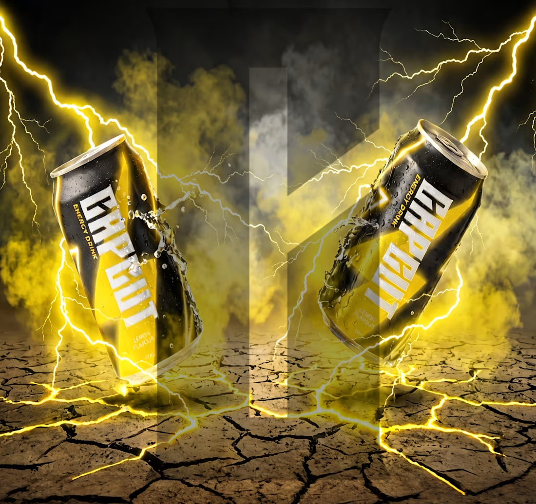
CapCut doesn't just edit videos it gives people the power to transform raw material into something sharp and intentional. That feeling? Focused, electric, unstoppable. That's exactly what an energy drink sells.
So I built CAPCUT energy...