The network for creativity
Join 1.25M professional creatives like you
Connect with clients, get discovered, and run your business 100% commission-free
Creatives on Contra have earned over $150M and we are just getting started
Back to feedPost
Taste Test

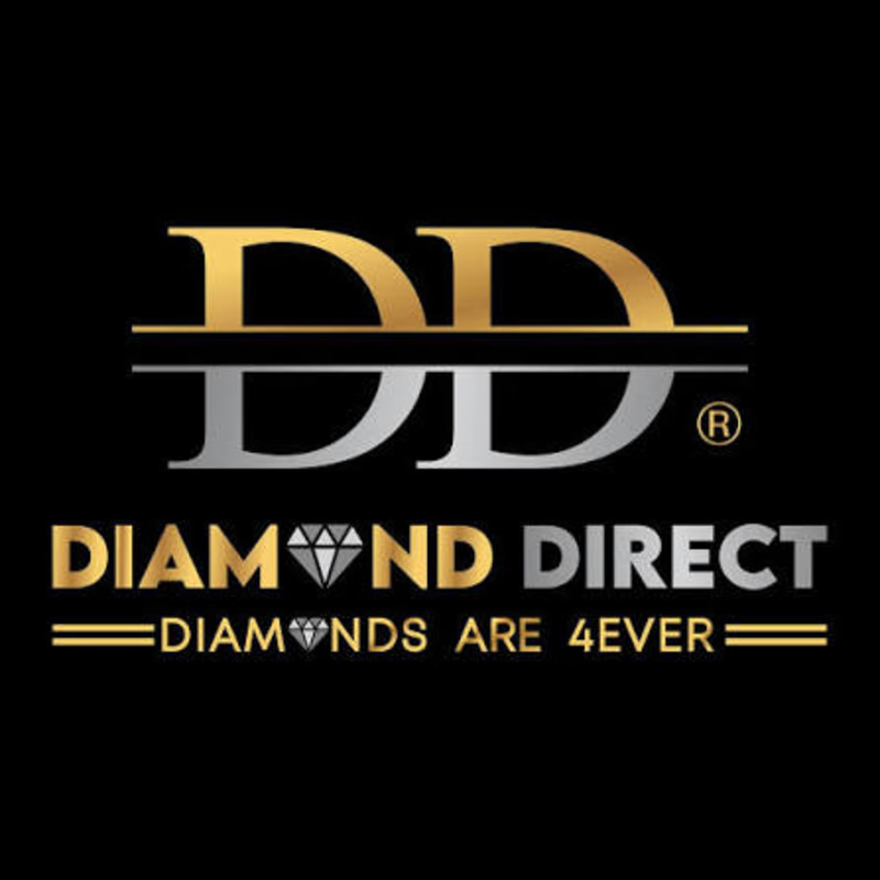
Which logo would you trust with a Rs 500,000 diamond purchase?
I redesigned a luxury diamond brand's logo
Their jewellery is world class. GIA certified. Sold across two continents.
Their logo did not know that.
So I built them one that does.
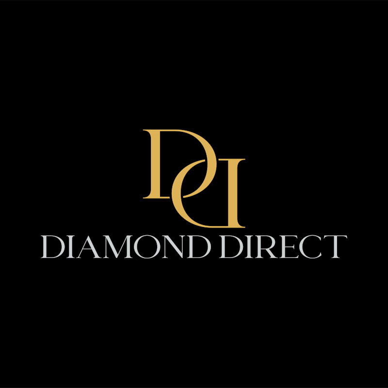
Two interlocked D's in a classic serif, because timeless brands do not chase trends, they outlast them.
The interlocking references the craftsmanship of diamond setting itself. The precision. The permanence. The way stones are locked into place forever.
And in the space where the two letters meet, a marquise diamond appears. Not drawn. Not placed. Hidden in the negative space. There for the eye that looks closely enough.
Drop your vote in the comments, Before or After?If you chose After, tell me what made the difference for you.
0 voted
0%
2 voted
100%
2 votes
Closed
The network for creativity
Join 1.25M professional creatives like you
Connect with clients, get discovered, and run your business 100% commission-free
Creatives on Contra have earned over $150M and we are just getting started





Related posts

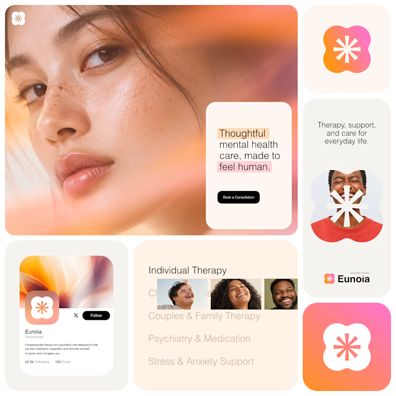
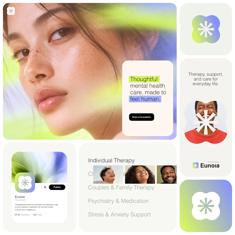
Exploring two visual directions for Eunoia, a mental health & psychiatry brand.
Direction 01 - Warm peach, orange and soft pink tones for a calm, human and comforting feel.
Direction 02 - Lime and periwinkle tones for a fresher, more optimistic and contemporary expression.
Same brand system. Different emotional energy.
32 voted
52%
29 voted
48%
61 votes
Closed

That's impactful, love to see fresh styles

Continuing my series of short motion videos for a crypto project.
Which coin looks better? (Rendered on a transparent background, by the way.)
If your product needs something similar, feel free to reach out :)
67 voted
74%
24 voted
26%
91 votes
Closed

B took the lead for me

Two short motion ads for Instaheadshots, an app that turns ordinary selfies into studio-quality professional headshots with AI.
🎬 Ad 1: "Slide to Unlock" (10s)
A product-flow spot. It opens on a glowing slide-to-unlock button, then shows the app's processing and generating screens as a casual selfie becomes a polished headshot. It ends on the brand and a "Try Instaheadshots" CTA.
🎬 Ad 2: "Everyone's Upgrading" (20s)
A social-proof spot. Notification cards stack up as Sarah, Daniel and Priya each post a new profile photo within one week. The punchline is "everyone is using the exact same Instaheadshots to upgrade," which works on FOMO and ends on a clear CTA.
What I did: concept, motion design, UI animation, kinetic typography, sound sync
7 voted
39%
11 voted
61%
18 votes
Closed

Option 2..Depicts what the app does instantly.